Design symbology for a thematic map in ArcGIS Online
Symbolize polygons by color
In 2020, there were more than 270 million people in Indonesia, making it the fourth most populous country in the world. The population is distributed unevenly across thousands of islands and 34 provinces. You'll symbolize the populations of the provinces using colors. This kind of map is known as a choropleth map and is a common way to display quantitative data (such as population) for geographic regions.
- Open the Indonesia Population web map.
- At the top of the page, click Sign In and sign in to your ArcGIS account.
Note:
If you don't have an organizational account, see options for software access.
The map has three layers, in addition to the basemap layers: Cities, Roads, and Provinces. You'll symbolize the provinces polygons first, because it is the most important layer in your map. You'll turn the other layers off for now, so you can focus better on the provinces.
- On the Contents (dark) toolbar, click Layers to open the Layers pane.
- In the Layers pane, point to the Cities layer. Click the visibility button to turn off this layer.
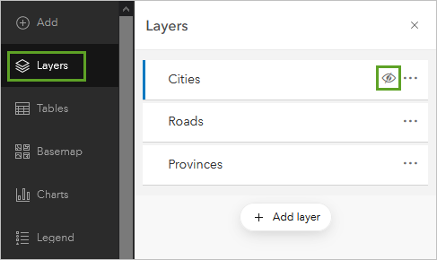
- Turn off the Roads layer as well.
- Click the Provinces layer to select it.
A blue bar appears next to a layer when it is selected.
- On the Settings (light) toolbar, click Styles.
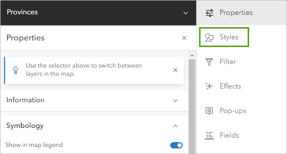
The Styles pane appears. To make more room for your map, you'll collapse the toolbars.
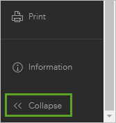
- On both the Contents toolbar and the Settings toolbar, click Collapse.
The provinces are symbolized with the Location (single symbol) style, which is good when you only want to convey the location of things. But in this map, you also want to convey one of the layer's attributes: population.
- In the Styles pane, click the + Field button.
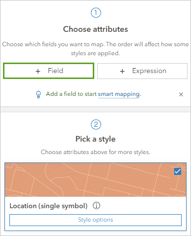
- In the Add fields window, choose Population and click Add.
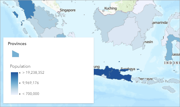
The map updates and a legend card appears. The map shows more populous provinces in dark blue and less populous ones in light blue.
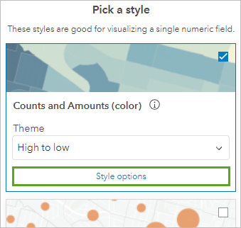
The Styles pane also updates to list drawing styles available for the selected field. The Counts and Amounts (color) style is already selected.
- For Counts and Amounts (color), click Style options.
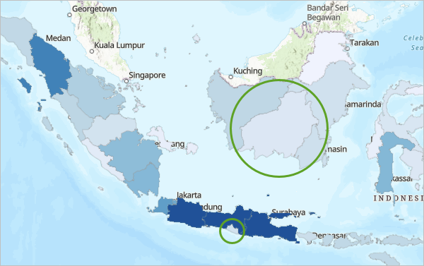
The symbology of this map could be misleading. Central Kalimantan (on the island of Kalimantan, or Borneo) and the Special Region of Yogyakarta (on the island of Java) appear to have similar populations. But one is many times larger than the other, so population density must be very different. This map is misleading because it doesn't indicate well where most people live. Instead of mapping population, it would be better to map population density.
When making a choropleth map, it's important to normalize your data, usually by converting counts to rates or ratios. The point of normalization is to convert values to a standardized scale so that comparisons are meaningful. To normalize this population data, you'll divide the population of each province by its area to calculate the population density.
- In the Style options pane, for Divided by, choose Area (square km).
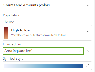
Now the colors on your map represent the number of people per square kilometer in each province. The map shows you that population density is highest on the island of Java. In fact, Java is the world's most populous island.
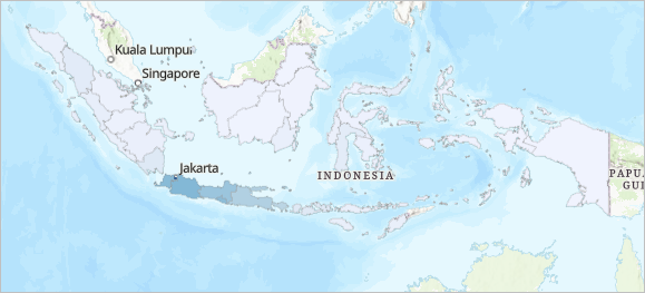
Next, you'll change the color ramp. The blue colors of this color ramp are difficult to read against the blue ocean of the basemap. Another reason to change the color ramp is due to color connotation. All colors have connotations, and these can vary by culture. Blues of often associated with water, so a casual map reader might think this map is about water resources. Population and urbanism are often represented on maps with pinks or purples, since these colors are less common in nature.
- Under Symbol style, click the color ramp.
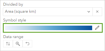
A window appears with more symbol options.
- In the Symbol style window, under Fill color, click the color ramp.
- Under Category, click All color ramps and choose Purples and pinks. Scroll to the third row and click the Pink 3 color ramp. (Point to the color ramps to read their names.)
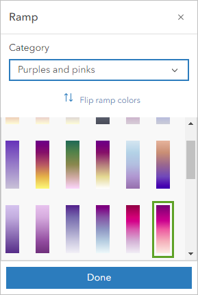
- Click Done and close the Symbol style window.
Most map readers interpret dark colors to mean more while light colors mean less, so a good color ramp choice for a population map will be one that ranges evenly from light to dark colors.
Note:
On a map with a dark background, this pattern should be flipped. Watch Light and dark color schemes to learn more.
- Scroll to the bottom of the Style options pane and turn on Classify data.
The Classify data section expands. The map and legend also change.
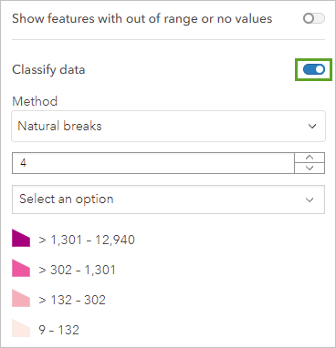
All provinces are now grouped into one of four symbol classes. They are defined by values that aren't necessarily meaningful. This map suggests that a value of 132 is more similar to 9 than it is to 133.
You could choose better cut-off values, either by rounding them or choosing a different classification method. But for this map, categorizing the data is not necessary. The data is continuous, not discrete, and the goal of this map is to help a general audience visualize populations as either more or less than other provinces. Classifying the data into discrete partitions does not improve the clarity of this map.
- Turn off Classify data.
The symbol colors now change gradually from a minimum value to a maximum value. This approach is simpler and more appropriate for the purposes of your map.
Note:
When is it necessary to classify your data? Sometimes a map is easier to understand if values are grouped into bins representing small, medium, or large values. Sometimes cut-off values are meaningful, for example, if governmental funding is available at different tiers. Sometimes a classification method will reveal patterns and trends not otherwise visible.
In the Style options pane, a vertical histogram shows the distribution of population density values. Most of the data is at the very bottom, with one outlier (the Special Capital Region of Jakarta) at the top.
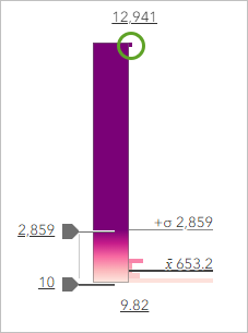
Two bounding handles on the side of the histogram represent one standard deviation above and below the average. They were assigned as cut-off values for the darkest and lightest colors. This prevents the outlier province—with its very high population density—from influencing the color ramp too much. You'll adjust this cut-off value even further to better show the comparisons between the other provinces.
- On the histogram, click the upper handle (2859) and type 1500. Press Enter.
The handle moves closer to the bottom of the histogram.
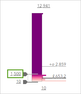
Now all values greater than 1,500 are symbolized with the darkest purple, reserving the range of colors between the two handles for the bulk of the data range.
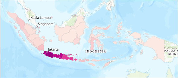
You can now discern more variation on the islands of Borneo, Sumatra, and Sulawesi, without losing color variation on the island of Java. You did not move the control very far, so the change in the map is not dramatic.
You'll finish this layer by changing its name, to make it clear to map readers what it represents.
- In the Layers pane, on the Provinces layer, click the Options button and click Rename.
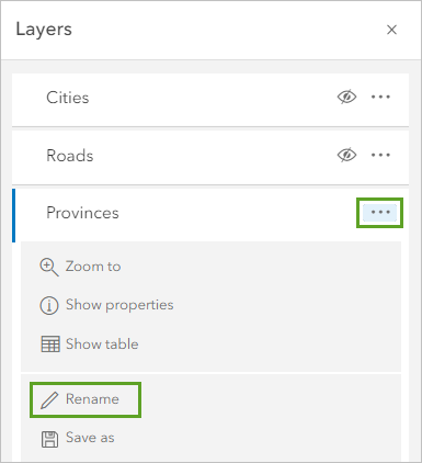
- For Title, type Provinces: Population Density and click OK.
- On the Contents toolbar, click the Save and open button and click Save as.
- In the Save map window, for Title, type Indonesia Population. Click Save map.
You've now made a choropleth map that symbolizes the provinces of Indonesia by population density. You learned why to use rates or ratios instead of counts, when to classify your data, how to adjust the range of the symbology, and how to choose an appropriate color scheme. Next, you'll symbolize cities.
Symbolize points by size
For the cities of Indonesia, you'll vary the size of the symbols instead of the color. Because the point features have no area, you don't need to normalize the data into population density. You'll map population counts, with larger symbols for larger cities.
- In the Layers pane, click the Cities layer to select it. Click the visibility button to turn it on.
The Styles pane updates to show symbology options for the Cities layer.
- Click + Field and choose Population. Click Add.
The suggested drawing style changes to Counts and Amounts (size). The city symbols on the map change so they are now all different sizes.
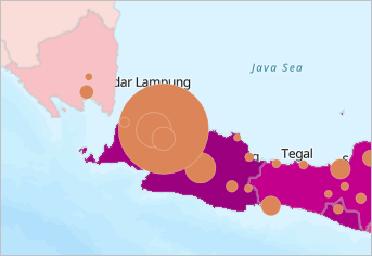
On the map, the capital Jakarta stands out as the largest city in Indonesia. Unfortunately, it also hides other important map information. You'll make the symbols transparent to prevent this problem. You'll also change the symbol color to match the darkest purple province.
- Under Counts and Amounts (size), click Style options.
- Click the symbol under Symbol style.
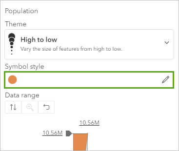
- In the Symbol style window, click Fill color. For Hex, type 7A1B77 and press Enter.
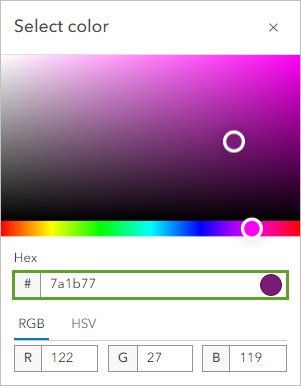
Now both the point and the polygon layers of the map will use the same color to represent the same theme: population. Using similar colors for similar things makes your map easier to interpret.
- Click Done.
- Set Fill transparency to 75.
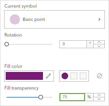
The transparent circles no longer hide each other or other parts of the map, but they are difficult to see. After the provinces, the cities are the most important element of this map, and so should appear as prominent symbols. You'll change the outline of the symbols to an even darker purple color to make them more visible.
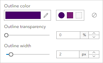
- Click Outline color. Change Hex to 49006A and click Done.
- Set Outline transparency to 0.
- Set Outline width to 2.
- Close the Symbol style window.
You'll also adjust the size range of your symbols. The smallest and largest symbol sizes were chosen automatically based on the scale of your map and adjust automatically as the scale changes. You'll increase the maximum size.
- In the Style options pane, on the Size range slider, click the upper handle and move it to the highest value.
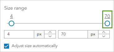
The value at the end of the slider will vary based on your current scale.
The circle symbols are larger than before, which allows for a greater range of difference between the smallest and the largest. Because Adjust size automatically is checked, the size of the circles will increase at every scale.
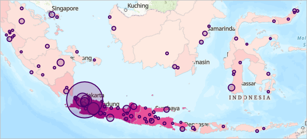
- In the Layers pane, rename the Cities layer to Cities: Population Totals.
- Save the map.
You've now symbolized points with size. You learned how to create transparent overlapping symbols that don't hide other parts of the map. This is important, because while Jakarta has 10 million people, there are also several other cities just outside of its boundaries with large populations of their own. The metropolitan area of Jakarta extends beyond the boundaries of its province.
The city points and province polygons work together to tell a story about population distribution. While the provinces carry the entire population—urban and rural—the cities provide more context about where most of the population is concentrated. In particular, they help to highlight the prominence of Jakarta.
Symbolize lines by type
The final thematic layer in your map is a line layer representing roads. Roads and road densities can often serve as a proxy for population and urbanism in maps. You will symbolize the roads based on their type.
- In the Layers pane, select the Roads layer and make it visible on the map.
So far in this tutorial, you have symbolized quantitative data. Next you'll symbolize qualitative data, or data that varies by types or categories rather than numeric values.
- In the Styles pane, click + Field, choose Type, and click Add.
- For Types (unique symbols), click Style options.
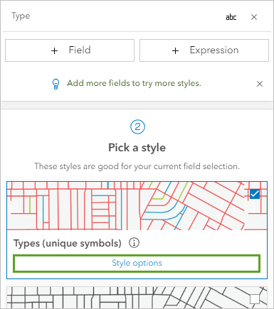
Four symbol categories are listed: Unknown, Road, Major Highway, and Other. Numbers next to the symbol classes indicate how many features of each type are present on the map.
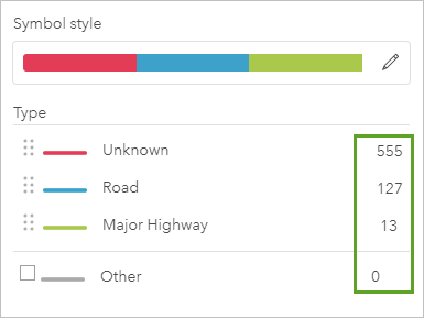
The Other category has no features. This is inconsequential, since the empty check box next to it indicates that this category will not draw on the map. You'll rename and reorder the categories to improve the layer's legend.
- Click the Unknown label. Erase the existing text and type Secondary Road to rename the category. Rename Road to Primary Road.
- Click the button next to each row to reorder the categories. Move Major Highway to the top of the list and Secondary road to the bottom.
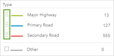
Now that you have decided on the hierarchy of the road symbols, you'll restyle them.
- Click the color ramp under Symbol style.
You won't change the color ramp, because you only have three symbols and can change them individually. But you can use this window to change other properties of all three symbols at once.
- Ensure that the Adjust width automatically check box is checked.
- On the map, zoom to the island of Java until the labels for Tegal and Situbondo appear on the basemap. For Width, type 2.
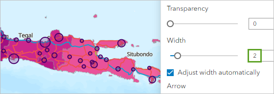
The road symbols will have a size of two pixels the current scale. When the map is zoomed in further, they will be slightly thicker. When the map is zoomed out further, they will be slightly thinner.
- Click Pattern and choose the fifth dashed line.
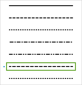
A dashed pattern will help distinguish the roads from the province borders. Next, you'll use color to establish a hierarchy for the symbols. You'll use darker colors for more important roads.
- Close the symbol style window.
- Click the symbol next to Major Highway.
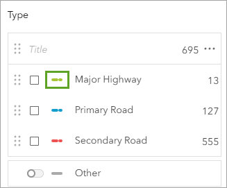
- Click the Color menu. For Hex, type 000000 and press Enter.
The symbol changes to black.
- Click Done.
- Change the color of the Primary road symbol to 555555.
- Change the color of the Secondary road symbol to AAAAAA.
- Close the Symbol style window.
Tip:
A hex color where all digits are the same value will always produce a shade of gray.
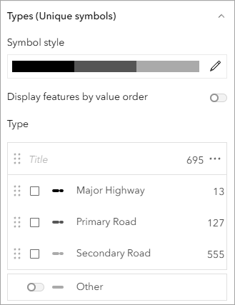
- Click Done twice. Save the map.
You've now symbolized polygons, points, and lines to effectively map the population of Indonesia. In this tutorial, you symbolized one layer at a time. When you work on your own map projects, you will often switch back and forth between layers to ensure that all map symbols work together in a cohesive map design.
Customize the basemap
At the start of this tutorial, your thematic map layers were drawn with default symbols, which you changed to better suit your map's purpose. But your map has at least one more layer that should not be left in its default state: the basemap. Next, you'll learn how to mix and match basemap layers to create a simple background that complements your thematic data, rather than distracting from it.
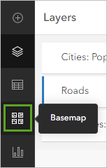
- On the Contents toolbar, click Basemap.
Your map currently uses the Topographic basemap, which provides lots of detail that is useful for exploring your data in its geographic context. However, its variety of colors and textures also distract from the focus of your map. Instead of thinking about population density in Indonesia, a map reader's attention may be captured by the ocean trench bordering Java and Sumatra or forest cover in Papua New Guinea.
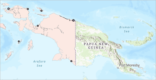
Simpler, more neutral backgrounds are better choices for thematic maps. Next, you'll choose a gray basemap that better supports your thematic data.
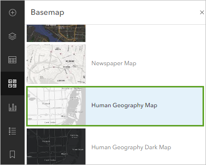
- In the Basemap pane, choose Human Geography Map.
Note:
If Human Geography Map is not listed in the basemap list, scroll to the bottom of the list and click Living Atlas. Search for and add the Human Geography Map web map owned by Esri.
The map updates. The new map background now appears simpler and better highlights the thematic content.
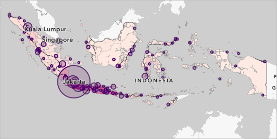
Gray is a useful basemap color because it is typically interpreted as no data. Being pale and desaturated allows it to read as background information, rather than foreground.
- At the top of the Basemap pane, click Current basemap Human Geography Map.
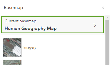
The Basemap pane shows the components of the basemap. The Human Geography basemap contains three layers. The two Reference layers draw on top of your thematic map layers. The Base layer draws underneath. Layer order is an important aspect of symbology. You'll reorder one of these layers so it can be recolored in later steps.
- Drag the Human Geography Detail layer into the Base section and drop it above the Human Geography Base layer.
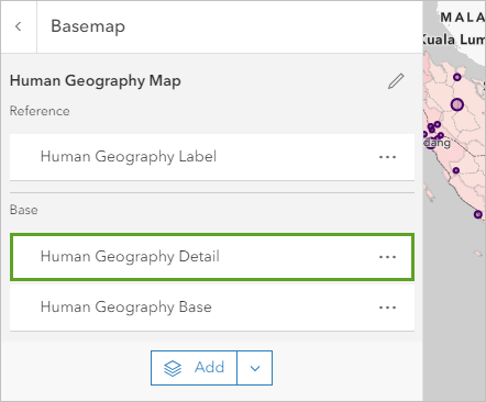
- In the Basemap pane, on the Human Geography Base layer, click the Options button and choose Remove.
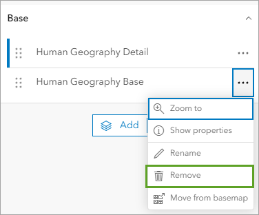
This layer only contains a pale background for land areas and isn't needed in your map.
You can also add basemap layers. Next, you'll add a hillshade layer to bring back some texture and topographic context.
- In the Basemap pane, click the Add button.
- Change My Content to Living Atlas. In the search bar, type world hillshade.
- In the search results, on the card for the World Hillshade tile layer owned by Esri, click the Add button.
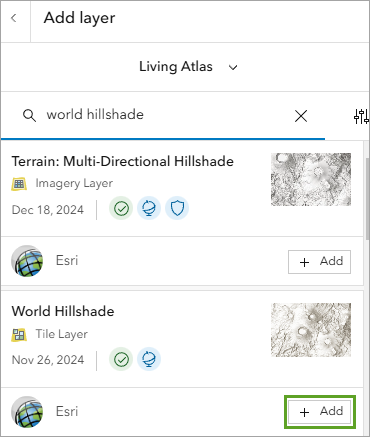
- At the top of the Add layer pane, click the back button.
There are now three layers in your basemap. The hillshade sits on top of the other base layer and hides it. The mountains appear to float in a white ocean.
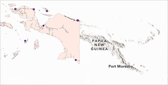
- Drag the World Hillshade layer to the bottom of the list, below Human Geography Detail.
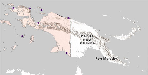
The hillshade no longer hides the ocean and other basemap details. But the hillshade is only visible in neighboring countries. It is hidden in Indonesia by the province polygons.
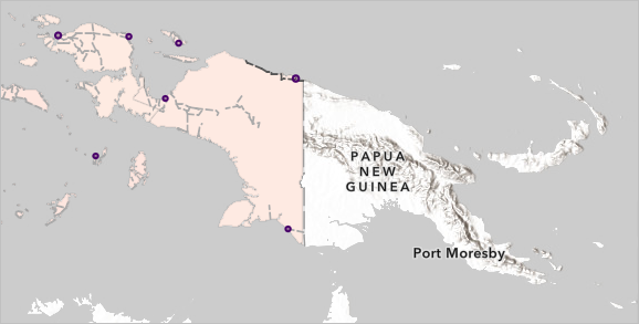
If you move the hillshade layer above the provinces, it will hide them instead. To get around this issue, you'll use a blend mode.
- On the Contents toolbar, click the Layers button. In the Layers pane, select the Provinces: Population Density layer.
- On the Settings toolbar, click the Properties button. In the Properties pane, for Blending, choose Multiply.
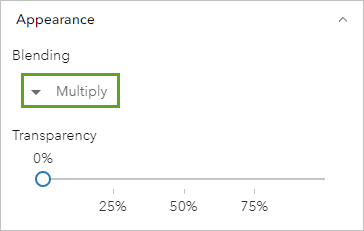
Layer blending determines how layers combine with the layers underneath. Multiply is one of the most commonly used blend modes. In this situation, it allows both the provinces and the basemap layers underneath to be equally visible.
You'll also add a drop shadow to Indonesia to make the distinction between the thematic data and the basemap stronger.
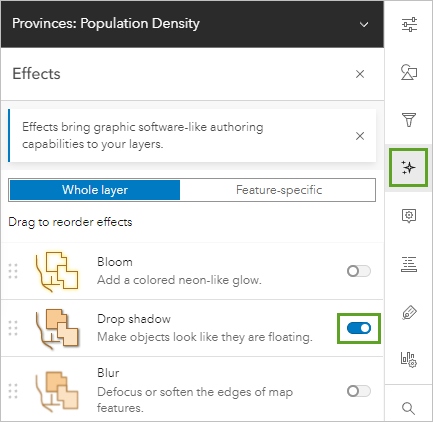
- On the Settings toolbar, click the Effects button.
- In the Effects pane, turn on Drop shadow.
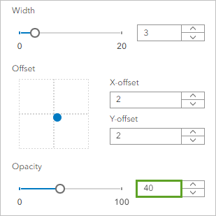
- In the Drop shadow window, change Opacity to 40.
Now the islands of Indonesia appear to hover over the basemap, giving them greater visual hierarchy.
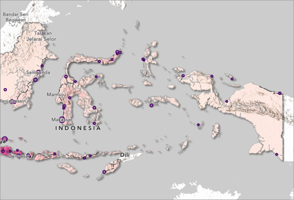
- Close the Drop shadow window and the Effects pane.
- Save the map.
Basemaps are helpful resources for thematic maps, since you do not have to spend time building and symbolizing background geography. But just like every other map element, you don't need to use them in their default state. Choose a gray basemap to better present your thematic data. Try reordering basemap layers, removing those that aren't needed, adjusting their transparency and layer blending.
An effective basemap elevates your thematic data, rather than distracting from it.
Change the color of the basemap
The gray color of the basemap is neutral and elevates your thematic data. However, in the case of the Indonesian archipelago, most of the map is water, so the majority of the map is gray. You may find this to be a bit drab. Next, you'll change the color of your basemap to change the tone of your map.
- On the Contents toolbar, click the Basemap button. Click Current basemap Human Geography Map.
- In the Basemap pane, select the Human Geography Detail layer.
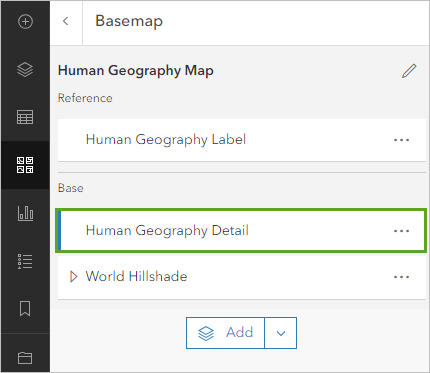
On the Settings toolbar, there is no Style button available. Human Geography Detail is a tile layer, so you do not have the option to change its style. You'll instead use a combination of effects to customize its appearance.
- In the Effects pane, turn on Hue rotate.
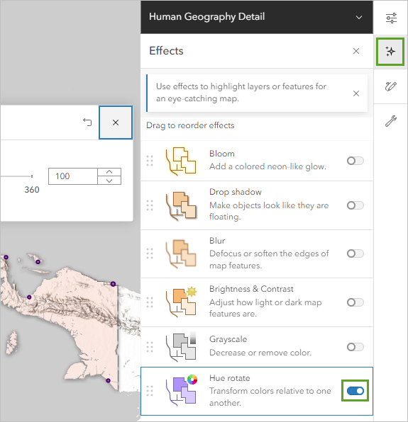
- In the Hue rotate window, experiment with the slider control.
No change is visible on the map. The basemap layer is completely desaturated: its only colors are gray, black, and white. These colors have no hue, so the hue can't be changed. You'll apply another effect to give the basemap a hue first.
- In the Effects pane, turn on Sepia.
The basemap layer changes from gray to a pale brown color. You'll increase the strength of the Sepia effect to get the strongest color possible.
- In the Sepia window, change Strength to 100.
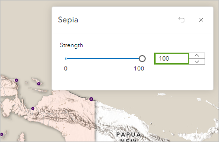
You'll also use the Saturate effect to increase the strength of the color.
- In the Effects pane, turn on Saturate and set Strength to 200.
You'll reorder the effects to make sure that the Sepia effect is applied before the other effects.
- In the Effects pane, drag the Sepia effect to the top of the list.
It does not matter how the other effects are ordered.
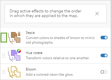
The color of the map changes. Placing Sepia at the top of the list ensures that the other effects act on the sepia-altered basemap, rather than the original gray basemap.
- Click Hue rotate and change Degrees to 115.
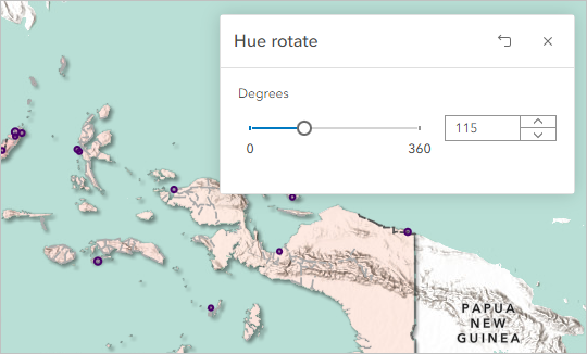
The basemap changes to a light green color. The green ocean complements the pink provinces nicely. However, the most common forms of color blindness make it difficult for many people to distinguish between reds and greens. While this map may look attractive, it may also be hard for some people to read. You'll change the ocean color to blue.
Tip:
You can use online tools such as this Color Blindness Simulator to test the legibility of your map.
- Change Degrees to 145.
The map changes to a blue color.
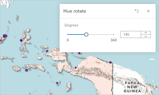
- Close the Hue rotate window.
Color is one of the most important tools in cartography, conveying both meaning and mood. Consider the color of your basemap as carefully as you consider the color of your thematic data.
Share the map
You've now designed a map of population in Indonesia. To finish, you'll share it in a web app.
- On the Contents toolbar, click the Bookmarks button and click the Indonesia bookmark.
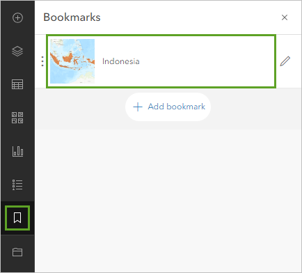
The map repositions to place Indonesia in the center. The position of the map will be reflected in the web app.
- Save the map.
You'll share the web map to ensure that other people will be able to view it in an app.
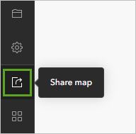
- On the Contents toolbar, click the Share map button.
- For Set sharing level, choose Everyone (public) and click Save.
The map is now ready to convert into an app.
- On the Contents toolbar, click the Create app button and click Instant Apps.
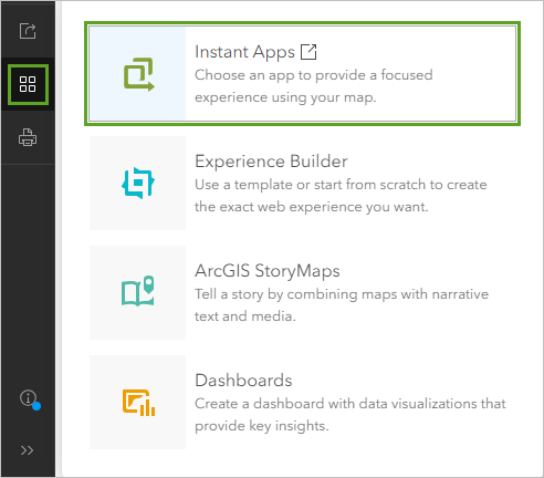
The Instant Apps page appears. It lists templates that allow you to create apps with minimal set-up steps.
- Scroll through the list of templates. On the Sidebar card, click Preview.
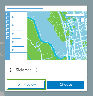
A preview of the app appears. It includes a map and a sidebar with a few controls.
- On the app toolbar, click the Legend, Details, and Info buttons to preview the appearance of these widgets.
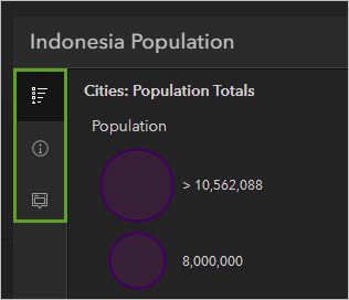
- Click the Info button and click a city or a province on the map.
The sidebar displays the pop-up information for the selected feature.
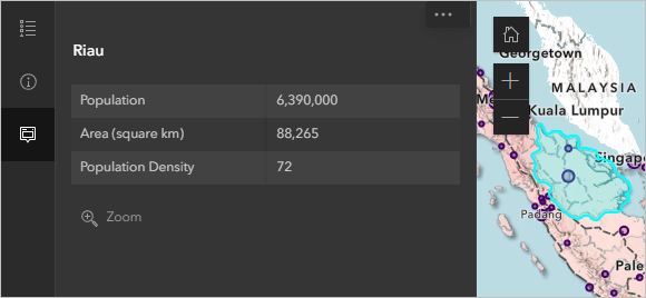
This template is suitable for your map.
- Click Choose.
- For Give your app a title, type Population map of Indonesia.
- Click Create App. If necessary, close the Express window.
The new application appears. You'll change the theme to light colors that better match the map.
- In the Express pane, click Step 5. Theme & Layout. For Select a mode, choose Light.
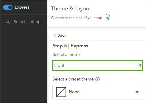
- At the bottom of the Express pane, click Publish. In the Publish window, click Confirm.
- In the Share window, click Change share settings.
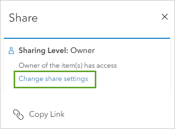
- Choose Everyone (public), and click Save.
- Above the map, click the Share button and click Copy Link.
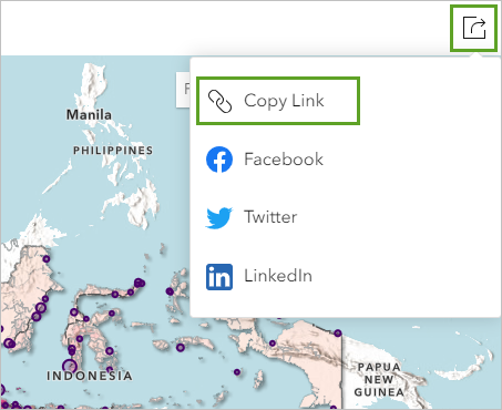
- Open a new browser tab and paste the link in the address bar to view your finished app.
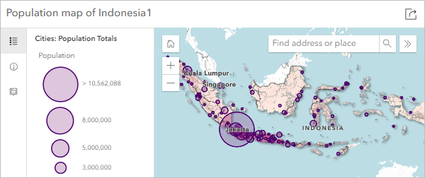
Designing an attractive and effective map does not require complex symbol effects, but it does require thought and experimentation. In this tutorial, you learned some common techniques used by cartographers to design maps, including the following:
- How to choose colors that work well together and suit the map's theme
- When to normalize your data
- How to adjust a symbology histogram to better show a range of data
- How to improve symbols with simple symbol property changes
- How to improve a basemap by adding, reordering, and blending layers
Making a map requires making many choices, not just about map symbols. Try some of the resources listed below for further cartographic skills.
You can find more cartography tutorials on the Introduction to Cartography page.

