Get started with ArcGIS Online
Begin a map
You'll begin your map by signing in to ArcGIS Online and navigating to your area of interest: Houston, Texas.
- Sign in to ArcGIS Online using your ArcGIS organizational account.
Note:
If you don't have an organizational account, see options for software access.
If you don't have an account, you may skip this step. You can still complete this tutorial, but you will not be able to save the map.
- On the ribbon, click the Map tab.

A default web map appears.
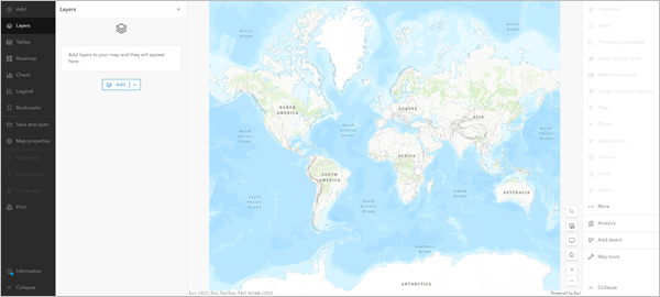
Your map's appearance varies based on your account or organizational settings and your browser window size. It may show the United States, the world (such as in the example image), or another extent.
The only layer on the map is the basemap, which provides geographic context such as water bodies and political boundaries. The default basemap is Topographic, which includes highways, railways, water features, cities, parks, landmarks, building footprints, and administrative boundaries. Your map may have a different basemap depending on your organization's settings.
On either side of the map are the toolbars. The Contents (dark) toolbar allows you to manage and view the map contents and work with the map. The Settings (light) toolbar allows you to access tools and options for configuring and interacting with map layers and other map components. The Layers pane is also open. The data you add to the map will be listed here.
Next, you'll navigate to your area of interest.
- On the map, at the bottom corner, click the Search button.
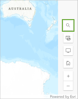
A search box appears at the top of the map window.
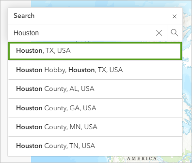
- In the search box, type Houston and choose Houston, TX, USA from the list of suggested locations.
Note:
Some ArcGIS organizations have custom address locators. You may encounter different search results than those in the example image.
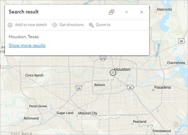
The map zooms to Houston. The Search result pop-up confirms the location.
- Close the Search result pop-up.
Add a layer
Layers contain geographic data that can be displayed on your map. To determine areas of the city that may be more likely to need evacuation assistance ahead of a hurricane, you'll add a layer that contains demographic data by census tract.
United States census tracts divide counties into smaller geographic areas, which are useful for revealing spatial patterns. When creating maps, you can add your own data or search for existing data that organizations have shared. In this tutorial, you'll add existing data.
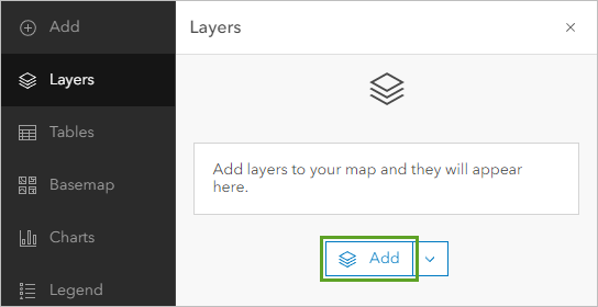
- In the Layers pane, click Add.
- In the Add layer pane, click My content and choose Living Atlas.
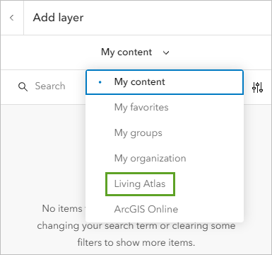
ArcGIS Living Atlas of the World is a collection of authoritative geographic data shared by a variety of organizations.
- In the search box, type or paste ACS Vehicle Availability (Latest).
- Click the ACS Vehicle Availability (Latest) result.
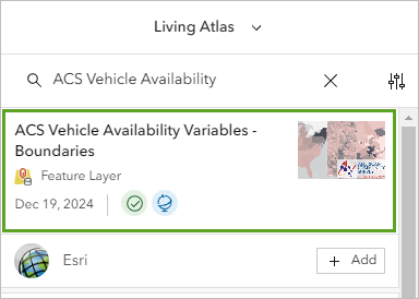
The item pane appears. It shows details about the layer, including a summary and description of what the layer contains.
- In the item pane, expand the Description section and read about the layer.
This layer contains data collected by the United States Census Bureau about the number of vehicles available to households.
- Close the item pane.
- For the ACS Vehicle Availability (Latest) layer, click Add.
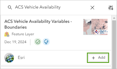
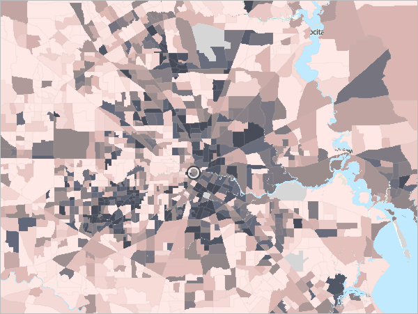
The layer is added to the map. It's styled to show the percentage of households with no vehicle available in each census tract. Darker gray tracts have a higher percentage of households without a vehicle available. Lighter pink tracts have a lower percentage.
- At the top of the Add layer pane, click the Back button.

You return to the Layers pane, where the new layer is now listed. This is a group layer, meaning that there are multiple related layers that have been added and can be managed together.
- In the Layers pane, expand the ACS Vehicle Availability (Latest) group.
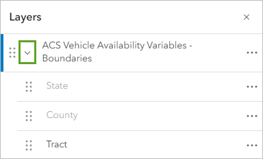
The group contains three layers. Each layer shows the percentage of households with no vehicle available aggregated within a different geographic boundary and at a different scale. For example, if you wanted to compare the availability of vehicles across the state of Texas, you could zoom out to see the County layer. To compare the availability of vehicles across multiple states, you could zoom out to see the State layer.
If you were making a map in which it was helpful for you to make these kinds of comparisons, you could leave all of the layers on the map. Because you want to focus on the area of Houston specifically, you'll separate out the Tract layer and remove the additional layers.
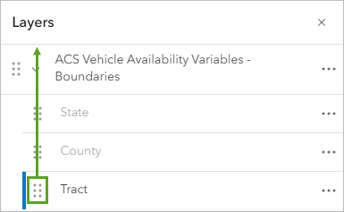
- In the Layers pane, drag the Reposition handle for the Tract layer above the ACS Vehicle Availability (Latest) group.
- For the ACS Vehicle Availability (Latest) group, click the Options button and choose Remove.
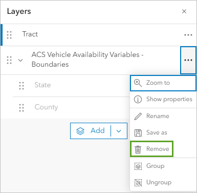
The group is removed from the map. There is one layer listed in the Layers pane now, Tract.
Style demographic data
Next, you'll change the layer's appearance. The layer is already styled based on the percentage of households with no vehicle available, which is what you want to show. You'll choose a different color scheme to emphasize tracts with high percentages of households without a vehicle. These are the tracts that you want aid organizations to focus on when planning public transportation for evacuations.
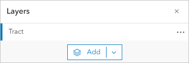
- If necessary, in the Layers pane, click the Tract layer to select it.
A blue bar to the left of the layer name shows whether it is selected. Selecting a layer allows you to work with it.
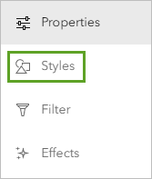
- On the Settings toolbar, click the Styles button.
Note:
By default, your Settings toolbar may be collapsed, meaning only the button icons appear, not the button names. You can expand or collapse the toolbar by clicking the Expand or Collapse button at the bottom of the toolbar. The example images will show the expanded toolbars.
- In the Styles pane, for Choose attributes, make sure Percent of households with no vehicle available is selected.
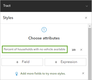
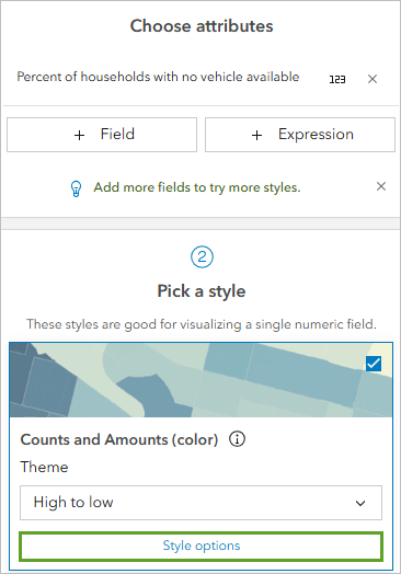
The list of available styles is determined by the data type. In this case, the options are for numeric data. The map shows the Counts and Amounts (color) style. The colors are based on the High to low theme. This style symbolizes each census tract with a different color based on the percentage of households without a vehicle. Census tracts with the lowest values have a light color, while those with the highest values have a dark color.
- For Pick a style, on the Counts and Amounts (color) card, click Style options.
- For Symbol style, click the color ramp.
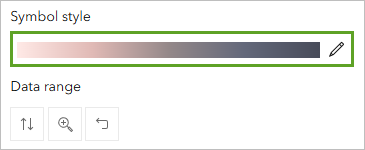
The Symbol style window appears. It includes options to change the fill color and outline of the symbols on the map. You'll choose a color ramp that emphasizes tracts with high percentages of households with no vehicle available.
- In the Symbol style window, for Colors, click the color ramp.

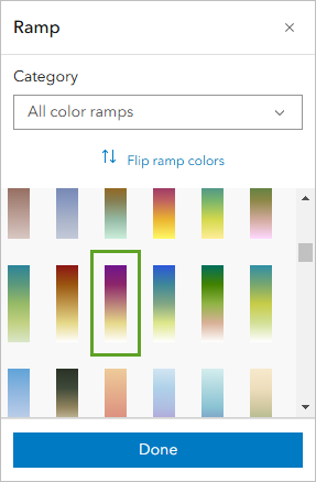
- In the Ramp window, for Category, choose Purples and pinks.
- Click the Purple 18 ramp.
Note:
Point to a color ramp to see its name.
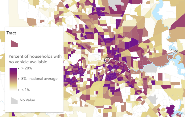
The new color ramp is applied to the map. Census tracts with high percentages are displayed in dark purple while low percentages are white.
Note:
If your color ramp is reversed, meaning that the map shows high percentages in white and low percentages in dark purple, click Flip ramp colors.
Now the census tracts with a higher-than-average percentage of households without a vehicle are more noticeable on the map. Based on the legend, the average percentage is about 8 percent. A clear pattern of limited access to vehicles is evident in downtown Houston, close to the geographic center of the city. These census tracts would likely benefit the most from increased evacuation assistance, such as public transportation.
- In the Ramp window, click Done. Close the Symbol style window.
- In the Style options pane, click Done. Click Done again.
Next, you'll give the layer a more descriptive name.
- In the Layers pane, for the Tract layer, click the Options button and choose Rename.
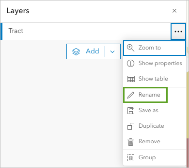
- For Title, type Percent of Households with No Vehicle Access. Click OK.
The layer name updates in the Layers pane.
Change the basemap
On the map, the basemap's labels are hidden by the census tracts. In some cases, this is desirable, such as when you want to add your own labels to the map. In this case, labels will help you identify areas in need of evacuation assistance, so you don't want them to be hidden. You'll change the basemap to one that shows labels over features.
- On the Contents toolbar, click Basemap.
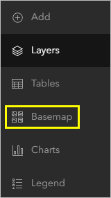
The Basemap pane appears. It lists basemaps that you can choose to add to your map.
- In the Basemap pane, scroll down and choose Human Geography Map.
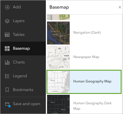
Note:
Some ArcGIS organizations have different default basemaps. If you don't see the Human Geography Map basemap, scroll to the end of the list and click Living Atlas. Search for Human Geography and add the Human Geography Map web map.
On the map, the basemap changes.
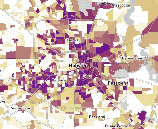
Labels and other contextual information like major roads and water bodies now show on top of the census tracts.
- On the Contents toolbar, click Layers.
The Basemap pane is replaced by the Layers pane.
Filter the map
The Percent of Households with No Vehicle Access layer is a national data layer, so it shows census tracts for the entire United States, even though you're only interested in Houston. Next, you'll use the filter tool to remove extra data from the map. Filters are logical expressions that define criteria that data records must meet to be shown on the map.
- In the Layers pane, make sure the Percent of Households with No Vehicle Access layer is selected.
- In the Settings pane, click Filter.
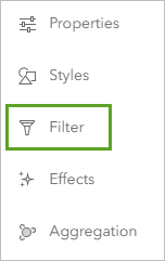
The Filter pane appears.
- In the Filter pane, click Add new.
The Filter pane displays a Condition group with three boxes. The first box defines the attribute you'll use for the filter. In addition to a spatial location, each census tract in the layer contains additional information, such as what state the tract is in and how many households are within the tract. These additional pieces of information are called attributes.
For this filter, you want to choose tracts within Harris County, the county that Houston is in, so you'll choose the County attribute to begin your filter.
- Under Condition, click the first box. In the Replace field window, choose County Name.
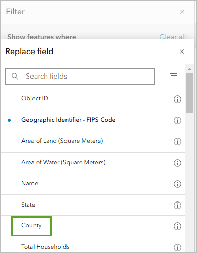
The second box defines the logical operator. You'll leave the default operator, is. The final box sets the condition that the attribute field must meet.
- For the third box, click the drop-down arrow. Search for Harris County and click the result to select it.
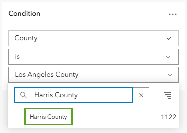
The filter condition now reads County Name is Harris County. The map updates to show only census tracts in Harris County. All other tracts are shown in gray. Once you save your filter, they'll be hidden from the map.
- In the Filter pane, click Save.
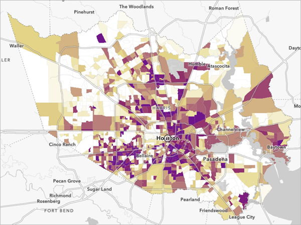
Emphasize the top tracts
Lastly, you'll add an effect to the map to emphasize only the tracts with the top 10 highest percent of households with no vehicle access. First, you'll open the attribute table and use it to find information about the tracts. Every layer has a table that contains attribute data about the geographic features in the layer.
- In the Layers pane, for the Percent of Households with No Vehicle Access layer, click the Options button and choose Show table.
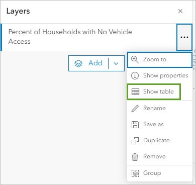
The layer's attribute table appears. The attribute table is a way of viewing all of the attributes that exist for each feature. Each row in the table represents a feature (in this case, a census tract area). The columns, or fields, provide information about the census tract features, such as the County Name attribute that you used to filter the data earlier.
The top of the table indicates that there are 1,122 census tracts in Harris County.
- Scroll to the far right of the table until you see the Percent of households with no vehicle available column.
Tip:
To see the full attribute name, resize the column width or point to the header.
- For the Percent of households with no vehicle available column, click the Menu button and choose Sort descending.
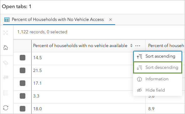
The table is sorted so that the Percent of households with no vehicle available field shows tracts in order of highest to lowest values. The highest value is 49.5 percent.
Note:
Demographic data is updated periodically. The values shown in this tutorial may be based on an older version of the data than what you're using. If you see different values, use the ones based on your own data.
- Use the table to find the 10 highest values for the Percent of households with no vehicle available field.
These tracts have values at or above 36.5 percent.
You'll use this information to emphasize these tracts on the map so that you can better understand where to target evacuation assistance.
- Close the table.
- In the Settings pane, click the Effects button.
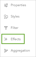
Effects are cartographic masks that can be applied to layers to highlight different attributes or areas of the map.
- In the Effects pane, click Feature-specific.
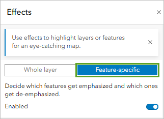
The Drop Shadow + Gray effect is automatically applied to the map. This effect is similar to a filter. You create a logical query on an attribute to emphasize important data. Instead of hiding some features from the map, they're de-emphasised.
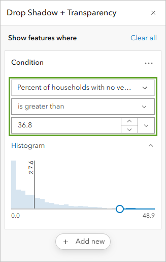
The Drop Shadow + Gray pane shows the logical expression currently dictating the effects: Percent of households with no vehicle available is greater than 7.9. You'll choose a different effect and set the expression to show the top 10 tracts as well as the underlying data.
- Click the Drop Shadow + Transparency effect.
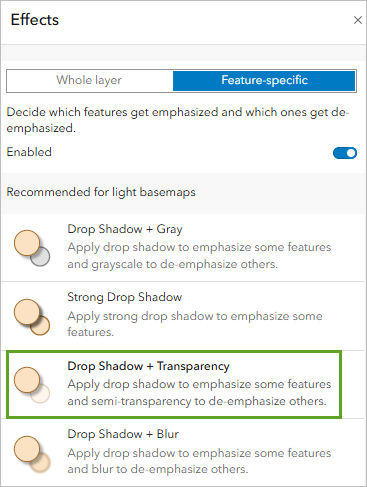
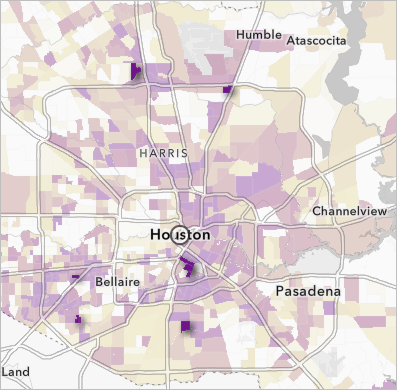
The map updates to show tracts with high percentages of households with no vehicle access with a drop shadow. These tracts now appear to pop off the map, highlighting their importance.
By changing the expression, you can change which tracts are emphasized. You previously identified 36.5 percent and above as the values for the top 10 tract values, so that's where you'll set the slider.
- Change the logical expression to read Percent of households with no vehicle available is at least 36.5.
- Close the Drop Shadow + Transparency window and the Effects pane.
The top census tracts where you need to consider targeting evacuation efforts are now emphasized on the map.
Save and share the map
Finally, you'll save your evacuation map and give it a title, tags, and a summary so you can find and access it later. Then, you'll share the map to make it accessible to others.
Note:
If you are not signed in to an ArcGIS account, you can't save and share the map. Skip ahead to read the tutorial's conclusion.
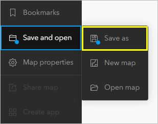
- On the Contents toolbar, click Save and open and choose Save as.
Note:
The blue dot next to Save and open indicates that the map has unsaved changes.
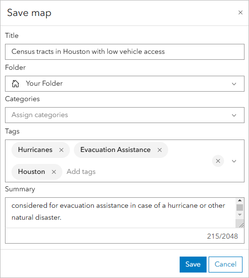
- In the Save map window, for Title, type Census tracts in Houston with low vehicle access.
Next, you'll add tags. Tags are terms that allow users to search for your map in ArcGIS Online.
Note:
For Folder, you can leave the default or choose a folder of your choice. Similarly, for Categories, you can add or select a category of your choice from the drop-down menu.
- For Tags, type each of the following tags, pressing Enter after each one:
- Hurricanes
- Evacuation Assistance
- Houston
Finally, you'll add a summary. The summary appears on your map's details page and should provide information about the map so that users better understand its purpose.
- For Summary, type This map shows census tracts in Houston, Texas, that have many households without access to a vehicle. These areas may need to be considered for evacuation assistance in case of a hurricane or other natural disaster.
- Click Save.
The map is saved. It now appears in your account's content. You can access your content by clicking the options button next to the map's name and choosing Content. For now, you'll set the sharing permissions.
By default, your content is private and only visible to you and your organization's administrator. You can share content to different groups of viewers depending on the level of privacy you want to maintain and the content's audience and purpose. For example, if you choose to share it with your organization, only users with accounts in the same organization as you can access your content. For this tutorial, you've created a public information map and you want it to be available to everyone, so you'll share it publicly.
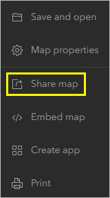
- On the Contents toolbar, click Share map and choose Manage sharing.
Note:
Depending on privacy and other concerns around your data and organization, not all content should be shared publicly. For more information, review Best practices for sharing.
- In the Share window, choose Everyone (public) and click Save.
In this tutorial, you created a basic web map in ArcGIS Online. You added a layer, styled it, and changed the basemap. You also filtered the data and added an effect to emphasize the most important information. Then, you saved and shared the map.
Maps can be used for more than just displaying data. If you're interested in learning more about what you can do with web maps in ArcGIS Online, try some of the following resources:
- To learn how to transform your web map into an interactive app, check out the tutorial Create an app.
- To learn useful tips and tricks for web maps, check out the series Common skills for working with data in ArcGIS Online.
- To learn about performing spatial analysis, check out the series Perform analysis in Map Viewer.
- To learn more advanced techniques for styling your map, check out the series Cartographic creations with web maps.
You can find more tutorials in the tutorial gallery.
