Create a map
In this module, you'll create a map that shows hurricane evacuation routes in Houston, Texas. First, you'll create a new map and locate Houston, Texas. Then, you'll add a map layer that shows evacuation routes. Lastly, you'll change the way your map and layers look to better display the data.
Begin a map
You'll begin your map by signing in and navigating to your area of interest: Houston, Texas.
- Sign into your ArcGIS Enterprise portal with a named user account.
- On the ribbon, click the Map tab.
Note:
Depending on your organizational and user settings, you may have opened Map Viewer Classic. ArcGIS Online offers two map viewers for viewing, using, and creating maps. For more information on the map viewers available and which to use, please see this FAQ.
This tutorial uses Map Viewer.
- On the map viewer, zoom into the United States.
Tip:
There are several ways to zoom in. You can click the Zoom in button in the corner of the map or scroll up with the mouse wheel. Alternatively, you can press Shift while drawing a box around the area you want to zoom to.

Your map's appearance varies based on your account or organizational settings and your browser window size. It may show the United States (like in the example image), the world, or another extent. The only layer on the map is the basemap, which provides geographic context such as water bodies and political boundaries. The default basemap is Topographic, but your map may have a different basemap depending on your organization's settings.
- On the map, click the Search button.

- In the search box, type Houston. In the list of suggested locations, click Houston, TX, USA.

Note:
Some Enterprise portals have custom address locators. You may encounter different search results than those in the example image.
The map zooms to Houston. A Search result pop-up confirms the location.

- Close the Search result pop-up.
Add a layer
Next, you'll add a layer to your map that shows hurricane evacuation routes in Houston which is maintained by Texas Department of Transportation (TxDOT) Traffic Safety Division (TRF)
- In the Layers pane, click Add.

The search pane appears.
- Click My content and choose ArcGIS Online.
- In the search box, type TxDOT Evacuation Route.

- Find the TxDOT Evacuation Routes layer and click the Add button.

The layer is added to the map.
- On the map, zoom out so that you can see the evacuation routes that encircle the city.
Tip:
There are several ways to zoom out. You can click the Zoom out button in the corner of the map or scroll down with the mouse wheel.

The routes are displayed as dark blue lines that travel throughout the city, but they don't stand out clearly against the Topographic basemap. You'll change the basemap to one with a lighter color scheme so the routes stand out.
- On the Contents (dark) toolbar, click Basemap and choose Light Gray Canvas

Note:
Some portals may have different default basemaps. If you don't see the Light Gray Canvas basemap, scroll to the bottom of the Basemap pane, and click Living Atlas. Search for World Light Gray and add the Light Gray Canvas Base and Light Gray Canvas Reference layers.
The basemap changes. The evacuation routes stand out much more against the lighter-colored, less-detailed basemap.

Note:
You can expand the Contents and Settings toolbars by clicking the Expand button on the bottom of them. When you expand the toolbars, you will see the names of the tools, not just the button. The remaining graphics will show the toolbars expanded.
Navigate the map
Before you continue, it's a good idea to explore the map and familiarize yourself with Houston's geography. With a better understanding of the area, you'll be better informed to make decisions and draw conclusions later on. Before you explore, you'll create a bookmark of the current extent so you can quickly return to it when needed.
- On the Contents toolbar, click Bookmarks. Click Add bookmark.

A text box for the bookmark's name appears.
- In the text box, type Houston and click Add.

The bookmark is added. You can choose this bookmark to automatically navigate to the map extent where the bookmark was created.
You're now ready to explore the city.
- Zoom in to the center of the city, near the Houston label, until the Buffalo and Brays Bayou labels appear on the map
- If necessary, pan the map until both bayous are visible.

Houston has several major bayous (flat, low-lying marshes or wetlands). During a hurricane, these bayous are prone to flooding and can become especially dangerous. You may want to keep this area in mind when you later identify high-risk areas.
- Add a bookmark for the current map extent. Name the bookmark Bayous.
- In the Bookmarks pane, click Houston.
The map zooms to the previously bookmarked extent.
Change the style
Although the evacuation routes stand out more against the light basemap, they could be even more eye-catching. You'll change the layer's style, also known as its symbology, to give the routes a brighter color and a thicker line width.
- On the Contents toolbar, click Layers. In the Layers pane, verify that the TxDOT Evacuation Routes layer is selected so you can access its settings.

The blue vertical line for a layer shows the layer is selected.
- On the Settings (light) toolbar, click Styles.

The Styles pane appears. Layers can have either a single symbol or multiple symbols based on attribute information such as names or speed limits. You'll learn more about attribute information later. Right now, you're only interested in showing the location of roads, not particular characteristics of each road, so you'll symbolize the layer with a single symbol.
- In the Styles pane, for Choose attributes, remove the ROUTE_TYPE field.

- In the Pick a style section,
for Location (single symbol), click Style options.
 Style options button")
- For Symbol style, click the line symbol.

The Symbol style window appears with various options. You'll specify a custom color by entering a six-character hexadecimal code.
- For Color, click on the color palette.

- In the Select color window, for Hex, type 004C73 and press Enter. Click Done.

After you choose the color, the custom color changes to a shade of dark blue and the map updates. Now, you'll make the line thicker so it's easier to see on the map.
- In the Symbol style window, change Width to 3 pixels.

The map updates with the thicker blue line symbol for the routes.

The routes layer is a feature layer, which means it consists of individual features with distinct characteristics. In this case, each route segment is a feature. You can view a feature's characteristics, also known as its attribute information, by clicking the feature on the map and opening its pop-up.
- Close the Symbol style window. Then, click Done. Click Done again.
With the thicker, brighter symbol, the routes are eye-catching and stand out.
- Click a segment of an evacuation route.
Its pop-up appears. A map can show descriptive information about features configured through pop-ups. You'll learn how to configure pop-ups in a later tutorial.
- Click a few more route segments to view their pop-ups. When finished, close the pop-up.
Save and share the map
Next, you'll save your evacuation map and assign it a title, tags, and a summary to make it easy to find and identify later. Then, you'll share the map to make it accessible.
- On the Contents toolbar, click the Save and open button. Choose Save As.

The Save map window opens.
- For Title, type Houston Evacuation Map.
Next, you'll add tags. Tags are terms that allow users to search for your map in your ArcGIS Enterprise organization.
- For Tags, type each of the following tags, pressing Enter after each one:
- Hurricanes
- Roads
- Evacuation Routes
- Houston
The summary appears on your map's details page and should provide information so users better understand your map's purpose.
- For Summary, type This map shows hurricane evacuation routes in Houston, Texas.

- Click Save.
The map is saved. It now appears in your account's content. You can access your content by clicking Home and choosing Content. For now, you'll set the sharing permissions.
- On the Contents toolbar, click the Share map button.

- In the Share window, choose Organization.

Note:
Alternatively, you can also choose to share it only with select groups of people within your organization or with the public.
- Click Save.
In this module, you located the city of Houston and added a layer showing hurricane evacuation routes. Then, you changed the basemap and the style of the routes. Finally, you saved your map and shared it with your organization.
Web maps often include multiple layers of data to highlight spatial patterns and relationships. Next, you'll add a layer of Houston demographic data and identify vulnerable areas in need of evacuation assistance.
Identify spatial patterns
Previously, you created a map of Houston evacuation routes. Next, you'll determine areas of the city that are likely in need of evacuation assistance. To do so, you'll add a layer of Houston demographic data to your map and view the layer's attribute table to find attributes about vehicle ownership. Areas with a high percentage of people who don't own vehicles might need help evacuating, so you'll style the layer using more advanced symbology options to emphasize these areas. Lastly, you'll customize the layer's pop-up to show the relevant demographic information.
Add demographic data
First, you'll add a layer containing demographic data by census tract. United States census tracts divide counties into smaller geographic areas, which are useful for revealing spatial patterns.
- If necessary, open your Houston Evacuation Map. (Sign in to your account. At the top of the page, click Content. Click the Options button next to your web map and choose Open in Map Viewer.)

- In the Layers pane, click Add. In the Add layer pane, click My content and choose ArcGIS Online.
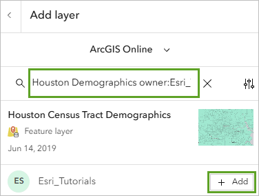
The demographic data you'll add is owned by the Esri_Tutorials account. To simplify locating the layer, you'll add the owner of the layer to the search string.
- In the search box, type Houston Demographics owner:Esri_Tutorials and click Add.
The layer appears on the map.

It's styled by location and shows all census tracts with the same color. Right now, the layer doesn't tell you anything or provide any insight into areas in need of evacuation assistance.
- Next to Add layer, click the Back button.
The new layer is listed in the Layers pane above the TxDOT Evacuation Routes layer you added in the previous module.
Layers are drawn on the map in the same order they appear in the Layers pane. In your map, the evacuation routes are partially covered by the census tracts because the Houston Census Tracts Demographics layer is above the TxDOT Evacuation Routes layer in the Layers pane (you can still see the routes somewhat because the census tracts layer is transparent). To better see the routes, you'll reorder the layers.
- In the Layers pane, drag the TxDOT Evacuation Routes layer above the Houston Census Tract Demographics layer.

The layers are reordered and the evacuation routes are now displayed on top of the census tracts on the map.

View the attribute table
Every layer has a table that contains all attribute data about the geographic features in the layer. You'll view the table for the Houston Census Tract Demographics layer to find data that will help you identify areas that are vulnerable during a hurricane.
- In the Layers pane, for Houston Census Tract Demographics layer click the Options button. Click Show table.

The layer's attribute table appears. Each row in the table represents a feature (in this case, a census tract area). The columns, or fields, provide different types of information about the census tract features. For example, the ID field contains a code that represents the state, county, and census tract identifier for each census tract feature, and the Total Owner/Renter Households (ACS 2013-2017) field shows the total number of households in each tract.
- If necessary, use the scroll bar at the bottom of the table to scroll to the right and locate the Percent of Households without a Vehicle (ACS 2013-2017) field.
Tip:
To see the full attribute name, resize the column width or point to the header.
")
This field shows the percentage of households in each tract that do not own a vehicle. Areas with a high percentage of people who don't own vehicles might need help evacuating, so you'll style the layer using the values in this field.
- Close the table.
Style the layer using an attribute
Next, you'll change the layer's style based on the attribute field to emphasize census tracts with a high number of households without a vehicle on the map.
- In the Layers pane, click the Houston Census Tract Demographics layer to select it. Open the Styles pane.
When you styled a layer previously, you styled evacuation routes with a single symbol based on location. This time, you'll choose an attribute and style the census tracts with multiple symbols.
- In the Styles pane, for Choose attributes , click the Field button.

- In the Select fields window that appears, choose Percent of Households without a Vehicle (ACS 2013-2017) and click Add.

Based on the attribute you chose, several styles become available. The list of available styles is determined by your type of data, a process known as smart mapping. In this case, the map redraws to show the Counts and Amounts (color) style. The colors are based on a color ramp called High to low. This style symbolizes each census tract with a different color based on households without a vehicle. Census tracts with the lowest values have a light color, while those with the highest values have a dark color.

Note:
Your default colors may differ from those in the example image.
With the default color ramp, it may be difficult to determine the evacuation routes in areas with high percentages, so you'll choose another color ramp.
- For Counts and Amounts (color), click Style options.
- For Symbol style, click the current color ramp.

The window that appears includes options to change the fill color and outline of the symbols on the map. You'll choose a blue-themed color ramp to match the evacuation routes.
- Under Colors, click the current color ramp.
- In the Ramp window, choose Blue 7.
Tip:
Point to a color ramp to see its name.

The new color ramp is applied to the map.

Now, the census tracts with a higher-than-average percentage of households without a vehicle are more noticeable in the map. Based on the legend, the average percentage is about 6 percent. A clear pattern of limited access to vehicles is evident in downtown Houston, close to the geographic center of the city. These census tracts would likely benefit the most from increased evacuation assistance, such as public transportation.
- Click Done
- Click Done two times to close the Styles pane.
Now that the layer is styled to show the percentage of households without a vehicle, you'll give it a more descriptive name.
- In the Layers pane, for the Houston Census Tract Demographics layer, click the Options button. Choose Rename.
- For Title, type Percentage of Households Without a Vehicle. Click OK.
The layer name updates in the Layers pane.
- Save the map.
In this module, you added a layer of Houston demographic data to the map and viewed its attribute table. Then, you styled the layer to show the percentage of households without a vehicle in each census tract. Finally, you customized the layer's pop-up to highlight key demographic information. Now, you can better identify areas in Houston with limited vehicle ownership to determine where evacuation assistance is most needed during a hurricane. Next, you'll create an interactive web app to share your findings with your organization.
Create an app
Previously, you finished your web map by adding and styling demographic data to show census tracts with a high percentage of households without vehicles. In this module, you'll use your map to create a web app. A web app is a customized user interface that enhances your map's appearance, adds (or removes) functionality, and helps you integrate the map with other media. You can choose from a variety of configurable templates, depending on how you want to display your map. You simply want to showcase your map to your organization, so you'll configure a Basic Viewer app template with only a few standard navigation tools. You'll also edit the app's item details to include proper information about the app's purpose and data sources.
Create a web app
In this section you'll build an Instant App to share your data.
- On the Contents toolbar, click Create app and choose Instant Apps.

The Instant Apps gallery page that opens provides information and guidance to help you choose an appropriate app template, depending on your needs. When browsing the available apps, you can click the button next to each name for more information. Instant Apps checks the data and configuration of your map. If your map doesn't meet the requirements for an app, it's moved to the bottom of the gallery and a warning message appears on the thumbnail to inform you. You can also search the apps for a particular capability or tool.
You want your map to be the primary focus of your app. You also want to provide access to the bookmarks that you created.
- In the search box, type bookmarks and click the bookmarks suggestion that appears.

The gallery is now filtered to show only the apps that support bookmarks. The Basic app template is a good choice for sharing a map in a simplified layout with standard navigation and exploration tools.
- On the Basic card, click Choose.

Tip:
Click Preview to try an app before creating it. If the default settings meet your needs, you can publish it as is. If you want to make changes, you can configure the app and customize it before publishing.
By default, the app has the same title and tags as the web map used to create it. You'll change the title to better represent what you intend the map to emphasize.
- In the Create app - Basic window, for the title, type At-Risk Population in Houston.
- Click Create app.

- If necessary, review and close the welcome window.
The app is created based on the template you chose. The app configuration window provides several app settings and an interactive preview of your app.

Configure the app
Next, you'll specify the tools to include in the app. When configuring the app, you can use the default Express setup mode, which offers a subset of the configurable options to facilitate creating an app with the most essential settings. Or you can turn off Express to access additional options and configure all the settings available for the template. If the default settings are acceptable for your use case, you don't need to go through each step in the setup. You've already selected the Houston map, so you'll skip to the second step.
- In the Express pane, click Step 2. About.

The About settings include options to provide information that helps users understand the map, including a header for the title and a map legend. When users open the app, it will include a button to view the map legend. You'll accept this default setting.
- In the About settings, turn on Header.

The app preview updates to include a header with the name of your app. The app automatically saves as noted next to the Draft badge that appears in the configuration panel.
- Click Next.

The Interactivity settings provide tools for exploring the map, including spatial bookmarks and a search tool. The app will automatically open the map to the extent of your area of interest, so you don't need to include the search tool. Your map includes two bookmarks that show different zoom extents of the city. By default, the app includes a button to access the bookmarks in the map.
- Turn off Search.

The app preview updates and the search button is removed from the map. Next, you'll search the settings to find where you can add a scalebar to provide a visual indicator of distance on the map.
- In the vertical toolbar, click Search settings, type scale, and click Scalebar in the suggestions.

- When prompted to turn off express mode, click Continue.
The configuration panel updates to include all settings available for the app. The Interactivity pane opens to the Explore/navigate section with the Scalebar setting highlighted.
- Turn on Scalebar.

The app preview updates to include a scalebar in the bottom corner of the map. You can test the app as you configure it.

- In the app, click the Open bookmarks button. Zoom to the Bayous bookmark.

- Click a feature in the map to display its pop-up. In the pop-up, click the Dock button.

The pop-up window moves to the top corner of the app so you can see more of the map. The docked pop-up covers the buttons for accessing bookmarks and viewing the legend, so you'll reposition these tools.
- On the vertical toolbar, click Theme & Layout and click Position manager.

You'll move the bookmarks button next to the other navigation tools.
- For Manage widget positions, click the grid next to Legend and move it to the bottom corner so it's on the opposite side of the scalebar in the app.

In the app preview, the Open bookmarks button now appears with the other map navigation tools.
- Test your app's functionality by navigating the map, opening pop-ups, and viewing the legend.

Now that you've configured and tested your app, you're ready to publish it.
- In the configuration panel, click Publish. In the Publish window, click Confirm.

A success message appears when publishing is completed and the Draft badge changes to a Published badge with the date and time you published. The Share window appears, which includes a link to the app and a button to launch it in a new window to test.

- Close the Share window. Click Exit. When prompted, confirm that you want to exit.

Note:
Updates made and saved to your map will also be shown on your instant app.
Edit the item details
Next, you'll add item details to provide meaningful information about the app. It's important for all maps and apps to have complete item details. The title and tags are already completed from when you first created the app. The Item Information bar indicates your progress toward high-quality item information and indicates the most important improvement you can make.
- On the Overview tab of the item page, under Item Information, click Add a summary.

- In the Edit Summary box, type (or copy and paste) the following text:
This web app highlights areas in need of assistance during a hurricane evacuation in Houston, Texas.
- Click Save.

- Under Item Information, next to Top Improvement, click Add a description.
A description should be even more detailed and in-depth than a summary. It should explain not only the app's purpose and what kind of data it shows, but also information about how to use the app and how it was created.
- In the Edit Description box, type (or copy and paste) the following text:
This app shows evacuation routes and demographic data by census tract for Houston, Texas. The darker blue tracts have a higher percentage of households without a vehicle. This pattern helps answer the question: Where in Houston should we provide evacuation assistance during a hurricane?
Use the map legend and feature pop-ups to learn more about the data shown in the map. Click individual census tracts to see pop-up information, including the percentage of households without a vehicle.
The map in this app contains a Living Atlas layer of Houston evacuation routes and a layer of Houston demographic data. The demographic layer is styled using an Arcade expression that calculates the percentage of households without a vehicle. This information is also provided in pop-ups.
- Click Save.

The Item Information progress bar indicates that you are closer to completing the item information for the app.
- Next to Item Information, click Learn more.

A complete list of suggested improvements is displayed. You have completed all but one: Add terms of use.
- Click Add terms of use.
- In the Edit Terms of Use box, type None. Public domain data. Click Save.

The item details are complete.
Tip:
To modify app settings and republish with changes, you can reopen the app's configuration page by clicking Configure.
- Click Share.

The Share window appears. There are multiple ways to share content to different groups of viewers. For example, if you choose to share this to the public, anyone would be able to access this app and its content. However, you only want this app to be available to those members in your organization.
- In the Share window, for Set sharing level, select Organization and click Save.
Now that the app is configured and shared, you can use the Copy button in the URL section to copy the app's URL to your computer's clipboard and share it with anyone.

In this tutorial, you created a map with a layer of hurricane evacuation routes in Houston, Texas. You then added demographic data by census tract and used smart mapping, pop-ups, and expressions to emphasize areas with limited vehicle ownership. The spatial patterns revealed in your map helped you determine where evacuation assistance is most needed in the event of a hurricane. Finally, you shared your findings by turning your map into an interactive web app.
You can find more tutorials in the tutorial gallery.
 logo")