Explore an interactive map
Explore a multiscale map
You'll start by zooming in and out on the map. You've probably done that before, but you may not have appreciated how a thoughtfully designed multiscale map can turn one map into many, revealing a different, more nuanced story at each scale.
- Open the What is the predominant number of units per housing structure in the area? web map.
This map is from the Esri Demographics team and is made with data from the United States Census Bureau's American Community Survey (ACS).
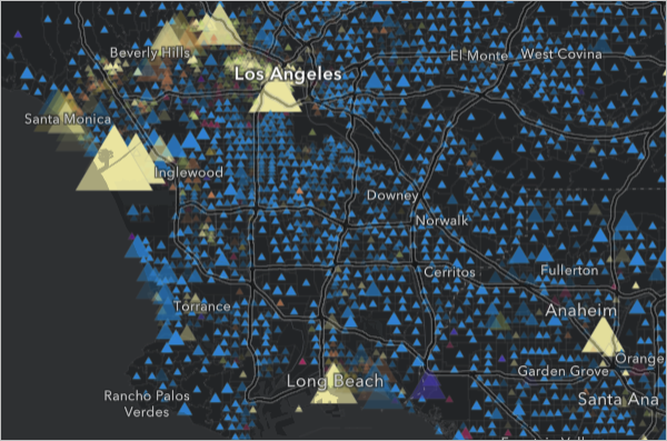
The map shows one triangle for each census tract in the United States. The blue triangles represent tracts where the most common housing type is a detached single-family home. The other colors represent tracts where buildings with multiple housing units are more common. Larger triangles represent more housing units.
At this scale, the map portrays where the denser population centers can be found in the Los Angeles area.
Note:
The data in this map is updated regularly, so the patterns you see may not exactly match the examples in the tutorial.
- Zoom in on the map until the extent of each tract is visible, shaded with the same color as the triangles.
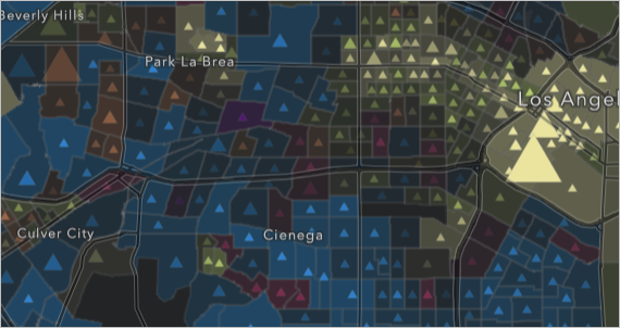
- Zoom in further, until the street network is visible.
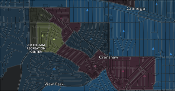
At this scale, the shaded polygons take over as the map's primary symbology and the map tells a local story about the kinds of housing that are found in each neighborhood.
- Zoom out on the map until you can see all of California.
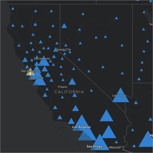
The map changes to show one triangle for each county instead of one triangle for each tract.
- Pan and zoom to explore the rest of the country.
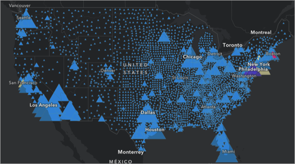
Showing the data at the county level when zoomed out allows you to get a better picture of housing trends across the entire nation. You can see that for most of the country, single-family homes (shown in blue) are the norm.
Interactive maps allow the cartographer to reveal different information at different scales. In this map, if information for census tracts was shown at all scales, the triangles would be too large and crowded to read at small scales (zoomed out).
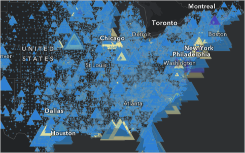
And they would be too small and sparse to read at large scales (zoomed in).
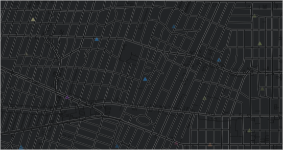
The multiscale nature of this map makes it easy to read at any scale. The same map can tell local, regional, and national stories about housing.
Note:
To see another example of a multiscale map, visit the Esri World Imagery basemap. Observe how the satellite imagery changes from continental overviews of forests, deserts, and oceans to detailed depictions of villages, roads, and fields.
Explore multivariate symbology
So far, you've seen how this interactive map can carry huge amounts of information through its multiscale design. Next, you'll explore the information it conveys through its symbols. This map uses a form of multivariate symbology, which means it can communicate multiple variables in a single symbol.
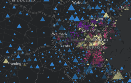
- Zoom in to any part of the map until data for each census tract is shown.
- If the Legend pane is not visible next to the map, on the Contents (dark) toolbar, click the Legend button.
- Review the Legend pane.
The first part of the legend explains the color of each symbol on the map.
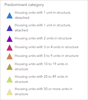
Blue triangles represent areas where the most common housing unit is a detached single-family home. Yellow triangles represent areas where the most common housing unit is in a building with 50 or more units.
The second part of the legend explains the size of each symbol.
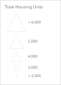
The largest triangles represent areas with 25,000 or more housing units, while the smallest triangles represent areas with 1,300 or fewer housing units.
On the map, large yellow triangles represent areas with a lot of housing units, most of them in large buildings, while small blue triangles represent areas with few housing units, most of them detached single family homes.
This symbology conveys a lot of information. It depicts the predominant category with color and the total number of housing units with size.
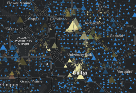
- Zoom and pan on the map to observe the geographic patterns formed by these symbols. Visit different cities to see what you can learn about the settlement patterns there.
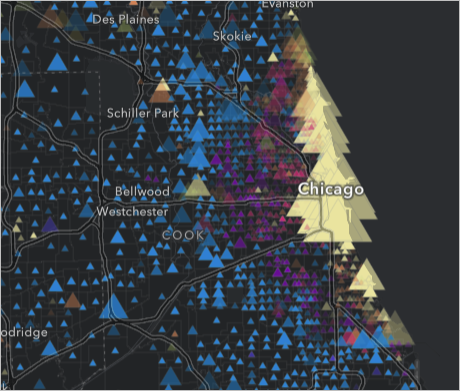
In Chicago, the density of housing fans out from the lakeshore.
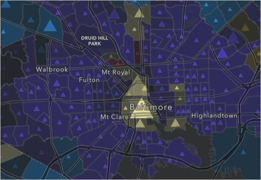
In Baltimore, housing outside of the city is dominated by attached single-family homes, also known as rowhouses.
In New York, the housing landscape of Manhattan is dominated by buildings with 50 units or more, but at the north end of the borough, slightly smaller buildings—with 20-49 housing units each, and shown in green—are more common.
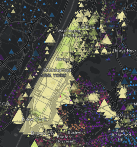
The multivariate symbology of this map conveys much more than just the location of each census tract. It translates a large amount of statistical information into visible geographic patterns. This symbology style is called Predominant category and Size, and it is just one of many smart mapping styles available in ArcGIS Online.
Note:
To see another example of smart mapping, read the Taxi Cab Terrain story. It contains multiple maps using overlapping proportional symbols.
Effective symbology is essential to the design of interactive maps. Excellent data is only useful if it is communicated clearly. To learn how to design your own maps with smart mapping, try the Design symbology for a thematic map in ArcGIS Online tutorial.
- Close the Legend pane.
Explore pop-ups
Interactive maps allow for more complex symbology because users can click the symbols to find exact values. Next, you'll explore this map's pop-ups and learn how effective formatting elevates them beyond a list of attribute values.
- On the map, click any triangle or colored polygon.
A pop-up appears.
- At the top of the pop-up, click the Dock button.
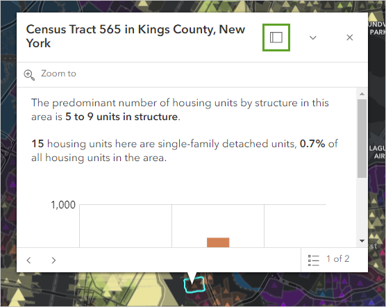
The pop-up docks to one side of the map and also expands to show all of its contents.
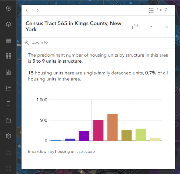
The pop-up repeats the information provided by the symbology—the predominant number of housing units by structure—but it also provides the census tract number, the percentage of housing units that are single-family detached homes, and a bar chart showing the breakdown of housing in the tract.
Pop-ups don't always look like this. By default, pop-ups show a list of attributes for the selected feature. The image below shows what a pop-up for this map would look like if it had been left in its default state. Some of the listed attributes, like Total Housing Units, are relevant to the map, and some, like Area of Water (Square Meters), are not.
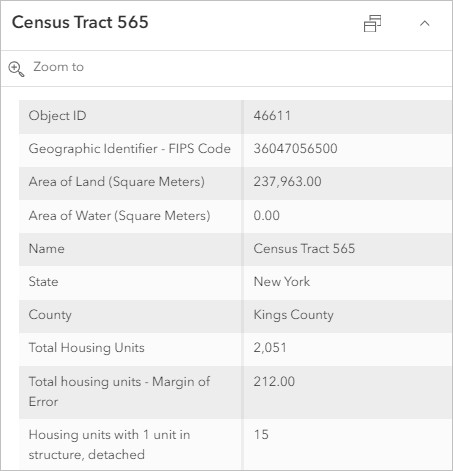
Default pop-ups are powerful tools, giving you access to large amounts of information beyond the symbols visible on the map. However, carefully designed pop-ups are even more powerful. This particular map converts all of the default numbers listed in the feature's attributes into two short sentences and a bar chart, with colors that match those of the map. These styling decisions made a pop-up that is much easier to interpret than the default.
- On the pop-up, point to the bars in the bar chart.
The count of housing units in each category is displayed.
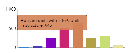
The bar chart in particular expresses the more complex story within each census tract. In a static map, this information would not be available, unless it was provided as a multipage report that would be time consuming to search.
Note:
To see another example of formatted pop-ups, visit Five Years of Drought. The pop-ups in this map use color-coded text instead of a chart.
Almost all interactive maps use pop-ups. In many of them, the pop-ups are formatted to summarize and visualize the data.
An interactive map can carry and communicate far more information than a static map. Patterns can be viewed at local and national scales simply by zooming in and out. Complex and subtle symbology that changes with the scale are possible with smart mapping. Details for any location are immediately available through pop-ups.
The web map you explored in this tutorial is a good example of the powers of interactive maps, but it is also available as an app, the A Look at Housing Stock in the US dashboard. Try the next tutorial in this series, Explore an interactive app, to learn about map applications.
You can find more tutorials in the tutorial gallery.
