Create an after-school program needs map
To begin mapping, you'll design and visualize data layers in a new web map using Map Viewer.
To share your map, you will create a web app using ArcGIS Instant Apps so your audience can view and interact with the map, without needing experience with all the tools in Map Viewer. Map-based apps provide a simplified interface that allows you to share a story or message in a focused way and allows others to explore the map with a specific purpose in mind
Note:
See a preview of the Afterschool Program Opportunities App you will create.
Because your goal is to share these layers in a swipe app, you'll ensure they're visually compatible to be viewed on a single map.
Add educational data
You'll start by adding data for where public schools are located, historic redlining data, and American Community Survey data for educational attainment. Education attainment refers to the highest level of education a person has completed. This data can be found in ArcGIS Living Atlas of the World.
- Sign in to your ArcGIS organizational account.
Note:
If you don't have an organizational account, see options for software access.
- On the ribbon, click the Map tab.
A new map appears in Map Viewer with the Layers pane open.
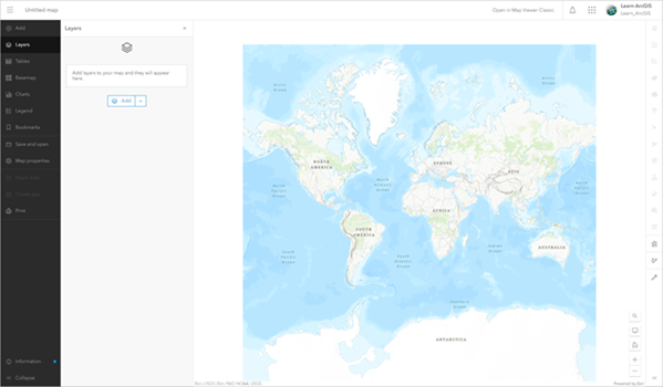
This tutorial uses Map Viewer.
- In the Layers pane, click Add.
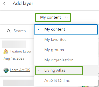
- In the Add layer pane, click My content and select Living Atlas.
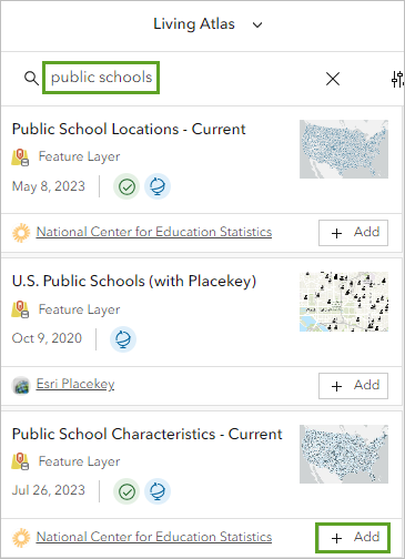
- In the search bar, type public schools and press Enter.
In the list of results, locate the School District Characteristics - Current layer and click the Add button.
Next, you will search for and add data on educational attainment.
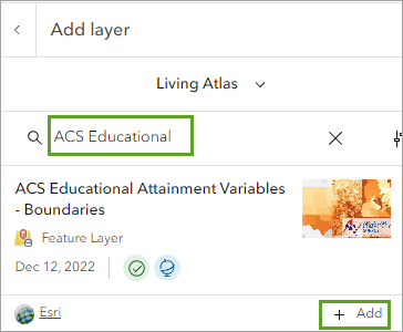
- In the search bar, type ACS Educational and press Enter.
Find the ACS Educational Attainment Variables - Boundaries layer owned by Esri and click the Add button.
- Click the Back button to return to the Layers pane.

In the Layers pane, the ACS Educational Attainment Variables - Boundaries layer is added to the Layers pane as a group layer that contains three layers: State, County, and Tract.
The U.S. Census Bureau reports data by various political and statistical geographic units. The entire country contains states, states contain counties, counties contain tracts. Census tracts are statistical subdivisions of a county that aim to represent about 4,000 people who live in them.
Note:
To learn more about U.S. Census Bureau geographic units, see United States Census Geography.
Each of these layers shows the data generalized to a different extent. You'll remove the State layer because it won't be needed for your analysis.
- Expand the ACS Educational Attainment Variables - Boundaries group layer.
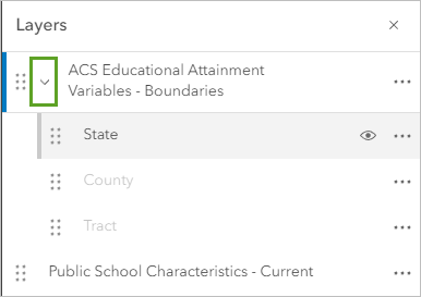
- For the ACS Educational Attainment Variables - Boundaries group layer, click the Options button for the State layer, and click Remove.
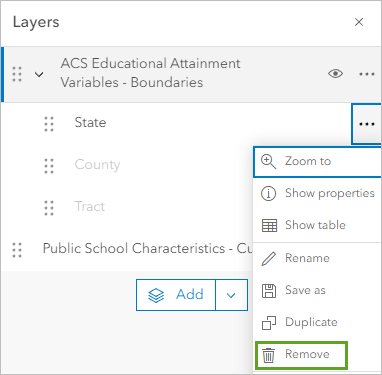
- In the same way, remove the County layer.
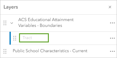
Now none of the educational attainment layers are visible in the map. You'll adjust the settings for the Tract layer so it appears in the map.
- In the Layers pane, select the Tract layer.
- In the Properties pane that appears, modify the Visible range setting to span the full distance between World and Room.
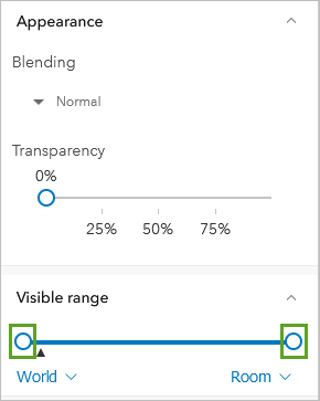
By adjusting the Visible range to World and Room, the Tract layer is now visible at every zoom level on the map. The Tract layer appears in the map.
You have added all the data layers you will need to create a map to determine where is the best area in the city to establish more after-school programs. Next, you will search for and add the historic Home Owners' Loan Corporation grades.
Add historic redlining data
After the Great Depression, the Home Owners' Loan Corporation (HOLC) program was created to provide loans for people to buy homes. HOLC hired real estate assessors to create color-coded maps that assigned grades to neighborhoods that would help banks decide how risky an investment would be in certain areas.
Due to racial prejudice, the grades were assigned largely based on racial bias, with areas with more White residents receiving higher grades and areas where people of color and immigrants lived receiving the worst grades.
Although the HOLC program ended in 1936, the grading system continued to be used, creating decades of segregation and areas that did not receive investments particularly in communities of color. Many of these effects are still felt in these communities today.
Note:
To learn more about the history and current-day impacts of redlining, see the story The lines that shape our cities.
- In the Layers pane, click the Add button. In the Add layer pane, click My content and choose Living Atlas.
- In the search bar, type redlining and press Enter.
Locate the Mapping Inequality Redlining Areas layer owned by Esri and click the Add button.
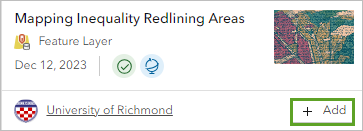
The Mapping Inequality Redlining Areas layer is added to the map.
- At the top of the Add layer pane, click the back button to return to the Layers pane.
Next, you will zoom in to Detroit, Michigan, so you can better view the redlining data.
- On the map, click the Search tool.
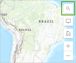
- In the search bar, type Detroit, MI and press Enter.
The map centers on Detroit, Michigan.
- Close the Search result pop-up.
- In the Layers pane, click the visibility button for the ACS Educational Attainment Variables - Boundaries group layer and the Public School Characteristics - Current layer.
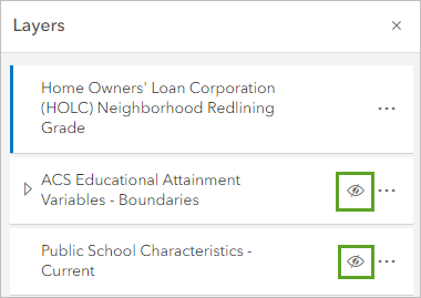
Now, only the Mapping Inequality Redlining Areas layer is visible on the map.
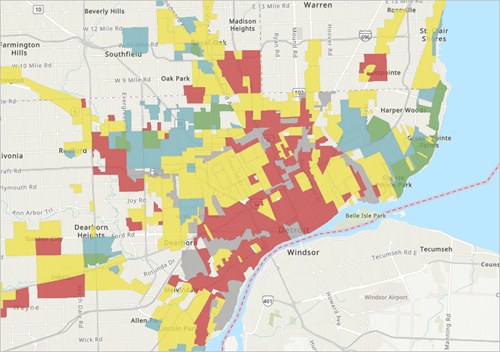
The best grade an area could receive was an A and was marked on the map in green. Due to prejudice and racism, assessors often determined that areas inhabited by wealthy White people were deemed the best. In contrast, the worst grade, D or hazardous, was given to areas that were mostly home to foreign-born, lower class, communities of color. Grade D neighborhoods were identified by red lines on the map, which is where the term redlining comes from.
- In the Layers pane, ensure that the Mapping Inequality Redlining Areas layer is selected.

The layer is selected when the blue line appears next to the layer name.
- On the Settings (light) toolbar, click Labels.
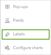
- In the Label features pane, turn off Enable labels.

Next, you will hide the style for the areas that did not receive a redlining grade.
- On the Settings toolbar, click Styles.
- Under Pick a style, for the Types (unique symbols) style, click Style options.
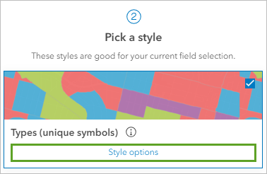
- In the Style options pane, uncheck Other.
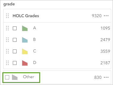
The layer is now clear of extra information. It is helpful to minimize what data is displayed in a layer to help your viewers focus on the information that is most key to understanding your map.
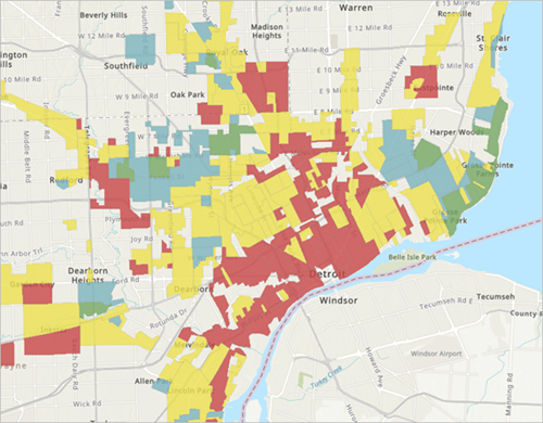
You have added all the data you need for your swipe app. Before you continue editing your web map, you will save the map.
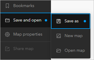
- On the Contents (dark) toolbar, click Save and open and click Save as.
- In the Save map window, provide the following information:
- For Title, type Afterschool Program Opportunities and add your name or initials.
- For Tags, type education, afterschool, equity, pressing Enter after each tag.
- For Summary, type A map showing educational attainment and equity indicators to determine areas that would most benefit from more afterschool programs.
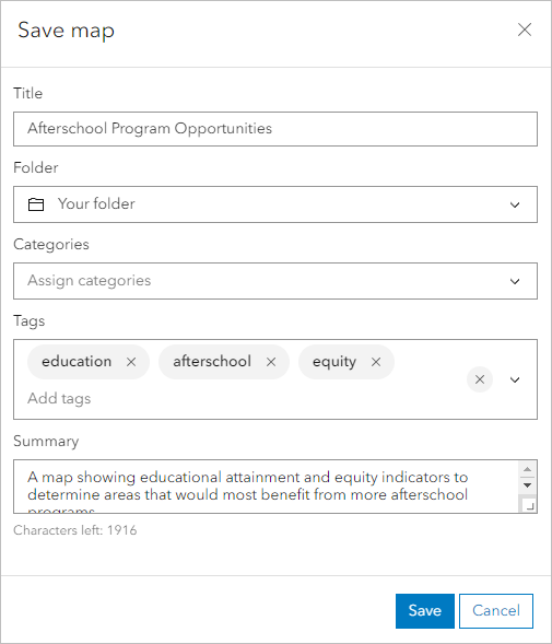
- Click Save.
Style the layers
Next, you will style the layers to show the data that will help you determine the areas that would most benefit from new after-school programs. First, you will turn on all the layers you want to be visible in your web app.
- In the Layers pane, click the visibility button for the Public School Characteristics - Current layer and the ACS Educational Attainment Variables - Boundaries group layer.
Next, you will adjust the layer order so that the public schools are visible on top of the other two layers.
- In the Layers pane, drag the Public School Characteristics - Current layer to the top of the layer list.
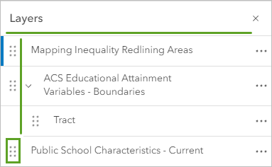
The Public School Characteristics - Current layer is now visible above the other layers.
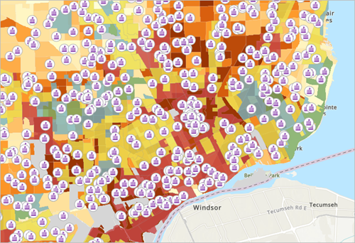
Next, you will filter the layer to only show the high schools in Detroit.
- In the Layers pane, for the Public School Characteristics - Current layer, click the Options button and click Show table.
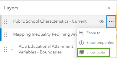
The table for the Public School Characteristics - Current layer appears.
You want to create a filter that will only show high schools in the city of Detroit, so you will look for the field names that contain data on school level— such as high, middle, and elementary—and the city in which the schools are located.
- In the table, scroll and locate the field names Location city and School level.
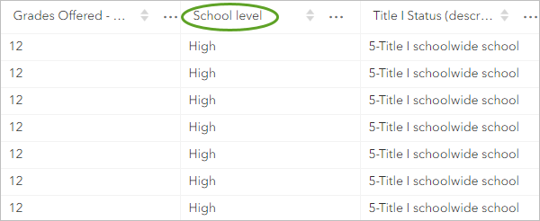
These fields contain the data you will need to create a filter.
- In the Layers pane, ensure the Public School Characteristics - Current layer is selected. On the Settings (light) toolbar, click Filter.
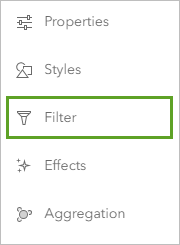
- On the Settings toolbar, click Filter. In the Filter pane, click the Add new button.
First, you will choose a field you want to filter by.
- Click the field drop-down menu, and in the Replace field window, search level and choose School level.
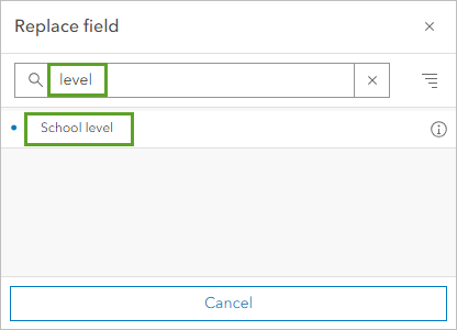
Next, you will choose the value of School level. You only want the layer to show high schools, so you will choose the field value High.
- In the attribute drop-down menu, choose High.
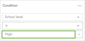
- Click Add new. For the attribute, choose Location city.
- For the value, type Detroit and click Save.
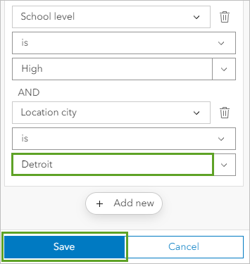
You have created a filter that tells the Public School Characteristics - Current layer to only show records that have the value High for School level and the value Detroit for Location city.
Next, you will style the layer to show the number of students eligible for free and reduced price meal (FRPM).
Eligibility for FRPM is set by the U.S. Department of Agriculture Child Nutrition Programs and is based on federal poverty guidelines issued by the Department of Health and Human Services. The number or percentage of students eligible for FRPM is often used as an equity indicator to understand the needs of school-aged children.
- In the Layers pane, ensure the Public Schools Characteristics - Current layer is selected, and on the Settings toolbar, click the Styles pane. In the Styles pane, click the Field button.
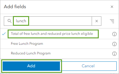
- In the Add fields window, search lunch and in the list of results, click Total of free lunch and reduced-price lunch eligible and click the Add button.
- Under Pick a style, for Counts and Amounts (size), click the Style options button.
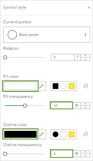
- In the Style options pane, click the symbol under Symbol style. In the Symbol style window, enter the following:
- For Fill color, choose white.
- For Fill transparency, type 50.
- For Outline color, choose black.
- For Outline transparency, set it to 0.
- In the Style options pane, click Done twice.
The Public Schools Characteristics - Current layer is styled so the larger circles represent a higher number of students who are eligible for free and reduced meal plan programs.
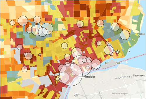
Next, you will style the Educational Attainment layer.
- In the Layers pane, if necessary, expand the ACS Educational Attainment Variables - Boundaries group layer and ensure the Tract layer is selected. On the Settings toolbar, click Styles.
The drawing style for this layer is set to Counts and Amounts (color) based on the attribute Percent of Population 25 Years and Over whose Highest Education Completed is Less Than High School. This is the attribute you want to use to style the layer, so you don't need to change the attribute setting.
- In the Styles pane, under Pick a style, for Counts and Amounts (color), click Style options.
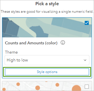
- In the Style options pane, click the Symbol style button.
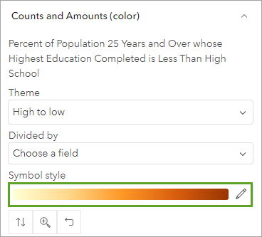
The Symbol style window appears.
- In the Ramp window, click the Purple 2 color ramp.
Tip:
Point to a color ramp to see its name.
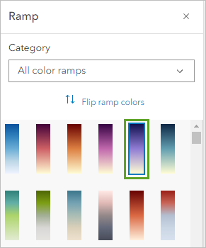
- In the Style options pane, click Done. In the Styles pane, click Done again.
- On the Contents toolbar, click Save and open and click Save to save your map.
Your map is now finished.
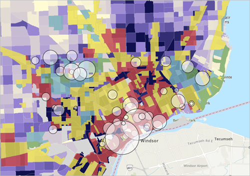
It contains the data you want to show, but it's difficult to do a quick visual comparison while turning each layer on and off. To better compare the data, you'll publish an app with a swipe tool. By dragging the swipe tool across the map, you can show and hide each layer for comparison. Although the redlining layer is not visible, you want to have both the educational attainment and redlining layer visible because you will make a swipe app. When you create a web app with Instant Apps using this web map, you will have the option to make both layers visible with the swipe tool.
Next, you'll create a web app using Instant Apps to compare the two layers.
Create a swipe app
Now that your map is complete, you'll configure an app with a slider bar to compare patterns in both layers. With ArcGIS Instant Apps, you can share your map as an app. You'll start with the Media Map template and configure the app to compare the two layers and show the map legend.
Create an app to compare two layers
First, you'll share your completed map as an app. The Instant Apps templates allow you to share your map in a simplified view with only the tools that you want people using your map to see. Unlike in Map Viewer, you can show or hide elements such as the legend, measure tool, search bar, and other functionality. Then, you'll configure the swipe option to show both of your data layers.
- On the Contents (dark) toolbar, click Create app and click Instant Apps.
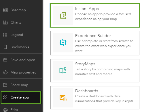
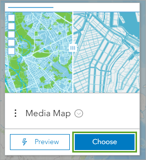
The Instant Apps gallery page opens in a new tab. You'll use the Media Map template, which includes a swipe tool. (You can search app capabilities to filter the gallery for applicable templates.)
- On the Media Map card, click Choose.
- In the Create App window, for the app title, type Afterschool Program Opportunities App.
- Add appropriate tags and click Create app.
The Media Map configuration window appears. By default, you see the express setup steps. The express setup contains many of the basic app configuration options. You want to add a swipe tool, so you'll search the settings to find where to configure it.
- In the configuration panel, click Search settings, type swipe, and click Swipe tool in the list of suggestions.
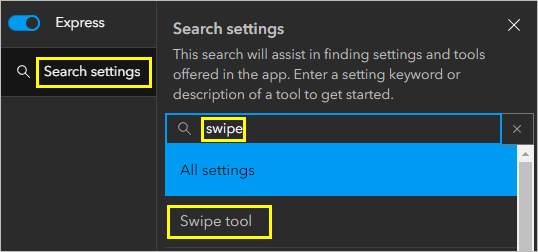
- When prompted to turn off express mode, click Continue.
The configuration panel updates to include all settings available for the app. The Interactivity settings panel appears, displaying the Modify section with a blue box on the Swipe tool setting.
- Turn on Swipe tool.
Additional options appear and the app preview updates with a slider bar. You'll choose the layers to show on either side of the slider bar.
- For
Select leading layers, expand ACS Educational Attainment Variables and check the box for Tract. For Select trailing layers, check the box for the Home Owners' Loan Corporation layer.
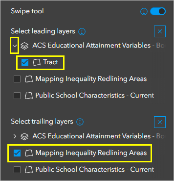
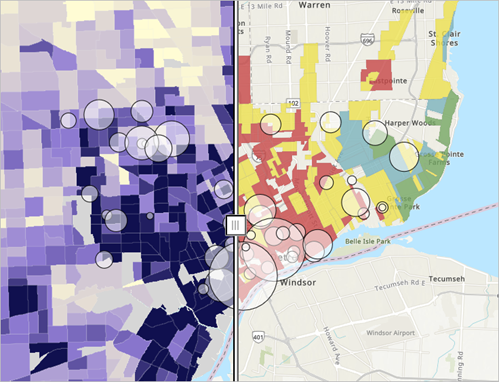
The app preview now shows the Educational Attainment layer on one side and the Mapping Inequality Redlining Areas layer on the other side.
- In the app preview, drag the swipe tool to compare the two layers.
Now you'll add contextual information.
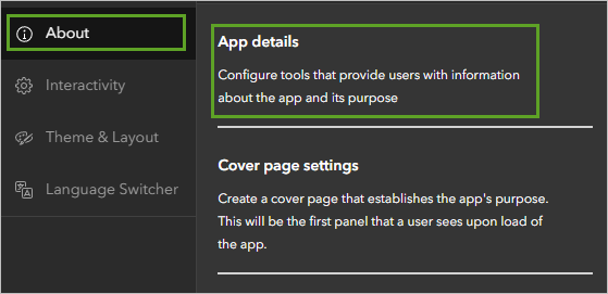
- In the configuration panel, click About and click App details.
- In the Location details pane, verify that the Legend setting is turned on and that it appears in the app preview. Set Legend style to Classic.
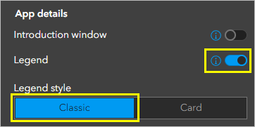
- If necessary, click the Open legend tool in the app preview to show the legend.
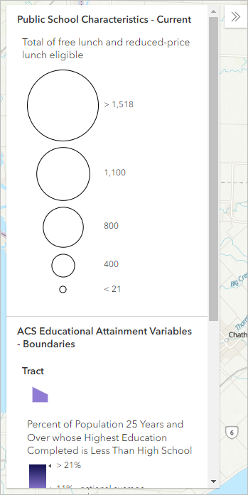
The legend shows the three layers on your map, the Public Schools layer, the Tract layer, and the Mapping Inequality Redlining Areas layer.
- Test the swipe tool, and click several counties to explore the app.
When you're satisfied with your app configuration, you can publish it.
- Click Publish. In the Publish window, click Confirm.
A success message appears when publishing is completed and the Draft badge changes to a Published badge. The Share window appears, which includes a link to the app, buttons to share through social media, code to embed the app in a website, and the date and time the app was last published. You can also change the sharing level for your app, such as to share it with the public.
- In the Share window, click Launch to test your app in a new window.
Use your swipe app to answer questions
Now that your app is finished, you'll use it to answer questions.
- Using the swipe tool on the app, explore the map and answer the following questions:
- What do you notice about the areas with a high percentage of adults without a high school diploma and areas that were graded D for hazardous?
- What do you notice about areas with a low percentage of adults without a high school diploma and areas that were graded A for best?
- What do you notice about areas where the schools have a large number of students who were eligible for free and reduced meal plan programs and the historic redlining grades?
- Based on your answers, which areas would benefit the most from more after-school mentoring programs to help boost high school graduation rates and serve communities that are historically underserved?
In this tutorial, you created a map showing public high schools by the number of students eligible for free and reduced meal plans, educational attainment, and historic redlining data. You then created a swipe app to compare the relationship between the layers and better visualize which areas would benefit the most from more after-school mentorship programs. Consider creating another version of this web app for another city or area in the country.
You can find more tutorials in the tutorial gallery.
