Map COVID-19 cases
First, you'll create visualizations that show COVID-19 case rates, total cases, and total deaths by state, as well as indicators for numbers of cases and deaths countrywide. You'll also style your maps to ensure that you communicate key information.
Import a workbook
First, you'll download a workbook that contains data from the CDC and a layer of state boundaries. Then, you'll sign in to ArcGIS Insights and import the workbook.
- Download the US COVID-19 Analysis Workbook file.
The item is a workbook package containing the data required to complete this tutorial.
- Locate the downloaded file on your computer.
Note:
Depending on your web browser, you may have been prompted to choose the file's location before you began the download. Most browsers download to your computer's Downloads folder by default.
- Go to ArcGIS Insights and click Sign in.
Note:
To access Insights, your ArcGIS organization's administrator must grant you a license for it.
- Do one of the following:
- To complete the tutorial in Insights in ArcGIS Online, go to ArcGIS Insights and click Sign in. Sign in to your ArcGIS organizational account.
- To complete the tutorial in Insights in ArcGIS Enterprise, sign in to your portal. On the ribbon, next to your username, click the App Launcher button and choose Insights.
- To complete the tutorial in Insights desktop, launch the Insights desktop app and sign in to your ArcGIS organizational account, if prompted.
Note:
To access Insights, your organization’s administrator must grant you a license for it. If you don’t have an ArcGIS account or a license for Insights, see options for software access.
- If necessary, in the Welcome to Insights window, click Skip.
The Insights home page appears. In Insights, you work in a workbook. Workbooks contain connections to your datasets and cards with maps, charts, or other data. You'll import the workbook you downloaded.
- On the home page, click the Workbooks tab.
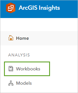
The Workbooks page appears. Depending on your previous use of Insights, this page displays the workbooks that you already created or that were shared with you by members of your organization.
- Click Import.

- Browse to and double-click the US_COVID-19_analysis workbook package you downloaded.
The workbook is added to the list of workbooks.
- Click the name of the US COVID-19 analysis workbook.
The workbook opens. The first page contains two datasets, located in the data pane. US COVID-19 (2020-2021) contains daily COVID-19 cases by state. State boundaries is a standard boundary layer from ArcGIS Living Atlas of the World.
- In the data pane, click the arrow next to the US COVID-19 (2020-2021) dataset.
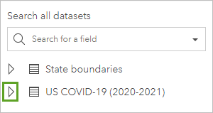
The dataset is expanded, revealing its attribute fields. The fields include the date the cases were reported (submission_date), the number of cases (tot_cases), the number of deaths (tot_death), and the name of the state (state), among other relevant information. In this dataset, the new_case field contains the number of new confirmed cases for each date, and tot_cases contains a cumulative total.
The symbols next to each field name indicate the field type. The fields in this dataset have field types of date/time, string (text), or numbers. To map the data, you need to add a field with a location field type. Using the state field, you'll join this dataset to the State boundaries dataset to add a location field based on the location of the state boundaries.
- For the US COVID-19 (2020-2021) dataset, click the Dataset options button and choose Enable location.
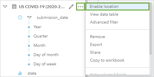
The Enable location pane appears. The default method to add a location field is to use coordinates, but your dataset doesn't have coordinate data. You'll instead add a location field based on geography. This method joins your dataset to a location field in a different dataset.
To create a join between two datasets, at least one field that is common to both datasets must exist. In this case, both datasets include fields that contain state names.
- In the Enable location pane, click the Geography tab.
- For Location fields, confirm that state is chosen. For Matching geography level, confirm that State boundaries is chosen.
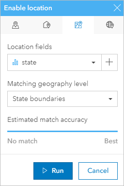
Estimated match accuracy shows whether there is a match between the two datasets. The match accuracy between these two datasets is at Best, meaning all records have a match.
- Click Run.
A location field, State boundaries, is added to the US COVID-19 (2020-2021) dataset. You can now use this dataset to create a map.
The US COVID-19 (2020-2021) dataset includes a field for total number of cases. A new total is given each day, so it's important that you do not aggregate the data to prevent inaccurate and exaggerated results. You'll apply a filter so that your analysis is completed only using the data from the last reported day in the dataset.
- In the data pane, next to the submission_date field, click the Dataset filter button.
- In the Filter by submission_date window, use the slider to set the filter so the start and end date are both 12/31/2021.
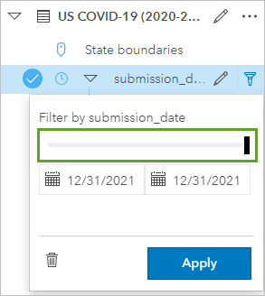
The dataset includes records for the same dates for every state, so the filter will return the December 31, 2021, record for each state.
- Click Apply.
A filter is added to the dataset.
Visualize COVID-19 case distribution
The workbook contains datasets, but no maps or charts to visualize the data. You'll create two maps, one that shows the case rate per 100,000 people for each state and one that shows the total confirmed cases and deaths for each state. These maps will provide information about where cases are concentrated across the country.
The first map you'll create will have the COVID-19 case rate per 100,000 people in each state. This map normalizes the total number of cases by population and is useful for showing where COVID-19 is having a greater effect on the population as a whole.
Your dataset doesn't include a field for case rate or the total population by state. You'll need to add a field for total population before you can calculate the case rate. You'll do that using Enrich Data, which can be accessed from an existing map.
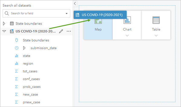
- Drag the US COVID-19 (2020-2021) dataset to the page and onto the Map drop zone.
- Click the Action button.
The Analytics pane appears
- In the Analytics pane, click Enrich Data.
- In the Enrich Data pane, click Open data browser.
- In the Data Browser pane, for Country or area, confirm that United States is selected and click Population.
- Under Popular variables, choose 2020 Total Population. Click Apply.
The 2020 Total Population variable is added to the Enrich Data pane.
- Click Run.
Note:
The Enrich Data tool uses credits. The estimated credit usage for this workflow is 0.51 credits.
The 2020 Total Population field is added to the US COVID-19 (2020-2021) dataset.
You now have all the fields required to calculate case rates.
- In the data pane, for the US COVID-19 (2020-2021) dataset, click the Dataset options button and choose View data table.

The US COVID-19 (2020-2021) table appears. It contains all of the data in the dataset, organized by fields. You'll add a field to the table and calculate it to show the case rate per 100,000 people.
- In the table window, click + Field.
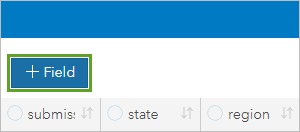
A field is added to the end of the table. The field has a default name and no data.
- Click the new field name to make it editable. Change the name to Case rate per 100k and press Enter.
Next, you'll calculate the field by dividing total cases by total population and multiplying the result by 100,000.
- In the Enter calculate function text box, type and use the Fields menu to create the expression (tot_cases/2020 Total Population )*100000.
Note:
2020 Total Population is the alias for the totpop20 field. If you want to copy and paste an expression into the text box, use the expression (tot_cases/totpop20)*100000.
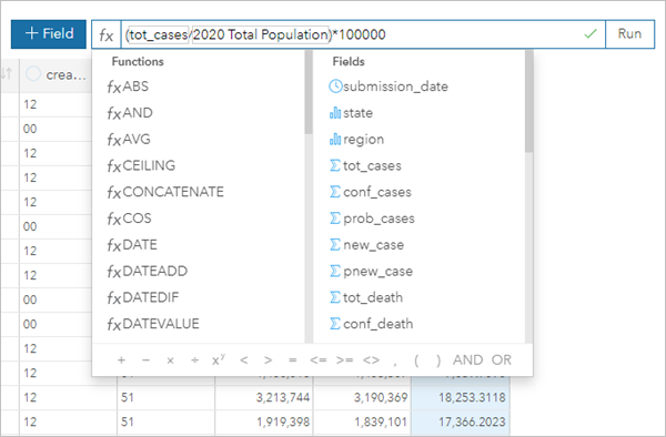
- Click Run. When the field calculation is complete, close the table.
The field is calculated. By default, the new field type is a number. You'll change the field type to indicate that the value is a rate.
- In the data pane, next to the Case rate per 100k field, click the field type button and choose Rate/Ratio.
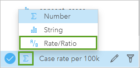
The field type changes. Next, you'll update the map so it shows the case rate field.
- Drag the Case rate per 100k field onto the page and onto the map.
A map style updates. It now displays the states styled based on the number of COVID-19 cases per 100,000 people. By default, darker colors have a higher normalized case rate. The default extent of the map does not show all states, so you'll update it.
- Zoom and pan on the map until all states are visible.
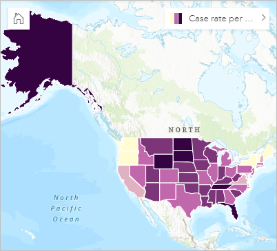
- On the card toolbar, click the Zoom tools button.

- From the zoom tools options, click the Set default extent button.

You'll make a second map showing the total number of COVID-19 cases and deaths per state. Your dataset contains fields for this information, so you don't need to create a new field.
- In the data pane, drag the tot_cases field onto the page, next to the map card and onto the Map drop zone.
Another map card appears. It displays the number of cases by state. Its default style is different from the first map card, using symbols that increase in size to represent more cases. When showing counts instead of rates, this style is more appropriate.
You also want to add deaths to the second map card. If you try to add the tot_death field to the map the same way you added the tot_cases field, you'll only update the map's style instead of adding a second layer. To add a second layer to the map, you'll select both a location field and the tot_death field.
- Click the circles next to the State boundaries field and the tot_death field to select both fields. Drag the fields onto the second map card and onto the Add new layer drop zone.
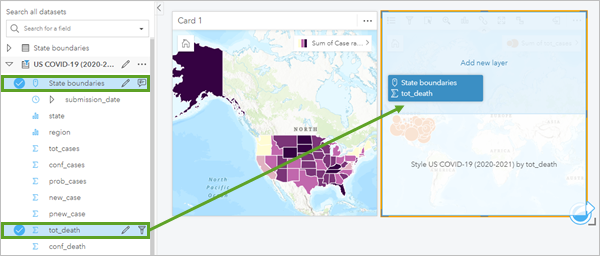
A second layer, tot_death, is added to the map card.
Every state on the map now has two symbols, a gray symbol representing deaths and an orange symbol representing cases. (In some states, the symbols may be sized similarly, so you can't see both at the same time.)
Your two maps show different aspects of the same data and help give a more complete understanding of the COVID-19 pandemic. The total values and the case rates are important to understand on their own, but using them together provides even more insight. For example, some states with a large population may have a high case count, but a relatively small case rate, whereas smaller states may have a small case count and a high case rate.
It would be helpful to synchronize the maps so they use the same extent when you zoom and pan. Since you already set the extent for the first card, you use that card to sync the extents.
- Click the first map card (Card 1) to activate it. On the card toolbar, click the Sync extents button.

The second map moves to the same extent as the first map. Now, when you navigate one map, the other map navigates to the same location.
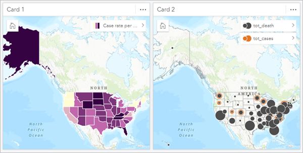
- Set the new default extent for Card 2.
Tip:
The Set default extent button is located in the zoom tools.
- On the ribbon, click the Save button.

The workbook is saved.
Style the case rate map
The style of your maps and data is essential to communicating information effectively. For instance, in your second map, it's not possible to see the cases and deaths for every state because the symbols overlap. You'll update the styles of both maps using cartographic principles.
First, you'll change the basemap to one with less detail and minimal colors. This basemap will make your data stand out on the map. Then, you'll change the style for the case rate map.
- Click an empty space on the page to deactivate all cards.
Note:
When a card is inactive, the name of the card remains visible (for instance, Card 1).
- On the ribbon, click the Basemaps button and choose Light Gray Canvas.
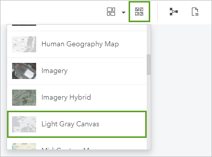
The basemaps update for both maps.
Next, you'll change the style of your first map, which shows the number of cases per 100,000 people. The current style divides states into five groups and gives them a darker symbol if their case rates are higher. You'll change how the groups are classified and choose a different color scheme.
- On Card 1, click the arrow next to the Case rate per 100k layer.

The Layer options pane appears. The default tab shows the legend.
- In the Layer options pane, click the Symbology tab. Click Classification to expand the classification options.
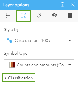
By default, the data is classified using the Natural Breaks method with five classes. The Natural Breaks classification method identifies clusters of similar values in the data and inserts class breaks between the clusters.
In the Layer options pane, the histogram chart shows how your data is distributed and where the breaks are located. The distribution of case rates is slightly skewed toward higher rates. The dashed line indicates the average. You'll change the classification type to standard deviation, which classifies each state's case rate based on how far away it is from the average.
- For Classification type, choose Standard deviation.
The map and the histogram chart update. Now, the class breaks are set at intervals of one standard deviation. In statistical analysis, a distance of two standard deviations from the average is generally considered significant.
- In the Layer options pane, click the Appearance tab. For Color palette, choose the white to blue palette.
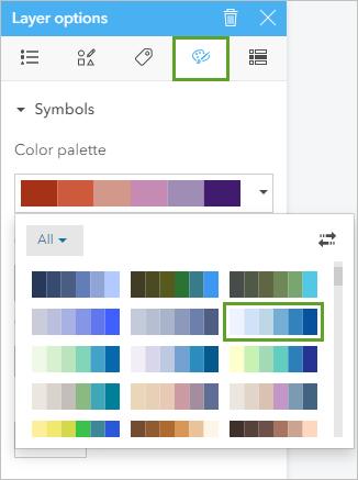
You'll also adjust some of the other style parameters to ensure that the data is displayed clearly.
- Change Outline thickness to 0.5 px.
- Change Outline color to the gray color in the second column, third row (#5C5C5C).
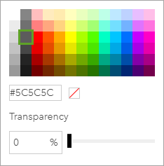
- Change Layer transparency to 10 percent.
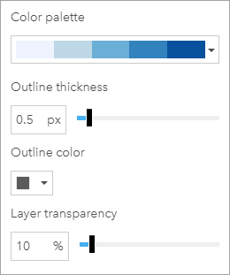
The changes are automatically applied to the map.
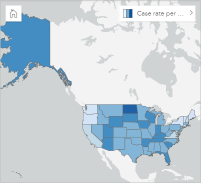
The gray outline makes it easier to see the boundaries between states.
You'll add a legend to the page so users can see which values correspond to which symbols.
- In the Layer options pane, click the Legend tab. Click the Pop out legend button.
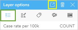
The legend is added to the map.
- Close the Layer options pane. Drag the legend under the map.
You'll change the legend's size and appearance later in the tutorial.
- Save the workbook.
Style the cases and deaths map
The map of case rates is complete. Next, you'll change the style for the map of cases and deaths.
Currently, the map is styled so that the symbols for cases and deaths vary in size. You'll keep this symbol type but change parameters such as the classification type and size of the symbols. First, you'll change the symbols for cases. You'll turn off the layer for deaths so you can focus on the layer for cases.
- Click the symbol next to the tot_death layer to turn it off.

The tot_death layer is turned off and only the tot_cases layer is shown on the map.
- Click the tot_cases arrow.
The Layer options pane appears.
- In the Layer options pane,
click the Symbology tab. Expand Classification.
Like the map of case rates, the default classification type is Natural Breaks with five classes. The histogram chart indicates that the data is skewed toward lower values, but with a small number of outliers.
You'll change the classification type to unclassed. This type scales symbol size on a continuous scale instead of dividing the data into a certain number of discrete classes. A continuous scale will emphasize the highest values on the map. It'll also make it more efficient to update the map with more recent COVID-19 data, because you won't need to adjust the classification as the data changes.
- For Classification type, choose Unclassed.
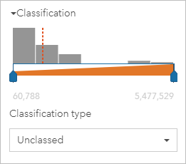
The symbols on the map change. States with a large number of total cases, such as California, Texas, and Florida, stand out compared to the large number of states with relatively few cases. However, it can be difficult to interpret the symbols in some areas where many smaller states are located close together. You'll update the symbol size, fill color, and transparency so that users can differentiate the symbols.
- Click the Appearance tab. For Size (min - max), change the maximum size to 44 px.
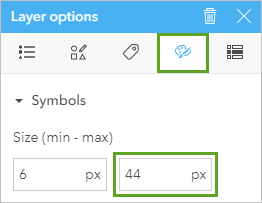
This size is the largest symbol size that legends in ArcGIS Insights can show to scale.
- For Fill color, replace the hex code with #00A9E6 and change Transparency to 93 percent.
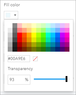
When you have many symbols close together, increasing transparency is a good way to make sure all of the symbols appear. You'll increase the outline thickness and change its color to match the fill color.
- Change Outline thickness to 1.3 px. For Outline color, replace the hex code with #00A9E6.
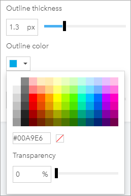
The map updates. Because you didn't increase the outline transparency, the outline color is darker than the fill color.
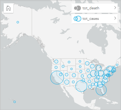
As with the first map, you'll pop out the legend.
- Click the Legend tab and click Pop out legend. Close the Layer options pane and move the legend to the right of the map.
Next, you'll update the style for the layer of deaths.
- On the map card, click the tot_death symbol to turn the layer on and click the arrow to open the Layer options pane.
- On the Symbology tab, expand Classification. Change Classification type to Unclassed.
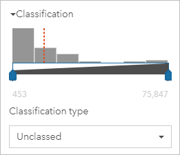
You'll also change the size and color of the deaths so that they appear distinctly compared to cases. Because there are fewer deaths than cases, you'll make the symbols for deaths smaller.
- On the Appearance tab, change the following parameters:
- For Size (min - max), change the minimum size to 1 px and the maximum size to 10 px.
- For Fill color, change the color to #FF5500 and Transparency to 80 percent.
- For Outline thickness, change the value to 1.5 px.
- For Outline color, change the color to #FF5500.
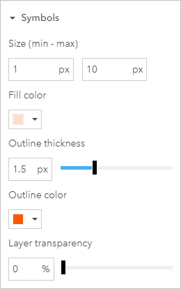
Next, you'll pop out the legend for deaths.
- Click the Legend tab and click the Pop out legend button. Move the legend below the tot_cases legend and close the Layer options pane.
You now have three legends on your page, one for the first map and two for the second. You can rearrange the legends.
- Move and resize the three legends to reduce empty space.
Tip:
To resize a card, click the card to select it and drag its handles.
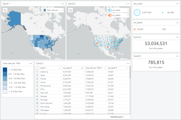
The example image shows a possible page layout with maps and legends. Your layout may look a little different.
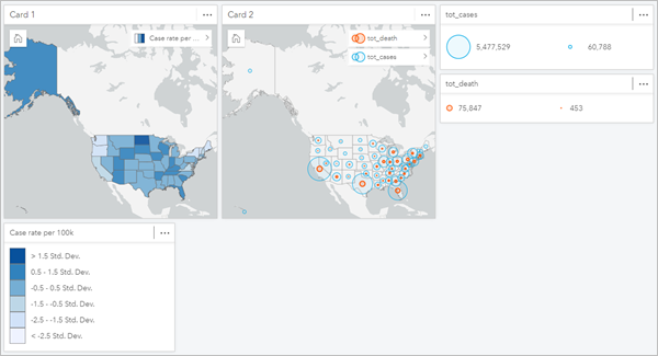
Finally, you'll check the pop-ups. You already configured the display field, so the pop-ups will show the name of each country.
- On the map of cases and deaths, point to some of the symbols.
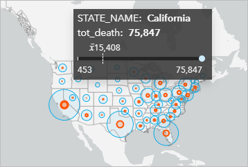
The pop-ups show the number of deaths for each state, as well as statistics such as the minimum, maximum, and average number of deaths countrywide. It would be more useful to show the number of cases in the pop-up instead of the number of deaths. You'll reorder the layers so that cases are displayed first.
- In the list of layers, drag the tot_cases layer above the tot_death layer.
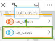
The layers are reordered.
- Point to the symbols on the map.
Now, the pop-ups display the sum of cases for each state.
- Save the workbook.
Create tables and charts
Now that the maps are complete, you'll add tables and charts to supplement the spatial information. First, you'll create a table showing the data for each state and region.
- In the data pane, select the state, tot_cases, Case rate per 100k, and tot_death fields in the order listed.
When selecting multiple fields to create a table, the order in which you select the fields determines the order in which the fields are displayed in the table.
- Drag the selected fields to a blank area of the page under the maps and onto the Table drop zone, and drop them on Reference Table.
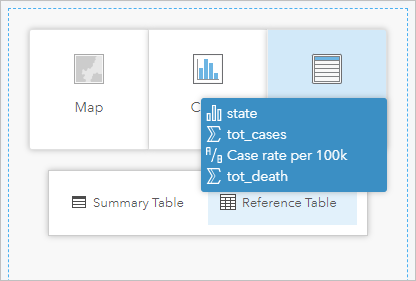
A table is created. Its default size is too small to display all four fields.
- On the table, drag the handles to expand the card until you can see all four fields.
The table displays the values for each field for each state. By default, the table is sorted alphabetically by state name. You'll sort the table by number of cases so that states with the most cases appear at the top of the table.
- Click the tot_cases field arrows to sort the field from lowest to highest (ascending). Click the arrows again to sort the field from highest to lowest (descending).

It would also be useful to show an aggregated number of cases and deaths to which users can refer quickly without looking through the large amount of data in the table. You can show total values of any field using a Key Performance Indicator (KPI) chart.
- In the data pane, click tot_cases to select it. Drag the tot_cases field onto the page next to the cases and deaths map, point to the Chart drop zone, and drop the field onto KPI.
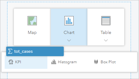
A KPI card is created. It shows the total number of confirmed COVID-19 cases countrywide. The card has a lot of empty space, so you'll resize it.
- Drag the handles to resize the card so there is minimal empty space.
- In the data pane, select the tot_death field. Use it to create a second KPI card and resize the card to the same size as the first.
You've added all the spatial and nonspatial visualizations for your page. (Your layout may look slightly different than the example image.)
- Save the workbook.
Design the page
The COVID-19 pandemic has resulted in unprecedented data sharing from public health authorities, governments, and researchers. It's important that your page have an appropriate design for your audience. In this case, your audience is the general public, so you'll design the page so that the most important information is clearly visible. You'll also rename cards and fields so your audience can understand what each visualization shows.
Your page includes legends for each map layer, so you don't need the layer lists on the maps. You'll hide them.
- Click Card 1 (the map of case rates) to activate it. On the card toolbar, click the Layer options button.

The button is deselected and the list of layers is removed from the map.
- Remove the list of layers from Card 2 (the map of cases and deaths).
Next, you'll change the style of the KPI cards so that the text color used for the total number of cases and deaths matches the colors used for cases and deaths on the map. By using the same color for the same data, you'll help your users connect the data on the map with the values on the KPI cards.
- Activate Card 4 (the cases KPI card) and click the Layer options button.
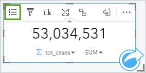
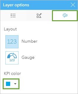
- In the Layer options pane, click the Appearance tab. For KPI color, enter the hex value #00A9E6.
- For Card 5 (the deaths KPI card), follow the same process to change the KPI color to #FF5500.
Many of your cards don't require titles. The KPI cards include text for sum of cases and sum of deaths, so you don't need titles for the legends and maps that show these values. You also don't need a title for the case rates map, because its legend includes its title. The table also doesn't need a title because the field names provide the necessary information. Next, you'll hide the unneeded titles.
- Point to each of the cards (except the Case rate per 100k legend card) and click the Hide button.

Now, none of the cards except the case rates legend have titles. You'll update the field names to be clearer.
- In the data pane, point to the state field and click the Rename field button. Change the field name to State and press Enter.
The field name changes in the data pane and on the table.
- Change the name of the tot_cases field to Cases and the tot_death field to Deaths.
Next, you'll update the text in the KPI cards and rearrange the KPI and legend cards.
- Click the Sum of tot_cases KPI card to activate it. Click the Card options button and click the Edit labels button.
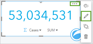
- Click the Sum of tot_cases label to make the text editable. Change the label to Total cases and press Enter.
- Follow the same process to change the label for the Sum of tot_death KPI card to Total deaths.
- Rearrange the KPI cards and the legends for cases and deaths so that the KPI card for total cases is above the legend for cases and the KPI card for total deaths is above the legend for deaths.
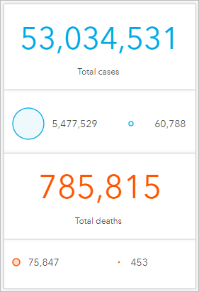
Next, you'll change the page's background color to match the color used in the Light Gray Canvas basemap.
- On the ribbon, click the Page options button.

- In the Page options pane, for Page background color, type the hex value #F4F4F4.
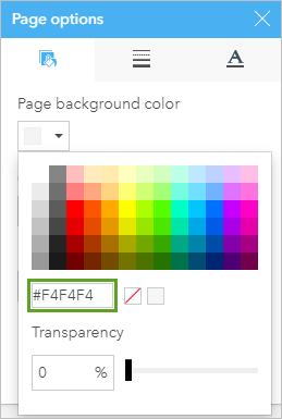
The page background changes (the change is slight, so it may be difficult to tell). You'll also change the background for the cards to the same color.
- For Card background color, type the hex value #F4F4F4.
Next, you'll remove borders from all of the cards.
- Click the Card borders tab. Change the Border style parameter to <None>. Close the Page options pane.
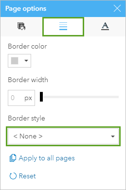
The borders are removed from all cards.
- Save the workbook.
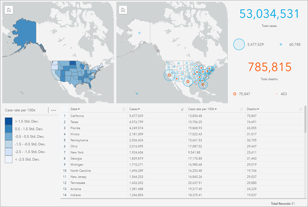
You've created an overview of the COVID-19 pandemic in the United States as of December 31, 2021. Your page maps cases, deaths, and case rates. It also provides key information in nonspatial formats and is designed for a broad audience.
Chart temporal COVID-19 trends
Previously, you created a workbook page with an overview of the COVID-19 pandemic in the United States as of December 31, 2021. The CDC data you used also provides the daily number of new cases and deaths for each state, meaning it's possible to also visualize trends in the data. Next, you'll create a page with charts that will be useful for examining the temporal trends of new cases across the country.
Create a time series chart
First, you'll go to the second page in the workbook and create a time series chart that shows how cases have changed over time for each state.
- If necessary, open your US COVID-19 analysis workbook in ArcGIS Insights.
- Click the COVID-19 trends tab.

The COVID-19 trends page contains the same US COVID-19 (2020-2021) dataset from the previous page.
- In the data pane, expand the US COVID-19 (2020-2021) dataset.
The dataset includes the submission_date field. The field is a date/time field, meaning it contains temporal data. You'll use this field to create a time series chart showing the number of daily reported COVID-19 cases per state.
- Select the submission_date, new_case, and state fields.
The three fields are selected in the data pane.
- Drag the fields onto the page and onto the Time Series drop zone.
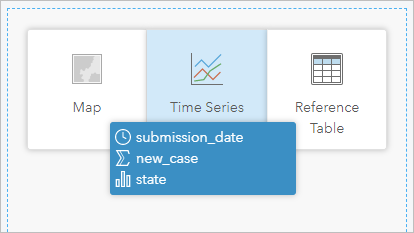
A time series chart is created.
Note:
Because there is a large amount of data, it may take a few seconds for the chart to load.
The chart shows the number of cases by state for each reported date. The y-axis shows the average number of new cases, the x-axis shows the date, and the different lines represent various states.
You'll change the y-axis to show the total number of new cases instead of the average number.
- In the time series chart, on the y-axis, click Avg new_case. In the new_case drop-down list, change AVG to SUM.
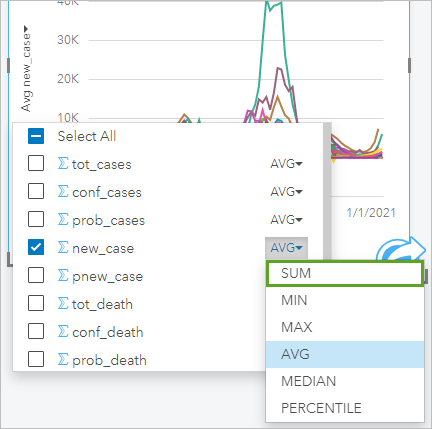
The chart is updated automatically. (Again, it may take a few seconds to load.)
The chart can be difficult to read because there are so many overlapping lines in a condensed area. First, you'll increase the size of the chart. Then, you'll create filters to show only a few states at a time.
- Drag the handles on the right and bottom of the chart to expand it so that it is about twice as wide as before and a little taller.
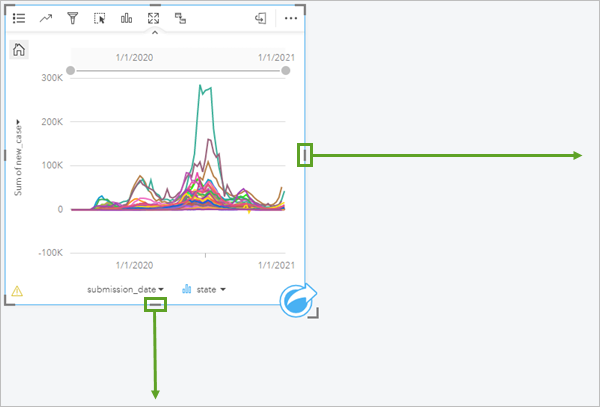
- Click any empty area on the page to deactivate the card. Click the title, Card 1, and change the title to New cases over time.
- Save your workbook.
Filter the chart
It's still difficult to distinguish the data for many of the states. Next, you'll create a filter widget and filter the chart to show only the five with the highest number of cases. Users will have the option to change the filters to show states of interest to them.
- On the ribbon, click the Widgets button and choose Filter.
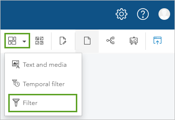
A new widget, Filter 1, is added to the page.
- If necessary, move the Filter 1 widget next to the time series chart.
Next, you'll configure the filter to show the five states with the highest total number of cases: California, Texas, Florida, Illinois, and Pennsylvania.
Tip:
You can use the table on the COVID-19 overview page to see the states sorted by total number of cases.
- On the Filter 1 widget, expand the menu for Filter type and select Group.
- Expand the menu for Field and select state.
- Click Create.
- Select California and click Add.
A filter value called California is added to the widget.
- Click Add groups. Select Florida and click Add.
A filter value called Florida is added to the widget below California.
- Repeat the previous step to add values for Illinois, Pennsylvania, and Texas. Use the search bar, if necessary.
The widget lists the five states with the highest number of cases.
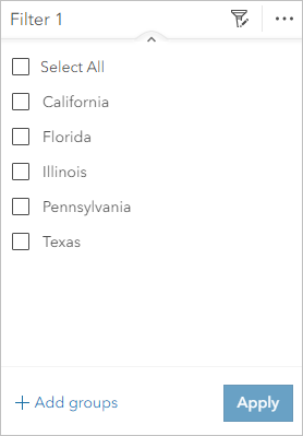
- Rename the filter widget Highest total cases.
Next, you'll add a filter widget for regions. Users can turn these filters on or off to see states of interest to them, while keeping the total number of states displayed in the time series chart relatively low.
- Click the Widgets button and choose Filter. Move the new filter widget beneath the Highest total cases filter widget.
- For Filter type, choose Dynamic. For Field, choose region.
- Click Create.
The four regions are listed on the filter.
- Rename the filter widget Regions.
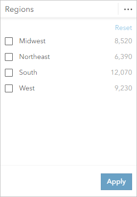
Some of the configurations on the widget are not necessary. You will remove them.
- Click the Card options button and click the Appearance button.
- In the Appearance pane, click the Properties tab.
- Turn off Show include/exclude and Show search box. Close the Appearance pane.
The Include configuration and search box are removed from the widget.
- On the Highest total cases widget, check Select All. Click Apply.
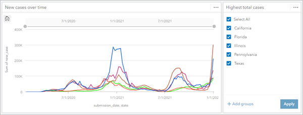
The time series chart shows only the five states with the highest number of cases.
Create bar charts
Next, you'll create bar charts showing the number of cases and the number of deaths for each state.
- In the data pane, select state and new_case. Drag the fields onto the page next to the filter widget and onto the Chart drop zone.
Note:
Bar charts aggregate the data based on the selected category. The new_case field was chosen instead of the tot_cases field so that the aggregated value will represent an accurate total number of cases.
A bar chart is created. It shows the total number of cases in the five states with the highest number of cases. (If you change the filter, different states are shown.)
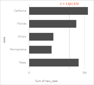
The bars on the chart are displayed using default colors. You'll update the style so the colors on the bars match the colors on the time series.
- Click the bar chart to activate it. Click the Layer options button.

The Layer options pane appears.
- Click the Symbology tab. For Symbol type, choose Unique symbols.
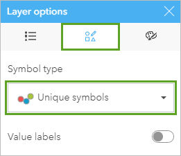
- Close the Layer options pane.
You'll also sort the chart so the states are displayed in descending order by number of cases.
- Click the Sort button and choose Sort descending.
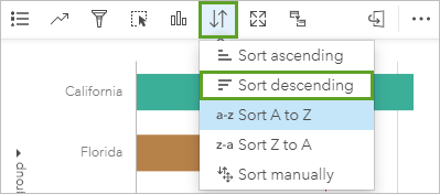
By default, the chart displays the average number of cases across the states displayed. You don't need the average, so you'll remove it from the chart.
- Click the Chart statistics button and uncheck Mean.
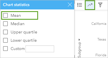
- Close the Chart statistics pane. For the bar chart, click the Hide button to hide the card header.
You'll create a second bar chart to show the number of deaths.
- In the data pane, select the state and new_death fields. Drag the fields onto the page under the first bar chart and onto the Chart drop zone.
- For the second bar chart, click the Layer options button. In the Layer options pane, on the Symbology tab, change Symbol type to Unique symbols.
- Close the Layer options pane. Click the Sort button and choose Sort descending.
- Click the Chart statistics button and uncheck Mean.
- Click the Hide button to hide the card header.
Create a box plot chart
The last card you'll create is a box plot, which shows the distribution of data, such as minimum and maximum values, median values, and outliers.
- If necessary, move and resize the cards on the page so the filter widget and the bar charts are stacked on top of one another next to the time series.
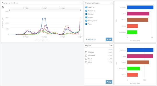
- In the data pane, select the state and new_case fields. Drag the fields onto the page under the time series chart, point to Charts, and drop the fields on Box Plot.
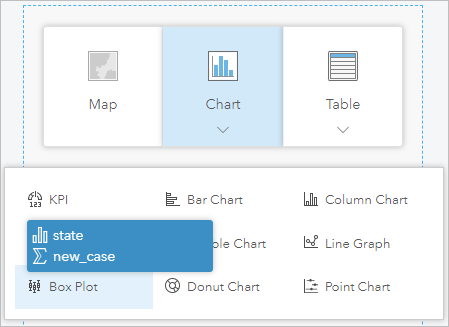
A box plot card is created. It displays a separate box plot for each state. The box plots indicate the maximum, minimum, and median values for the daily number of confirmed cases for each state. Outliers are depicted with lines that extend above the boxes.
Next, you'll resize the box plot chart.
- Drag the side handles of the box plot chart to fill the empty space between the box plot chart and the Sum of new_death bar chart.
- Click an empty area of the page to deselect the card. Click Card 3 (the title of the box plot chart), change the title to Distribution of new cases, and press Enter.
You can also apply the same background and border settings from the first page to create consistency within the workbook.
- Click the COVID-19 overview tab to return to the first page.
- On the ribbon, click the Page options button.
- On the Colors tab, click Apply to all pages.
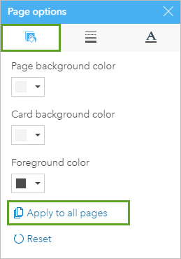
The page and card background colors you set on the first page are applied to the COVID-19 trends page. You'll do the same thing for the card borders.
- Click the Borders tab and click Apply to all pages. Close the Page options pane.
- Click the COVID-19 trends tab.
The second page now has the same card and page settings as the first page.
Finally, you will rename the fields on the cards and update the axis labels.
- In the data pane, rename the fields as follows:
- state—State
- new_case—New cases
- Use the Edit labels button for the charts to edit the axis labels as follows:
- For the y-axis on the time series graph, type New cases.
- For the x-axis on the time series graph, type Date.
- For the x-axis on the bar chart of cases, type Total cases.
- For the x-axis on the bar chart of deaths, type Total deaths.
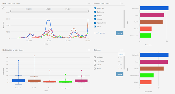
Both pages are now complete. The final step is to share your workbook to create a report.
Share a workbook
Creating a report is an important part of communicating your analysis to stakeholders. You can share your work in Insights as individual pages or a complete workbook. You'll share your workbook so both pages are readily accessible.
A shared workbook is a read-only version of your original workbook. Viewers can interact with the maps and charts in the same way as an editable Insights workbook, but they cannot make any changes. Members of your organization can also duplicate your shared workbooks to create their own editable copy.
- Click the COVID-19 overview page to return to the first page.
- Save the workbook.
- On the ribbon, click the Home button.
You return to the Insights home page. The home page lists recent workbooks, so your workbook is listed first.
- On the home page, point to your US COVID-19 analysis workbook and click the Share button.
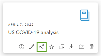
The Share workbook window appears.
- Check Everyone (public) and click Share.
Your workbook is now available to the public in a read-only format. You can open the workbook and share the URL with anyone, including people who don't have an Insights account. The URL will redirect to a view-only URL when opened by anyone other than you.
In this tutorial, you learned about mapping techniques that give an accurate and responsible overview of the COVID-19 pandemic in the United States and looked at the trends in new cases over time. You conveyed key information clearly so ordinary users could gain insight into the pandemic. You also shared your workbook to make it available to the public.
You can find more tutorials in the tutorial gallery.

