Map Easter Rising fatalities
First, you'll create a map of fatalities during the 1916 Easter Rising in Dublin, Ireland. The data you'll use comes from Glasnevin Cemetery burial records, national census records, historical newspapers, and historical street directories. It includes not only the names and locations of some of the people who died during the Rising but also their affiliation, be it civilian, military, or paramilitary. This data is available as a point layer that you'll add to a map in ArcGIS Online. Then, you'll symbolize the layer and configure pop-ups to clearly differentiate civilian fatalities from other kinds of fatalities.
Map fatalities
Your map will represent fatalities where there is extant geographic information about the place of death. First, you'll familiarize yourself with, and then add the layer to a new map. Then, you'll navigate to your area of interest: Dublin, Ireland.
- Open the item detail page for the Easter Rising Fatalities 1916 layer.
Note:
If you are an ArcGIS Enterprise user you will need to build the web map from scratch.
First, log in to your enterprise account on another tab. On the ribbon, click Map. Make sure you have opened the new Map Viewer. On the Contents (dark) toolbar, click Add and click Add layer from URL. For URL, add the following layer and click Add to map: https://services2.arcgis.com/j80Jz20at6Bi0thr/arcgis/rest/services/Easter%20Rising%20Fatalities/FeatureServer.
Continue the tutorial at step 7.
- Sign in to your ArcGIS organizational account.
Note:
If you don't have an organizational account, see options for software access.
- On the ribbon, click Data.

The layer contains a wide variety of information regarding fatalities during the 1916 Easter Rising. The fields range from basic information about the deceased (name, age, gender, place of death) to information about their affiliation and occupation. The Biography field provides a brief description of the deceased.
- Locate the Place of Death Latitude and Place of Death Longitude fields.
- These fields provide the geographic coordinates of each fatality. These fields were used when geocoding the data so the fatality locations can be displayed on a map.
Note:
The origin spreadsheet for this layer can be downloaded at Easter Rising Fatalities 1916 as a comma-separated values (CSV) file. Some of the fatalities in this spreadsheet have no information for these fields because no place of death was recorded. Many of the fatalities with incomplete records are either leading figures in the rebellion who have been included for their historical importance or children who have been included for their historical under representation. These fatalities will not be mapped when you convert the spreadsheet into a data layer, but their information might be useful for reference or for probing deeper into the questions posed by this project.
- On the layer ribbon, click Overview. Click Open in Map Viewer.
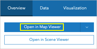
The layer opens in Map Viewer.
The map contains many points, corresponding to individual fatalities. The map zoomed out because some of the fatalities occurred outside of Dublin, including locations such as Cork and even London. The points have been symbolized by default based on location.
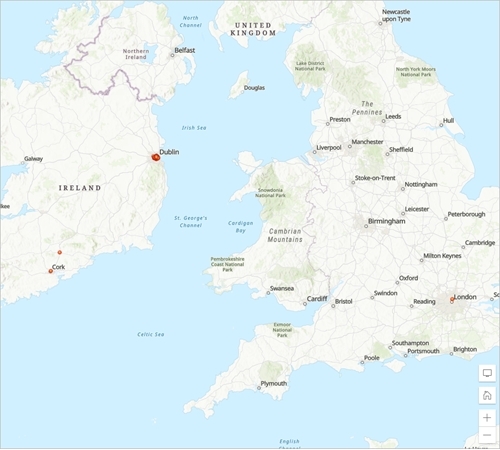
Because most of the fighting and fatalities occurred in Dublin, you'll zoom in closer to Dublin.
- Use the mouse scroll wheel or the Zoom In button to zoom to Dublin.
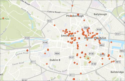
The fatalities are primarily clustered around the center of the city, where most of the population lived in 1916. However, the current symbology makes it difficult to determine spatial patterns other than where the fatalities tended to occur.
Note:
The map shows the current landscape of Dublin. In 1916, it looked much different. When you add the fatalities to the map as a layer, you should keep in mind how the city may have changed in the century between now and the time of the event.
- On the Contents (dark) toolbar, click Basemap.
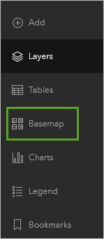
With the historical context of this data in mind, you'll look for a different basemap. The readily available basemaps are based on current data and will still show the city as it looks today, but the differences in symbology will emphasize the historical nature of the data.
- In the Basemap pane, click Modern Antique Map.
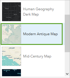
The map updates to show the new basemap. The font and colors of the new basemap are more reminiscent of traditional, hand-drawn cartography, suggesting the historical context of the data.
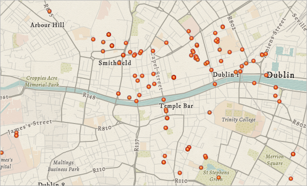
Now, you'll adjust the symbology of the fatality data. The way the map is currently drawn only shows the location of the fatalities, making it difficult to determine spatial patterns other than where the fatalities tended to occur.
Symbolize the layer
Next, you'll change the symbology of the Easter Rising Fatalities 1916 layer. First, you'll symbolize the layer as a heat map to see where fatalities were most densely clustered. You also want to examine how civilians were affected during the event compared to combatants (Irish rebels, British military, and Dublin police or constabulary forces). To do so, you'll symbolize the layer again, this time by the affiliation of the fatalities.
- On the Contents toolbar, click Layers. On the Settings (light) toolbar, click Styles.
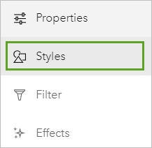
The Styles pane appears. Under Pick a style, the Current style is set to Location (single symbol). First, you'll show the fatalities using a heat map.
- For Pick a style, click Heat Map.
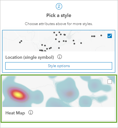
The map symbology changes automatically.
The heat map represents the concentration of fatalities in certain areas, with yellow and red areas having a higher concentration.
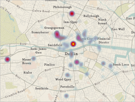
Many of the highest-density areas correspond to key locations during the Easter Rising, such as rebel garrisons. From the heat map, there appear to be several areas of intense fighting scattered throughout the city, indicating a chaotic and violent event that would be more likely to affect civilians. The heat map supports the assessment you made based on the affiliation of the fatalities: that the Rising was more than a clash between Irish rebels and the British army, but a broad and disorderly struggle that stretched throughout the city.
Next, you'll symbolize the layer by the affiliation of each fatality.
- In the Styles pane, for Choose attributes, click Field.
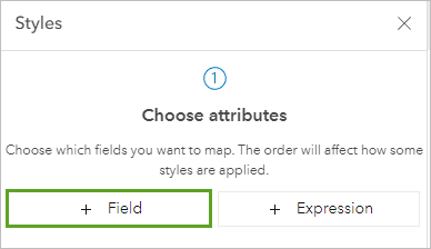
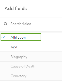
- In the Select fields pane, choose Affiliation.
Note:
To make the Affiliation field easier to find in the long list you can (1) sort the fields by name by clicking Sort or (2) search for the field name by typing a few letters into the search box.
- Click Add.
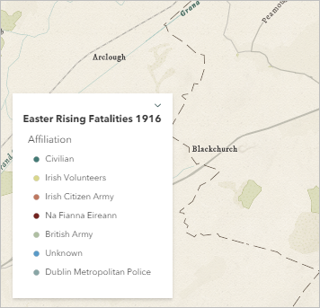
The symbols on the map and the map legend change automatically. A legend appears at the bottom of the map pane, showing what color each group has been symbolized with.
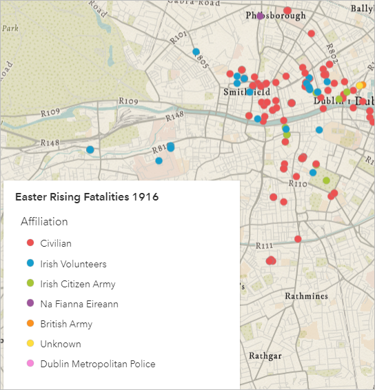
The colors of each fatality correspond to a certain type of affiliation. The most common affiliations are Civilian (Red) and Irish Volunteers (Blue), with the other affiliations corresponding to either other organizations of Irish fighters, the British army, or the Dublin police. While Irish combatants were a significant portion of the total fatalities, the civilian deaths make up more than half of the total deaths. Although historic commemorations of the Easter Rising primarily focused on those who fought, mapping the Rising through this lens reveals a broader range of experiences.
Now, you'll change the symbols to better suit the basemap.
- For Types (unique symbols), click Style options.
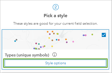
In the Style options pane, you can choose to change individual symbol colors by clicking the point for each category. You can also change all the symbols simultaneously by choosing a different color ramp.
- For Symbol style, click the current color ramp.
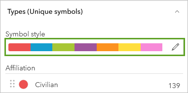
The Symbol style pane appears.
- For Colors, click the current color ramp.
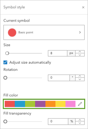
The Ramp pane opens.
- For Category, choose Subdued, and choose the Olive Harmony color ramp.
Tip:
Point to each color ramp to see the name. If necessary, you may need to click the Flip ramp colors button to display your desired color ramp.
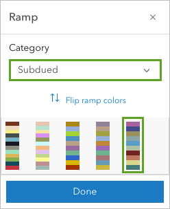
The symbols update on the map. The legend on the map shows the updated symbols.
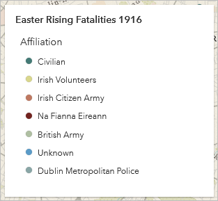
- On the Ramp pane, click Done. Close the Symbol style pane and in the Style options pane, click Done twice.
Configure pop-ups
Before you ask more in-depth questions about the data you've mapped, you'll configure pop-ups for the layer. Pop-ups are windows of information that appear when you click a feature on a web map. By narrowing down the information that appears, you can improve your map's use as an information resource for both yourself and others who view it.
- On the map, click any feature to open its pop-up.
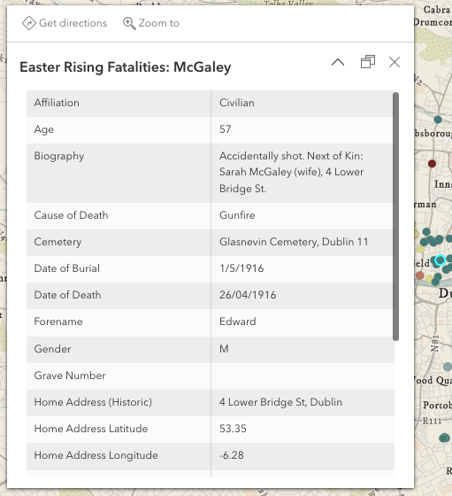
The default pop-up contains all of the attribute fields that were in the original Easter Rising Fatalities 1916 CSV file. A lot of this information, such as the latitude and longitude fields or the fields about home address and cemetery, are not particularly relevant to how the Easter Rising affected civilians. You'll configure the layer's pop-up to contain fewer fields of information to emphasize the ones that are more important.
- On the Settings toolbar, click Pop-ups.
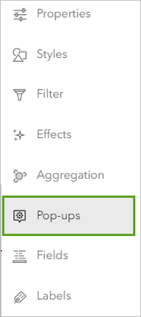
The Pop-ups pane appears. You'll give your pop-up a title that contains the name of the person who was killed. Then, you'll change the pop-up contents to show a shorter list of field attributes.
- Click Title to expand the current title block.
The existing title contains static text showing the name of the layer, and dynamic text, showing the surname of the person corresponding to the point.
- For Title, delete the layer name and colon (:).
The only text still in the Title box is {Surname}.
- With the pointer in the Title text box, outside the left bracket of {Surname}, click the Add Field button.

- In the Add field pane, choose Forename.
The word Forename, in brackets, is added to the text box.
- Add a space between {Forename} and {Surname}.
The title updates to {Forename} {Surname} and is shown in the sample pop-up in the map pane.
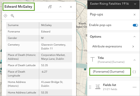
Now, the pop-up will display the fatality's first and last name as the title. Next, you'll configure the attributes that appear in the pop-up.
- In the Pop-ups pane, click Fields list to expand the current fields selection.
A list of all attribute fields in the layer appears. You'll remove most of the attributes, leaving only some basic information about the person who was killed, such as their age and biography.
- In the Fields list group, click Select fields.
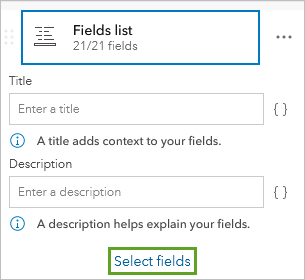
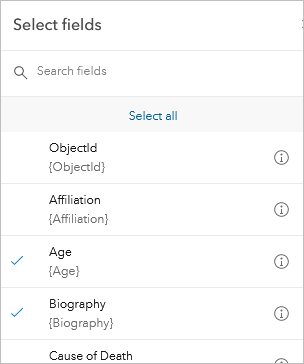
- In the Select fields pane, click Select all, then click Deselect all.
- Scroll through the list of fields and check the Age and Biography fields.
Note:
If you're interested in comparing other kinds of information, such as the religion or occupation of the deceased, feel free to check other fields.
- Click Done.
The preview pop-up updates to only show the two fields you selected.
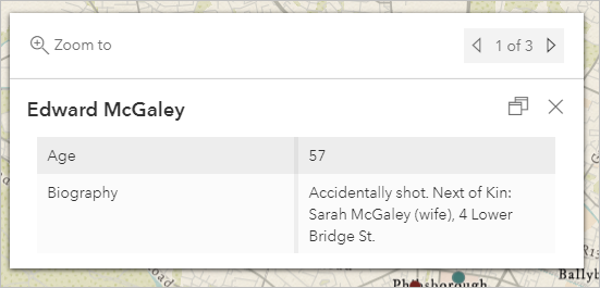
- Click other features on the map to see how various people are represented.
Note:
Because of the incomplete nature of the death records, some of the features may not have information for the Biography, Age, or even Forename fields.
- Close the pop-up.
Lastly, you'll save the map.
- On the Contents (dark) toolbar, click Save and open and click Save as.
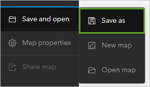
The Save map window appears.
- For Title, type Easter Rising 1916 to Present and add your name or initials.
- For Tags, type Easter Rising, 1916, Dublin, Ireland, and Fatalities. Press Enter between each tag.
- For Summary, copy and paste the following text: A map showing fatalities during the 1916 Easter Rising in Dublin.
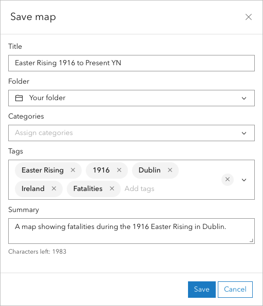
- Click Save.
Discussion
- Although in this module you symbolized the fatalities by affiliation, there are several other attribute fields by which the layer could be symbolized. Try symbolizing the layer by gender, religion, or age. Which demographic groups were affected the most by the Rising? Which were affected the least? What might the representation of certain demographic groups among the fatalities tell you about the nature of the Rising?
- When symbolizing the fatalities using the Heat Map drawing style, there is one hot spot with a higher intensity of fatalities than any others. Zoom to this hot spot's location. What was located there? Why might the highest number of fatalities have occurred there? What is located at the sites of the other clusters?
- The basemap in your map uses information from Dublin's contemporary geography. How was the geography of Dublin in 1916 different from its geography today? How might the urban layout in 1916 have affected where battles and skirmishes occurred?
For more evidence to support your answers, try using the following resources to learn more about the historical context and chronology of the Easter Rising:
You've created your map of fatalities during the 1916 Easter Rising in Dublin, Ireland. The data that you've explored has given you a better idea of the civilian experiences during the event and the extent that they were affected. Next, you'll compare those experiences to how the event is remembered today through commemorative memorials and exhibits.
Create an ArcGIS StoryMaps tour
The previous module illustrated how GIS can add visual and spatial dimensions to historical data, while this module demonstrates the importance of geography to the field of history. By being able to digitally juxtapose historical and contemporary data, historical scholars are able to create new types of public history engagements.
This new use of geography, or neogeography, can be defined theoretically, technologically, and territorially. From a theoretical perspective, neogeography is both a communal and subjective use of geographic techniques and tools, generally by people who would not normally be considered geographers. From a technological perspective, it involves social media and telecommunications technologies. From a territorial perspective, it synthesizes actual places and virtual spaces into digital ecosystems.
Previously, you created a map showing fatalities during the 1916 Easter Rising in Dublin. Next, you'll create an ArcGIS StoryMaps story with a tour block that contains geotagged images of historical sites and examples of public commemoration to tell the story of the 1916 Easter Rising. Users will be able to explore your narrative, engaging actively with the story of the Easter Rising to reach their own conclusions about the event.
Upload a layer
Next, you'll map the location of historical sites and examples of public commemoration of the Rising. Using a spreadsheet containing the location and description of various historical and commemorative sites, you'll create a layer with images that can be shared later in an ArcGIS StoryMaps tour block.
- Download the dublin_images_information.xlsx file.
- On the map ribbon, click the navigation button and choose Content.
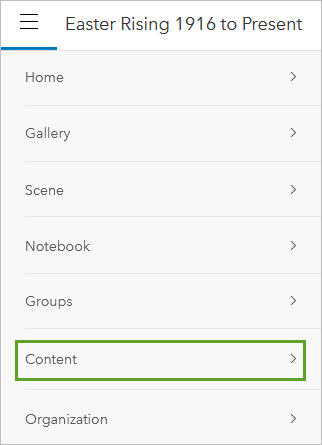
The Content page appears. This page shows, by default, the content you have saved, including your map of the Easter Rising Fatalities. You can also upload new items.
- On the ribbon, click New item.
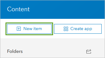
The New item window appears. Next, you'll add the Dublin images information spreadsheet you downloaded with the tutorial data.
- Drag the dublin_images_information.xlsx file into the Drag and drop your file section or click Your device and browse to the file.
- In the File window, make sure Add dublin_images_information.xlsx and create a hosted feature layer or table is selected.
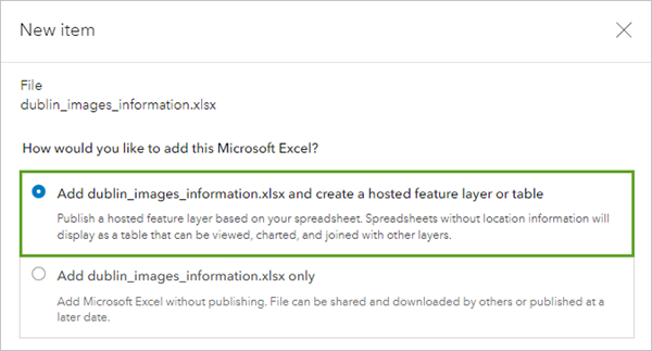
- Click Next.
The next screen allows you to select which fields from the spreadsheet you want to include in the layer and in what formats.
- Accept the defaults for the fields and click Next.
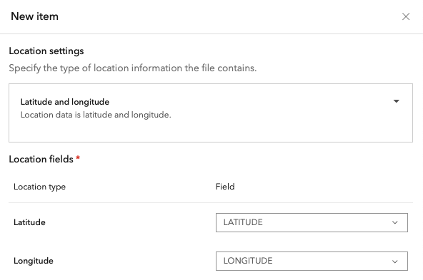
- For Location settings, confirm Latitude and longitude is selected. Under Location fields, confirm LATITUDE and LONGITUDE are selected.
- Click Next.
Finally, you'll enter metadata for your new layer. This includes a title, tags, and summary, as well as the folder location in which you want to store the layer.
- On the New Item page, enter the following metadata to store your layer:
- For Title, type Dublin Commemoration Sites and add your initials or name.
- For Tags, type Ireland, Easter Rising, 1916, pressing Enter after each tag.
- For Summary, type This layer shows the locations of historical and commemorative sites related to the 1916 Easter Rising.
Note:
Tags aren't required to save your layer but are helpful for locating data for future use. Categories aren't required either; they can be used to organize content across an organization.
- Click Save.
After a few moments, the layer is saved to your account as a hosted feature layer. Each of the records in the spreadsheet was geocoded by its latitude and longitude. Next, you'll add images to these points.
Add images to a hosted feature layer
To add images, you'll enable attachments, then choose which locations you want to show on your map. This layer will be added to an ArcGIS StoryMaps tour block to provide context about how the 1916 Easter Rising is remembered.
- Download and unzip the Dublin Images.zip file.
The Dublin Images folder contains images that can add to the context, tone, and narrative of your story remembering the Easter Rising.
- If necessary, open your Dublin Commemoration Sites item details page.
The item details page shows any metadata you've saved about your layer. You can also edit and visualize the data.
- Under Layers, click Sheet1.
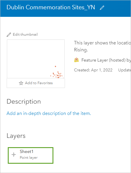
The Point layer service page appears. Here, you'll enable attachments to save images along with the data.
- In the Attachments section, turn on the Enable Attachments toggle button.
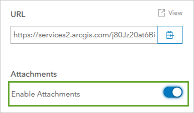
Now, you can open the feature layer's data and add your images.
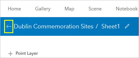
- On the ribbon next to the title, click the back arrow to return to the item details page.
- On the ribbon, click the Data tab.
The Data tab opens. In the Data view, you can see your layer's stored attributes in table format. You can also edit and update the layer's data here. Editing attributes on the Data tab doesn't change the hard copy of the information stored to your computer.
Now, you'll choose what sites you want to feature on your final map.
- If necessary, scroll until you see the Photos and Files column.
The 43 sites in this layer show a wide variety of historic locations around Dublin. You'll decide which images to show (or whether to show all of them) in a way to present a certain narrative or understanding of the Easter Rising. Just as if you were writing a historical story or essay, you should outline or storyboard your content. Feel free to do your own research to add to the layer or story as well.
- Read the description of each site and decide which you want to upload images for.
Tip:
The IMG_NAME column contains names that match the images in the Dublin Images folder.
The more images you include, the broader your narrative will be. For the purposes of this exercise, try to include somewhere between 10 and 20. If you'd like, feel free to use all of them.
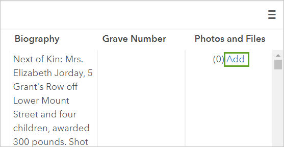
- In the Photos and Files column for each image you want to include in your layer, click Add.
- In the Photos and Files window, on the Add tab, click Choose File and browse to the Dublin images folder. Choose an image and click Open.
You can also drag and drop images onto this window to upload them.
- Click Upload. When you see the Upload Successful message, click Close.
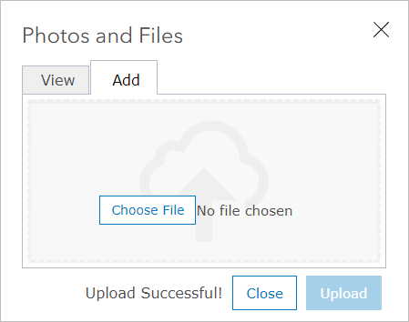
Each record with an image attached will be updated to show the number of corresponding files. When you build your tour later, you can choose to exclude any records that don't have images associated with them.
- Repeat steps 8 through 11 to upload the images for the commemorative sites you've chosen to show.
Once you're done building the feature layer, you'll add your fatalities map and your feature layer to an ArcGIS StoryMaps story to tell your narrative.
Start your story
Now that you have your data, you'll start building it into a story to share. You'll start with a blank story and add content blocks to share the map and layer you created.
- On the ribbon, click the Content tab.
- On the My Content tab, click Create app and choose ArcGIS Storymaps.
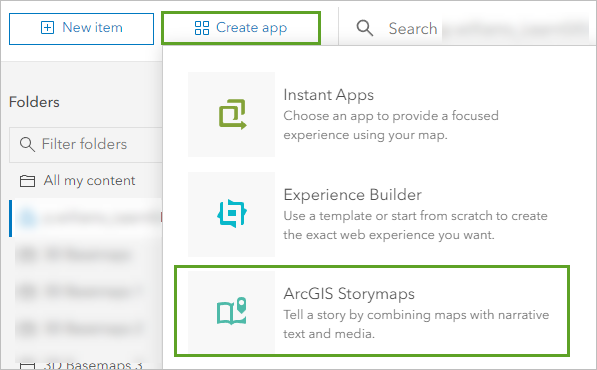
A new story opens. First, you'll add a title.
- For Title your story, type Easter Rising 1916 Commemoration.
- For Start with a short introduction or subtitle (optional), type or paste Mapping Dublin's remembrance.
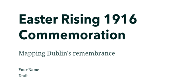
This builder will help you put together your story and tell the narrative of the Easter Rising. Next, you'll add your first block.
- Below the cover, click Tell your story and type or paste the following:
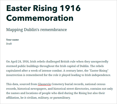
On April 24, 1916, Irish rebels challenged British rule when they unexpectedly stormed public buildings throughout the Irish capital of Dublin. The rebels capitulated after a week of intense combat. A century later, the "Easter Rising" insurrection is remembered for the role it played leading to Irish independence.
This data, sourced from Glasnevin Cemetery burial records, national census records, historical newspapers, and historical street directories, contains not only the names and locations of people who died during the Rising but also their affiliation, be it civilian, military, or paramilitary.
- Point below the last paragraph and click Add content block.
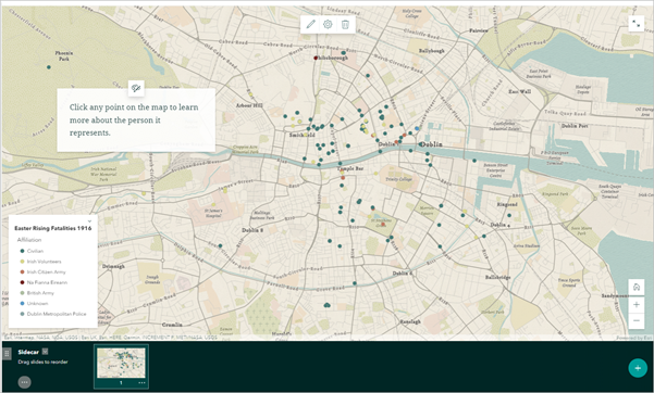
The block palette appears with options for adding content. Before getting into your tour, you want to give your readers a chance to fully explore the human cost of the 1916 Rising. You'll use a Sidecar block to share the map you created, alongside information on how to interact with it.
- Under Immersive, click Sidecar.
- In the Select a sidecar layout pane, choose Floating and click Save.
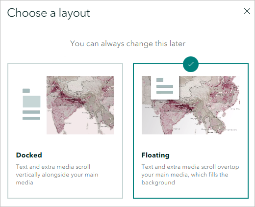
A blank sidecar is added to the story.
- In the sidecar block, click Add and choose Map.
- In the Add a map pane, select your Easter Rising 1916 to Present map.
The selected map opens in the Adjust map appearance pane. Here, you can choose several visual and interactive settings for the map. You'll ensure readers can view the map legend.
- In the side panel, click Options. Under Map configuration, turn on the Legend and Keep legend open toggle buttons.
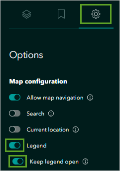
The Legend appears in the lower area of the map pane.
- Zoom and pan the map so all the features are centered and click Save.
The map is added to the story.
- In the Continue your story box, type or paste the following:
Click any point on the map to learn more about the person it represents.
The sidecar is complete.
- Scroll below the sidecar and click Continue your story.
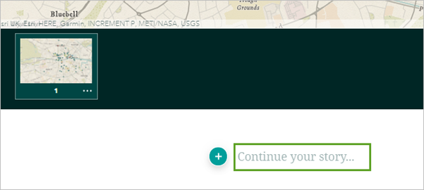
- Type or copy and paste the following text: The Uprising is still commemorated in many ways. Explore the map tour below to see how.
Next, you'll build a tour using the map tour block.
Build a map tour
The next block you'll add is a Map tour. The map tour block combines a map with media and descriptive text to present a set of related places to your readers. While you can choose to create these from scratch by adding individual points to the map, for this story you'll start with the Dublin Commemorative Sites layer you added earlier.
- Below the last sentence you just added in the story, click Add content block and under the Immersive group, click Map tour.
The How would you like to create your tour? page appears.
- Click Start with a feature service.
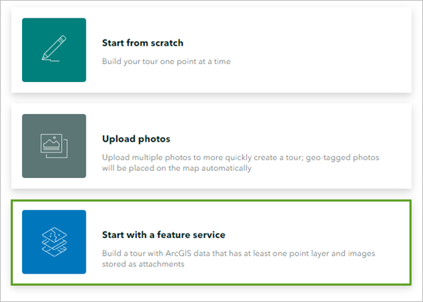
- In the Connect to data pane, click your Dublin Commemorative Sites layer.
A map tour block is added to your story. This block shows the image and description for each site and places a pin on the map corresponding to the location of each. Clicking a map pin will scroll to the point's image and description, and vice versa.
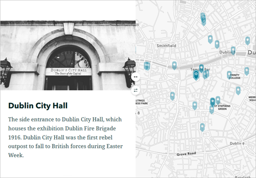
Note:
The examples shown in this story include images for each site point. If you chose not to upload some images, you can hide the points without images.
In ArcGIS Online: At the bottom of the Map tour block, click the Edit data source button and choose the Filter & Sort tab. Check the box for Only show places that have media.
In ArcGIS Enterprise: At the bottom of the Map tour block, click the Data options button and choose the Filter & Sort tab. Check the box for Only show places that have media.
The map will redraw with only the points that include images.
Now that the tour block is in the story, you'll add the fatality map as a basemap for more context.
- In the tour block, at the top of the map, click Edit.

The Adjust map appearance page appears. Here, you can set visual properties for the map. You'll change the tour's basemap to the points showing the locations of Easter Rising fatalities.
- For Select basemap, click Human Geography Light or the current basemap listed. In the Change basemap pane, click Browse more maps.
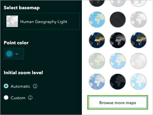
- In the Change basemap pane, choose your Easter Rising 1916 to Present map.
The basemap is now shown as the fatalities map. You'll also change the map pin color used for the commemoration locations. Blue on a map typically depicts water, and since the fatality points are symbolized by color, you want these tour points to be visually differentiated.
- For Point color, click the current color and choose a shade of black by dragging the color selector dot.
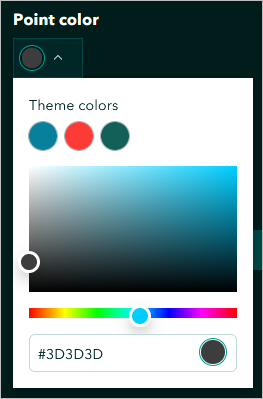
The dark points stand out from the fatality data as visually important, and are clearly a separate dataset.
- Collapse the Point color color picker.
- Under Initial zoom level, click Custom, and from the drop-down list choose Neighborhood.
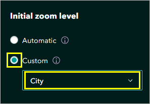
- Click Save.
The map, with the new basemap and updated symbols, is saved.
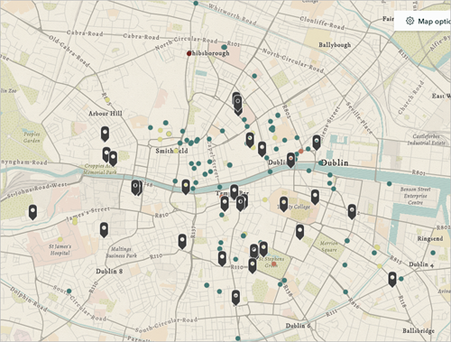
You'll select a different layout to showcase both the images and their descriptions in the tour.
- At the bottom of the Map tour block, click Layout.

The Select a map tour layout window appears.
- Under Explorer, click List. Click Save.
The List layout includes a thumbnail of the image and the first part of the text description.
- Change settings and add more context as you see fit to best represent your story. You can also include credits, referencing the acknowledgements below.
Note:
For more information about the settings you can change, try the tutorial Get started with ArcGIS StoryMaps.
- When you're finished changing settings, click Publish and under Share, for Who can see this after it is published, choose Everyone (Public). Click Publish.
Note:
If a window appears asking you to share additional items, in ArcGIS Online click Update sharing or in ArcGIS Enterprise click Yes, share these items.
Discussion
In The Landscape of History (2002), John Lewis Gaddis linked the ancient practice of mapmaking with the three-part conception of time (past, present, and future) that many historians apply to their work. Both practices explain infinitely complex human and environmental interactions by imposing abstract grids over them, such as hours and days or longitude and latitude. Observing this phenomenon, Gaddis asks, "What if we were to think of history as a kind of mapping?"[1] He argues that people discern similar types of patterns in historical and geographical narratives, and that history itself is a kind of landscape. This landscape metaphor accommodates varying degrees of complexity, not only as a reflection of scale but also for the information available at any given time concerning a particular landscape, geographical or historical.
In addition, as the digital historian Alexander von Lünen argues, "rather than a visualization tool, GIS should be used as a painting tool; a tool to creatively engage with one's sources. Historians need to make a decision: will they remain in the 'painting by numbers' domain or will they develop into true GIS artists, abandoning the imitation game and transforming GIS into a genuine vehicle for historic inquiry?"[2] Through the use of web maps and stories, you can make more creative inquiries into historical and geographical narratives.
Lastly, digital history and historical GIS practices operate at the intersection of the arts and sciences and are shaping new discourses in the digital humanities. They provide studies in neogeography with alternative scenarios for modeling landscape, shaped by human history. The GIS applications outlined in the preceding tutorials can help historians (and humanities scholars) add visual and spatial dimensions to their digital narratives.[3]
You've created an ArcGIS StoryMaps story that compared the historical event of the 1916 Easter Rising to various contemporary commemorations and public sites around Dublin. Over the course of the tutorial, you used archival data and geospatial technology to explore and reach conclusions about the relationship between history and historical narrative.
You can find more tutorials in the tutorial gallery.
