Create a real-time map
For the purposes of this tutorial, you're a contractor hired by the National Oceanic and Atmospheric Administration (NOAA) to conduct weather analysis. You're given a map containing several layers of real-time weather datasets
Explore bookmarks
First, you'll open the map containing the real-time weather data and sign in to ArcGIS Online. You plan to analyze weather data in several regions worldwide, so you'll explore bookmarks set for these regions to navigate to them quickly.
- Open the Predict weather with real-time data map.
Note:
Depending on your organizational and user settings, you may have opened Map Viewer. ArcGIS Online offers two map viewers for viewing, using, and creating maps. For more information on the map viewers available and which to use, please see this FAQ.
This tutorial uses Map Viewer.
- Click Sign In.
If you don't have an organizational account, see options for software access.
- On the Contents (dark) toolbar, click Bookmarks.
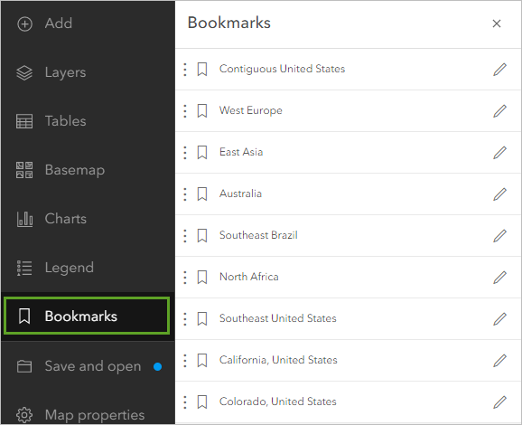
The map contains bookmarks of several regions globally where you'll analyze weather data. Bookmarks save specific map extents, and clicking them quickly navigates you to the saved extent.
- Contiguous United States
- West Europe
- East Asia
- Australia
- Southeast Brazil
- North Africa
- Southeast United States
- California, United States
- Colorado, United States
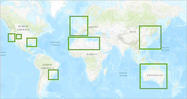
Note:
You can also add bookmarks for any other areas in which you're interested.
- In the Bookmarks pane, choose the Contiguous United States bookmark.
Note:
If necessary, beside the Settings (light) toolbar, click the Time button to remove the time line along the bottom of the map.
Now, you'll start to explore the weather data on the map. Understanding the data available will help you analyze it in future steps.
Explore weather data
There's a lot of data on your map. It's important to know what you're working with before starting analysis. Because this is real-time data, depending on the time of year and location you're analyzing, conditions and weather events may be different. You'll turn on the layers to visualize them and understand the type of data each contains.
- On the Contents toolbar, click Layers.
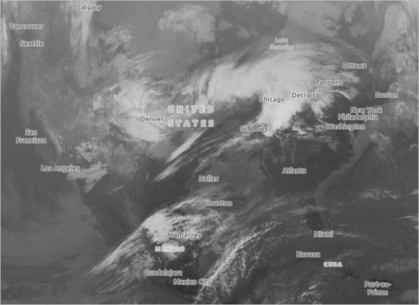
- In the Layers pane, scroll to the bottom of the layer list and click the Show NOAA Infrared Satellite Imagery button to turn on the layer.

The layer is visible on the map. You know this layer shows satellite imagery, but not much else. You'll open the layer's metadata to learn more.
Note:
Real-time data updates periodically. Your layers may differ from the example images.
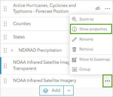
- In the Layers pane, for NOAA Infrared Satellite Imagery, click Options and choose Show properties.
- In the Properties pane, expand Information and click NOAA Infrared Satellite Imagery.
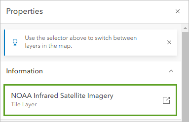
The layer's item description page appears in an external tab and shows its metadata.
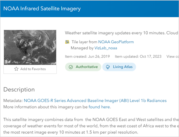
The item description page contains detailed descriptions of the agency responsible for the satellite, the sensors that produce the imagery, and how often it is updated (every 10 minutes).
The imagery not only shows what is visible to the human eye, but also infrared light. Infrared sensors help show the relative warmth of objects, which is important for determining the temperature of clouds. In this imagery, white clouds are colder, while dark clouds are warmer.
The layer completely covers all layers under it. Above this layer in the Contents pane is a second layer named NOAA Infrared Satellite Imagery Transparent. This is a copy of the layer with transparency applied so it's easier to see the basemap underneath. You'll be able to switch between the transparent and opaque versions of the layer as needed.
- Close the metadata tab and return to the Map Viewer tab.
- In the Layers pane, point to the NOAA Infrared Satellite Imagery layer and click the Hide NOAA Infrared Satellite Imagery button to turn off the layer.
- In the Layers pane, turn on the NEXRAD Precipitation layer.
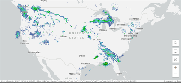
The metadata for this layer explains that this layer was created by combining reflectivity radar data from next-generation radar (NEXRAD) locations across the United States.
These radars work by sending out radar waves that reflect off precipitation. Based on how much of the radar's power is reflected, how long the signal took to return to the radar, and how much the radar's frequency changes, the radar can determine the location and intensity of precipitation. Areas that are blue or light green generally indicate light rainfall, while darker greens, yellows, oranges, and reds tend to indicate increasingly more severe rainfall.
The data does not extend far from the United States national boundaries and updates every four minutes.
- Turn off the NEXRAD Precipitation layer and turn on each of the Active Hurricanes, Cyclones, and Typhoons layers.
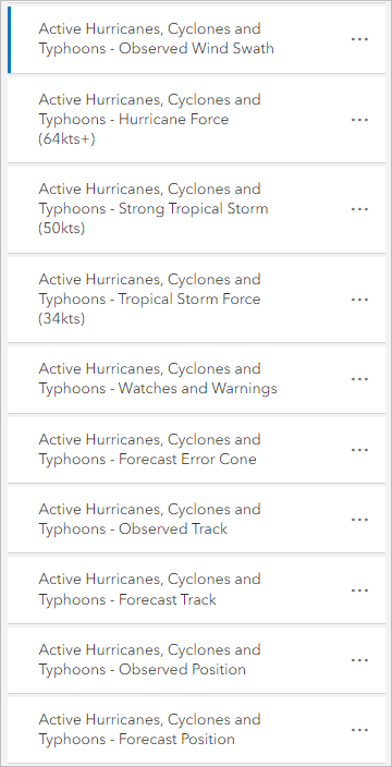
- On the map, pan and zoom until you locate an active hurricane.
Note:
Depending on the time of year when you take this tutorial, there may be no active hurricanes. The Atlantic and Northeast Pacific hurricane season goes from June through November, the Northwest Pacific Ocean goes from April through December, and the South Pacific Ocean and Indian Ocean go from November through April. If no hurricanes are active, you can skip the steps related to hurricane data.
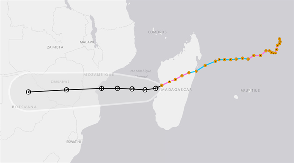
The orange points show the observed track of the tropical storm. The black points and text are the forecasted track of the tropical storm. The gray area indicates the possible margin of error in the forecast. The data was compiled by NOAA but is located on ArcGIS Living Atlas. The layer updates every 15 minutes.
Lastly, you'll look at data for wind speed and direction.
- Turn off all the Active Hurricanes, Cyclones and Typhoons layers and navigate to the Contiguous United States bookmark.
- In the Layers pane, turn on the Current Weather and Wind Station Data - Stations and Current Weather and Wind Station Data – Buoys layers.
These layers cover the world, although not uniformly. Each arrow or point represents either a weather station (on land) or a weather buoy (on water). The direction of the arrow indicates wind direction, while the color indicates speed.
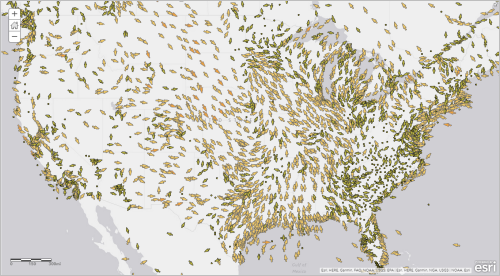
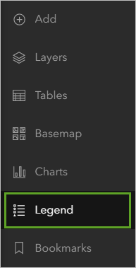
- On the Contents toolbar, click the Legend button.
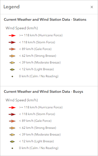
The legend indicates which arrow colors represent which range of wind speeds.
This layer is currently styled to show wind speed and direction, but it contains several other useful attributes, such as temperature and pressure.
- On the Contents toolbar, click the Layers button.
- In the Layers pane, for the Current Weather and Wind Station Data - Stations layer, click the Options button and click Show table.
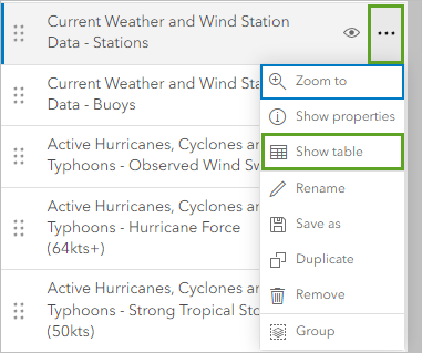
The table opens. It contains all the layer's attribute information. The table includes the Air Temperature and Altimeter Pressure fields.

To visualize these attributes, the Stations layer has been cloned twice.
- Close the table.
- Turn off the Current Weather and Wind Station Data - Stations and Current Weather and Wind Station Data – Buoys layers and turn on the NOAA METAR Pressure layer.
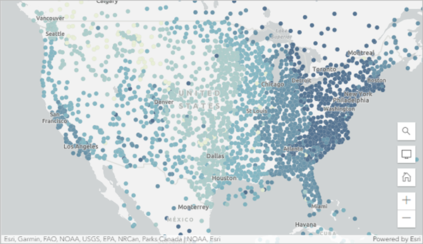
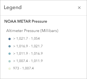
- Click the NOAA METAR Pressure layer to select it. On the Contents toolbar, click Legend.
Altimeter pressure is measured in millibars, and is an important predictor of precipitation and other weather. Low pressure causes air to rise, cool, and condense into rain clouds. High pressure causes air to flow down and heat up. In the northern hemisphere, air tends to move counterclockwise around a low pressure system and clockwise around a high pressure system (this trend is reversed in the southern hemisphere). Air pressure is usually between 1,000 and 1,030 millibars, but stations that did not report data are listed as 0.
- In the Layers pane, turn off the NOAA METAR Pressure layer and turn on the
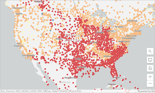
NOAA METAR Temperature layer. On the Contents toolbar, click Legend.
Temperature is in degrees Fahrenheit shown in five classes of data. In the example image, temperatures seem to be strongly affected by latitude (your temperatures may vary). At least in the United States, the hottest temperatures are in the south, with the coldest temperatures in the north. However, the correlation between temperature and latitude is not exact, and some states on the same latitude have much different temperatures.
Now that you've explored all the data on the map, you'll save a copy and begin your analysis.
Save a copy of the map
You've been exploring a map containing several layers of real-time weather datasets. Now, you'll save a copy of the map to keep your analysis work and any changes you make.
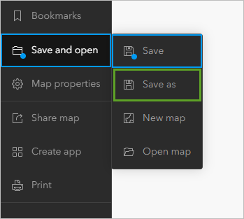
- On the Contents toolbar, click Save and open and choose Save as.
- In the Save map window, enter the following:
- For Title, type Real-Time Weather Map and add your initials so your map is unique within your organization.
- For Tags, type Precipitation, Air Pressure, Hurricanes, Wind Speed, and Wind Direction and press Enter after each tag.
- For Summary, type This map contains real-time weather data from NOAA.
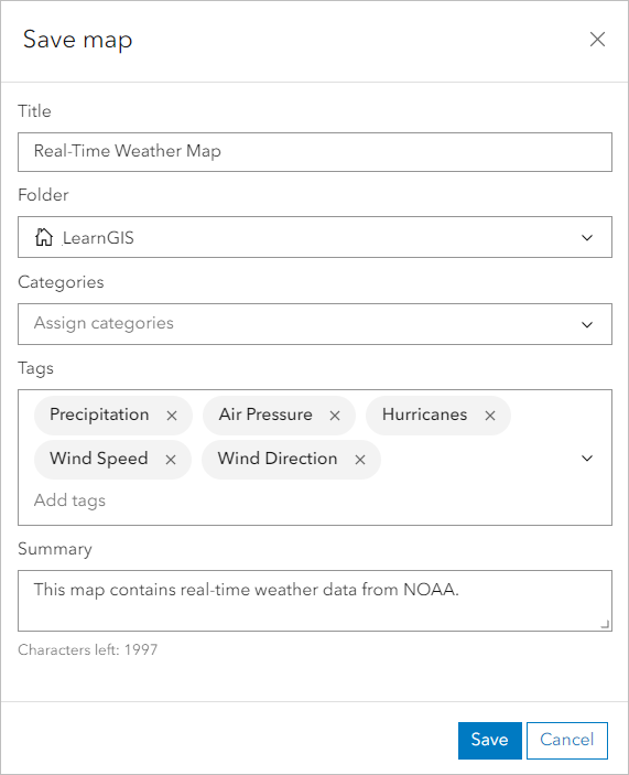
- Click Save.
You've created a map with a large amount of weather data, showing precipitation, hurricanes, wind speed and direction, pressure, temperature, and satellite imagery. This data is updated automatically by sensors and radars around the world. Next, you will use the weather real-time weather to make data-driven predictions.
Predict weather
Previously, you explored and saved a map of real-time weather data collected from satellites, radars, and weather stations around the world. You learned a little about how the data was collected and who collected it. Now, you'll go on a deeper exploration of your data and use what you learn to predict weather across time and space.
Explore temperature
First, you'll look for trends in your data. Accurate weather forecasting is dependent on seeing what patterns are happening now. You'll start by examining your temperature layer.
- If necessary, open your Real-Time Weather Map in ArcGIS Online.
The map opens to show NOAA METAR Air Temperature data for the contiguous United States. Temperatures seem to be strongly affected by latitude (your temperatures may vary). At least in the United States, the hottest temperatures are in the south, with the coldest temperatures in the north. However, the correlation between temperature and latitude is not exact, and some states on the same latitude have much different temperatures.
You'll explore worldwide to see what other patterns you can find.
- On the Contents (dark) toolbar, click Bookmarks and click the West Europe bookmark.
Most of western Europe is at the same latitude as Canada and the northern United States. For instance, London is at a similar latitude as Vancouver. Do the latitudinal trends that were apparent in the United States apply to Europe?
Although your map may vary, Europe is generally warmer than the United States at similar latitudes. Why might this be? Are there other trends you see when comparing the two?
- Navigate to the East Asia bookmark.
In eastern Asia, there are far fewer weather stations than in the United States or Europe. Although this dataset spans the world, that coverage is not uniform. Forecasts for areas with less weather data are likely to be less accurate than areas with more.
- Navigate to the Australia bookmark.
Australia is in the southern hemisphere, so its seasons are different than those in the northern hemisphere. For instance, when it's summer in the United States, it's winter in Australia, and vice versa. How might seasonal variations influence temperature?
- Navigate to the Colorado, United States bookmark.
- On the Contents toolbar, click Basemap. In the Basemap pane, choose Terrain with Labels.
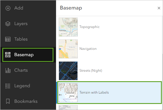
Colorado is on the border of the Rocky Mountains. The western half of the state is mountainous, while the eastern half is flat plains. Does altitude have a pronounced effect on temperature?
- Navigate around the world using your bookmarks and the pan and zoom tools. Change the basemap as necessary. Answer the following questions:
- Which areas have the most data? Which areas have the least?
- Name two areas where latitude is the most likely explanation for observed temperature.
- Name two areas that will likely experience much different temperatures three months from now. Name one area that will likely experience the same temperatures three months from now.
- Are there any areas where altitude is causing temperatures that aren't explained by latitude or seasonal variation?
- What effect might oceans and large water bodies have on temperature? How do temperatures tend to differ between coastal and inland areas at the same latitude?
- How does the temperature where you live compare to the temperature in the surrounding area? Does the recorded temperature match the temperature you're currently experiencing? If not, what might have caused the difference?
Next, you'll calculate statistics to find out the range of temperatures around the world.
- On the Contents toolbar, click Layers. In the Layers pane, for the NOAA METAR Temperature layer, click Options and click Show table.
- In the table, for the Air Temperature (°F) field, click Options and click Information.
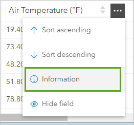
The Air Temperature field information window appears.
- In the window, scroll down until you see Statistics.
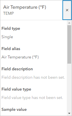
Your numbers will vary, but the range of temperatures will usually span over 100 degrees Fahrenheit, given seasonal and latitudinal variations around the world. Next, you'll locate the hottest and coldest areas.
- Close the Air Temperature field window. In the table, click the Air Temperature field twice to sort the values highest to lowest.
The table sorts so that the highest temperature is shown first.
- Scroll to the first row that has a value for the Country Name field. Click the check box next to the row and click Zoom to selection.
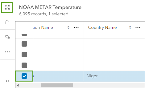
The map navigates to the selected station, which is currently the hottest in the world.
- Where is this station located?
- Why is this station so hot? Is it primarily hot because of latitude, elevation, or season?
Note:
If necessary, minimize the table to see the highlighted point on the map.
- Click the Air Temperature field to sort it from lowest to highest values. Navigate to the coldest temperature that has a value for the Country Name field.
Note:
When you sort the row in ascending order, the first few rows may have no value, meaning the station did not record a temperature the last time the data updated. You may need to scroll down the table until you find the coldest temperature.
- Where is this station located?
- Why is this station so cold? Is it primarily cold because of latitude, elevation, or season?
- Close the table.
Predict rain with wind and pressure
Next, you'll take a closer look at your precipitation and pressure data. In conjunction with your other data layers, you'll predict where rainfall might occur in the near future.
First, you'll compare current rainfall to wind patterns to see where the wind might cause rain clouds to travel in the near future. Then, you'll learn how pressure can affect precipitation and determine areas with high and low pressure systems.
- On the Contents toolbar, click Basemap and choose Topographic.
- Navigate to the Contiguous United States bookmark.
- In the Layers pane, turn off the NOAA METAR Temperature layer and turn on the NEXRAD Precipitation and NOAA Infrared Satellite Imagery Transparent layers.
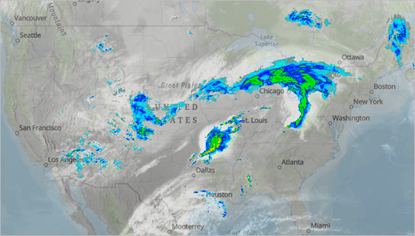
- Which areas are experiencing rainfall?
- What patterns do you see in the location of rainfall?
- How closely correlated are the clouds in the satellite imagery and the rain captured by radar?
- Turn off the NOAA Infrared Satellite Imagery Transparent layer and turn on the NOAA Infrared Satellite Imagery layer.
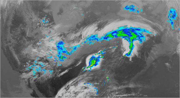
- Does precipitation tend to occur where the clouds are bright white (cold) or dark gray (warm)?
In general, warm clouds are lower to the ground and absorb moisture through evaporation. As they rise, they become colder, and the water vapor condenses into liquid droplets. This makes the cloud heavier, so it drops and releases the liquid in the form of precipitation.
- Turn off the NOAA Infrared Satellite Imagery layer. Turn on the Current Weather and Wind Station Data - Stations layer.
- Does wind speed have any relationship to current precipitation? If so, what is it?
- Name two spatial patterns that you observe about the current wind speed and direction.
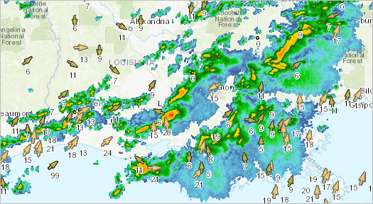
- Zoom to an area of heavy precipitation (dark green, yellow, orange, or red).
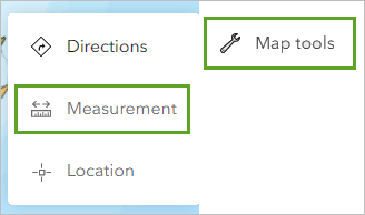
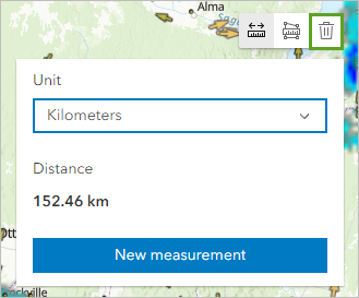
- Find a city that is currently dry but, based on wind direction, might experience rain soon. On the Settings (light) toolbar, click Map tools and choose Measurement.
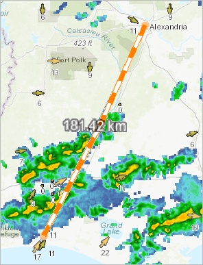
- Click a wind speed arrow near precipitation that is pointing toward the city you found. Then, double-click the city.
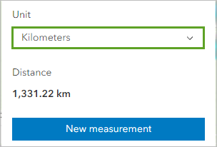
- In the window that appears, for Unit, click the drop-down menu and choose Kilometers.
In the example image, a southeastern arrow with a wind speed of 13 kilometers per hour is about 210 kilometers away from Tallahassee. At this rate, it would take about 16 hours for rain to reach the city. Additionally, other stations in the area record either no wind, slower wind, or wind that is more northern. It's possible the precipitation will pass north of the city altogether.
- How far away is rainfall from the city you found?
- How long would it take rainfall to reach the city, given the wind speed and direction?
- Are there other winds that might cause the rainfall to avoid your city?
- Overall, how likely would you say it is that your city receives rain?
Wind is not the only factor that influences precipitation. Pressure is also important. Low pressure causes air to rise, cool, and condense into rain clouds. High pressure causes air to flow down and heat up. In the northern hemisphere, air tends to move counterclockwise around a low pressure system and clockwise around a high pressure system (this trend is reversed in the southern hemisphere).
Based on your satellite imagery, precipitation, and wind speed layers, you'll predict where pressure is high and low.
- Above the measurement window, click the Clear measurement button.
- Navigate to the Contiguous United States bookmark and turn on the NOAA Infrared Satellite Imagery Transparent layer.
- Based on what you just learned about air pressure, where in the United States do you think air pressure is highest? Lowest?
You'll use the Add sketch tool to track your predictions.
- On the Settings toolbar, click Add sketch.
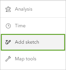
The Sketch pane appears along with a vertical bar of sketch tools.
- In the sketch tools list, click the Text tool.
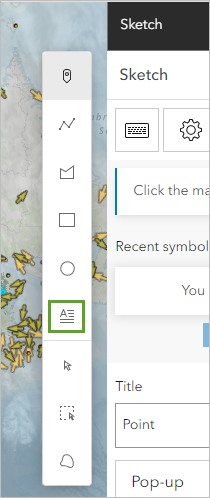
- Click a location of the map where you think pressure is high. In the Sketch pane, for Content, type H and for Size, type 45.
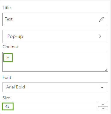
The map is updated.
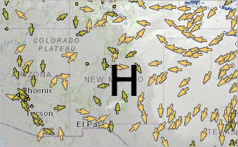
In the example image, central New Mexico was chosen as a possible area of high pressure due to its lack of rainfall, low-lying (dark-colored) clouds, and generally clockwise winds (although the wind does not move in a uniformly clockwise pattern).
Next, you will denote areas where pressure is low
- Click the map where you think the pressure is low. In the Sketch pane, for Content, change the text from H to L.
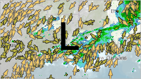
In the example image, Louisiana was chosen as a possible area of low pressure. Not only does it have high precipitation and high (white) clouds, but winds also move generally counterclockwise around it.
- Add two more map notes, one for another area of predicted high pressure and one for another area of predicted low pressure.
- Close the Sketch pane.
- In the Layers pane, for the Sketch layer, click Options and choose Rename. For Title, type Pressure Predictions and add today's date. Click OK.
Next, you'll turn on your pressure layer to see whether your predictions were accurate.
- In the Layers pane, turn off all layers except Pressure Predictions and turn on the NOAA METAR Pressure layer.
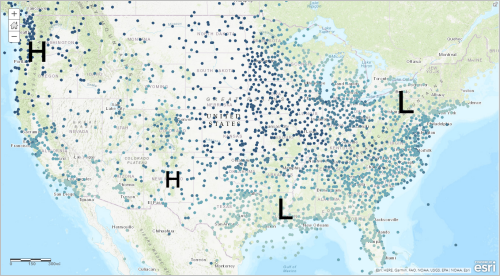
- How accurate were your predictions?
- Were there other areas of high or low pressure that you did not predict?
- Are there any areas of high or low pressure where you wouldn't expect them to be?
- Which areas may soon experience rainfall based on air pressure?
- Save the map.
Predict rain with temperature
You've predicted precipitation based on existing rainfall, wind direction, and air pressure. But there are more factors that influence rainfall, including heat and humidity.
The amount of water vapor that air can hold depends on its temperature (hotter air holds more). When air holds the maximum amount of water vapor possible, it becomes saturated. The water vapor begins to condense into tiny water droplets to remove it from the air. This condensation can lead to precipitation. Saturation can occur when hot air holding a lot of moisture cools suddenly.
Your temperature data contains a field named Dew Point Temperature. The dew point temperature is the temperature to which the air would have to cool to become saturated. Thus, the dew point temperature is a measure of how much moisture is in the air. If the dew point temperature is close to the air temperature, the air has a high relative humidity and may soon become saturated. When there is a large difference between the dew point and air temperatures, the air is dry.
To determine where the dew point and air temperature is close, you'll create an Arcade expression that changes the style. You can't create Arcade expressions for sublayers, so you'll first have to add a new version of the original wind speed and direction layer that only shows stations, not buoys.
- In the Layers pane, turn off the Pressure Predictions and NOAA METAR Pressure layers.
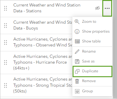
- For the Current Weather and Wind Station Data - Stations layer, click Options and click Duplicate.
- Rename the duplicate layer as NOAA METAR Dew Point Temperature Difference.
- If necessary, turn on the NOAA METAR Dew Point Temperature Difference layer and click it to activate it. On the Settings toolbar, click Styles.
- In the Styles pane, for Choose attributes, remove the Wind Speed (km/h) field.
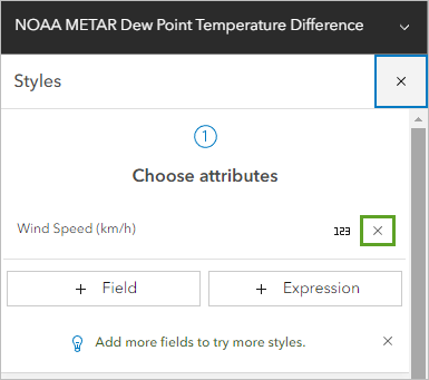
- Click the Expression button.
A window to create an Arcade expression appears. The expression you create will be simple. It will subtract the dew point temperature from the air temperature to find the difference between the two values. Then, it will determine whether that difference is greater or less than 4 degrees Fahrenheit.
If the difference is less than 4, saturation—and possibly precipitation—is close. If the difference is greater than 4, saturation is less likely to occur.
- Change the name of the expression to Dew Point Temperature Difference and click anywhere outside the box.
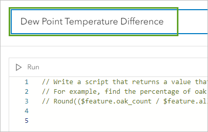
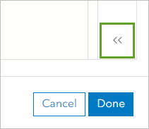
- Click the Expand button to view the side tabs.
- Click Profile variables and click the arrow next to $feature.
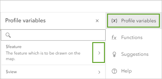
- In the Profile variables pane, under Values, click $feature.TEMP (you may need to scroll down).
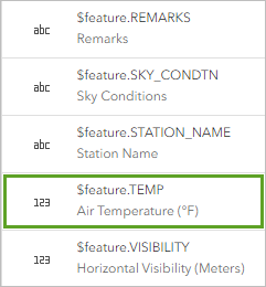
The $feature.TEMP value is added to the Expression box. In Arcade notation, it refers to the Air Temperature field.
- In the expression box, after $feature.TEMP, press the spacebar. Type - (the minus sign) and press the spacebar again.
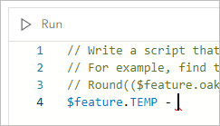
- In the Profile variables pane, scroll through the list of fields and click $feature.DEW_POINT.
Your expression now subtracts the dew point temperature from the air temperature. Next, you'll adjust the expression to determine whether the difference is less than 4.
- In the expression box, add parentheses around the existing expression. At the end of the expression, press the spacebar and type < 4.
The full expression reads ($feature.TEMP - $feature.DEW_POINT) < 4.

- Click Done.
The expression is saved and the map displays in the default symbology of counts and amounts (size). You will change the style to represent two different symbols.
- In the Style pane, for Pick a style, scroll down and choose Types (unique symbols).
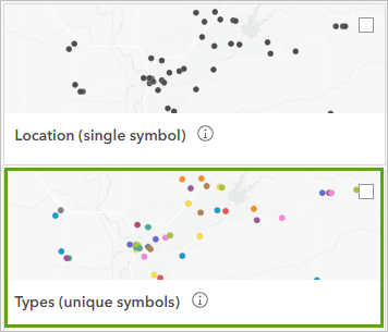
The symbology updates to reflect the change.
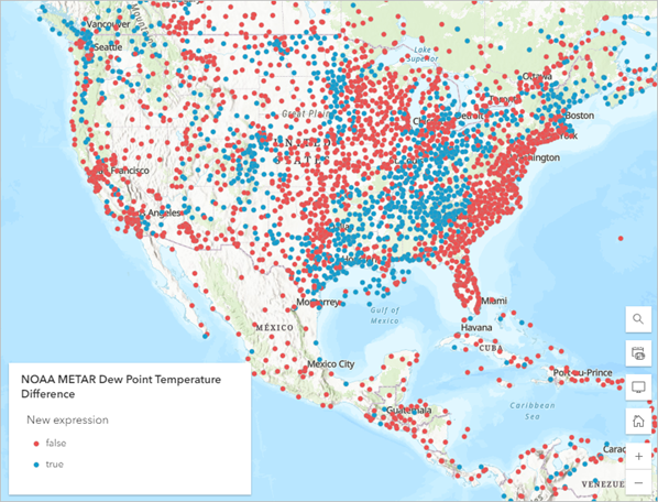
The map has two types of symbols: false (red) and true (blue). The expression you created is false when the difference between air and dew point temperature is greater than 4. It is true when the difference is less than 4. Blue points show areas that are close to saturation.
Note:
The number 4 was chosen because it was small, but if the difference is 6 or even 10 degrees, an area might still be at risk of saturation. For an optional challenge, in the Styles pane, click the Dew Point Temperature Difference button. Change your expression to find values where the difference is less than 6 or 10 degrees and compare your results to when the difference is less than 4 degrees.
- What patterns do you find?
- What differences exist between the various expressions, and what similarities?
- In the Styles pane, click Done.
- Is your dew point temperature difference expression a good predictor of precipitation?
- If you completed the optional challenge (see the note in the previous step), which expression seems to be the best predictor of precipitation?
- Based on the dew point temperature difference, which areas aren't currently experiencing precipitation but might soon?
It's difficult to compare both the dew point temperature difference and the air temperature at the same time because the layers mostly overlap. Another way to compare them is to label features.
Label based on temperature
Next, you'll label your dew point temperature difference layer with the air temperature at each point.
- In the Layers pane, turn on the NEXRAD Precipitation layer and ensure the NOAA METAR Dew Point Temperature Difference layer is selected.
- On the Settings toolbar, click Labels and ensure Enable labels is switched on.
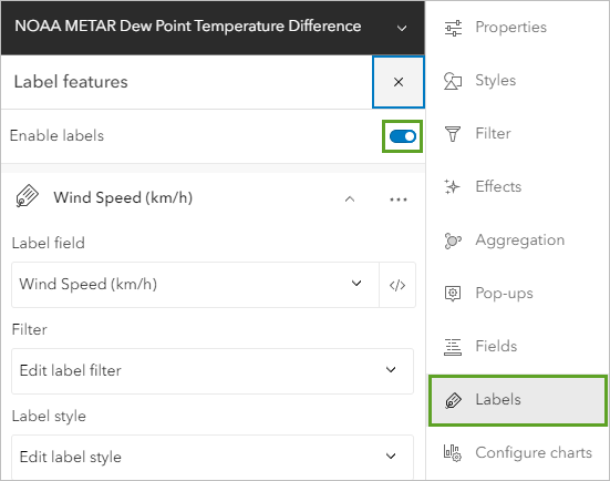
- For Wind Speed (km/h), click the Options button and choose Delete.

- Click Add label class.

- Under Station Name, for Label field, click the Station Name button. In the Replace field window, choose Air Temperature.
The labels have decimal places. You will change it to 0 decimal places using Arcade.
- Next to the Air Temperature field, click the Arcade button.
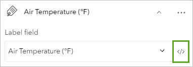
- Name the expression Air Temperature (No Decimals) and click anywhere outside the text box.
- In the expression box, remove the existing expression and type (or copy and paste) the following expression:
Round($feature.TEMP, 0)
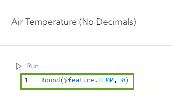
This expression will round the Air Temperature field to 0 decimal places. The labels may be too small to see, so you will increase their size.
- Click Done.
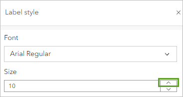
- For Label style, click the Edit label style button.
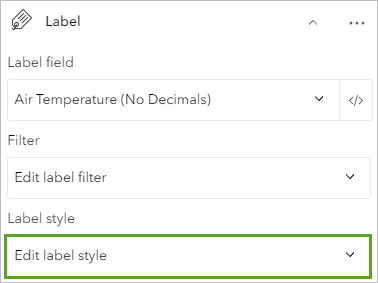
- In the Label style window, for Size, click the up arrow until you like the size of the labels displayed on the map.
- Close the Label style window and Label features pane.
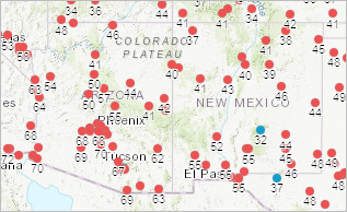
The decimals are removed from the labels on the map.
Note:
If you don't see the labels, adjust the Visible range slider to an appropriate scale.
In areas where many points are clustered (such as the area around Phoenix, Arizona, in the example image), some of the labels may not appear. If you zoom in, you can see all the labels.
- Explore the map to answer the following questions:
- Does air that is close to being saturated tend to be warmer or colder? Or is there no correlation?
- Does precipitation tend to occur more near cold air that is close to saturation or warm air?
You have used Arcade to remove the decimal places from labels and increased their size so that you can better see them on the map.
Examine hurricanes
Hurricanes are large storms that tend to form over the ocean. They can make landfall and cause property damage and loss of life, and they have strong winds, and often include precipitation and low pressure. Next, you'll examine your hurricanes layer and see what connection you can find between hurricanes and some of your other data layers.
Note:
Depending on the time of year you take this tutorial, there may not be any active hurricanes. If there are none, you can skip this section.
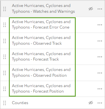
- In the Layers pane, turn off the NOAA METAR Dew Point Temperature Difference and NEXRAD Precipitation layers and turn on the following layers:
- Active Hurricanes, Cyclones and Typhoons – Forecast Error Cone
- Active Hurricanes, Cyclones and Typhoons – Observed Track
- Active Hurricanes, Cyclones and Typhoons – Forecast Track
- Active Hurricanes, Cyclones and Typhoons – Observed Position
- Active Hurricanes, Cyclones and Typhoons – Forecast Position
- Navigate around the map until you locate an active storm.
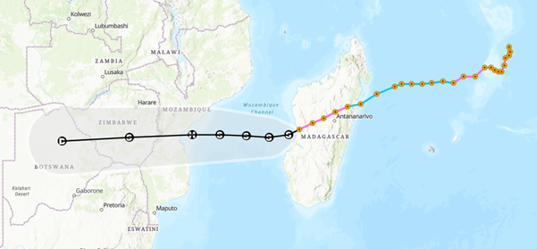
The example image shows Tropical Storm Chalane near Madagascar. Each orange point represents the storm's observed position on each day of its existence.
- On the Contents toolbar, click Legend.

- On the map, click any hurricane position point to view a pop-up with more information, such as the date and time of an observed or forecasted position.
- Based on the Observed Track, what kind of storm did the hurricane begin as? Has it gotten stronger or weaker over time? (In the legend, the symbols are ranked from weakest to strongest, with Hurricane5 being the strongest.)
- Based on the Forecast Position, what kind of storm will this storm become in the next few days? Will it become stronger or weaker than it currently is?
- Use the Measure tool to measure how far the storm has moved each day in kilometers.
- How fast is the storm moving in kilometers per hour? Has it sped up or slowed down over time?
- Return to the Layers pane. Turn on the NOAA Infrared Satellite Imagery Transparent layer and change the basemap to Light Gray Canvas.
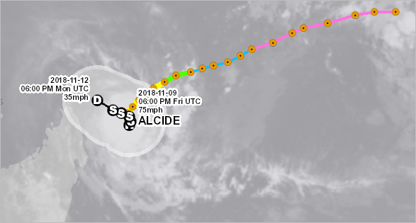
Depending on the time of year and particular day you take this tutorial, you may not have a clear view of the hurricane imagery. If so, use the example of Hurricane Alcide, which was off the coast of Madagascar in November 2018, to answer the following questions:
- Can you see the hurricane in the imagery? How big is it compared to the width of the hurricane track line?
- What is the shape of the cloud cover around the hurricane?
- If this hurricane makes landfall, about how much area will it cover?
- Return to the Contiguous United States bookmark. Turn off all the layers.
Interpolate temperature
So far, the weather predictions you've made have been about determining what weather will be like in the future. However, sometimes it's important to make predictions about what the weather is now in areas where no data is available.
Your temperature, pressure, and wind speed data all is derived from weather stations around the world. But there isn't a weather station covering every location worldwide. How can you know what the weather is in an area with no station? One way is to interpolate a surface. Interpolation estimates unknown values across space based on their proximity to known values. Basically, it uses the data you have to make guesses about the data you don't have.
You'll interpolate the temperature data for a defined geographic area, one with enough data that you can feel confident that your interpolation will be accurate but with enough gaps to make interpolation useful. For this exercise, you'll choose the state of California, in the United States. First, you'll filter your States layer to show only California.
- In the Layers pane, turn on the States layer and click the States layer to activate it.
- On the Settings toolbar, click Filter.
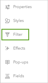
The Filter window appears. You'll create a simple expression so that only features with the name California are shown.
- In the Filter pane, click Add new.
- For Condition, keep the first value of STATE_NAME and leave the second drop-down menu unchanged. For the third drop-down menu, choose California.
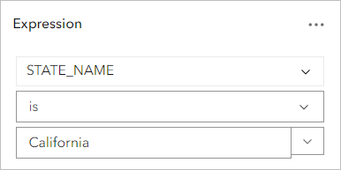
The expression reads STATE_NAME is California.
- Click Save and zoom in to California.
You navigate to the state of California, which is now the only state shown in the States layer.
- Turn on the NOAA METAR Temperature layer.
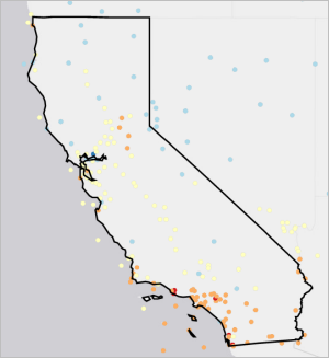
California has many weather stations along the southern coast (where Los Angeles and San Diego are located) and near the San Francisco Bay. In general, the number of stations tends to correspond to centers of population. But the eastern and northern parts of the state often have fewer stations. Using interpolation, you can estimate the temperatures in these areas.
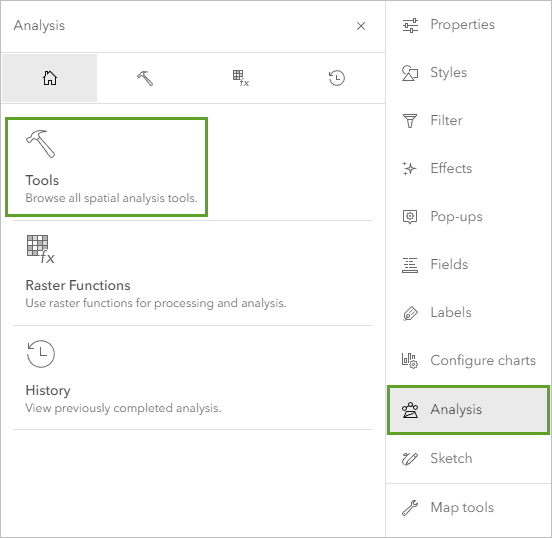
- On the Settings toolbar, click Analysis. In the Analysis pane, click Tools.
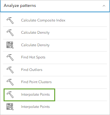
- In the Tools pane, expand Analyze patterns and click Interpolate Points.
The Interpolate Points pane appears. This pane contains options for how you want to interpolate your data.
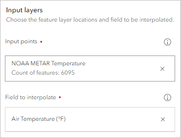
- For Input points, click Layer and choose NOAA METAR Temperature layer. For Field to interpolate, replace the default field by clicking it and choose the first Air Temperature attribute in the list.
You can also decide whether you want to optimize the interpolation process for speed or accuracy. By default, the tool does not prioritize one over the other, which is fine for your purposes. However, you want to change an option so that the interpolation is filtered to the state of California.
- Expand Optional layers. For Clipping polygons, click Layer and choose States.
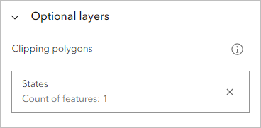
Because you filtered the layer to show only California, this will clip the interpolated surface to California too.
- Under Result layers, for Output features name, type California Temperature Interpolation and add the current date (numbers only, no special characters).
- Expand Environment settings and ensure Processing extent is set to Full extent.
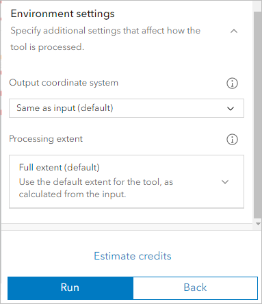
Before you run the tool, you'll estimate the number of credits that the tool will consume.
- Click Estimate credits.
The tool will consume about 6 credits.

- Click Run.
The tool runs and the layer is added to the map. Your result will look different than the example image.
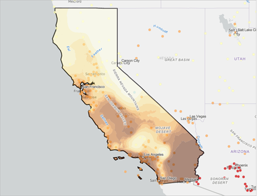
- Is there a relationship between temperature and proximity to the ocean? If so, what is it?
- California has some of the highest and lowest elevations in the United States. Is there a relationship between temperature and elevation? Try using a basemap that shows topographic features such as mountains to help answer the question.
- How well does your interpolated surface match the station temperature data?
- The Interpolate Points tool uses a statistical interpolation method called empirical Bayesian kriging. Based on the method's documentation, how confident are you in the accuracy of your interpolated surface?
- For an optional challenge, try creating an interpolated surface for atmospheric pressure or wind speed in California (you can do so by changing the Field to interpolate parameter of the Interpolate Points tool and typing a new name under Output features name). Additional credits will be consumed. What patterns do you see in the results? How do these patterns differ from the patterns you see in the interpolated surface temperature?
- Zoom to the northeastern corner of California. If necessary, in the Layers pane, drag the NOAA METAR Temperature layer above the California Temperature Interpolation layer so the station locations are more visible.
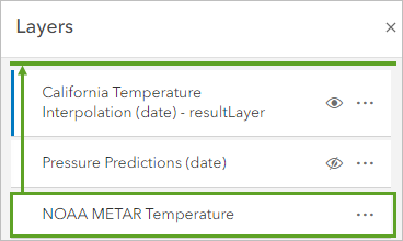
- How many weather stations are in this area?
- How confident are you in the predicted surface temperature here compared to the San Francisco Bay area? Why?
- Do you think the interpolated surface for this area would be much more accurate if your interpolated surface included data from the weather stations in Oregon and Nevada? Which area or areas in California might have more accurate interpolated surfaces if you included weather stations from neighboring states?
- For an optional challenge, try creating an interpolated surface temperature for the states of California, Nevada, Oregon, and Arizona (you can do so by adding expressions to the States layer filter). What differences do you notice?
- Navigate to the North Africa bookmark.
- If you were to create an interpolated surface of the country of Algeria, how confident would you be in it compared to the interpolated surface you created for California?
- Which areas around the world do you think would have the most accurate interpolated surfaces? Which would have the least accurate?
- For an optional challenge, try creating an interpolated surface temperature for the country of Algeria. What layer would you need to add to your map to create this interpolated surface? Where can you find this layer?
- Navigate to the California, United States bookmark. Turn on the Counties layer.
- Counties are subdivisions of states and generally much smaller. About how many weather stations are there per county?
- Would you be confident in an interpolated surface that was created for a single county?
- Navigate to the Contiguous United States bookmark. Turn off the States, Counties, and California Temperature Interpolation layers.
- Save the map.
You've now predicted the weather not only across time, but also space. Throughout this tutorial, you've learned how temperature, precipitation, pressure, and wind combine to create the temperature you experience. You answered questions about your data and performed statistical analysis on it to derive new insight.
You can apply many of the concepts you learned in this tutorial to any weather-related GIS workflow—or create your own workflow. What questions can you answer using your real-time data that weren't asked in this tutorial?
You can find more tutorials in the tutorial gallery.

