Create a policy map
Add data to your map
A policy map shows areas where policy intervention should occur. You'll create a policy map of Pasadena, California, that shows the five school zones with the most traffic accidents in which a pedestrian or cyclist was injured or killed. The city can then focus policy efforts on increasing safety in these areas.
Your map's subject is pedestrian and bicycle accidents in Pasadena, so you'll start by adding relevant data to a new map.
- Sign in to your ArcGIS organizational account or into ArcGIS Enterprise using a named user account.
Note:
If you don't have an organizational account, see options for software access.
- On the ribbon, click the Map tab.
Map Viewer opens.
- In the Layers pane, click Add.
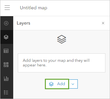
The Add layer pane opens. By default, the search is set to only look for data in your account. You'll add data hosted in the Esri Tutorials administrator account, prepared specifically for this tutorial. The data was originally compiled and uploaded by the City of Pasadena.
- Click My content and choose ArcGIS Online.
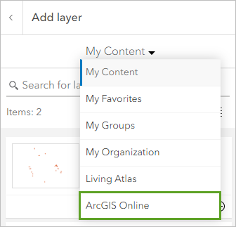
- In the search box, type Traffic Collisions. To limit the search, add owner:Esri_Tutorials.
- In the list of results, for Traffic Collisions, click the Add button.
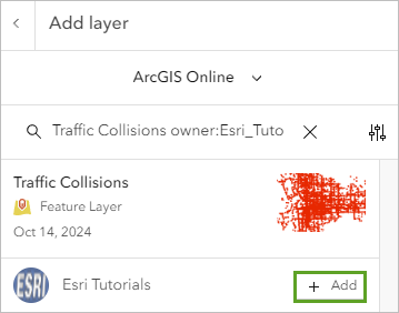
The layer is added to the map. The map zooms to the extent of the layer, which is Pasadena, California.
Note:
Depending on the size of your browser window, the default zoom extent may differ from the example images. If necessary, zoom the map in or out until you see all the data clearly.
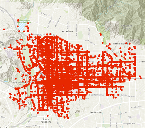
The layer shows all accidents that occurred in Pasadena during the past decade. With policy maps, it's essential to determine whether the dataset is a reasonable representation of reality. Any biases in the data can distort your results and lead to poorly informed policy.
In the example of traffic collisions, unreported accidents could be a potential bias. Because this data comes from the City of Pasadena municipal government, you know your data is an authoritative and accurate representation of traffic accidents.
Filter the data
Next, you'll filter the layer to show only accidents that involved a pedestrian or cyclist.
- In the Add layer pane, click the Back button.

The Layers pane includes the Traffic Collisions layer and your organization's default basemap. To filter a layer, you should first become familiar with its attribute information. You'll find out whether this layer has attributes that explain whether an accident involved pedestrians or cyclists.
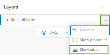
- For the Traffic Collisions layer, click the Options button and choose Show table.
The table opens. It contains the layer's attributes: additional information about the data on the map. Each row corresponds to a single accident, while each column is a field that includes a specific type of information.
- Scroll through the table until you find the InvolvedWith field.
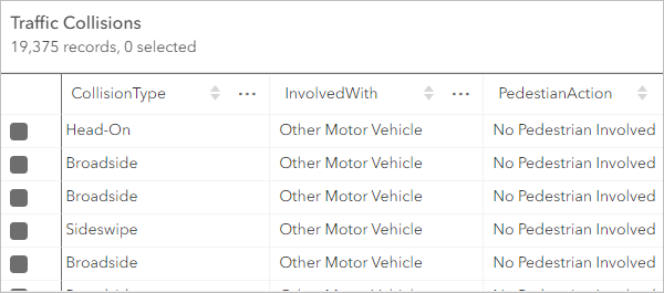
This field describes who was involved in the crash. It includes information about whether the crash involved a pedestrian, a cyclist, or another motor vehicle. You can use this field to filter your layer.
- Close the table.
- In the Layers pane, make sure the Traffic Collisions layer is selected. On the Settings (light) toolbar, click the Filter button.
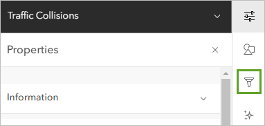
The Filter pane opens. To filter the layer, you'll create a logical expression that shows which type of features to display, based on attribute information.
- In the Filter pane, click Add new.
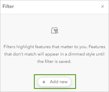
- Create the following expression:
- Click the first drop-down box and choose InvolvedWith.
- For the operator, the second drop-down, choose includes.
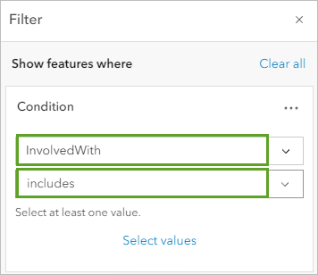
The includes operator enables you to choose more than one value for the filter. You are interested in collisions involving bicycles or pedestrians.
- Click Select values.
- Check the boxes for Bicycle and Pedestrian. Click Done.
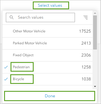
The expression reads InvolvedWith includes Bicycle, Pedestrian. It will filter the layer to show only crashes that involved a bicycles and pedestrians.
- At the bottom of the Filter pane,
click Save.
The data on the map is filtered. Only accidents involving either a cyclist or a pedestrian are shown.
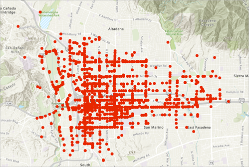
Filtering your data highlights the subject of interest. If you wanted, you could also create filters to show only data from a specific year or time period. A date filter could be used to compare accidents over time and show whether city policies are having a positive effect.
Uncover patterns
You've mapped accidents, but what patterns can be found in the data? Are there areas where particularly large clusters of accidents are occurring? It's helpful to display the data in different map styles to find trends.
Ways to find patterns in your data include point clustering, heat maps, and hot spot analysis. These methods all reveal where accidents are happening at abnormal rates. You'll map the accidents using all three methods to gain insight into your data.
First, you'll apply clustering to your points. Clustering groups points within a certain distance of one another into a single symbol, showing where many points are located close together.
- On the Settings toolbar, click Aggregation.
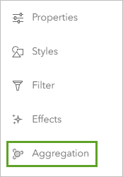
- In the Aggregation pane, click Clustering.
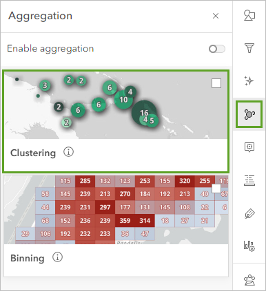
The symbols on the map are combined into clustered points. The larger the point, the more collisions the cluster represents. These cluster points were aggregated using default parameters; you can change the aggregation settings, labeling, and other properties of the cluster.
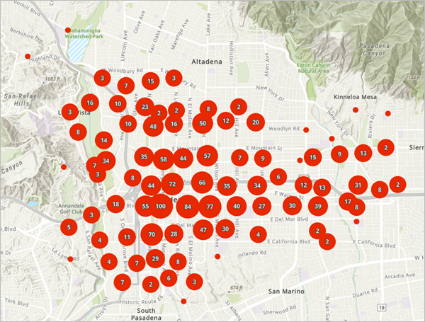
The areas with the highest clusters of accidents seem to be in the central part of the city. Labels on the points show how many features each cluster point represents.
- For Clustering, click Options.
- For Cluster radius, drag the slider to show clusters of more or fewer accidents.
At less clustering, large clusters may represent as few as 10 accidents, while at more clustering, they may represent as many as 472. While clustering does tend to show patterns of where points are located in higher densities, the degree of clustering can change where those patterns seem to appear.
For instance, at some levels of clustering, the eastern side of Pasadena seems to have a high cluster of accidents, while at other levels, it does not.
- In the Clustering pane, click Back. Turn off Enable aggregation.
Next, you'll create a heat map of accidents. A heat map also shows where points are more densely located, but using color instead of symbol size.
- On the Settings toolbar, click Styles.
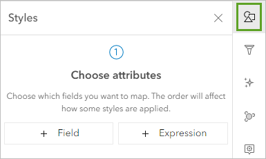
In the Styles pane, you can choose different styles for your data. The collision data is currently showing just the location of traffic accidents, so you have two options: Location (single symbol) or Heat Map.
- Under Pick a style, click Heat Map.
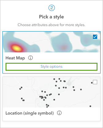
The drawing style is automatically applied to the map.
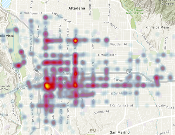
Like the clustered points, the heat map indicates a high density of accidents in central Pasadena. However, the heat map particularly emphasizes the area south of the Foothill Freeway, corresponding to downtown.
Although it may seem like the bright yellow areas are areas to focus policy, a heat map is not a policy map. A policy map takes a stand and explicitly indicates areas where policy should be focused. You still don't have enough information to make a claim like that. It's possible another way of exploring patterns will provide new information about the data.
- In the Styles pane, click Cancel.
The last way you'll explore patterns is through hot spots. Hot spots are statistically significant clusters in spatial data. While a heat map only shows accident density, a hot spot map uses statistical analysis to compare where concentrations are high and low relative to other areas. To create hot spots, you must run an analysis tool on your data.
- On the Settings toolbar, click Analysis.
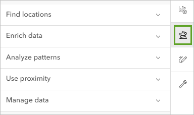
The Analysis pane opens.
- Click Tools.

- Expand Analyze patterns. Click Find Hot Spots.
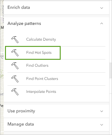
The tool requires a few parameters. You'll set the layer you want to calculate hot spots for and change the default parameters so that the hot spots are shown in the form of hexagonal bins. Any parameters marked with a red dot are required to run the tool.
- For Input layer, click Layer and choose the Traffic Collisions layer.
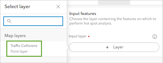
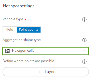
- For Hot spot settings, leave Variable type set to Point counts. For Aggregation shape type, choose Hexagon cells.
- Under Result layer, change Output name to Traffic Collision Hot Spots and add your name of initials.
Note:
You cannot create two layers in an ArcGIS organization with the same name. Adding your initials to a layer name ensures that other people in your organization can also complete this tutorial. Once a layer has been created, you can rename it in the map to remove your initials, which will not affect the name of the underlying data layer.
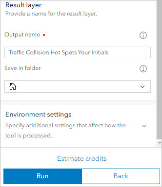
Some analysis tools require service credits to run. To find out how many your analysis will cost, you can estimate the amount of credits needed. In many cases, such as with the Find Hot Spots tool, the number of features in your input layer will be multiplied by the cost of running the tool.
- At the bottom of the pane, click Estimate credits.
Running the tool will require about 2 credits.
- Click Run.
The tool takes about a minute to run. When it finishes, the hot spots layer is added to the map.
- In the Layers pane, point to Traffic Collisions and click the Hide Traffic Collisions button.
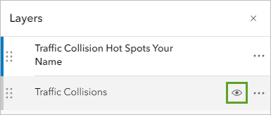
On the map, only the hot spots layer is displayed.
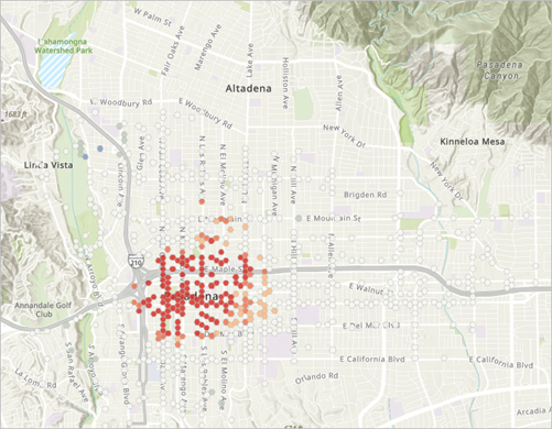
The red hexbins show areas of spatially significant clustering, while white hexbins show areas with no significant clustering. There are no blue areas on the map, but if there were, they would represent areas with statistically low clustering. The map indicates that accidents happen statistically regularly across the city, but with a statistically significant clustering in the downtown area.
These results all point to patterns of high accidents in downtown. You now have a better understanding of the data.
- Point to the Traffic Collision Hot Spots layer and click Hide Traffic Collision Hot Spots. Turn the Traffic Collisions layer back on.
Configure layer style
Next, you'll change the symbols of your accidents layer to show different categories of accidents. In particular, you want to distinguish fatal accidents from accidents with only injuries. You also want to distinguish pedestrian accidents from bicycle accidents. This information adds more detail to your findings and helps support policymaker decisions on your subject.
To create these four symbol categories, you'll use an Arcade expression. Arcade expressions use attribute information to determine style.
- In the Layers pane, click Traffic Collisions to select it.
- On the Settings toolbar, click Styles.
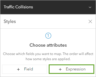
- In the Styles pane, for Choose attributes, click Expression.
An Arcade expression editor window opens. The default name for the new expression is New expression.
- Delete the default name and type Collision Type.
For the first part of your expression, you'll create variables that represent the four categories you want to symbolize. Each variable will refer to an attribute field that contains information about the category. The first variable will be for accidents that involved pedestrians and cyclists.
- In the expression editor, on line 1, type var type = .
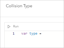
In Arcade, var means variable. The word type is the name of the variable, which you choose. Next, you'll choose the attribute field that defines this variable. As you learned when you looked at the data's table, the InvolvedWith field includes information on whether pedestrians or cyclists were involved in the accident. There are two ways to add variables to an expression. First, you'll use the Profile variables tab. The Profile variable method is good to use when you're not sure of the Arcade syntax, or want to see the entire list of variables available.
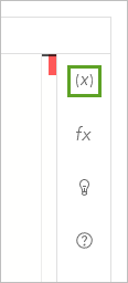
- Click the Profile variables button.
- In the Profile variables pane, click the arrow next to $feature.
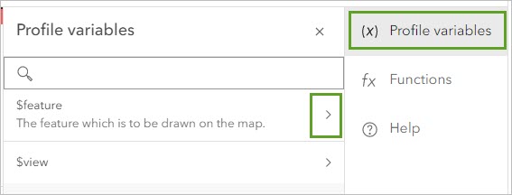
- Scroll through the list of fields and click $feature.InvWith.
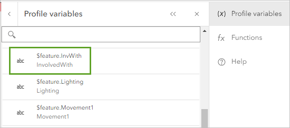
The field is added to the expression.
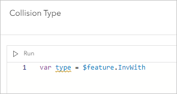
This variable can be used for both pedestrians and cyclists, so you only need to create two more variables, one for fatalities and one for injuries. The NumberKilled and NumberInjured fields contain information relevant to these variables. Now that you know the syntax for adding a variable, you'll add them directly through the expression editor.
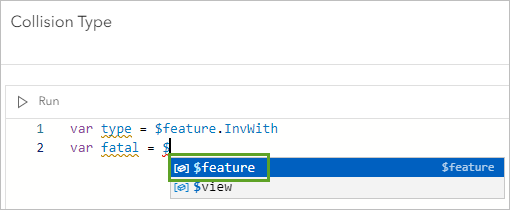
- Click the end of the line and press Enter. On line 2, type var fatal = $. In the autocomplete suggestions, choose feature.
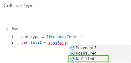
- After $feature, type a period (.). In the autocomplete suggestions, choose NoKilled.
- Create another variable named injured and set the field as NumberInjured.
Tip:
If you have difficulty creating the expressions, you can copy and paste the following text:
var fatal = $feature.NoKilled
var injured = $feature.NoInjured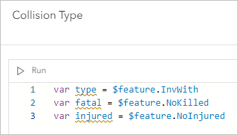
These three variables represent the four types of attributes you want to depict on the map. However, these variables aren't exclusive. Accidents involving pedestrians or cyclists likely also have injuries or fatalities. There are four combinations of the type, fatal, and injured variables:
- Accidents involving a pedestrian and a fatality
- Accidents involving a pedestrian and an injury
- Accidents involving a cyclist and a fatality
- Accidents involving a cyclist and an injury
To account for these combinations, you'll create a function.
- Press Enter twice. On line 5, type When (.
A When function indicates that when certain conditions are met, a specific symbology category will be used. First, you'll create a symbology category for pedestrian fatalities.
- Type type == "Pedestrian" && fatal == "1", "Pedestrian Fatality".

The syntax of this function may seem confusing, but all it says is that when the type variable equals Pedestrian and the fatal variable equals 1 (meaning one fatality), a category named Pedestrian Fatality is used.
You'll add more lines to the When function for the other categories.
- Type a comma and press Enter. Add the following lines to the expression inside the parentheses:
type == "Pedestrian" && injured != "0", "Pedestrian Injury",
type == "Bicycle" && fatal == "1", "Bicycle Fatality",
type == "Bicycle" && injured != "0", "Bicycle Injury",
null
Note:
The part of the expression that reads injured != "0" indicates that any number of injuries that isn't 0 will fulfill the condition. This syntax is necessary because some accidents have two or more injuries. However, no accident in your data involving a cyclist or pedestrian has more than one fatality, so fatal == "1" will include all accidents that had a fatality. Details like these are why it's important that you understand your data before creating a policy map.
- Click Done.
- In the Styles pane, under Pick a style, click Types (unique symbols).
The expression is used to symbolize the accidents. Each category has a different symbol.
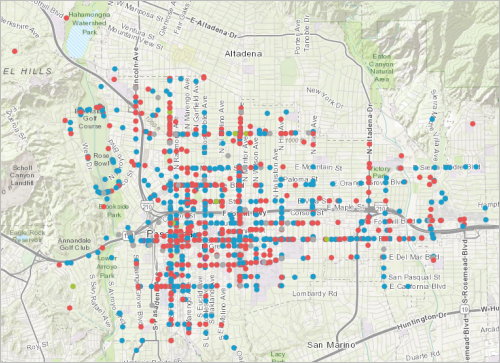
In addition to the four categories you specified, there is a fifth category named Other (gray symbols). This category includes any accidents that didn't fulfill the conditions for any of the categories you created. These accidents are likely those that had neither injuries nor fatalities.
Next, you'll make the symbols more visually distinct.
Configure style by category
You'll change fatal accidents to have a larger symbol, while you'll distinguish between pedestrian and cyclist accidents with color. You'll also remove the Other symbols, as these accidents are probably minor and shouldn't affect policy.
- In the Styles pane, for Types (unique symbols), click Style options.
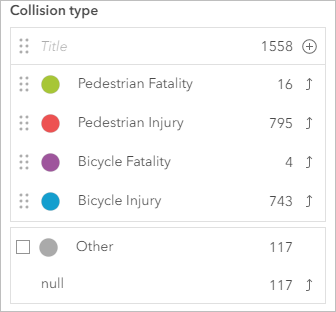
The pane changes to show a list of the categories and their symbols.
- Turn off Other.
- Drag the three dots to the left of each symbol to rearrange them in the following order:
- Pedestrian Fatality
- Pedestrian Injury
- Bicycle Fatality
- Bicycle Injury
- Click the Pedestrian Fatality symbol.
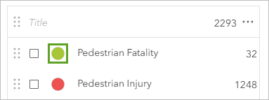
The Symbol style window opens with symbol options. You'll make the symbol red and increase its size.
- Click Fill color. In the Select color window, change the hexadecimal value to ff4040.
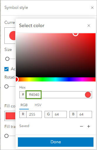
- Click Done.
- Under Basic point, uncheck Adjust size automatically. Change Size to 15 px.
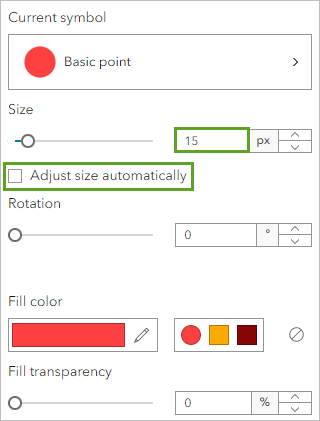
- Close the Symbol style window.
- Change the remaining symbols with the following parameters:
- For Pedestrian Injury, set the fill color hexadecimal value to ff4040 and the size to 3 px.
- For Bicycle Fatality, set the fill color hexadecimal value to ffaa00 and the size to 15 px.
- For Bicycle Injury, set the fill color hexadecimal value to ffaa00 and the size to 3 px.
The fatalities receive a larger symbol size to indicate the difference in severity between injuries and fatalities.
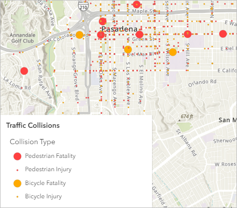
- In the Style options pane, click Done twice.
Lastly, you'll change the basemap so that the symbols stand out more.
- On the Contents (dark) toolbar, click Basemap. In the Basemap pane, choose Dark Gray Canvas.
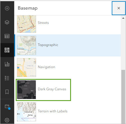
The basemap changes automatically.
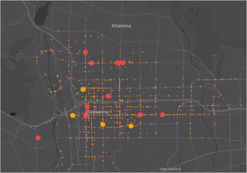
Now, the accidents stand out because the points are not competing with the basemap colors. There is also a clear distinction between bicycle and pedestrian accidents.
Add school areas
When it comes to policy decisions, hot spots and heat maps don't provide much context and make no explicit claims about the data. Because your subject is not only accidents but accidents near schools, you'll add a layer of Pasadena Unified School District (PUSD) schools to your map. Later, you'll find areas within a half-mile walking distance of each school.
- On the Contents toolbar, click Add and choose Browse layers. Click My content and choose ArcGIS Online.
- In the search box, type PUSD Schools owner:Esri_Tutorials. In the list of results, for the PUSD Schools layer, click the Add button.
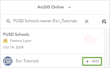
The layer of schools is added to the map. By default, the schools have red point symbols that can be difficult to distinguish from the accident points. You'll change the symbol so the schools stand out more.
- On the Contents toolbar, click Layers. In the Layers pane, make sure PUSD Schools is selected.
- On the Settings toolbar, click the Styles button. For Location (single symbol), click Style options.
- Click Symbol style.
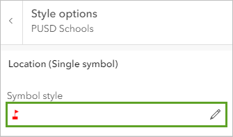
- In the Symbol style window, for Current symbol, click Basic point. Click the square symbol.
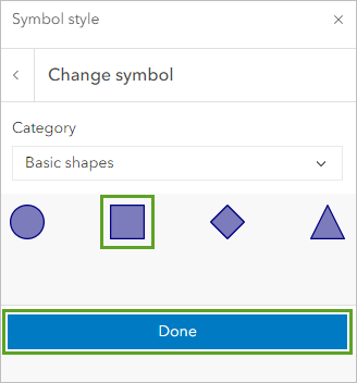
- At the bottom of the Symbol style window, click Done.
The square shape will be distinguishable from the circle shapes of the accidents. You'll also change the color to white so the symbols stand out against the dark basemap.
- Click Fill color. In the Select color window, change the hexadecimal value to ffffff and click Done.
- For Fill transparency, type 40.
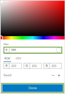
- Set the following parameters for the outline:
- For Outline color, confirm the color is #FFFFFF.
- For Outline transparency, type 0.
- For Outline width, type 2.
- Close the Symbol style window.
The symbol is applied to the map.
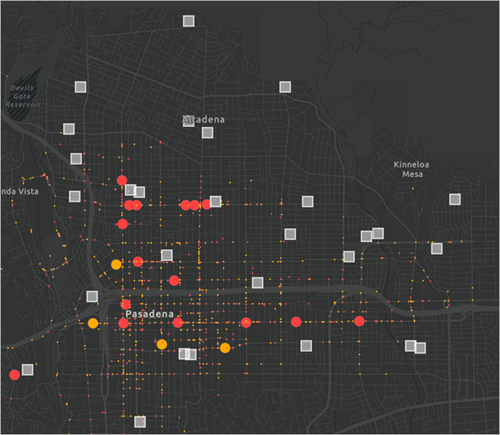
The schools now stand out and can be distinguished from the accidents.
- In the Style options pane, click Done twice.
Create travel areas
Next, you'll create the walk-time areas around each school. You'll later be able to calculate the number of collisions near each school.
- On the Settings toolbar, click Analysis. Click the Back button to return to the list of tools.
- Expand the Use proximity group and click the Generate Travel Areas tool.
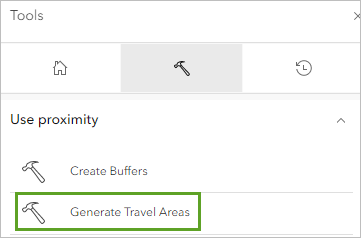
This tool uses road network data to create areas that can be reached within a specific driving or walking distance or time. Creating areas within a half-mile walking distance of schools will show places where there are likely large numbers of student pedestrians.
- For Input layer, click Layer and choose the PUSD Schools layer.
- For Analysis settings, set the following parameters:
- For Travel mode, choose Walking Distance.
- For Cutoffs, type .5 and press Enter.
- For Cutoff units, choose Miles.
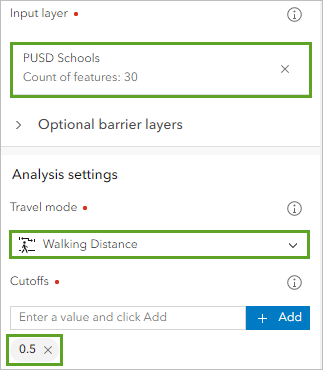
If school areas overlap, you want to keep them as distinct features. That way, you'll still be able to calculate the number of accidents in each area.
- For Overlap policy, confirm that Overlap is chosen.
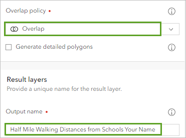
- For Output name, type Half Mile Walking Distances from Schools and add your name or initials.
- Click Run.
Note:
Running this tool will require 15 credits.
The tool may take a few moments to run. After it finishes, the walk-time areas are added to the map. Most are centered around a school.
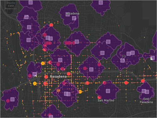
You'll rearrange the order of layers so the walk-time areas appear under the schools and accidents layers.
- In the Layers pane, drag the Half Mile Walking Distances from Schools layer under the Traffic Collisions layer.
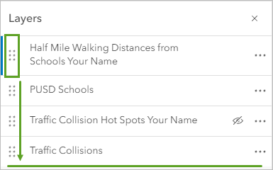
You'll also change the layer style to make the areas more transparent and have a white color that matches the schools.
- If necessary, click the Half Mile Walking Distances from Schools layer to select it. On the Settings toolbar, click Styles.
- For Location (single symbol), click Style options.
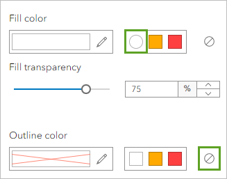
- Click Symbol style. In the Symbol style window, change Fill transparency to 75 percent.
- For Fill color, click the white color from the recent colors group. For Outline color, choose No color.
- In the Styles pane, click Done twice.
The new style is applied to the map.
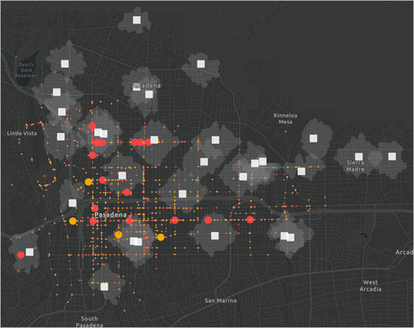
Some school areas have no pedestrian or cyclist accidents, while others have a significant amount. At the same time, the area with the highest density of accidents is not within any school area. Adding more information beyond a heat map has provided essential context for policymakers.
Find the most dangerous school areas
You could stop your analysis here, and use this map as grounds to implement a policy that encompasses all school zones. Changing street signs and adding bicycle lanes in these areas may reduce accidents near schools.
However, sometimes a city does not have enough funds to enact new policy for every location. Many Pasadena school zones have few accidents, so policies in these areas may have little effect. Instead, policymakers want to focus their efforts on areas that need it most.
You'll calculate the number of accidents within each school zone and filter the layer to show only the five most dangerous zones. Then, policymakers can prioritize these zones over zones that are already relatively safe.
- On the Settings toolbar, click the Analysis button. Click the Back button to return to the list of tools.
- In the Summarize data group, click the Summarize Within tool.
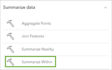
This tool summarizes the number of point features within a polygon feature.
- For Input features, click Layer and choose Traffic Collisions.
- For Summary polygon layer, choose Half Mile Walking Distances from Schools.
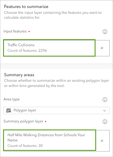
You only want to know the count of points in each polygon, so you don't need to add any other statistics or group by an attribute field.
- For Output name, type Five Most Dangerous School Zones and add your name or initials.
- Click Run.
Note:
Running this tool requires about 2 credits.
The tool runs and the layer is added to the map. The information about the number of accidents in each school zone is located in the layer's table.
- In the Layers pane, for the Five Most Dangerous School Zones layer, click the Options button and choose Show table.
- Scroll to the Count of Points field. For the field, click the Menu button and choose Sort descending.
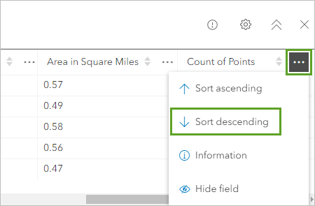
The table is sorted so that school zones with more accidents are shown first. The first five school zones have accidents totaling 216, 216, 117, 95, and 92.
The sixth-highest school zone has 91 accidents, which is not much fewer than the fifth highest. With this information, you might consider expanding policy to include this school zone as well. Alternatively, depending on your city's resources, you may want to limit policy to focus only on the three most dangerous school zones, which have a much higher number of accidents than the fourth.
For this scenario, you'll continue to focus on the five most dangerous school zones. You'll filter the layer to show only these zones.
- Close the table. On the Settings toolbar, click the Filter button.
- In the Filter window, click Add new. Create the expression Count of Points is at least 92.
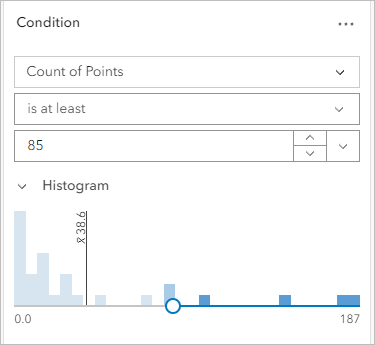
This expression will filter the layer to show only school zones with at least 92 accidents. Because the fifth most dangerous school zone has 92 accidents, only the top five will be shown.
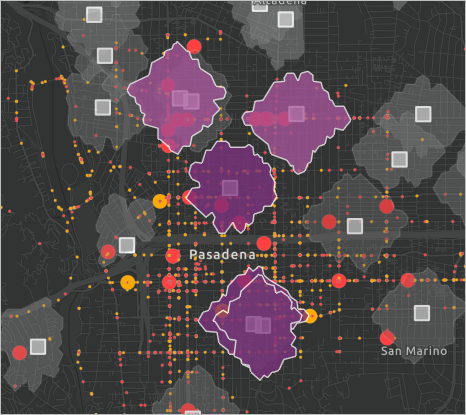
- At the bottom of the Filter pane, click Save.
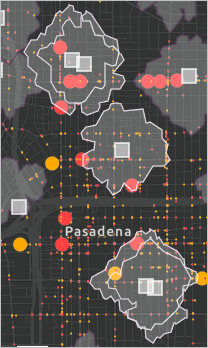
All five of the most dangerous school zones are relatively close to one another. Two of the most dangerous zones almost overlap entirely, which means the city can increase safety for both schools with many of the same policy decisions.
The default drawing style of the dangerous school zones layer includes a point sized proportionally to the number of accidents in the zone. This symbol distracts from your other point data, so you'll change the drawing style.
- On the Settings toolbar, click Styles. In the Styles pane, for Choose attributes, delete Count of Points.
The drawing style changes. The dangerous school zones are now shown with a single fill color. You'll remove the fill color and change the outline.
- For Location (single symbol) click Style options.
- Click Symbol style. Set the following parameters:
- For Fill color, click No color.
- For Outline color, choose white (FFFFFF).
- For Outline transparency, type 0.
- For Outline width, type 2.
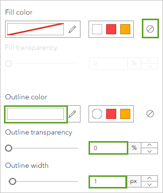
- In the Styles pane, click Done twice.
The layer is styled.
Clean up and save the map
Lastly, you'll rename some of the layers to remove your name or initials or add clarity. You'll also remove any unused layers. Then, you'll save the map.
- In the Layers pane, for the Five Most Dangerous School Zones layer, click Options and choose Rename.
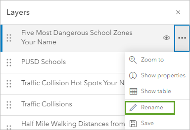
- Remove your name or initials from the layer name. Click OK.
- Rename the Half Mile Walking Distances from Schools layer the same way.
You'll also rename the PUSD Schools layer. Users may not be familiar with the acronym, and the school district is less important than the geographic location of the schools.
- Rename PUSD Schools to Schools.
You did not use the hot spots layer in your policy map. You'll remove this layer (it will still exist in your account's contents if you want to use it).
- In the Layers pane, for Traffic Collision Hot Spots, click the Options button and choose Remove.
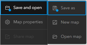
- On the Contents toolbar, click Save and open and choose Save As.
- In the Save map window, set the following parameters:
- For Title, type Pasadena Traffic Collisions.
- For Tags, type Pedestrians, Bicycles, Schools, Pasadena, and California, pressing Enter after each tag.
- For Summary, type This map displays traffic collisions in Pasadena, California.
- Click Save.
You've created a map that highlights five school zones that would benefit from policy intervention. Instead of only showing data point locations, your map takes a position on which areas are in the most need of help. Depending on how you want to share the map with the community, your next steps could be to build an app using one of the ArcGIS Instant Apps templates, or to create a story using ArcGIS StoryMaps. To see how these are built, see Create an app or Get started with ArcGIS StoryMaps.
Policy mapping is about using GIS to discover problems around you, understand them from a geographic perspective, investigate data, personalize your understanding of the issues involved, view possible points to intervene, and track progress in improving the situation. You can take the practices you learned in this tutorial and apply them to any policy map you may want to make. Start by defining your subject. Then, find authoritative spatial data relevant to the subject. Add more data for context and analyze patterns. From traffic accidents to demographic distribution, similar techniques apply.
You can find more tutorials in the tutorial gallery.
