Create a real-time web map
The first step to creating your real-time app is to make a web map with the necessary real-time data. The city's public works department already collects real-time data on its snowplow fleet using automatic vehicle location (AVL) devices. These devices are installed on each snowplow and transmit GPS coordinates from the vehicle to a receiver at the city office. You'll add this data to a web map and symbolize and label it appropriately to clearly communicate important information to users.
Add real-time data
The local government's real-time feature layers are updated periodically by ArcGIS GeoEvent Server, which connects real-time data streams (such as those transmitted by the AVL devices in each snowplow) to feature services hosted on ArcGIS Online and ArcGIS Enterprise. You'll add each of the three real-time feature layers to a new web map.
Note:
This tutorial won't go into detail about how to create real-time feature services using GeoEvent Server. You can learn more with the tutorials provided in the ArcGIS GeoEvent Server Gallery.
- Sign in to your ArcGIS organizational account.
Note:
If you don't have an organizational account, see options for software access.
- On the ribbon, click the Map tab.

The Map Viewer opens with a thematic basemap. Next, you'll search for and add the city's three real-time layers involving snowplows and streets.
- In the Layers pane, click Add.

The Add layer pane appears.
- In the Add layer pane, click the My Content drop-down arrow and choose ArcGIS Online.
- In the Search text box, type Vehicles (Latest). Then type owner:Esri_Tutorials_GE in the search box to limit your search to layers owned by the Esri_Tutorials_GE account.

The search returns the Vehicles (Latest) layer. This layer contains point features that will display the latest recorded location of each snowplow. When the snowplows change locations, their AVL devices transmit their GPS coordinates to GeoEvent Server. Once the layer is configured appropriately, it will automatically update with the newest coordinates.
- For Vehicles (Latest), click the Add button. Zoom in closer to the features around Salt Lake City, Utah.

The vehicles are represented by colored triangles. Orange triangles represent snowplows, and blue triangles represent pickup trucks with plows attached. Each of the five vehicles have a corresponding symbol on the map. Currently, the locations of the symbols do not update in real time, because you haven't changed the settings to enable the layer to do so. First, you'll add the remaining layers to the map. Then you'll update the refresh interval for the layers.
- In the Add layer pane, change the search string to Vehicles (Past) owner:Esri_Tutorials_GE.

- From the search results, for the Vehicles (Past) layer, click the Add button.

The vehicles' previous locations are represented by colored circles. As before, orange represents snowplows, and blue represents pickup trucks. As with the other layer, this layer is not yet enabled to update in real time. Additionally, the large number of circles obscures the triangles that represent the most recent location of each vehicle. Later in this tutorial, you'll change the symbology of one of the layers to make each more distinct. Before then, you have one more layer to add.
- In the Add layer pane, search for and add the Street Plowed Status owner:Esri_Tutorials_GE layer.

The Street Plowed Status layer is added to the map.

This layer contains features that represent major streets in the area. Each street is symbolized based on whether it has been plowed (green), has not been plowed (red), or is in progress of being plowed (yellow). Although the features look like lines, they are actually polygons. To detect whether a snowplow has entered or exited a particular street section, the original street centerline data was buffered with a chosen distance. That way, even if a snowplow isn't located on the exact center of each street, it'll still register as having been on the street. The buffers were added to GeoEvent Server as geofences, or geometric boundaries that trigger a response if something enters their area. In this case, streets are marked as either plowed, not plowed, or in progress, depending on whether snowplows have crossed or are currently crossing the geofences.
- In the Add layer pane, click the Back button.
The Layers pane displays the layers you added to the map.

The Street Plowed Status layer doesn't show up well on the current basemap, so you'll change the basemap to one with a darker color scheme.
- On the Contents (dark) toolbar, click
Basemap, and choose Dark Gray Canvas.

The Streets Plowed Status layer now appears more clearly on the map.

Your layers have been added, but the temporal component of each layer is inactive. Although these layers were specifically prepared using GeoEvent Server to contain live data streams based on each snowplow's AVL device, the data will not update on the map until you set a refresh interval. A refresh interval is a period of time during which a layer refreshes on the map. When the layer refreshes, it takes the most recent data from the real-time data streams connected to it by GeoEvent Server. Until a refresh interval is set, a layer will only display the data that was current at the moment the layer was added to the map.
- On the Contents toolbar, click Layers. Ensure that the Street Plowed Status layer is selected.

The settings for this selected layer, including the refresh interval, can now be updated.
- On the Settings (light) toolbar, click Properties.

- Under Refresh interval, turn on Automatically refresh layer. For Refresh layer every, type 0.5.

The minimum refresh interval for this layer is 0.5 minutes, which equates to 30 seconds. Now the Street Plowed Status layer on your map will refresh every 30 seconds with the latest data from the AVL devices.
- Follow the same process to set Refresh interval to 0.5 minutes for the Vehicles (Past) and Vehicles (Latest) layers.
All three layers now refresh every 30 seconds. You'll reorganize the order of the layers so the most recent location of the vehicles appears on top of the other content in the map.
- In the Layers pane, drag the Vehicles (Latest) layer above the Street Plowed Status layer.

- Drag the Vehicles (Past) layer between the Vehicles (Latest) and Street Plowed Status layers.

Symbolize and label the data
You've added the real-time data layers, but the default symbology makes the current locations of snowplows difficult to see on the map. You'll change the layer symbology and label each snowplow and truck so they appear more clearly.
- In the Layers pane, select Vehicles (Latest). On the Settings toolbar, click Styles.

The Styles pane appears. The layer is already symbolized based on the vehicletype attribute, which indicates whether a vehicle is a snowplow or a pickup truck. You don't want to change the attribute being shown, but you do want to refine the symbol options.
- Under Pick a style, for Types (unique symbols), click Style options.

The pane displays symbology options. Two symbols are displayed: one for pickup trucks and one for snowplows. You'll maintain the blue and orange color scheme to keep the symbology consistent with the other vehicles layer, but you'll alter each symbol slightly so the current locations of the vehicles stand out.
- Click the blue triangle symbol for pickup trucks.

The Symbol style window appears, displaying options to change the symbol. You'll change it from a basic point to an arrow.
- Under Current symbol, click Basic Point. For Category, choose Arrows.

- Scroll through the list of arrow symbols and click the white arrow pointing upward inside a black circle.

You'll change its size and color next.
- In the Symbol style window, click Back.
- Under Current symbol, for Size, type 30.

- Under Vector marker, for Fill color, click Edit.
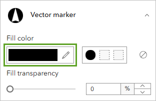
- In the Select color window, for #, type 71a5eb.
- Click Done. Close the Symbol style window.
The new symbol is automatically applied to the map.

The new symbol uses a slightly different blue that makes it distinct from the symbol for the past locations of pickup trucks. Next, you'll make a similar change to the symbol for snowplows.
- In the Style options pane, click the orange triangle symbol for snowplows. Click Basic point and choose the same arrow symbol.
- Change the size of the symbol to 30 and the fill color to f5c056.

- Close the Select color and Symbol style windows.
Both symbols for pickup and snow plows are updated.

Rather than have the arrows always point upward, you'll orient the symbols so that they point in the direction the vehicles are heading. Users will be better able to follow the route of each vehicle based on the symbology.
- In the Style options pane, expand Rotation by attribute. Turn on Rotate symbols based on attribute values.

Options for symbol rotation appear.
- For Field, choose heading. Confirm that Geographic is selected.

Geographic means that rotation will occur clockwise from 0, and the symbol will rotate in a clockwise direction from its current orientation. As a result, the arrows will point in the direction the vehicles are heading.
- At the bottom of the pane, click Done. Click Done.

Note:
You may have to wait until the next refresh interval for the symbol rotation to be applied.
The new symbols appear more clearly on the map and provide more information for the user. However, they can still stand out more and be more informative. You'll label the vehicles so city officials can determine at a glance where a specific vehicle is located on the map.
- On the Settings toolbar, click Labels.

The Label features pane appears. Labels are enabled, but still need to be configured. You'll add labels that will identify a vehicle's number (Truck 1, Truck 2, and so on), which will help city officials identify each truck in their fleet on the map.
- In the Label features pane, click Add label class.

Labels are added to each truck based on the vehiclename attribute.

The labels more clearly indicate which truck or snowplow corresponds to each symbol. (If two labels overlap, they may not appear on the map.)
Filter past locations of snowplows
It's useful to know where each snowplow has been, but currently far too many past locations are tracked, making it difficult to tell which snowplow was where and when it was there. You'll take advantage of time-based filtering to display only past vehicle locations that happened within the past two minutes. Applying this filter will streamline the amount of visual information for your users.
- In the Layers pane, select the Vehicles (Past) layer.
- On the Settings toolbar, click Filter.
The Filter pane appears. You'll use this pane to create a filter for the Vehicles (Past) layer to display only features that have a time attribute within the last two minutes.
- In the Filter pane, click Add new.
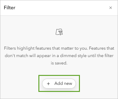
The expression will apply a filter on all types of vehicles (both snowplows and pickups) that have been updated within the last two minutes, relative to the current time.
- Under Condition, set the following:
- For the field, select time.
- For the operator, select in the last.
- For the value and units, specify 2 minutes.

- Click Save.
The data on the map is filtered.

Now each snowplow is trailed by a breadcrumb path of past locations. The filter allows users to better understand where each snowplow has been and the streets that have been plowed recently.
Finally, you'll save your map.
- On the Contents toolbar, click Save and open. Choose Save As.

- In the Save map window, enter the following:
- For Title, type Snowplows in a Utah City and add your name or initials.
- For Tags, type Snowplows, Roads, Utah
- For Summary, type This map shows the real-time location of snowplows in a city in Utah.

- Click Save.
Your map is now complete. It shows the location of snowplows and the status of roads throughout the city. The data layers update in real time at an interval of 30 seconds, and the features are symbolized to clearly communicate important information to the user.
Create a dashboard
Previously, you created a web map using real-time layers showing the current location of snowplows throughout the city. The map also indicated whether roads were plowed. While the map contains vital data for both citizens and government officials, city officials require a dashboard that can be used for internal purposes to monitor snow removal operations. The dashboard must provide the following information:
- A list that updates in real time with vehicle names and their speed
- A bar chart that updates in real time with vehicle speeds
- A pie chart that updates in real time with proportions of street plowed status
- A list that shows street names and plowed status
This information will help local officials organize the routes of snowplows and monitor snow removal operations throughout the city. You'll create a type of dashboard using ArcGIS Dashboards. Dashboards are fully configurable and can include elements that display maps, lists, and charts.
Add your map to a dashboard
First, you'll choose a map for your dashboard to use.
- If necessary, sign in to your ArcGIS Online account.
- On the ribbon, click the App Launcher button, and choose Dashboards.

The ArcGIS Dashboards home page appears, where you can create, edit, and view dashboards.
- Click Create dashboard.
The Create new dashboard pane appears.
- In the Create new dashboard pane, enter the following:
- For Title, type Snowplows in a Utah City.
- For Tags, type GeoEvent.
- For Summary, type The location of snowplows and the status of roads in a city in Utah.
- For Folder, select a location to store your dashboard.

- Click Create Dashboard to generate your new dashboard app.
Now that you've created your dashboard, you can add elements. In the next steps, you'll add the following elements:
- Map
- List
- Serial Chart
- Pie Chart
- On the side panel, click the Add element button.

The Layout panel appears.
- In the dashboard, choose Map.

The Select a map pane appears and lists the web maps that are available to your ArcGIS account.
- Browse to the Snowplows in a Utah City web map. Click Select to add the map as an element to your dashboard.

The Snowplows in a Utah City Map window appears and contains properties for configuring your map.
The web map's content will serve as the data source for the other elements.
- On the Settings tab, click the toggle buttons to enable the following options:
- Search
- Initial view and bookmarks
- Layer visibility
- Basemap switcher

These capabilities will allow users to navigate the map effectively, as well as select features of interest.
- Click the Layer actions tab.
Notice that pop-ups are automatically enabled. Pop-ups provide valuable information when a user clicks a feature on the map and are another way to make your dashboard interactive and informative.
- Click Done.
The dashboard appears with the map element you just configured.
- On the map, click a truck to open a pop-up containing attributes about the feature.

Because pop-ups are enabled in your dashboard, the functionality to click a feature to access attributes is automatically available.
- Close the pop-up.
Add a list element
You've configured your map element and taken advantage of some of the real-time functionality of Dashboards to make your map communicate information even more clearly. As mentioned at the beginning of this tutorial, the city authorities want to have easy access to some additional information about the snowplows. First, you'll add a list with information about each snowplow.
- On the side panel, click Add element.
Next, you'll choose where to add this element. You can add elements to any side of the dashboard or stack them on top of any existing elements. Your next element will be added to the left side of the dashboard.
- On the left side of the dashboard, click the Add button and choose List.

Now, you'll configure the list to display the speed of each of the five vehicles in the fleet. This information will be used to monitor the vehicles that are currently plowing and how fast they are traveling.
- In the Select a layer pane, choose Vehicles (Latest).

The List configuration pane changes to display data options for the Vehicle (Latest) layer.

Note:
Your list may be slightly different from the images shown in the tutorial, as this feature layer is dynamic and updates frequently.
By default, vehicles are listed in order by their ObjectID value, a field that internally organizes features in a layer. You'll change this to list the trucks in order by their vehicle name.
- In the Data options pane, for Sort by, click Add field, choose vehiclename.

- Click the sort button and verify that Sort ascending is selected.

The preview on the right side of the window indicates that the vehicles are now listed in order by their name. Next, you'll add the speed of each vehicle to the list. As with the time field you used to create the filter, the AVL devices also record vehicle speed for each snowplow. The speed information is included in the layer.
- In the side pane, click the List tab.
The vehiclename field is already added to the text box.

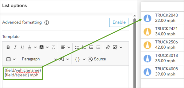
- Click after {field/vehiclename} and press Enter. Click the Insert drop-down arrow and add the speed field.

The list preview now includes the speed of each vehicle in miles per hour and is displayed to the right of the List options pane. You'll add units next.

- After {field/speed}, add a space and type mph.
The units for the speed value have been added.
- Click the Actions tab. Under When selection changes, click the Zoom drop-down arrow, and use the toggle button to enable zoom for Snowplows in a Utah City.

Now, when a user clicks a vehicle in the list, the dashboard will zoom to that vehicle on the map.
- Click the General tab. In the General options pane, for Top caption click Edit.
- In the text box, type Vehicles. Use the formatting options to center the title and make it bold.

- Click Done.
The list element is added to the dashboard.
- Adjust the width of the list element so it doesn't take up more space than necessary.
Note:
To adjust the size of an element, point to the edge of the element and drag it to the desired size.

Add a serial chart element
Having the vehicles' speed attribution is good, but you can make the information clearer by adding a bar chart that shows the vehicles' speeds relative to one another.
- In the side panel, click Add element. Under the list element, click Add element here. Choose Serial chart.

- In the Select a layer pane, select Vehicles (Latest).
- In the Data options pane, set the following parameters:
- For Categories from, choose Features.
- For Category field, choose vehiclename.
- For Series, click Add series, and choose speed.
- For Sort by, click Add field, choose vehiclename, and verify that Sort ascending is selected.

The preview shows a bar chart with five bars, one for each vehicle. However, the axis labels do not indicate the values that the bars represent.
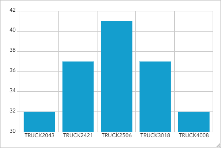
- Click the Category axis tab, and for Title, type Vehicle.
The title of the horizontal axis updates to Vehicle.
- Click the Value axis tab, and for Title, type Speed (mph).
The title of the vertical axis updates to Speed (mph).
- Click the Series tab, scroll down to the Bar colors option, and click the existing color patch.
- Replace the existing hex code with 00c5ff.

- Click the General tab. For Top caption, click Edit.
- In the text box, type Vehicle Speed. Center align the text.
- Above the text box, click Paragraph, and choose Heading 2.

- Click Done.
The chart appears under the list element.
- Resize the elements so that all information is displayed clearly.

Add a pie chart element
Next, you'll add an element that shows the status of streets as a pie chart. This element will allow city authorities to see at a glance the proportion of streets that have been plowed compared to those that haven't been plowed. It'll function as a progress meter for the plowing operation.
- In the side panel, click Add element. Under the serial chart, click Add element here. Choose Pie chart.
- In the Select a layer pane, choose Street Plowed Status.
To display a percentage of streets plowed, you'll display the count of features for each plow status.
- In the Data options pane, change the following parameters:
- For Categories from, ensure that Grouped values is selected.
- For Category field, choose PlowedStatus.

The preview updates and shows a pie chart with two or three sections (it possible that there are no In Progress streets). Next, you'll update the chart's appearance to add a legend.
Note:
Your values may be different as the data is dynamic.
- Click the Chart tab.
- In the Chart options pane, set the following:
- Expand the Labels section. Turn off Visibility.
- Expand the Legend section. Turn on Visibility. For Format, click Percentage.

The pie chart element updates and a legend is visible below the chart.
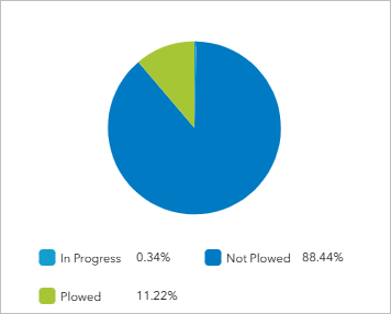
- Click the General tab. For Top caption, click the Edit button. In the text box, type Streets Plowed Status (Percent).
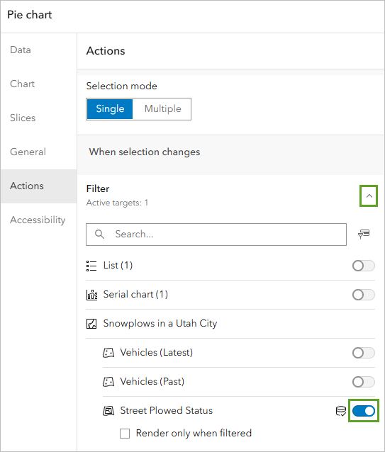
Now you'll enable the pie chart with feature actions so users can view streets of a certain status using the chart.
- Click the Actions tab.
- In the Actions pane, under When selection changes, expand Filter. Under Snowplows in a Utah City, turn on Street Plowed Status.
- Click Done.
- Resize the pie chart, list, and bar chart elements to display all information clearly.

- Click one of the pie chart segments.
Road segments on the map are hidden and revealed based on the pie slice you click. This is because of the action you enabled when configuring the pie chart.
Add a second list element
The pie chart element contains a lot of empty space. You'll use that space to contain one last element. This will be another list element that displays the names of streets and their plowed status.
- On the side panel, click Add element. To the left of the pie chart, click Add element here. Choose List.
- In the Select a layer pane, choose Street Plowed Status.
You want the list to display the plowed status of streets, so you'll change the lists settings appropriately. You'll also increase the maximum number of items that can be displayed in the list to display many streets at once.
- In the Data options pane, change the following parameters:
- For Maximum features displayed, set the value to 50.
- For Sort by, click Add field, choose PlowedStatus, and verify that Sort ascending is selected.
The preview updates with a list of streets, each with a symbol indicating the plowed status.

To make the list more clear, you'll add a description to each list item that states the plowed status explicitly. You added a similar description to the list of truck speeds earlier.
- Click the List tab.
- In the List options pane, click after {field/StreetName} and press Enter. On the line below {field/StreetName}, add the PlowedStatus field.

As with your pie chart, you'll enable certain feature actions for the list so users can use it to navigate to streets of interest.
- Click the Actions tab.
- In the Actions pane, expand Zoom. Turn on Snowplows in a Utah City.
- Click the General tab.
- In the General options pane, for Top caption, click Edit. In the text box, type Streets Plowed Status (Street Name).
- Click Done.
- Resize the elements to minimize empty space.

Next, you'll add a header to your dashboard.
- On the side panel, click the Add element button. Click the Add button at the top of the map and choose Header.

The header defaults to the title of the map.
- Click Done.
Save and share your dashboard
Your dashboard is now configured with the necessary elements. Next, you'll save your dashboard and share it with the appropriate audience.
- On the side panel, click the Save button and choose Save.

- Click the button next to the dashboard title. From the list, choose Dashboard item details

You can either share your dashboard with members of your organization or with everyone. Because this operation view is meant for use by city authorities and not the public, you'll only share it with your organization.
- On the Overview tab of the Snowplows in a Utah City item details page, click Share.

- In the Share window, choose Organization. Click Save.
When you share the dashboard, any associated maps and datasets will need to be shared in the same way. You can access the shared dashboard through the ArcGIS Dashboards application or an ArcGIS Online account.
In this tutorial, you created a map and dashboard for city officials that can be used to monitor the status of snow removal operations throughout the city. First, you created a web map containing real-time data layers. Then, you used that web map to create a dashboard that allows city officials to track snowplows and street status. This map and app will help keep the citizens safe and provide real-time information to decision makers.
You can find more tutorials in the tutorial gallery.

