
Map and explore oxygen level data using charts
First, you'll use line and histogram charts to explore the properties and characteristics of your data. Exploring your data is an important first step of nearly every analytical workflow. Then, using these charts, you'll determine whether the data is viable for an interpolation workflow. By using a line chart to see how dissolved oxygen levels change over time, you can choose appropriate time windows for the analysis. Once time windows are chosen, the histogram chart allows you to see the various levels of dissolved oxygen across the bay.
Download and open the project
A folder has been provided with water quality data collected from the estuaries of Chesapeake Bay and several data layers in an ArcGIS Pro package. This data was supplied by the Chesapeake Bay Program.
- Download the Chesapeake_WaterQuality.zip file.
- Locate the downloaded file on your computer.
Note:
Depending on your web browser, you may have been prompted to choose the file's location before you began the download. Most browsers download to your computer's Downloads folder by default.
- Right-click the file and extract the contents to a convenient location on your computer, such as your Documents folder.
- Open the unzipped folder to view the contents.
- If you have ArcGIS Pro installed on your computer, double-click Chesapeake_WaterQuality.ppkx to open the project.
Note:
If you don't have access to ArcGIS Pro or an ArcGIS organizational account, see options for software access.
- If prompted, sign in using your licensed ArcGIS account.
The project contains a map named Chesapeake Bay Dissolved O2 that contains a topographic basemap and the following data layers:
- The DissolvedO2 layer shows locations where dissolved oxygen and numerous other compounds have been monitored since 1984. While you will only see 131 points on the map, each location contains hundreds or thousands of historical measurements.
- The Bay layer represents a simplified polygon of the coastline of the bay.
Note:
Dissolved oxygen is measured in milligrams per liter of water (mg/L). According to the National Oceanic and Atmospheric Administration (NOAA)[1], any persistent dissolved oxygen levels below 5.0 mg/L are considered unhealthy, and any locations with persistent levels below 0.2 mg/L are dead zones where fish and plants cannot survive.
- In the Contents pane for the Chesapeake Bay Dissolved O2 map, turn on the Bay layer.

Note:
Depending on your default ArcGIS Pro configuration, the Contents pane may not open automatically. If necessary, on the ribbon, click the View tab. In the Windows group, click Contents.
- On the Map tab, in the Navigate group, click Explore.

- Click and pan the map to the northern tip of Chesapeake Bay.

- In the Contents pane, click the Bay layer to select it. On the ribbon, click the Feature Layer tab. In the Compare group, click Swipe.

When you point to the map, the pointer changes.
- Click the map and move the pointer up and down or left to right to hide the Bay layer.

Note:
The extent of the Bay layer polygon does not exactly match the Topographic basemap below. The Bay layer has been simplified and generalized from the actual Chesapeake Bay boundary. The generalization will make future analysis faster.
- On the Map tab, click Explore. Scroll your mouse wheel to zoom back to the full extent of Chesapeake Bay.
Enabling the Explore tool disables the swipe effect, allowing you to pan and zoom normally.
- In the Contents pane, turn off the Bay layer and turn on the DissolvedO2 layer.
Note:
The DissolvedO2 layer is sourced from a .csv file downloaded from the Chesapeake Bay Program Water Quality Database (1984 – present). This data was geocoded, projected, and filtered to retain data sampled between early 2014 and late 2015 that related to dissolved oxygen.
- Use the Explore tool to visualize the distribution of the dissolved oxygen measurements throughout the Chesapeake Bay.

Tip:
Using the Chesapeake Bay Program Water Quality Database (1984 – present) link, you can download additional nutrient data for multiple years that you can investigate on your own.
Create a line chart
Now that you've explored the data, you'll create a line chart for the dissolved oxygen levels. A line chart is a type of graph that shows how a value changes over time. Your line chart will show how the average dissolved oxygen level of the entire bay changed during 2014 and 2015.
Setting SampleDate as the Date or Number variable field specifies that the date and time each DissolvedO2 measurement was taken is plotted on the horizontal x-axis of the line chart.
- In the Contents pane, right-click DissolvedO2, point to Create Chart, and choose Line Chart.

The Chart Properties - DissolvedO2 and the Dissolved02 – Chart of DissolvedO2 panes appear.
- In the Chart Properties pane, on the Data tab, for Date or Number, choose SampleDate. For Aggregation, choose Mean.

- Under Numeric field(s), click Select. Check MeasureValue and click Apply.

The chart now shows the average (mean) of the dissolved oxygen measurements for each date.
The dissolved oxygen measurements stored in the MeasureValue field are plotted on the vertical y-axis of the line chart. You can now choose to aggregate the data differently. Because the SampleDate attributes are stored as dates, the default option is Count. This method counts the number of days that observations were recorded. MeasureValue is stored as a number, allowing different arithmetic operations to be applied.
- In the Time binning options section, confirm Interval size is set to 5 Days. For Empty bins, choose Connect line.

Connect line makes the line chart more readable by ensuring that the line connects even if there are dates with no available measurements.
The title of the chart and chart pane are updated to Dissolved02 – Mean of MeasureValue over SampleDate, reflecting the variables used to generate the line chart.
- In the chart pane, visually identify the average dissolved oxygen levels above 12–13 mg/L observed between 4/1/2014 and 4/1/2015. In addition, identify the summer dates that correspond to average dissolved oxygen levels lower than 5–6 mg/L.
Note:
Your chart content may appear different than the example image due to monitor resolution and chart size that affect which sample dates and measure values are displayed on the horizontal and vertical axis. The line color of your chart may also differ, but the results are the same.

There is a clear seasonal cycle to dissolved oxygen in Chesapeake Bay. The average dissolved oxygen level is highest during the winter (with average levels as high as 12–13 mg/L) and lowest during the summer (with average levels as low as 5–6 mg/L). Since anything below 5.0 mg/L is considered unhealthy, the dissolved oxygen level between June and September needs to be investigated. It is, however, encouraging to see that at no time was the average dissolved oxygen level close to 0.2 mg/L, which indicates the inability to sustain marine life.
Filter the line chart
Although you've observed a seasonal cycle in the dissolved oxygen levels, you want to look more closely at individual seasons. While the general trend of the data rises and falls, there is a lot of variation between each observation. You'll use a task to select measurements taken between June 15, 2014, and September 15, 2014, and sampled at a depth greater than 5 meters. A task is a set of preconfigured steps that guide you through a workflow. The task for this selection query is included in your project.
- On the ribbon, click the View tab. In the Windows group, click Catalog Pane.

- In the Catalog pane, expand the Tasks folder and double-click the Filter Samples for Summer 2014 and Summer 2015 task

The Tasks pane appears.
- In the Tasks pane, double-click Apply Summer 2014 Filter.

The task opens. This task consists of one step that executes a three-part query on the DissolvedO2 layer.

Tip:
You can resize the pane by pointing to the right side of the pane and dragging the pane to a larger size.
The task parameters are as follows:
- For Input Rows, select DissolvedO2.
- For Selection type, select New selection.
The expression uses the following SQL queries:
- Where TotalDepth is greater than 5
- And SampleDate is after 6/15/2014 12:00:00 AM
- And SampleDate is before 9/16/2014 12:00:00 AM
The query's expressions select all samples taken at a depth greater than 5 meters between June 15, 2014, and September 15, 2014.
Tip:
To learn how to write your own SQL query expression, see Write a query in the query builder.
- Click Run.
The task filter selects the points in the summer of 2014 on your line chart.

- At the top of the line chart, click the Filter By Selection button.

The chart updates to only show the selected points.

In the summer months of 2014, the average dissolved oxygen level fluctuates up and down without any clear pattern. The seasonal trends that you could see in the entire dataset disappear when viewing a single season. This is good; trends can cause difficulties for interpolation workflows. It appears that if you only use measurements within this three-month window, seasonal trends can be ignored.
- In the Tasks pane, click Finish to stop running the task. Close the Tasks pane.
Create a filtered histogram chart
In the previous section, you used a line chart to determine that you should limit your analysis to the summer months of 2014. These are the months when the average dissolved oxygen levels are near unhealthy levels. However, the line chart only showed the average dissolved oxygen level of the entire bay. What if some parts of the bay have low levels and other parts of the bay have high levels? Could the average be hiding some very low levels? To answer these questions, you'll create a histogram chart for the selected data.
- In the Contents pane, right-click DissolvedO2, point to Create Chart, and choose Histogram.
- In the Chart Properties pane, on the Data tab, make the following changes:
- Under Variable, for Number, choose MeasureValue.
- Under Bins, type 64.

The DissolveO2 – Distribution of MeasureValue pane updates, showing a histogram of DissolvedO2 for all samples.
Notice the samples from the summer of 2014 remain selected in blue.

- At the top of the line chart, click the Filter By Selection button to enable it.

The histogram updates to display only selected samples for summer 2014. In the summer of 2014, most of the data measurements ranged between 3 mg/L and 9 mg/L of dissolved oxygen. The average (mean) level over the three summer months was 5.26 mg/L.
However, the two bars on the far left side of the histogram are worth noting, as the dissolved oxygen levels are far below the average and are observed for a high number of samples. You'll investigate these next.
- In the Distribution of MeasureValue histogram, hover over the first data bin (bar) on the left, between 150 and 200, to show MeasureValue and Count values for the data bin.
Note:
Measure values may differ slightly due to rounding.

The bin properties reveal that 185 samples out of the total of 4,086 samples had dissolved oxygen levels between 0 and 0.2. This is indicative of a dead zone, and the result should be very concerning. However, a dead zone only occurs when the level of dissolved oxygen is persistently low for extended periods of time. Whether these locations have persistently low dissolved oxygen will be the focus of the next module.
- Close the Chart panes and the Chart Properties pane.
Closing the charts will not delete them from the project.
- On the Quick Access Toolbar, click the Save Project button. If prompted, click Yes to proceed with saving to a more current version of ArcGIS Pro.

You've used a line chart and histogram to explore your data while applying a selection filter. The line chart indicated a strong seasonal pattern of dissolved oxygen distribution, with the lowest levels occurring in the summer months. In the summer of 2014, the average dissolved oxygen of the bay was close to the unhealthy level of 5 mg/L.
In the histogram, it was clear that some individual points had levels indicative of dead zones if the dissolved oxygen levels remain very low for extended periods. It is now critical to determine whether there are any areas of the bay that have persistently low dissolved oxygen levels.
Perform interpolation and compare results
The accuracy of an interpolation model is defined by how closely the predicted value of a location matches the actual value at that location. However, this definition of accuracy immediately presents a seeming contradiction. If you only measured the dissolved oxygen at a particular set of locations, how can you judge how well the interpolation model is predicting at new locations? If you don't know the real values at the new locations, what basis do you have for the accuracy of the prediction? It seems like an impassable contradiction, but there is a common and accepted resolution to this contradiction, known as cross validation.
Cross validation is a "leave-one-out" statistical method. The accuracy of a model is assessed by sequentially removing each measured point from the dataset and using the remaining points to predict a value at the location of the removed point. If your interpolation model is reliable, the remaining points should accurately predict the true (measured) value of the hidden point. You can then compare the prediction to the true measured value and see how close it is. The difference between the true value and the predicted value for a particular point is called the cross validation error. After cross validating every measured point, various numerical and graphical diagnostics can be generated to allow you to assess the overall accuracy of your model. You'll interpret cross validation diagnostics by interpolating average dissolved oxygen levels from the summer of 2014 and comparing the results to those of the summer of 2015.
Interpolate data with a wizard
Next, you'll use the known measured O2 values to interpolate oxygen levels where no measurements were captured. Interpolation results in a surface that you can use for mapping or further analysis. You will use the features in the Bay layer as barriers to isolate the interpolation to the Chesapeake Bay.
For the interpolation of the summer 2014 data, you will use the Geostatistical Wizard, a dynamic set of pages that is designed to guide you through the process of constructing and evaluating the performance of an interpolation model.
- On the ribbon, on the Analysis tab, in the Workflows group, click Geostatistical Wizard.

The Geostatistical Wizard appears.
- On the Geostatistical Wizard first page, under Interpolation with barriers, select Kernel Interpolation.

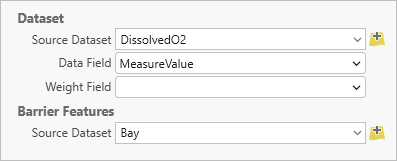
- Under Dataset, for Source Dataset confirm DisslovedO2 is selected and for Data Field, choose MeasuredValue. Under Barrier Features, choose Bay.
- Click Next.
The Loading data page appears.
- On the Loading data page, for Dataset, choose Use Mean.

- Click Next.
The Kernel Interpolation page appears.

The Bandwidth parameter is an important one, but you did not enter a value. The Bandwidth controls the radius of the searching circle in the preview surface. For this data, the bandwidth is measured in meters, and a default is provided by the software based on a simple optimization. You can leave it blank and allow ArcGIS Pro to calculate it based on your data.
The values under Identify Result are for the current location indicated by the crosshairs. Optionally, you can click on other locations to see their values.
Note:
Because there is a selection in the DissolvedO2 layer, the interpolation will use only the selected features in its calculations.
- Click Next.
The Cross validation page appears.

You'll explore cross validation in detail later in the tutorial.
- Click Finish. On the Method Report window, click OK.
The output layer appears in the map.

The Kernel Interpolation layer is a custom layer type only used with the ArcGIS Geostatistical Analyst extension. It is optimized for quick visualization and calculation and can be exported to either a raster or feature layer.
On the map, red and orange represent the highest average dissolved oxygen levels. Note that most of these high values are in the southern section of the bay near the Atlantic Ocean and at the tips of the inlets. The lowest levels (indicated by blue and green) are in the middle and upper parts of the bay.
- Save the project.
You've used the Geostatistical Wizard, part of the ArcGIS Geostatistical Analyst extension to interpolate average dissolved oxygen levels during the summer of 2014 in Chesapeake Bay. Based on the interpolated map, you can infer that some areas of Chesapeake Bay may have been under the healthy level of dissolved oxygen in the summer of 2014, but there was no indication that there were any persistent dead zones where fish and plants couldn't survive.
Explore cross validation results
Next, you'll look at the Cross validation window of the layer you created and interpret its various elements.
- In the Contents pane, right-click the Kernel Interpolation layer and choose Cross Validation.

Note:
Cross validation is a property of a geostatistical layer and is not supported for any other layer type.
The Cross validation window for the Kernel Interpolation layer appears.
Note:
To learn about all of the various tabs and statistics available in the Cross validation window, see Performing cross validation and validation.
- On the right side of the Cross Validation window, click the Table tab.
The table contains cross validation results for every measured point.
- If necessary, resize the window to display the Error column.

For each point, the Measured value for the point as well as the Predicted value from cross validation is maintained. The Error value is calculated by subtracting the Measured value from the Predicted value. If the Error value is greater than zero, that means the prediction from cross validation was higher than the true value. If the Error value is less than zero, the prediction was lower than the true value.
- Click the Error column title to sort from lowest to highest.

In the resorted Error column, the lowest cross validation error is -2.76. This means that cross validation predicted a dissolved oxygen level 2.76 mg/L less than the actual value at that location.
- Click the Error column title to sort from highest to lowest.
The highest cross validation error is approximately 3.03. This means that cross validation predicted a dissolved oxygen level approximately 3.03 mg/L higher than the measured value for that point.
- Click the first row to select the point with the highest cross validation error.
Selecting the record in the table highlights the associated point in the graph on the left. For this record, the point is on the x-axis of the graph.

This graph displays a scatter plot of the predicted values versus the measured values for each point together with a blue regression line for the points. Ideally, the predicted values will be close to the measured values, so you want to see the regression line follow at a 45-degree angle. A gray reference line is shown in the window to assess how close the regression line is to this ideal 45-degree angle. For this point, the blue regression line is a bit flatter than the gray reference line, and there is a lot of variability in the points around the lines. However, the difference does not appear to be too severe. If the blue line were close to completely flat or vertical, that would indicate severe problems that should not be accepted.
- In the graphical diagnostics portion of the window, click the Error tab.

The Error tab displays a scatter plot of the measured values versus cross validation errors. This graph is used to determine whether the cross validation errors are independent of the measured values.
Independence between the errors and the measured values is important because you want to make equally accurate predictions for low, medium, and high levels of dissolved oxygen. Independence between the errors and measured values is indicated by a flat regression line. In your graph, the regression line is decreasing, which indicates that the highest measured values were underpredicted, and the lowest measured values were overpredicted.
This is known as smoothing, and it is a common phenomenon. The degree of smoothing in your graph is typical, but you should be aware that this smoothing means that the model could be incorrectly predicting safe levels of dissolved oxygen in locations that actually have unhealthy or dangerous levels. This should not dissuade you from continuing your analysis, but it is something that should be disclosed when reporting your findings.
- In the numerical diagnostics portion of the Cross validation window, click the Summary tab.

The Summary tab displays summary statistics for the information on the Table tab and provides a simple and useful way to assess the cross validation results.
Root-Mean-Square is the most important statistic for judging the accuracy of a model. Its value will always be greater than zero, but the closer it is to zero, the closer the cross validation predictions are to the measured values, on average. Your Root-Mean-Square value of approximately 1.12 indicates that, on average, the cross validation errors were off from the true values by a little more than 1 mg/L of dissolved oxygen. All the other statistics give useful information about the model, but the Root-Mean-Square value is the only one that measures the accuracy of the predictions directly.
The other summary statistic to focus on is the Mean value. This is the average (mean) of the cross validation errors, and it is used to assess whether the model has a tendency to predict too high or too low (this is known as bias). If the model is unbiased, this value should be close to zero. If this value is significantly larger than zero, it means that the model is systematically making predictions that are too high. Similarly, if the value is significantly less than zero, it means that the model is systematically making predictions that are too low. Your value of approximately 0.045 indicates that this model has very little bias. On average, it is making predictions that are about 0.045 mg/L too high, but that is a very small amount. You can safely assume that your model is unbiased based on such a small Mean value.
- Close the Cross validation window.
View charts for 2015
Next, you'll select the dissolved oxygen measurements taken during the summer of 2015. You'll explore the data with charts.
- If necessary, open the Filter Samples for Summer 2014 and Summer 2015 task.
Tip:
On the ribbon, select View, then click Catalog Pane. Expand the Tasks folder.
- Double-click Apply Summer 2015 Filter.
- Click Run.
The measurements that were taken between June 15, 2015, and September 15, 2015, at depths greater than 5 meters are selected.
- Click Finish and close the Tasks pane.
- In the Contents pane, click the List By Drawing Order button.

You can see the charts that you created earlier listed in the Contents pane. Charts are stored as a type of layer property that you manage along with the list of layers in the map Contents pane.
- Double-click Distribution of MeasureValue to reopen the histogram. Confirm the Filter By Selection button is enabled, so only selected samples for summer 2015 are displayed.

- In the Chart Properties pane, under Statistics, turn on Median and Std. Dev.
The histogram updates to include the values.

This histogram looks similar to the histogram for the summer of 2014. Most dissolved oxygen measurements are between approximately 3 mg/L and 9 mg/L, and there is also a large bar on the left side at levels close to the dangerous level of 0.2 mg/L.
- In the Contents pane, double-click Mean of MeasureValue over SampleDate to reopen the line chart.
- In the Chart Properties pane, for Time binning options, change the Interval size to 5 Days.

- If necessary, click the Filter By Selection button to display only selected samples for summer 2015

The line chart also looks similar to summer 2014. The overall average dissolved oxygen level of Chesapeake Bay moves up and down without any clear pattern. This means that you can safely average the values at each location during this time period.
- Close the Chart properties pane as well as both charts.
Interpolate data with a tool
Earlier, you used the Geostatistical Wizard to interpolate the measurements from the summer of 2014. However, most of the interpolation methods that are available in the Geostatistical Wizard are also available as geoprocessing tools. Next, you'll interpolate the average dissolved oxygen levels from the summer of 2015 using the Kernel Interpolation With Barriers geoprocessing tool.
- On the ribbon, on the Analysis tab, in the Geoprocessing group, click Tools.
The Geoprocessing pane appears.
- In the Geoprocessing pane, search for Kernel.
The search returns several possible geoprocessing tools that implement or contain the search term.
- Click Kernel Interpolation With Barriers.

The Kernel Interpolation With Barriers geoprocessing tool opens in the Geoprocessing pane.
- For Input features, choose DissolvedO2.
This parameter specifies that the DissolvedO2 layer contains the points that you want to interpolate.
- For Z value field, choose MeasureValue.
This parameter specifies that the MeasureValue field contains the dissolved oxygen measurements.
- For Output geostatistical layer, type Summer 2015.
This parameter specifies the resultant geostatistical layer name.
- For Input absolute barrier features, choose Bay.
This parameter specifies that the Bay layer will be used as a barrier in the interpolation. This will allow the tool to use water distances.
- Accept the remaining default values.

By leaving the Bandwidth parameter empty, the tool will determine the value of the bandwidth that results in the smallest possible Root-Mean-Square cross validation error. This is also how the Geostatistical Wizard determined the optimal bandwidth.
Note:
The Kernel Interpolation With Barriers tool will take the average of all coincident points by default, so this does not need to be explicitly specified in the geoprocessing tool. The other aggregation methods for coincident points can be found on the Environments tab of the tool.
- Click Run.
The tool executes. A layer named Summer 2015 is added to the Chesapeake Bay Dissolved O2 map. This layer represents the predicted average dissolved oxygen level across Chesapeake Bay for the summer of 2015.
- Close any summary windows related to running the tool. In the Contents pane, turn off the DissolvedO2 layer.
- In the Contents pane, turn the Summer 2015 layer on and off and compare it to the layer Kernel Interpolation, which contains data from the summer of 2014.

As with summer 2014, the highest average dissolved oxygen levels in summer 2015 are at the tips of the inlets and near the Atlantic Ocean in the southern part of the bay. The lowest dissolved oxygen levels are again in the middle and upper parts of the bay.
Compare layers with cross validation
Next, you'll view the Cross validation window for the layer created in the previous section and compare the numbers and graphs to the map from summer 2014.
- In the Contents pane, double-click the Kernel Interpolation layer.
The Layer Properties window appears.
- On the General tab, for Name, delete Kernel Interpolation and type Summer 2014.
Renaming the layer Summer 2014 will help you differentiate and compare results for 2014 and 2015.
- Click OK.
- In the Contents pane, right-click Summer 2014 and choose Cross Validation.
The Cross validation window for the dissolved oxygen levels of summer 2014 appears.
- In the Contents pane, right-click Summer 2015 and choose Cross Validation.
The Cross validation window for the dissolved oxygen levels of summer 2015 appears.
- Compare the Root-Mean-Square and Mean values for both summer 2014 and summer 2015.
Summary Summer 2014 Summer 2015 Count
78
85
Root-Mean-Square
1.117
1.002
Mean
0.036
0.021
The Root-Mean-Square dropped from 1.117 in summer 2014 to 1.002 in summer 2015. This indicates that the predictions from cross validation were about 10 percent more accurate in summer 2015 than summer 2014. This is likely because summer 2015 had about 10 percent more data (85 points versus 78 points), as indicated by the Count value.
The Mean value changed from 0.036 in summer 2014 to 0.021 in summer 2015. This value should be as close to zero as possible, so summer 2015 had slightly lower bias than summer 2014 (though both summers had low levels of bias).
- In the graphical diagnostics, click the Predicted tab for both Summer 2014 and Summer 2015.
- Compare the graphs on the Predicted tab. If necessary, position the windows for Summer 2014 and Summer 2015 side by side for comparison.

The blue regression line for Summer 2015 (right) appears to fall closer to the gray reference line than the regression line for Summer 2014 (left).
- In the graphical diagnostics, click the Error tab for both Summer 2014 and Summer 2015.

The graphs on the Error tab for Summer 2014 and Summer 2015 appear to be nearly identical. You may recall that ideally the blue regression line will be flat. A regression line that is decreasing, as in both Summer 2014 and Summer 2015, indicates that the model is smoothing the data and underpredicting large values and overpredicting small values.
- Compare the slope of the Regression function, located at the lower left of each graph.
Regression function Summer 2014 Regression function Summer 2015 -0.668
-0.581
The Regression function shows that the slope of the blue regression line is slightly more negative for Summer 2014 than it is for Summer 2015 (-0.668 versus -0.581). This indicates that there is slightly more smoothing in Summer 2014 than Summer 2015.
Thus, you can conclude that the interpolation of Summer 2015 is slightly less likely than the interpolation of Summer 2014 to incorrectly predict safe levels of dissolved oxygen in locations where the actual levels are unhealthy or dangerous. However, neither year shows severe levels of smoothing.
- Close both Cross validation windows.
- Save the project.
You've assessed and compared the accuracy and reliability of an interpolation model using cross validation. By learning about the cross validation table, summary statistics, and graphs, you are now equipped to quantify the accuracy and reliability of an interpolation model. These skills also allow you to make important disclosures about the limitations of your models. It is necessary to disclose that your models appear to be smoothing the data, as this could potentially hide some dangerous dissolved oxygen levels of Chesapeake Bay.
With the statistical components of the analysis complete, you may want to present this information so that it can be easily understood by colleagues and decision makers. Even the best analysis will have no impact if the right people are not alerted to it or are unable to quickly understand it.
You might, for example, export your geostatistical layers to rasters and apply a meaningful color ramp. Then, you can add individual maps to a layout to make a poster of your findings. You might create a visualization like the one in this poster. See the tutorial series Design a layout in ArcGIS Pro for guidance on creating layouts.
In this tutorial, you have used the ArcGIS Geostatistical Analyst extension. You used both the Geostatistical Wizard and the Kernel Interpolation With Barriers geoprocessing tool to analyze the average dissolved oxygen levels in Chesapeake Bay during the summers of 2014 and 2015. Using interpolation, you created geostatistical layers that predicted the average dissolved oxygen levels across the entire bay. Then, you cross validated the results to quantify the accuracy of the interpolation.
Based on your results for the Chesapeake Bay, the average levels were never near the dangerous level of 0.2 mg/L, but many individual measurements were near or below this critically low level. Although mitigation efforts must be taken to bring dissolved oxygen levels in Chesapeake Bay above the healthy level of 5.0 mg/L, your analysis provides a scientifically and statistically defensible conclusion that even in the worst parts of the summer months, the dissolved oxygen levels were sufficient to sustain a thriving marine ecosystem.
Dead zones are a problem around the world. Similar processes of interpolating levels of dissolved oxygen could be used in places such as the Gulf of Mexico, the English Channel, and the East China Sea. The process of exploring data with charts, interpolating the data, and assessing the accuracy of your results with cross validation is common to almost all interpolation workflows. You are encouraged to download data from other sources and for other years from the Chesapeake Bay Program Water Quality Database (1984 – present) and repeat the steps using this new or updated data.
You can find more tutorials in the tutorial gallery.
 logo")