Add and join data

The first step to visualizing and charting data is adding it to Map Viewer. You’ll download two .csv files with intimate partner violence (IPV) and shelter capacity data, add them to a map as tables, and examine their attributes.

Open a map and save a copy

First, you’ll open a map of Canada in ArcGIS Online. Then you’ll sign in and save a copy of the map.

  1. Open the Canadian Provinces and Territories map.

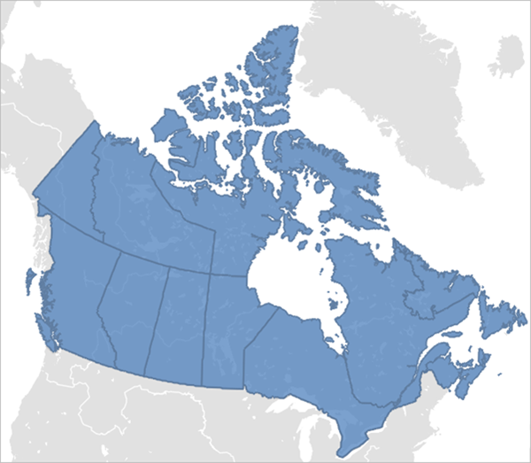
    A basemap of Canada appears.
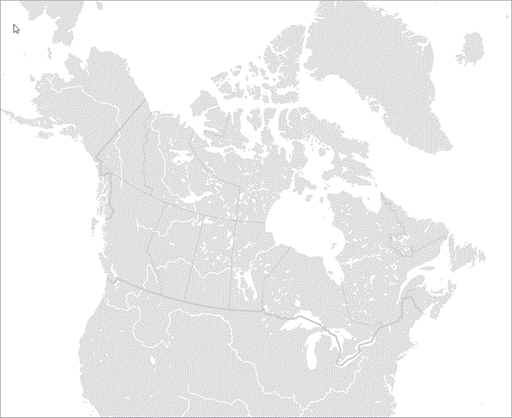
    Basemap showing Canada

    This basemap uses the Canada Lambert Conformal Conic map projection instead of the more common Web Mercator projection. Web Mercator greatly distorts area, which is particularly problematic for the northern regions of Canada. For more information, see this coordinate system definition from Statistics Canada. For more information on choosing a basemap, see this help topic.

  2. Sign in to your ArcGIS organizational account.
    Note:

    If you don't have an organizational account, see options for software access.

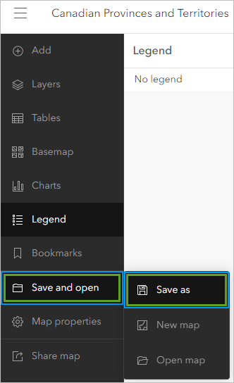
  3. On the Contents (dark) toolbar, click Save and open and click Save as.

    Save as option

    The theme of the map will be intimate partner violence and domestic violence shelter capacity in Canada, so you’ll name the map accordingly.

  4. For Title, replace the current text with: Intimate partner violence and domestic violence shelter capacity in Canada, followed by your name or initials.
  5. For Tags, type domestic violence shelters, intimate partner violence, and Canada, pressing Enter after each tag.
  6. For Summary, replace the current text with: Map showing the rate of police-reported intimate partner violence and domestic violence capacity by Canadian province or territory.
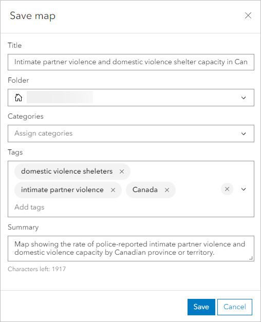
    Save map window

  7. Click Save.

    You have opened an existing web map and saved it to your content so you can edit the map.

Add the .csv files to a web map

Now you’ll download a .zip file that contains two .csv files that contain information about domestic partner violence in Canada. Once you download the data, you will add the .csv files to the map as tables.

  1. Download the IPVData.zip file and extract the files and store them in a folder that you will use for the tutorial.

    The file contains two .csv files that store data about police reported IPV and domestic violence shelter capacity in Canada.

    You’ll now add the first of the downloaded .csv files to the map.

  2. On the Contents toolbar, click the Add button and click Add layer from file.

    Add layer from file

  3. In File Explorer, browse to where you stored the .csv files. Drag the Police_reported_intimate_partner_violence_province_territory.csv file to the Add Layer window.

    Drag the .csv file to the Add Layer window.

    Note:

    Alternatively, click Your device and browse to the .csv file.

    The Add Layer window appears.

  4. In the Add Layer window, for How would you like to add this file?, verify that Create a hosted feature layer and add it to the map is selected.

    Create hosted feature layer option

  5. Click Next.

    The 11 fields that are in the .csv file populate in the Add Layer window. The field names match the column headers in the .csv file.

    Fields for .csv file

    You can choose which fields are imported by unchecking the box next to its name. For this workflow, you will keep all the fields.

  6. Click Next.

    On the next page, you can define locations for the data using addresses or place names. The file does not contain location data so you will verify that there are no location settings.

  7. For Location settings, verify that None is selected.

    Location settings set to None

  8. Click Next.
  9. For Title, type Police reported intimate partner violence, followed by your name or initials.
    Note:

    You cannot create two layers in an ArcGIS organization with the same name. Adding your initials or name to a layer name ensures that other users in your organization can also complete this tutorial. Once a layer has been created, you can rename it in the map to remove your initials, which will not affect the name of the underlying data layer.

  10. For Summary, type Police-reported intimate partner violence by Canadian province/territory, 2019.
  11. Click Create and add to map.
  12. On the Contents toolbar, click the Tables button.

    The Police reported intimate partner violence table is listed in the Tables pane.

    Table added to the map

  13. Repeat the above steps to add the Domestic_violence_shelter capacity_province_territory.csv to the map with the following properties:
    • For How would you like to add this file?, verify that Create a hosted feature layer and add it to the map is selected.
    • Location settings—None.
    • TitleDomestic violence shelter capacity, followed by your initials
    • SummaryDomestic violence shelter capacity by Canadian province/territory, 2021.

    The Domestic violence shelter capacity table is listed in the Tables pane, along with the Police reported intimate partner violence table.

    Tables pane

    Next, you will open each of the tables to review their attributes and ensure that the data was imported correctly.

  14. In the Tables pane, click Police reported intimate partner violence to open the table and review its contents.

    The table should have 11 fields (columns) and 14 records (rows).

  15. In the Tables pane, click Domestic violence shelter capacity.

    It should have 14 fields (columns) and 14 records (rows).

  16. Close the table.
  17. From the Contents (dark) toolbar, click Save and open and click Save.

    Save the map.

    In this section, you opened an existing web map and saved a copy of it. You added .csv files of data related to intimate partner violence and domestic violence shelter capacity in Canada to the map. Lastly, you reviewed the data tables to ensure the data was imported correctly.

    Next, you’ll use the Join Features analysis tool to join the data to a Canadian provinces and territories boundaries layer in ArcGIS Online. This will allow you to visualize the data on the map and configure charts and pop-ups to analyze intimate partner violence and domestic violence shelter capacity across Canada.

Join the intimate partner violence table to the boundaries layer

You’ll start by joining the Police reported intimate partner violence table to a feature layer of Canadian province and territory boundaries from ArcGIS Online. The result will be a feature layer with the same shapes as the boundaries feature layer and the same attributes as both the boundaries feature layer and the Police-reported intimate partner violence table so you can use the information for mapping and charting.

  1. On the Settings (light) toolbar, click the Analysis button.

    Analysis button

    Note:

    If you do not see the Analysis button, contact your ArcGIS administrator. You may not have the privileges required to perform analysis.

    Learn more about licensing requirements for spatial analysis

  2. In the Analysis pane, click Tools.

    Tools option

  3. Under Summarize data, click Join Features.

    Join Features tool

  4. For Target layer, click Layer.

    Target layer

    This is the layer that will receive the joined fields.

    You’ll browse to the Provinces and Territories of Canada feature layer in ArcGIS Online.

  5. In the Select layer window, click Browse layers.

    Browse layers button

    The Select layer window appears.

  6. In the Select layer window, click the My content drop-down menu and choose ArcGIS Online.

    Living Atlas

  7. In the search box, type provinces and territories of canada.

    Search for provinces layer

    There are many results, so you will refine the search with a filter.

  8. For Filters, expand Date modified and click Custom range. In the calendar, click the back arrow until you reach September of 2023 and click the 22nd and 23rd.

    Provinces and Territories of Canada layer

    The correct layer from Esri Canada appears.

  9. For the Provinces and Territories of Canada search result, click the Select layer drop-down menu and click Canana_Provincal_boundaries_generalized.

    Select the layer.

    The Provinces and Territories of Canada layer is selected for use in the Join Features tool.

    Provinces layer selected

  10. Click Confirm to add the layer as the target features of the join operation.

    Select layer window

    The Target layer parameter is populated with the layer from ArcGIS Online.

    Target layer parameter

    Next, you will populate the Join layer with one of the .csv files you added to the map. The Join layer is the table that will provide the joined fields.

  11. In the Join Features tool, for Join layer, click the Layer button and choose Police reported intimate partner violence.

    Join layer selected

  12. For Join settings, set or verify the following parameters:
    • Ensure that Use attribute relationship is enabled.
    • For Target field, choose postal.
    • For Join field, choose Prov_terr_code.
    • For Join operation, verify that Join one to one is selected.
    • For Multiple matching records, verify that Only keep first matching record is selected.
    • For Join type, choose Left join.

    Join settings

    When Join type is set to Left join, all target features are returned, even if the target feature does not have a match in the join layer. This will make it easier to find out whether any provinces or territories do not have records.

  13. For Output name, type Intimate partner violence followed by your name or initials.
  14. Click Estimate credits.

    The join operation will use 0.027 credits.

  15. Click Run.
  16. At the top of the Join Features pane, click the History tab.

    History tab

    The tool’s status is shown here. When the tool completes, the output appears on the map.

    Join result added to the map

Join the domestic violence shelter capacity table to the output layer

Now you’ll join the Domestic violence shelter capacity table to the output Intimate partner violence join layer you just created. This will result in a new feature layer with the shapes and attributes of the previous join layer, in addition to the attributes of the Domestic violence shelter capacity table.

  1. On the History tab of the Analysis pane, next to Join Features, click the Options button and click Open tool.

    Open tool

    The Join Features tool reappears. The parameters are already set with the choices you made earlier. You’ll modify some of the parameters to join the Domestic violence shelter capacity table to the Intimate partner violence join layer.

  2. For the Join features tool, change only the following parameters:
    • For Target layer, choose Intimate partner violence.
    • For Join layer, choose Domestic violence shelter capacity.
    • For Output name, type Intimate partner violence and shelter capacity, followed by your name or initials.
  3. Click Run.

    When the tool completes, the output appears on the map.

  4. Close the Join Features tool.
  5. On the Contents toolbar, click the Layers button.

    The two layers you created are listed in the Layers pane.

    In the Layers pane, you can hide or show layers as needed. For now, you will turn off the Intimate partner violence layer.

  6. In the Layers pane, point to the Intimate partner violence layer and click the Visibility button.

    Visibility button

    When you click the Visibility button, the layer turns off and its icon changes.

    Visibility turned off

  7. Click anywhere on the map of Canada.

    A pop-up appears, listing the layer’s fields.

    Pop-up

    The pop-up includes all the attributes from the two tables and the ArcGIS Online layer that were joined together.

  8. Close the pop-up and save the map.

You have joined attributes from several layers and have created two layers that contain all the attributes from the input tables. You can use these additional attributes in pop-ups, for symbology, and for charting.


Symbolize layers

Next, you will style the data to show the rate of intimate partner violence and the number of domestic violence shelter beds in each province or territory.

Explore the data using smart mapping

First, you will use smart mapping to explore the data visually. You will visualize the number of domestic violence shelter beds and duplicate the layer and choose a different attribute field to visualize the rate of intimate partner violence for every 100,000 adults (aged 15 to 89) by province or territory.

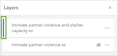
  1. In the Layers pane, click the Intimate partner violence and shelter capacity layer to select it.

    When a layer is selected, a blue line will appear next to its name.

    Select layer

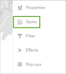
  2. On the Settings toolbar, click the Styles button.

    Styles button

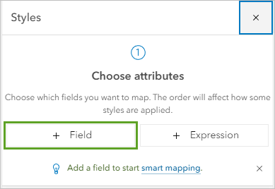
  3. In the Styles pane, under Choose attributes, click Field.

    Field button

    You’ll view the total number of domestic violence shelter beds on the map.

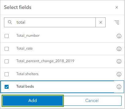
  4. In the search box, type total to narrow the options. Click the Total beds field and click Add.

    Add the Total_beds field.

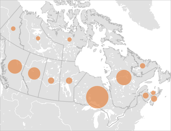
    A default style, Counts and Amounts (size), is applied to the layer.

    Counts and Amounts (size) symbology

    Proportionally sized symbols show the number of domestic violence shelter beds by province or territory, with larger circles representing higher numbers of beds and smaller circles representing lower numbers.

  5. In the Styles pane, click Done.

    Next, you’ll duplicate the layer to visualize the rate of intimate partner violence. Duplicating a layer creates a copy of an existing layer. The duplicate layer references the data in the source layer. Duplicating a layer allows you to save additional configurations of a feature layer in the same map.

  6. In the Layers pane, next to the Intimate partner violence and shelter capacity layer, click the Options button and click Duplicate.

    Duplicate option

    A copy of the layer appears in the Layers pane.

    Duplicated layer

    You’ll rename the layers to better reflect the data they will represent on the map.

  7. For the Intimate partner violence and shelter capacity layer, click the Options button and click Rename.

    Rename the layer.

  8. For Title, type Domestic violence shelter beds and click OK.
  9. Rename the Intimate partner violence and shelter capacity-Copy layer to Rate of intimate partner violence.

    Renamed layers

  10. In the Layers pane, for the Domestic violence shelter beds layer, click the Visibility button to turn it off.
  11. In the Layers pane, select the Rate of intimate partner violence layer. Verify that the Styles pane is still open. If it is not, on the Settings toolbar, click the Styles button.

    You’ll choose a different attribute value to visualize on the map.

  12. In the Styles pane, under Choose attributes, click Total beds.

    Total_beds

  13. In the search box, type rate and choose Total_rate.

    Total_rate field

    The map now shows the rate of intimate partner violence per 100,000 adults in each province and territory, with larger circles representing higher rates and smaller circles representing lower rates.

    Map showing rate of intimate partner violence

  14. In the Styles pane, click Done.
  15. Save the map.

Style the intimate partner violence data

You want to show the rate of intimate partner violence and the number of shelter beds on the map at the same time. To do this, you’ll style the two layers using different smart mapping styles. You’ll start by styling the Rate of intimate partner violence layer.

  1. In the Layers pane, ensure that the Rate of intimate partner violence layer is selected and from the Settings toolbar, click the Styles button.

    The layer is already styled with the Counts and Amounts (size) style you applied previously to show the Total_rate attribute. You’ll change the style to use color instead of size to represent the rate of intimate partner violence across Canada.

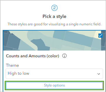
  2. In the Styles pane, under Pick a style, click Counts and Amounts (color).

    Counts and Amounts (color)

    When you choose the style, the map updates.

    Counts and Amounts (color) default symbology

    A default high-to-low color ramp is applied to the layer, with darker colors representing higher rates of intimate partner violence and lighter colors representing lower rates. You will change the color ramp to better reflect the data.

  3. Under Counts and Amounts (color), click Style options.

    Style options

  4. In the Style options pane, under Symbol style, click the color ramp.
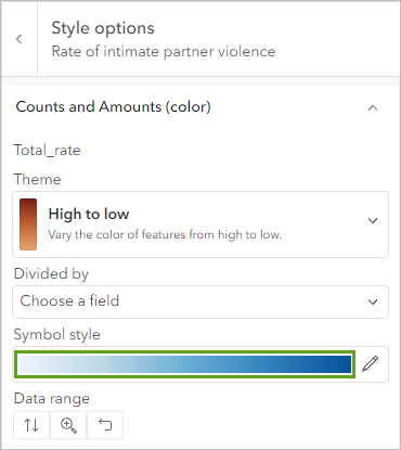
    Symbol style color ramp

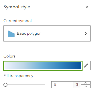
    The Symbol style window appears.

  5. In the Symbol style window, under Colors, click the existing color ramps.

    Fill color

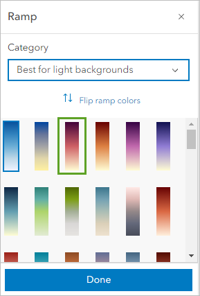
    A list of other color ramps appears.

  6. In the Ramp window, under Category, choose Best for light backgrounds. Point to the color ramps to see the name and choose Pink 1.

    Choose the Pink 1 color ramp.

  7. Click Done and close the Symbol style window.
  8. In the Style options pane, click Done. In the Styles pane, click Done.

    The map is updated to use the new color ramp.

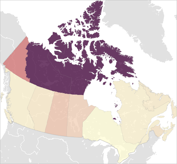
    Map updated to Pink 1 color ramp

    The map shows rates of intimate partner violence by province or territory using darker shades for higher rates and lighter shades for lower rates. Note that the Canadian territories are shaded the darkest colors, while the provinces are represented by lighter shades. This means that the rates of intimate partner violence are higher in the territories than in the rest of the country, with the highest rates in Northwest Territories and Nunavut as evidenced by their dark purple-pink shading.

  9. Save the map.

Style the domestic violence shelter beds layer

Now you’ll change some of the style options of the Domestic violence shelter beds layer to better coordinate with the color scheme of the Rate of intimate partner violence layer.

  1. In the Layers pane, select the Domestic violence shelter beds layer and click the Visibility button for the layer to make it visible.

    Select Domestic violence shelter beds layer.

    The Domestic violence shelter beds layer is displayed with the Rate of intimate partner violence layer.

    Two layers symbolized together

    The Domestic violence shelter beds layer is already styled with the Counts and Amounts (size) style you applied previously. The orange circles don’t work with the color ramp you applied to the Rate of intimate partner violence layer, so you’ll make some changes to the style options.

  2. In the Styles pane, under Counts and Amounts (size), click Style options.

    Style options button

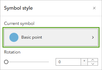
  3. In the Style options pane, for Symbol style, click the orange symbol.

    Click the current symbol.

    The Symbol style window appears.

  4. In the Symbol style window, for Fill color, click the existing color.
  5. In the Select color window, change the color code to dddddd.

    Change the color code.

  6. In the Select color window, click Done.
  7. In the Symbol style window, for Outline color, click the existing outline color.
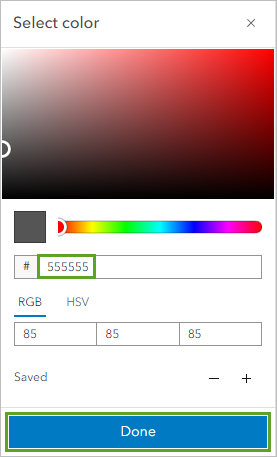
  8. In the Select color window, change the color code to 555555 and click Done.

    Change color code to 555555.

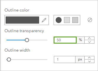
  9. In the Symbol style window, change the Outline transparency value to 50 percent.

    Change the transparency to 50 percent.

  10. Close the Symbol style window and click Done twice.
  11. If necessary, in the Layers pane, click Domestic violence shelter beds and move it to the top of the layer list.

    Domestic violence shelter beds layer moved to the top of the list

    Now it is easier to the see the symbology.

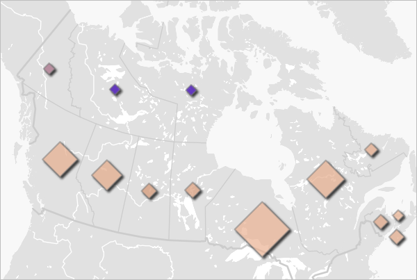
    Both layers symbolized

    In addition to rates of intimate partner violence, the map now shows the number of domestic violence shelter beds, with larger symbols representing higher numbers of beds and smaller symbols representing smaller numbers. Notice that Ontario and Quebec have the highest number of shelter beds in Canada. This might be due to the higher populations of these provinces.

  12. On the Contents toolbar, click the Legend button.

    Legend

    The legend provides additional information about how the shelter bed data and the intimate partner violence data is distributed.

  13. Save the map.

You have modified the symbology for both layers to better represent the data and so that they interact well with each other on the map.


Configure pop-ups

Previously, you visualized the data by duplicating a layer and styling each layer using different smart mapping styles and attributes. Next, you’ll configure pop-ups to provide clear information about the data in the map layers.

Review the default pop-up configuration

You’ll start by reviewing the default pop-up configuration. The default pop-up configuration includes a list of fields and values for each feature.

  1. On the map, click any province to open the default pop-up.

    Default pop-up

    A list of fields and values from the layers are displayed. The top of the pop-up indicates that you are viewing page 1 of 2 of the pop-up.

  2. At the top of the pop-up, click the Next button.

    Next feature button

    Note:

    You may see the Next button at the bottom of the pop-up instead of the top.

    The same pop-up information is displayed again because pop-ups are enabled by default on both layers in the map. You only want one set of pop-ups for the map, so you’ll disable pop-ups on the Domestic violence shelter beds layer.

  3. Close the pop-up.
  4. On the Contents toolbar, click the Layers button.
  5. In the Layers pane, select the Domestic violence shelter beds layer.
  6. On the Settings toolbar, click the Pop-ups button.
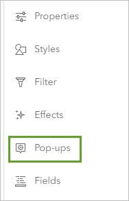
    Pop-ups button

  7. In the Pop-ups pane, turn off the Enable pop-ups toggle button.

    Enable pop-ups

  8. On the map, click a province.

    A pop-up with a single page appears.

Add text to the pop-up

The list of fields in the pop-up is long and difficult to understand, so you’ll replace the field list with text and a chart. You’ll begin by removing the field list and adding text.

  1. In the Layers pane, select the Rate of intimate partner violence layer.
  2. In the Pop-ups pane, click Title.
  3. In the Title box, delete the text before the first curly brace.

    {Name_EN} in title

    Fields are surrounded by curly braces. You’ll use the province or territory name, defined as {Name_EN}, as the title. Next, you’ll remove the fields list from the pop-up.

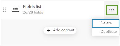
  4. For Fields list, click the Options button. Click Delete.

    Delete button

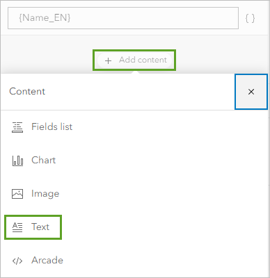
  5. Click the Add content button and choose Text.

    Add content, Text option

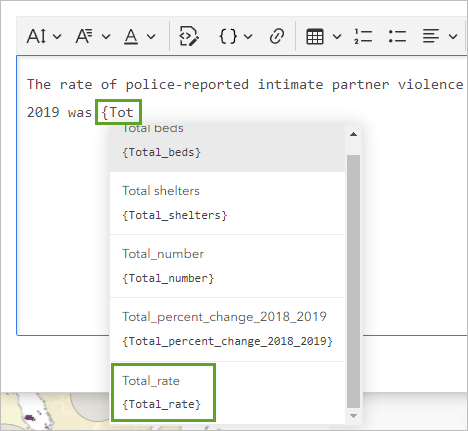
  6. Enter the following text: The rate of police-reported intimate partner violence (IPV) in {Name_EN} in 2019 was
  7. Press the space bar and type {. Type Tot.

    A list of fields appears.

    Fields list

    You’ll insert the Total_rate attribute field.

  8. Click the Total_rate field to add it.
  9. After the {Total_rate} field, type per 100,000 adults (aged 15 – 89).
  10. Select all of the text and click the Italic button.
  11. Select {Total_rate} per 100,00 adults (aged 15 – 18) and click the Bold button.

    Edit text in the pop-up.

  12. Click OK.
  13. On the map, click a province to see the pop-up.
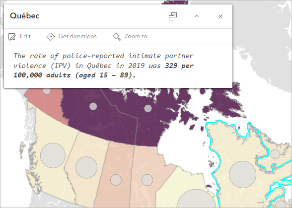
    Pop-up with edited text

  14. Save the map.

    Next, you will add a chart to the pop-up.

Add a chart

A chart is a graphical representation of data that comes in many types, such as bar charts, scatter plots, pie charts, and line charts. Pie charts group data into slices to visualize part-to-whole relationships. You’ll configure a pie chart for the pop-up to visualize intimate partner violence reports by gender.

  1. In the Pop-ups pane, click the Add content button and choose Chart.
  2. In the Configure chart window, choose Pie.
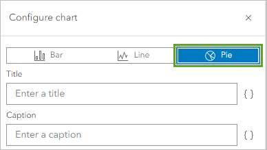
    Choose pie chart.

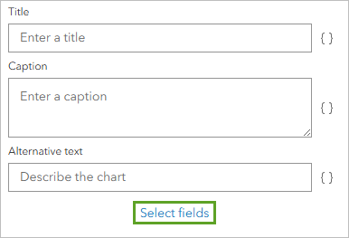
  3. Click Select fields.
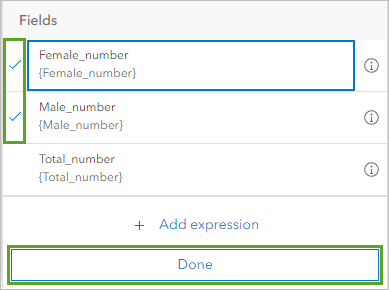
  4. In the Search fields box, type number.
  5. Select Male_number and Female_number and click Done.

    Select fields for the chart.

    The pie chart will show the proportion of intimate partner violence reports by women and men in orange and blue.

  6. In the Configure chart window, click Done.
  7. In the Pop-ups pane, under Media, for Description, copy and paste the following text: The following chart shows the number of intimate partner violence reports by gender.

    Next, you’ll finish the pop-up by adding a sentence about domestic violence shelter beds.

  8. In the Pop-ups pane, click the Add content button and choose Text.
  9. Copy and paste the following text: In 2021, there were {Total_number} beds in domestic violence shelters in {Name_EN}, out of a total of 9,197 beds in all of Canada.
  10. Select {Total_number} beds, click the Bold button, and click OK.

    Pop-up with chart

    The pop-up now contains the chart showing the number of intimate partner violence reports by gender and a meaningful description.
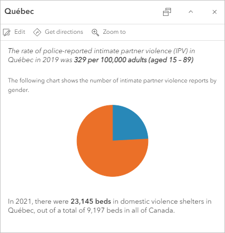
  11. Close the Pop-ups pane and save the map.

You have configured the pop-ups to include only the information that you want and display a chart. Now when a user views a pop-up on this layer, the pop-up is much more succinct.


Create charts and share an instant app

Previously, you configured custom pop-ups, including a pie chart, to provide descriptive information about the features in the map. You will now configure a series of stand-alone charts to help you examine the data in more detail.

When used in conjunction with maps, charts can help you tell a more complete story with data. In addition to the pie chart, you added to pop-ups in the last section, you’ll create three bar charts to help you make comparisons and uncover spatial patterns and relationships in the data.

Create a bar chart showing IPV reports

First, you’ll create a bar chart showing the number of police-reported intimate partner violence (IPV) incidents by province or territory.

  1. In the Layers pane, select the Rate of intimate partner violence layer.
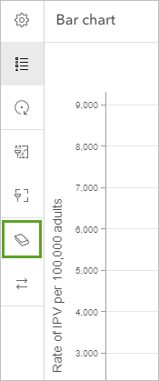
  2. On the Settings toolbar, click the Configure charts button. In the Charts pane, click Add chart and choose Bar chart.
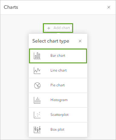
    Add bar chart.

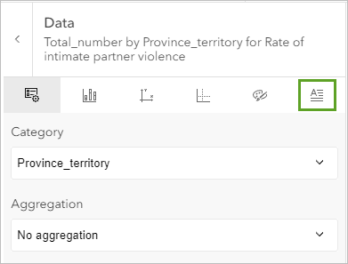
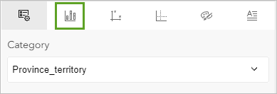
  3. On the Data tab, for Category, choose Province_territory.
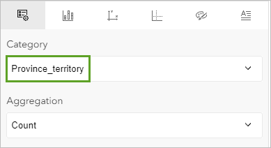
    Choose the Category.

  4. Click the Select numeric fields button.
  5. Choose Total_number and click Done.

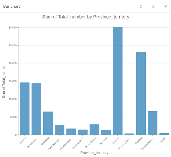
    A bar chart showing the total number attribute appears.

    Bar chart showing total number attribute

    The chart looks good, but you can apply the same colors as the layer by changing its aggregation type.

  6. On the Data tab, for Aggregation, choose No aggregation
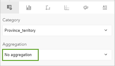
    No aggregation

    The colors in the chart now match the layer's symbology.
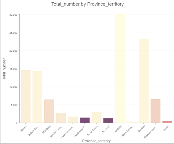
    Chart colors match layer symbology

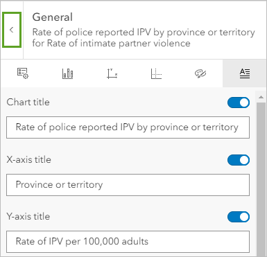
  7. In the Data pane, click the General tab.

    General tab

  8. For Chart title, change the default title to Police-reported IPV by province or territory.
  9. For X-axis title, replace the default with Province or territory.
  10. For Y-axis title, replace the default with Number of reports.
  11. On the chart, point to some of the bars, including the highest and lowest bar.
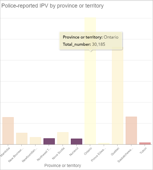
    Explore the bar chart.

    Ontario has the highest number of reports at 30,185, while Prince Edward Island has the lowest number at 354. Given the difference in population for these two provinces, it might be more meaningful to look at the rate of IPV for every 100,000 adults, rather than the number of reports.

  12. In the Chart pane, click the Data tab.

    Data tab

  13. For Numeric fields, remove Total_number.
    Remove button

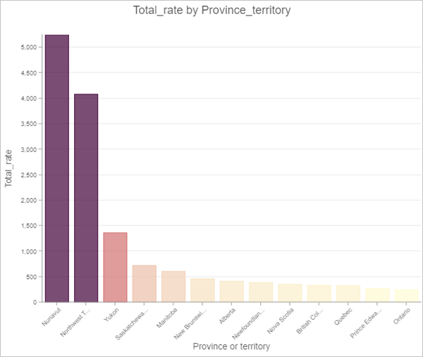
  14. Click Select numeric fields, choose Total_rate and click Done.
  15. For Aggregation, choose No aggregation.
  16. For Sort order, choose Y-axis descending.
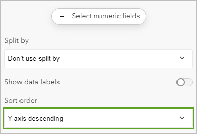
    Y-axis descending option

    The updated chart showing rates of IPV looks very different from the one showing numbers.

    Y-axis descending chart

    The rate of IPV for every 100,000 adults is highest in Nunavut, while Ontario and Prince Edward Island have the two lowest rates. These are the same results you saw earlier when applying smart mapping styles to the map.

  17. In the chart pane, click the General tab and update the following parameters:
    • For Chart title, type Rate of police reported IPV by province or territory.
    • For X-axis title, type or verify Province or territory is entered.
    • For Y-axis title, type Rate of IPV per 100,000 adults.

    The chart is dynamically updated to reflect your changes.

    Updated chart

  18. Save the map.

Create a bar chart showing male and female IPV rates

Next, you’ll create another bar chart comparing the rates of male and female IPV reports by province or territory.

  1. Click the back arrow to return to the Charts pane.

    Back arrow

  2. Click Add chart and choose Bar chart.
  3. On the Data tab, for Category, choose Province_territory.
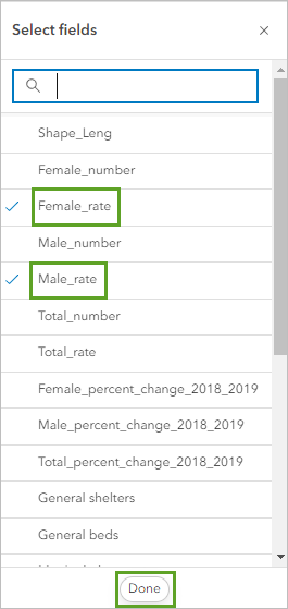
  4. Click Select numeric fields.
  5. Choose Female_rate and Male_rate and click Done.

    Select Female_rate and Male_rate fields.

    The bar chart shows female and male IPV rates in different shades of blue.
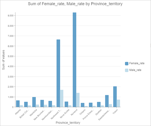
    Bar chart of female and male rates by province

    You’ll change the colors to better differentiate between the male and female rates. You will also provide clearer labels for the chart legend.

  6. Click the Series tab.

    Series tab

  7. Under Series, click Female_rate.
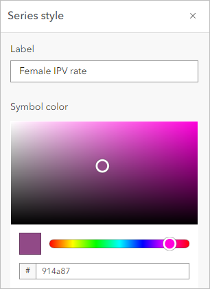
  8. In the Series style window, change the Label to Female IPV rate and enter a Hex value of 914a87.

    Series style properties

  9. On the Series tab, under Series, click Male_rate.
  10. In the Series style window, change the Label to Male IPV rate and enter a Hex value of f59d7d.

    Male IPV rate style

  11. Close the Series style window.
  12. Click the General tab and enter the following parameters:
    • For Chart title, type Male and female IPV rates by province or territory.
    • For X-axis title, type Province or territory.
    • For Y-axis title, type Rate of IPV per 100,000 adults.

    The chart updates based on your changes.

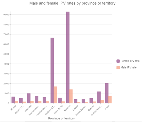
    Updated male and female IPV chart

    According to the chart, the rate of IPV reports by women is higher than the rate of IPV reports by men in all provinces and territories, with the largest discrepancy between the genders occurring in Northwest Territories and Nunavut.

  13. Save the map.

Create a bar chart showing the IPV rate percentage change

Next, you’ll compare the percentage change of IPV rates from 2018 to 2019 for both genders by province and territory with another bar chart.

  1. Click the back arrow to return to the Charts pane.
  2. Click Add chart and choose Bar chart.
  3. On the Data tab, for Category, choose Province_territory.
  4. Click Select numeric fields.
  5. Choose Female_percent_change_2018_2019 and Male_ percent_change_2018_2019.

    Select female and male percent change fields.

  6. Click Done.

    You’ll change the colors to match the ones you used for the previous chart. You will also provide clearer labels for the chart legend.

  7. Click the Series tab.
  8. Under Series, click Female_percent_change_2018_2019.
  9. In the Series style window, change the Label to Female IPV percentage change (2018 to 2019) and enter a Hex value of 914a87.

    Female percent change style

  10. On the Series tab, under Series, click Male_ percent_change_2018_2019.
  11. In the Series style window, change the Label to Male IPV percentage change (2018 to 2019) and enter a Hex value of f59d7d.

    Male percent change style

  12. Close the Series style window.
  13. Click the General tab and enter the following parameters:
    • For Chart title, type Male and female IPV percentage change (2018 to 2019) by province or territory.
    • For X-axis title, type Province or territory.
    • For Y-axis title, type IPV percentage change.

      The chart is complete.
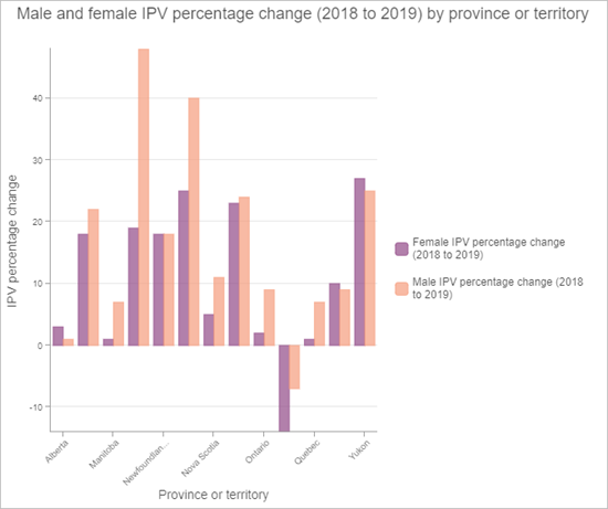
    Completed IPV percentage chart

    Although the previous chart showed that the rate of IPV reports by women is consistently higher than the rate of IPV reports by men across the country, this chart shows that in many provinces and territories, men’s IPV reports increased at a higher rate than women’s IPV reports between 2018 and 2019. It’s also worth noting that in Prince Edward Island, rates of IPV reporting for both genders decreased from 2018 to 2019. You can explore the data further to find possible explanations for these trends.

  14. Close the Charts pane and save the map.

Interact with the charts

The data in the charts is connected to the data in the map so you can interact with a chart to make selections on the map. Now you’ll view the charts you created and interact with one of them.

  1. On the Contents toolbar, click the Charts button.

    The three charts you configured are listed.
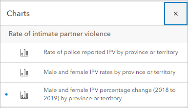
    Three charts listed

  2. Click the Male and female IPV rates by province or territory chart.

    The chart is displayed over the map.

  3. At the top of the chart, click the Collapse button.
    Collapse button

    The chart collapses.

  4. Zoom out and pan the map until you can see most of Canada.
  5. On the chart, click the highest purple bar.

    The corresponding territory, Nunavut, is selected on the map.
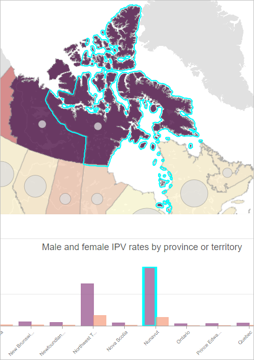
    Nunavut selected in the chart and on the map

    You’ll open the pop-up for Nunavut to see more information.

  6. On the map, click Nunavut to view its pop-up.
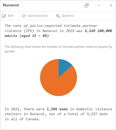
    The pop-up for Nunavut displays.

    Pop-up for Nunavut

    Notice that the colors in the pop-up's pie chart don't match the other charts that you created. You will change pie chart colors in the pop-up to match the bar chart colors.

  7. On the Settings toolbar, click Pop-ups.
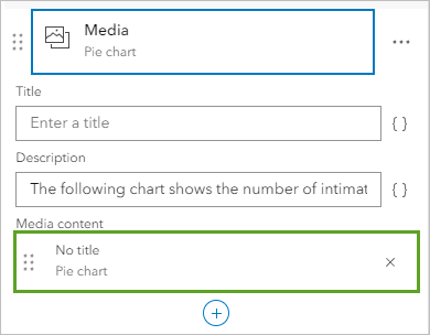
  8. In the Pop-ups pane, click Media.

    Media option

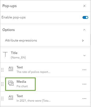
  9. For Media content, click Pie chart.

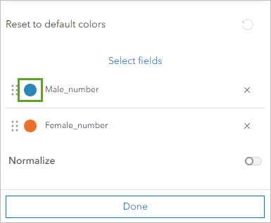
    Media content

  10. Click the symbol for Male_number.

    Symbol for Male _number field

  11. Change the Hex value to f59d7d and click Done.
  12. In the same way, select the symbol for the Female_number field and change its Hex value to 914a87 and click Done twice.

    Now the pie chart colors in the pop-up match the colors in the bar chart.
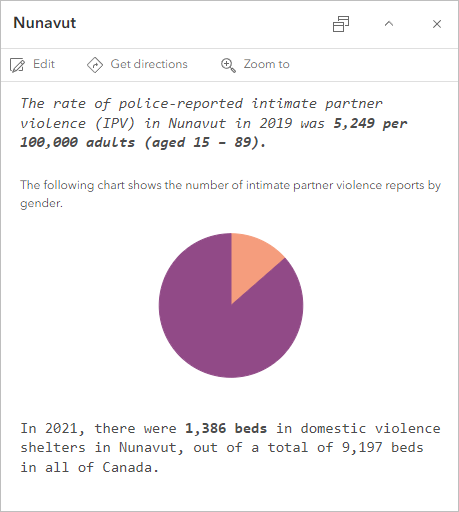
    Chart colors in pop-up matching map symbology

  13. Review the pop-up and close it. Close the Pop-ups pane.
  14. On the chart, click the Expand button.
  15. Clear the selection in the chart by either clicking in the white space or by clicking the Clear selection button.

    Clear selection button

    Nunavut is deselected on the map. You can edit a chart at any time by clicking it in the Charts list and then clicking the Edit chart button in the chart display.

  16. Close the chart and save the map.

    You created three bar charts to explore the intimate partner violence (IPV) data in more detail and interacted with one of the charts. The charts provided some additional insights into IPV patterns and trends in Canada.

    Now that you’ve created the map and stand-alone charts, you’ll create and configure an app using ArcGIS Instant Apps to share the visualizations with members of your organization. You’ll use the Chart Viewer app template, which allows users to explore the map alongside the charts you created.

Create and configure an app

Before you can create the app, you must share the map with your organization. When you share the map, the charts are shared with it.

  1. On the Contents toolbar, click the Share map button.

    Share map button

    The Share window appears. You’ll share the map with other members of your organization.

  2. In the Share window, click Organization and click Save.

    Share window

    The Review sharing window appears. Before you can share the map, you must share the source layer in the map to make the layer available to others viewing it.

  3. In the Review sharing window, click Update sharing.

    Update sharing button

    The map and layers are shared with your organization. You can now create the web app.

  4. On the Contents toolbar, click the Create app button and click Instant Apps.

    Create an Instant App

    The Instant Apps home page opens in a different browser tab.

  5. For the Chart Viewer template, click Choose.

    Choose the Chart Viewer template.

  6. In the Create app - Chart Viewer window, enter the following information:
    • For Give your app a title, type Intimate partner violence and domestic violence shelters in Canada and add your name or initials.
    • For Add tags, keep the ones you used for the map: domestic violence shelters, intimate partner violence, and Canada.
  7. Click Create app.

    The Configure Chart Viewer window appears in a new browser tab.

    The app is created based on the template you chose and currently shows one chart. The app configuration window provides several app settings and an interactive preview of the app.

  8. Next to the chart, click the names of the other two charts to display them (when displayed, they will be highlighted in blue).

    Display all charts

    The chart names are selected and the charts appear in the app.

    Map and all charts displayed

  9. In the Express pane, click Step 3. About.

    Step 3. About

    The About pane appears.

  10. In the About pane, turn on the Introduction window toggle button.

    Enable the Introduction window.

  11. For Introduction window title, replace the default text with Intimate partner violence and domestic violence shelter capacity in Canada.
  12. Under Introduction window content, click the Edit button and replace the default text with the following:

    Intimate partner violence (IPV), also known as spousal or domestic violence, is a form of gender-based violence that includes physical, sexual, emotional, and financial abuse, and other types of violence and control. Mapping police-reported incident data shows where rates of IPV are highest across Canadian provinces and territories, as well as other patterns and relationships. Domestic violence shelters are one type of service available for survivors of IPV and shelter capacity varies across regions.

    Explore and interact with the charts and map to get a deeper understanding of intimate partner violence and domestic violence shelter data in Canada.

    The data used to create the map and charts is adapted from Statistics Canada, Canadian Centre for Justice and Community Safety Statistics, Incident-based Uniform Crime Reporting Survey, Trend Database, and National Service Provider List, 2021.

  13. In the last paragraph, highlight the text Canadian Centre for Justice and Community Safety Statistics. On the toolbar, click the Link button.

    Link button

  14. For Link URL, copy and paste the following link: https://www150.statcan.gc.ca/n1/pub/85-002-x/2021001/article/00001-eng.htm and click Save.

    Edit the Link URL text.

  15. In the last sentence, highlight the text National Service Provider List and set its link URL to the following site: https://open.canada.ca/data/en/dataset/7e0189e3-8595-4e62-a4e9-4fed6f265e10/resource/dd8d935c-3e40-42d1-8de3-2e18f3877000?inner_span=True.
  16. In the Introduction window content window, click Close.

    The Introduction window text updates.

    Introduction panel

    The hyperlinks now appear in a different color and underlined to designate the links to the user.

  17. In the About pane, click Back.

    You’ll skip the Interactivity step.

  18. Click Step 5. Theme & Layout.

    In the Theme & Layout pane, you can adjust the overall look of the app.

  19. In the Theme & Layout pane, for Select a preset theme, click the drop-down menu and choose Street.

    Select a theme

  20. Test the app’s functionality by interacting with the charts, viewing pop-ups, zooming in and out, and so on.

    The app is ready to publish.

  21. In the Express pane, click Publish. In the Publish window, click Confirm.

    The Share window appears, which includes a link to the app and a button to launch it in a new window to test.

  22. In the Share window, click Change share settings, choose Organization, and click Save.

    The app is shared with members of your organization.

  23. Click Exit and confirm that you want to exit the application configuration.

    The item page for the app appears.

  24. On the item page, click View to view the app.

    The app opens in a new browser tab to the introduction panel you configured.

  25. Click Explore to view the charts and maps.

    You have shared the map with your organization and configured an app to display the map and charts together to visualize and interact with the data. This app will help other organization members better understand spatial patterns of intimate partner violence and domestic violence shelter capacity across Canada.

In this tutorial, you worked with intimate partner violence and domestic violence shelter data in .csv files from Statistics Canada. You began by adding the data as tables to Map Viewer, exploring the attributes in the tables, and joining the tables to a layer of Canadian province and territory boundaries from ArcGIS Living Atlas to visualize the data on a map. You then applied smart mapping styles to the layers to see where rates of intimate partner violence are higher and lower than average and identify the regions that have relatively higher or lower shelter capacity. After styling the data, you configured pop-ups to provide more details about intimate partner violence and domestic violence shelter capacity in each Canadian province and territory.

Once you explored the data using the map, you configured a set of charts to use for further analysis—for example, to examine the relationship between gender and intimate partner violence incidents and the percentage change in intimate partner violence rates from 2018 to 2019.