Map potential food deserts
A critical first step in improving access to fresh, affordable food is to identify areas that are not within close proximity to grocery stores. Using spatial analysis tools in Map Viewer, you'll identify places that potentially have greater access to food based on being within walking distance of a grocery store. This will allow you to see the gaps in access, revealing areas that are potential food deserts.
Open and save a map
First, you'll open an existing web map, save a copy, and explore the layers in the map.
- Open the DC Grocery Stores web map.
The map appears in Map Viewer.
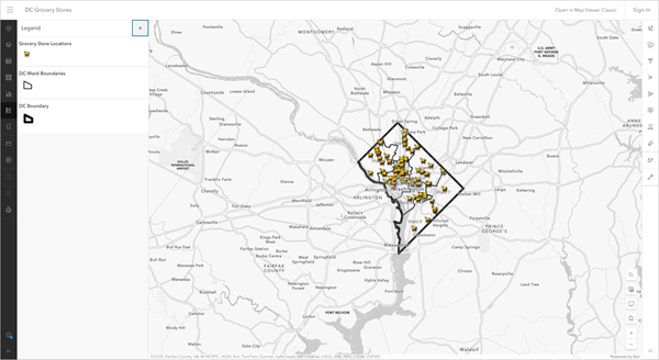
The map has four layers and a basemap.
You will save a copy of the map to your own ArcGIS organizational account. You will work on that copy for the rest of the tutorial. To save a copy of the map, you will need to sign in to your ArcGIS organizational account.
- Sign in to your ArcGIS organizational account.
Note:
If you don't have an organizational account, see options for software access.
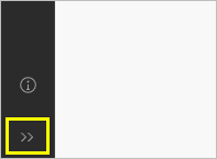
- If necessary, click Expand to see the labels for the Contents toolbar.
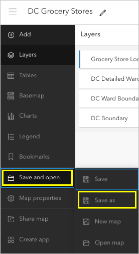
- On the Contents (dark) toolbar, click Save and open and choose Save as.
The Save map window appears.
- In the Save map window, enter the following:
- For Title, type Map and analyze food access followed by your name or initials.
- For Tags, clear the existing tags. Type each phrase, clicking Enter after each one: walk time, grocery stores, Washington DC.
- For Summary, type Map of potential food desert locations in Washington, DC., and other key data for determining areas in need of more access to full service grocery stores.
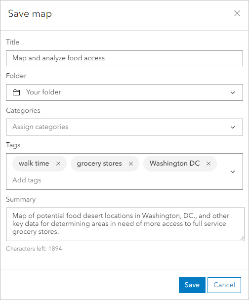
- Click Save.
Next, you'll investigate the layers you'll use including the locations of grocery stores, ward boundaries, and the boundary of Washington, D.C. These layers come from Open Data DC, a collection of apps, maps, dashboards, and data layers for the District of Columbia.
Many municipalities offer similar repositories of geospatial data that are free and open for use by the public. If you want to apply this workflow to your local community, search for and explore a data hub with layers specific to your study area.
- On the Contents toolbar, click Layers.
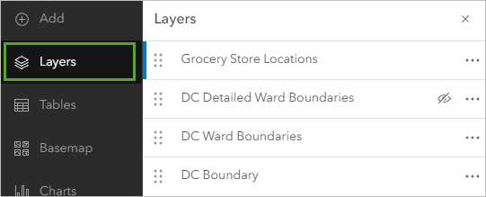
- In the Layers pane, point to the Grocery Store Locations layer and click the Visibility button to turn it off. Do the same for the DC Boundary layer.
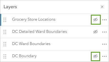
The remaining visible layer is the DC Ward Boundaries layer, which shows the eight wards that make up the District of Columbia.
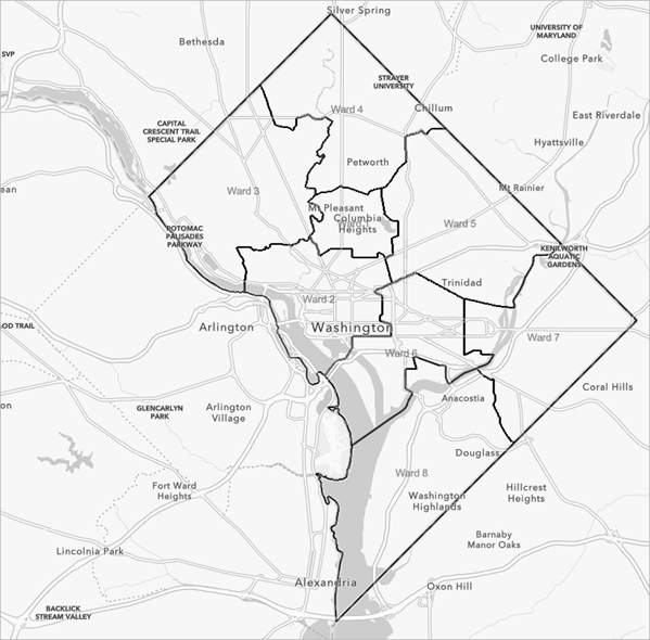
These ward boundaries are used for representation, planning, and decision-making. Each ward contains a diverse collection of neighborhoods and is represented by a different elected council member.
- In the Layers pane, turn off the DC Ward Boundaries layer and turn on the DC Detailed Ward Boundaries layer.
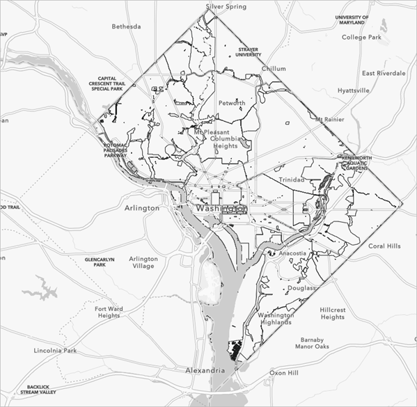
The DC Detailed Ward Boundaries layer does not include areas within the wards where people do not live. Using this layer to determine potential food desert areas will be more accurate and better aligned with lived experiences in the city. It is considered best practice to consider local characteristics to include or certain areas that might affect the accuracy of your analysis.
Note:
The DC Detailed Ward Boundaries layer was created using ArcGIS Pro. Several layers from the Open Data DC Hub, including military bases, parks, water bodies, and wetlands were merged. This merged layer was erased from the DC Ward Boundaries layer, resulting in a layer that only includes habitable sections of each ward.
- Turn off the DC Detailed Ward Boundaries layer and turn on the DC Ward Boundaries layer.
- Turn on the DC Boundary layer.
This layer outlines the administrative boundary of Washington, D.C.
- Turn on the Grocery Store Locations layer.
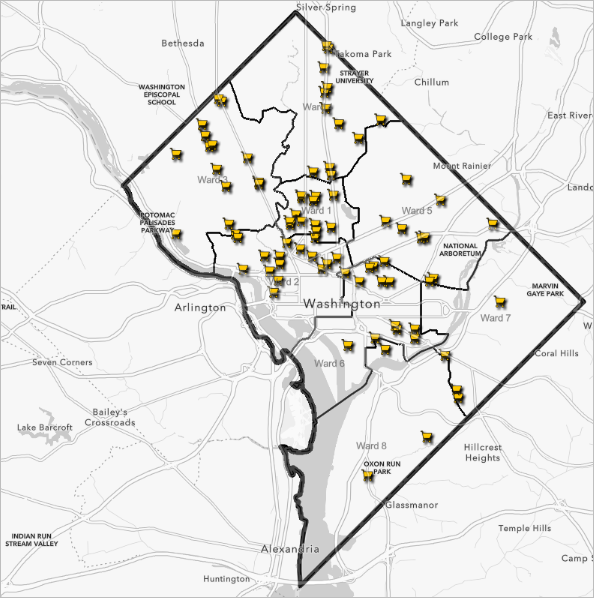
The Grocery Store Locations layer shows the locations of grocery stores and healthy corner stores. The healthy corner stores data comes from the DC Central Kitchen's (DCCK) Healthy Corners program, which includes corner stores that sell fresh, nutritious produce. For this analysis, these two types of stores have been combined to provide a greater distribution of facilities across the study area.
Now that you are familiar with the layers in your map, you will use these layers in analysis tools to generate 10-minute walking areas on the map.
Generate walking areas
One key barrier to accessing healthy, fresh groceries is distance. Many under-resourced communities rely on walking and public transit to access groceries. To help understand where there may be a lack of walkable grocery stores, you'll create a feature layer showing areas that are within a 10-minute walking radius of grocery store locations across the city using the Generate Travel Areas tool. This tool is one of the proximity tools used to analyze map data based on how close or far away another feature is.
- In the Layers pane, click the Grocery Store Locations layer to select it.
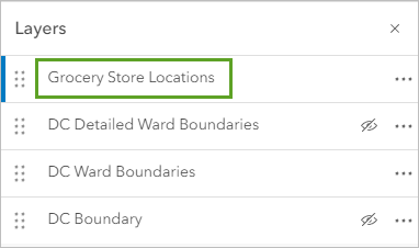
The blue bar on the layer indicates that the layer is selected.
- On the Settings (light) toolbar, click Analysis.
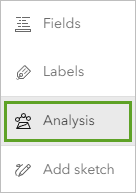
- In the Analysis pane, click the Tools tab, expand Use proximity, and click Generate Travel Areas.
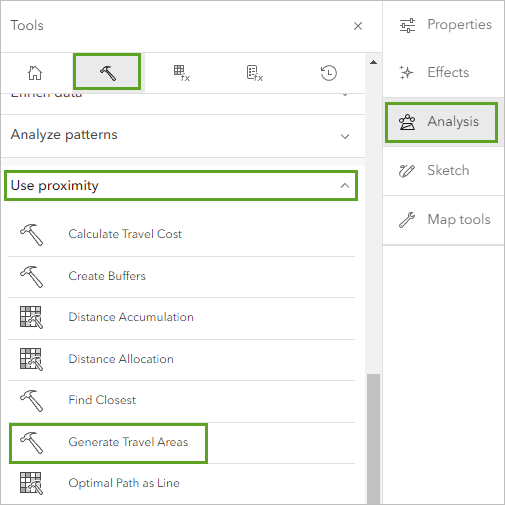
The Generate Travel Areas tool pane appears. In this pane, you can set the parameters for the tool. Required parameters are marked with a red dot.
- In the Generate Travel Areas tool pane, for Input layer, click Layer and choose Grocery Store Locations.
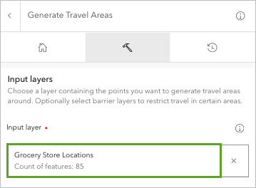
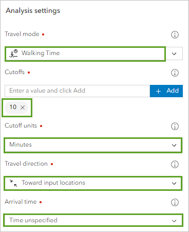
- Under the Analysis settings section, set the following parameters:
- For Travel mode, choose Walking Time.
- For Cutoffs, type 10 and click Add. Confirm that Cutoff units is set to Minutes.
- For Travel direction, choose Toward input locations.
- For Arrival time, confirm that the option is set to Time unspecified.
Next, you'll indicate how you want overlapping travel areas to be handled. You'll choose to merge any overlapping areas into one feature.
- For Overlap policy, choose Dissolve.
Next, you'll indicate whether you want travel areas to be generated as one continuous polygon or to include holes on streets that are not reachable but are fully surrounded by reachable streets. You'll choose to include holes.
- Check the box next to Generate detailed polygons.

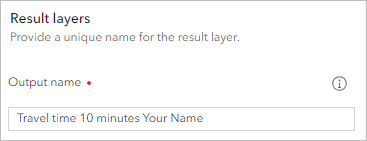
- Under the Result layers section, for Output name, type Travel time 10 Minutes and add your name or initials.
Note:
You cannot create two layers in an ArcGIS organization with the same name. Adding your initials to a layer name ensures that other people in your organization can also complete this tutorial. Once a layer has been created, you can rename it in the map to remove your initials, which will not affect the name of the underlying data layer.
Running an analysis tool consumes credits. Credits are the currency used across ArcGIS Online. They are consumed during specific transactions, such as performing analytics, storing features, and geocoding. Before running an analysis, it's a good idea to check how many credits will be consumed.
Note:
You can learn how many remaining credits are in your ArcGIS Online account if your organization administrator has enabled you to view that information. If it is enabled, at the top of the page, click your username and choose My settings. On the My settings page, click Credits to see how many remaining credits are in your account. If it is not enabled, contact your organizational account administrator. To learn more about credits, see Understand credits.
- Click Estimate credits.

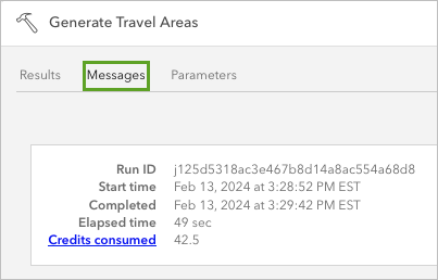
When running analysis tools, the credit cost is typically calculated by multiplying the number of features by the credit cost of the tool. This analysis will consume 42.5 credits.
Note:
If you did not have enough credits to run this tool, you can use the Travel Area 10 Minutes (Tutorials) layer to continue the tutorial. To add this layer to your map, in the Layers pane, click Add. Search ArcGIS Online for Travel Area 10 Minutes owner:Esri_Tutorials and click the Add button.
- Click Run.
It may take a few minutes for the tool to complete. You can review the tool's status by clicking the History tab.
- In the Analysis pane, click the History tab.
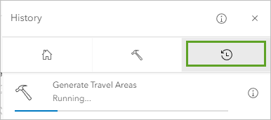
As the tool runs, you can view the tool progress.
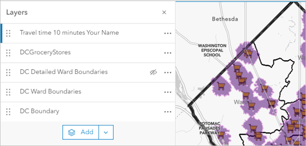
After a few moments, the new layer is added to the top of the Layers pane and drawn on the map. The purple areas show the 10-minute walking areas around each grocery store location.
Next, you will explore more features in the Analysis pane.
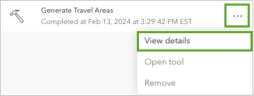
- In the Analysis pane, on the History tab, for the most recent Generate Travel Areas tool, click Options and select View details.
The analysis details include Results, Messages, and Parameters.
- On the Results tab, click the Options button on the result layer, then select Open item details to open the item details page.
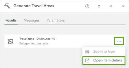
The item details page opens in a new browser window or tab. The item page contains information about the layer and its contents. When you create a layer, filling in the fields on the item details page provides additional context that is essential for managing your data and sharing it with other users.
- Close the browser tab or window with the item details page and return to the browser tab or window with Map Viewer.
- Under Generate Travel Area, click the Messages tab.
- Click the Parameters tab.
The Parameters tab provides a summary of the parameters used to run the tool.
Note:
To rerun the tool using the same parameters as a previous run, return to the History tab in the Analysis pane. Click the Options button on the most recent Generate Travel Areas tool and select Open tool. The Generate Travel Areas pane appears and is populated with the settings from the most recent run.
- Close the Open tabs: 1 view.
Determine potential food desert areas
Finally, you'll identify potential gaps in food access by finding the places that are outside of a 10-minute walking radius of a grocery store.
There are several factors that can be used to identify food deserts, ranging from affordability of goods to having access to a vehicle. The Hunger Heat Map from the Capital Area Food Bank presents one approach to mapping food access in the D.C. metropolitan area and was used to inform this workflow. When structuring an analysis such as this, it is essential that you understand the local dynamics of your study area, including the demographic makeup, infrastructure, and policies (both historical and present) that may influence patterns of inequity.
To simplify this analysis, you will consider gaps in proximity to grocery stores as an indicator of potential food deserts. While a gap doesn't necessarily mean that people living there don't have access, a lack of a gap doesn't always mean that access is abundant. You might live within a five-minute walk of a grocery store, but if you work during its operating hours or the products are unaffordable, access to fresh food may be low or nonexistent.
Using the Overlay Layers tool, you'll overlay and erase the 10-minute walking areas from the geographic boundaries that divide the city into eight wards to find the places that are outside of a 10-minute walking radius of a grocery store.
- If necessary, on the Settings toolbar, click the Analysis button to open the Analysis pane.
- In the Analysis pane, click the Tools tab. If necessary, click the back arrow.
- On the Tools tab, expand Manage data and click Overlay Layers.
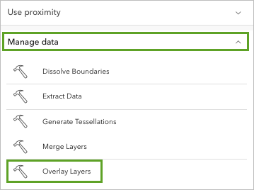
- In the Overlay Layers tool pane, for Input features, click Layer and choose DC Detailed Ward Boundaries. For Overlay features, choose Travel time 10 minutes.
- Under Overlay settings, for Overlay type, choose Erase.
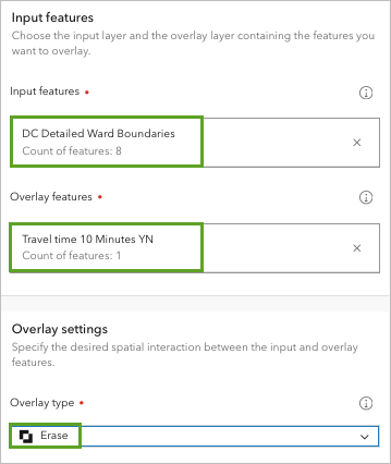
When you set the Overlay type setting to Erase, the tool will take the Overlay features and remove, or erase, them from the Input features, leaving you with a layer showing areas that are not within a 10-minute walk area of grocery store locations.
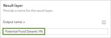
- Under the Result layer section, for Output name, type Potential Food Deserts, followed by your name or initials.
Note:
It will require 0.009 credits to run this tool.
- Click Run.
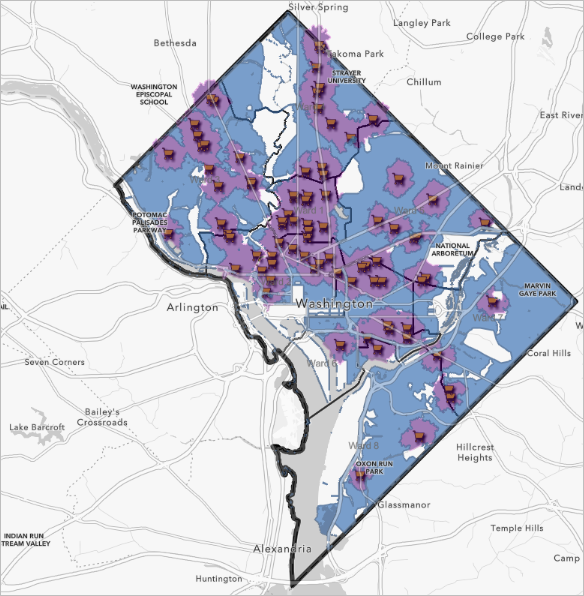
After a few moments, the new layer is added to the top of the Layers pane and drawn on the map.
You no longer need the Travel Time 10 minutes layer so you will remove it.
- In the Layers pane, for the Travel Time 10 minutes layer, click the Options button and choose Remove.
The remaining layer represents potential food deserts based on being outside of a 10-minute walking radius of a grocery store.
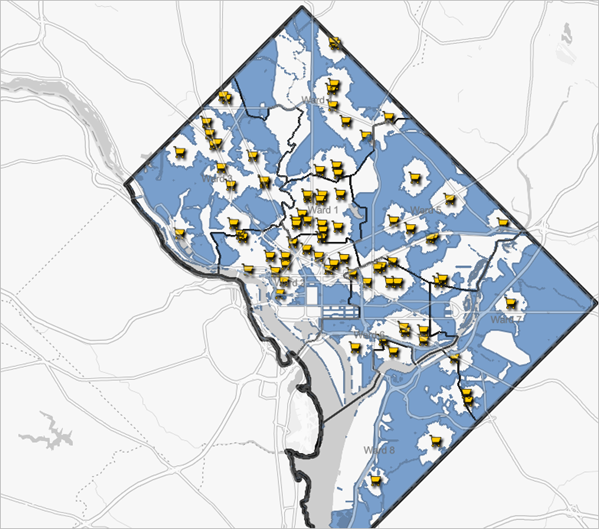
- In the Layers pane, click the Options button next to the Potential Food Deserts Your Name layer. Click Rename and rename the layer Potential Food Deserts.
- On the Contents toolbar, click Save and Open and click Save to save your map.
In this section, you opened an existing web map and created a copy to explore and analyze. You generated 10-minute walking areas around existing grocery stores and used overlay tools to create another layer that shows the areas outside that 10-minute walking area.
For this tutorial, you only considered one aspect of what contributes to food deserts—walking distance. In reality, there are many complex and cumulative factors that contribute to what makes an area a food desert. This might include historic land use practices that resulted in decades of disinvestment, inadequate public transit systems, and income inequality causing healthy foods to be less affordable. When conducting an equity analysis, it is important to consider the unique characteristics of the city or jurisdiction you are investigating and to tailor your analysis to reflect the experiences of those who are experiencing the inequalities.
Now that you have identified potential food deserts, you will supplement your analysis by bringing in demographic data to learn more about patterns of access for different populations across the city.
Visualize community demographics
Previously, you generated areas within a 10-minute walk of grocery store locations, then you overlaid these areas with ward boundaries to identify potential food deserts. Next, you'll use demographic data to better understand who lives in the communities affected by inadequate food access. Several studies have determined that communities of color often have less access to grocery stores that carry healthy, affordable food options compared to predominantly White neighborhoods.
You'll enrich ward boundaries with race and ethnicity data, then you'll compare the potential food deserts that you identified with areas that are considered disadvantaged as part of the Justice40 initiative to identify where these areas overlap.
Enrich wards with demographic data
Like many metropolitan areas, Washington, D.C., is organized into wards. These geographic boundaries affect political decision-making and representation, so you'll use ward boundaries to learn more about who lives in these communities and how demographic characteristics and identities might intersect with access to resources.
Sometimes population data is only available at certain "standard" geography levels, such as census tracts, ZIP Codes, or counties. The Enrich Layer tool allows you to add demographic data to other types of boundaries, such as wards, school districts, travel areas, or other "non-standard" geographies.
- In the Analysis pane, click the back button. On the Tools tab, expand Enrich data, and choose Enrich Layer.
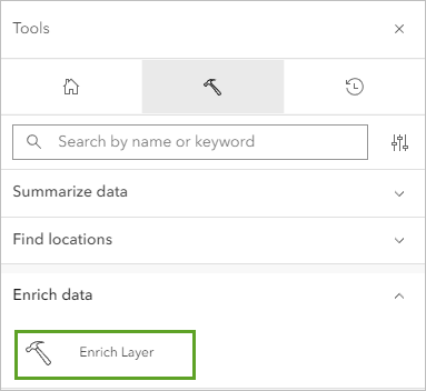
The Enrich Layer tool adds demographic information to geographic data, allowing you to better understand who lives in the communities affected by limited food access. This will also improve the level of detail provided in the apps that you'll create using Instant Apps in the final section of the tutorial.
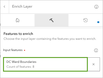
- On the Enrich Layer pane, for Input features, click Layer and choose DC Detailed Ward Boundaries.
- Under Enrichment data, for Enrichment variables, click Variable.
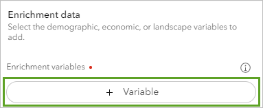
The Data Browser window appears.
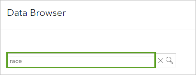
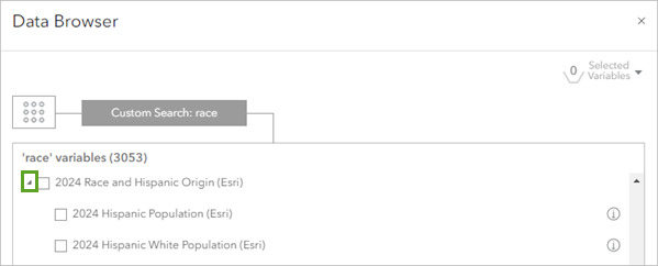
- In the search bar type Hispanic, and find and click 2025 Hispanic Population (Esri).
Note:
You made need to scroll to find some variables, depending on the keywords you search for. - Using what you know, search for and click the following variables:
- 2025 White Population (Esri)
- 2025 Black/African American Population (Esri)
- 2025 American Indian/Alaska Native Population (Esri)
- 2025 Asian Population (Esri)
- 2025 Pacific Islander Population (Esri)
- 2025 Other Race Population (Esri)
- 2025 Population of Two or More Races (Esri)
Note:
The variables may not be listed together, or in this order, in the data browser.
Data browser data is regularly updated. Use the latest available data. Learn about global demographic data using the Learn essential demographic data skills tutorial series and explore the variables available in the data browser.
At the top of the Data Browser window, you can confirm that you have selected eight variables.
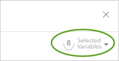
- Click Select to return to the tool parameters pane.
- Under Result layer, for Output name, type Enriched Ward Boundaries followed by your name or initials.
Note:
To run this tool will require 0.64 credits.
- Click Run.
After a few moments, the new layer is added to the top of the Layers pane and drawn on the map.
- Rename the result layer Enriched Ward Boundaries.
- On the map, click any ward to open the pop-up.
Tip:
You may need to click the Next feature button to view the pop-up information for the Enriched Ward Boundaries layer.
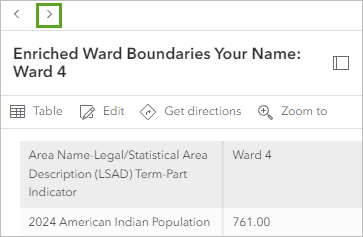
The pop-up contains demographic information about the population that resides there.
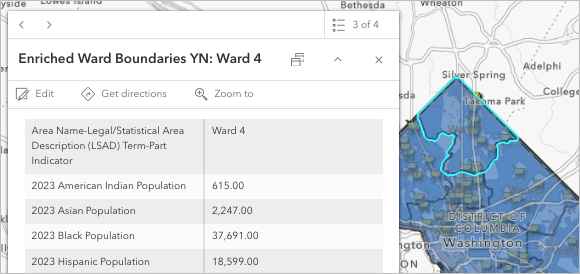
- Open the pop-up for Ward 3 and Ward 8 and compare the 2025 White Population field value relative to the other race and ethnicity fields.
Tip:
Ward 3 is furthest northwest and Ward 8 is furthest south ward.
The 2025 White Population value for Ward 3 was about 60,000. The other race and ethnicity fields are between 36 and 10,000. In Ward 8, the largest race and ethnicity field is the 2025 Black Population at about 70,000. The 2025 White Population field is about 10,000 in Ward 8.
- Close the pop-up and save the map.
Symbolize potential food deserts
Next, style your map to highlight where potential food desert areas exist. Rather than using the default styling, you'll use symbology to draw attention to these places.
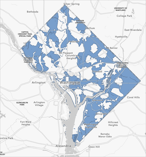
You'll start by styling the potential food desert layer.
- In the Layers pane, turn off all the layers except Potential Food Deserts.
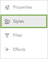
- In the Layers pane, click the Potential Food Deserts layer to select it. On the Settings toolbar, click the Styles button.
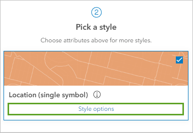
- In the Styles pane, under Location (single symbol), click Style options.
- In the Styles pane, click the symbol under Symbol style.
The Symbol style window appears.
- In the Symbol style window, click the Fill color.
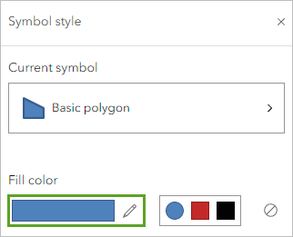
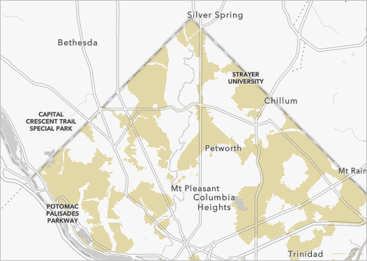
- In the Select color window, next to #, type cdb657.
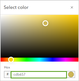
- In the Select color window, click Done.
- For Outline color, choose No color.

- In the Style options pane, click Done twice.
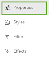
- With the Potential Food Deserts layer still selected, on the Settings toolbar, click Properties.
- In the Appearance section, set the Transparency slider value to 50%.
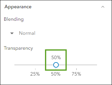
The map is styled.
Add funding opportunity data
To add more context to your map, you will add layers related to federal funding opportunities and public transit information.
The Justice40 initiative is a federal tool seeking to designate 40 percent of climate, clean energy, and other climate resilience building investments in communities that have historically been under-resourced and identified as disadvantaged based on a variety of socioeconomic and environmental burdens. Some of these measures include residing on Federally Recognized Tribal land, experiencing historic underinvestment, and being at or above the 65th percentile for low income.
You'll add a layer containing Justice40 data from ArcGIS Living Atlas of the World then apply filters to show only census tracts within Washington, D.C. You'll also blend the Justice40 layer with your potential food desert locations to understand where there may be opportunities to access federal funding for disadvantaged communities in potential food deserts.
- On the Contents toolbar, click Add and choose Browse layers.
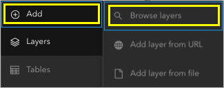
The Browse layers pane appears.
- In the Browse layers pane, click My content and select ArcGIS Online.
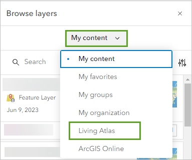
- In the search bar, type justice40 and press Enter. In the list of results, for the Justice40 Tracts November 2022 Version
1.0 (Archive) layer, click Add.
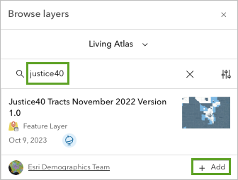
The layer is added to your map.
- Close the Browse layers pane. On the Contents toolbar, click Layers.
Next, you will rename the layer so it is shorter and clearer.
- For the Justice40 Tracts November 2022 Version 1.0 (Archive) layer, click the Options button and click Rename.
- Rename the layer Justice40 Tracts and press Enter.
The Justice40 Tracts layer includes data for every census tract in the United States. You only need to view the tracts within D.C., so you will create a filter.
- In the Layers pane, ensure the Justice40 Tracts layer is selected. On the Settings toolbar, click Filter.
- In the Filter pane, click Add new.
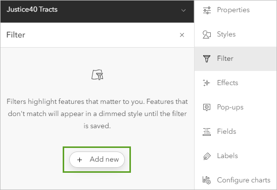
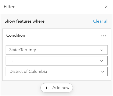
- Build the following expression:
- For the field name, click the drop-down arrow and choose State/Territory.
- For the operator, ensure that the value is set to is.
- For the value, click the drop-down arrow, and search for and choose District of Columbia.
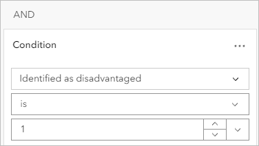
- Click Add new to create a second expression:
- For the field name, search for and choose Identified as disadvantaged.
- For the operator, ensure that the value is set to is.
- For the value, enter a value of 1.
- At the bottom of the Filter pane, click Save.
The results are now filtered to only include census tracts within Washington, D.C., that have been identified as disadvantaged as part of the Justice40 initiative.
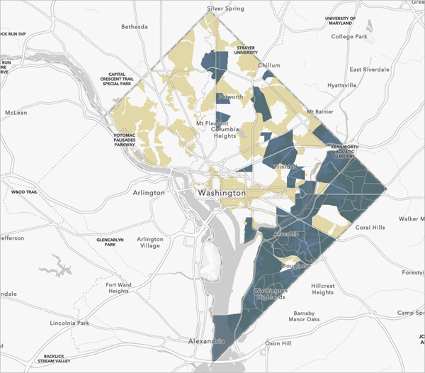
Next, you'll style the Justice40 Tracts layer so that the areas that overlap with potential food deserts are more distinct.
- In the Layers pane, ensure the Justice40 Tracts layer is activated. On the Settings toolbar, click the Styles button.
- In the Styles pane, under Choose attributes, remove the existing attribute.
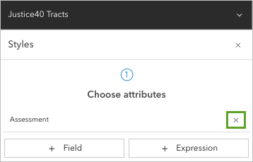
- Under Location (single symbol), click Style options.
- Click the symbol under Symbol style.
- In the Symbol style pane, for Fill color, set # to 990000 and click Done. For Outline transparency, type 0.
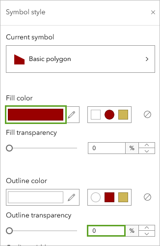
- With the Justice40 Tracts layer still selected, on the Settings toolbar, click the Properties button.
- In the Properties pane, under the Appearance section, set Transparency to 75%.
The Justice40 Tracts layer is styled.
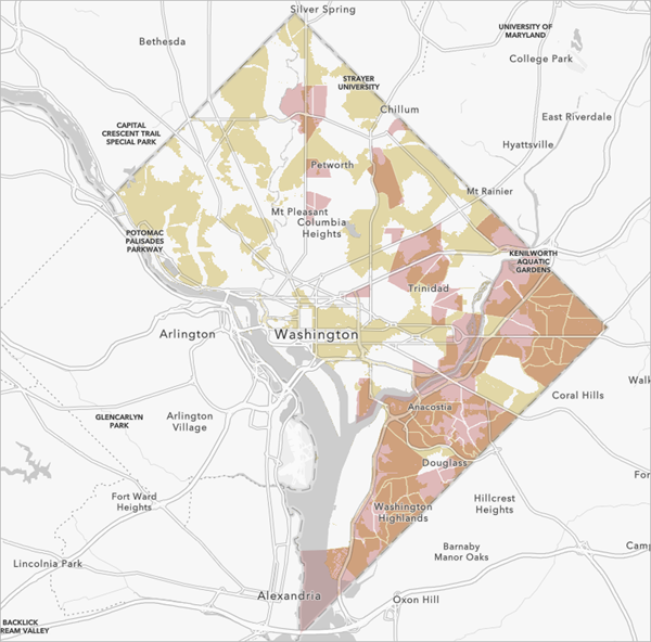
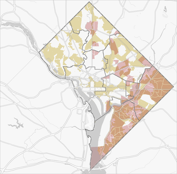
Now, areas where the Potential Food Desert and Justice40 layers overlap appear darker and are more visible.
Add more layers
For additional context, you'll add layers showing the locations of metro lines and stations, providing additional insight into which areas are serviced by public transportation relative to grocery store locations. You'll also add a layer that shows the locations of Capital Area Food Bank programs and partners, which may indicate where emergency efforts are being made to fill in the gaps in places with low or restricted access.
- On the Contents toolbar, click Add and choose Add
layer from URL.
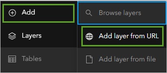
The Add Layer window appears. First, you will add a layer containing the metro lines in D.C.
- For URL, copy and paste the following URL:
https://maps2.dcgis.dc.gov/dcgis/rest/services/DCGIS_DATA/Transportation_Rail_Bus_WebMercator/MapServer/106
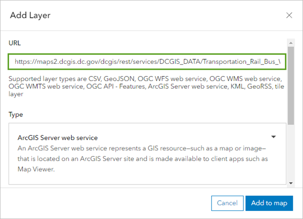
- Click Add to map.
The Metro Lines layer is added to your map.
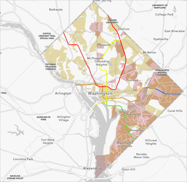
- In the Layers pane, rename the newly added layer to Metro Lines.
- Use what you have learned to add and rename the following layers:
URL Rename layer https://maps2.dcgis.dc.gov/dcgis/rest/services/DCGIS_DATA/Transportation_Rail_Bus_WebMercator/MapServer/52
Metro Stations
https://maps2.dcgis.dc.gov/dcgis/rest/services/DCGIS_DATA/Public_Safety_WebMercator/MapServer/26
Emergency Food Providers
The layers are added to your map.

The Emergency Food Providers layer includes data for the entire country. You want to filter it to only show locations within Washington, D.C.
- In the Layers pane, ensure the Emergency Food Providers layer is selected. On the Settings toolbar, click Filter.
- In the Filter pane, create and build the expression STATE is DC. Click Save.
The Emergency Food Providers layer now only shows locations within D.C.
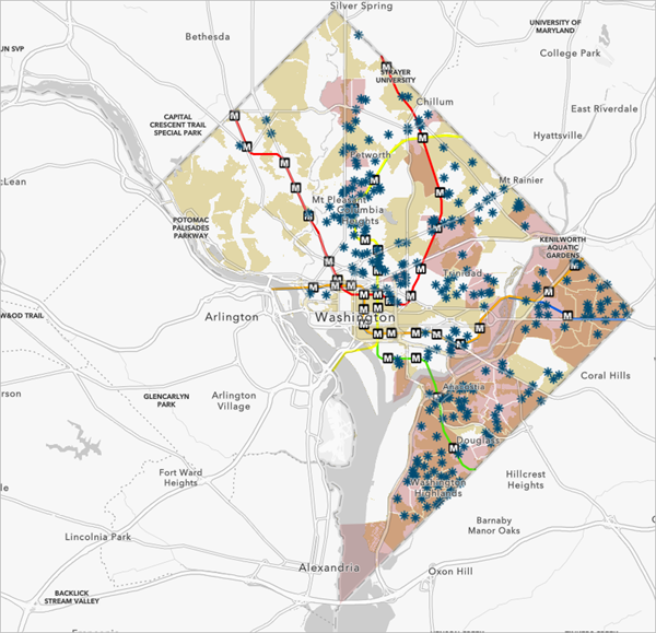
As you investigate the resulting map, do you notice any clusters or gaps in where food banks are located across the city?
By configuring a handful of styling parameters, you can now distinguish potential food deserts from Justice40 tracts, and the areas of overlap between these two layers are clear.
Finally, you'll apply an effect to the Metro Lines layer to make this layer more visible, then you'll set the visible range of all three new layers to keep the map uncluttered when zoomed out.
- In the Layers pane, click the Metro Lines layer to select it.
- On the Settings toolbar, click the Effects button.
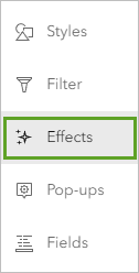
- Turn on the Drop shadow effect.
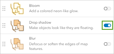
The Metro Lines layer is more visible with the Drop shadow effect on.
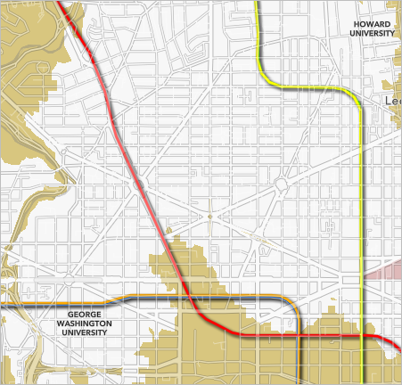
Next, you will set the visibility range for the Metro Lines and Metro Stations layers. When the map is zoomed out beyond the city, the Metro layers will not be as visible, and they will not provide useful information. These layers become more important when you are zoomed closer in to the city. You will set the visibility range for both layers to only be visible when the map is zoomed in closer to the city.
- With the Metro Lines layer still selected, on the Settings toolbar, click the Properties button.
- In the Visibility section, for Visible range, click World and choose City to set the maximum visible range.

Now when you zoom out beyond the city level, the metro-related layers are not visible. When you zoom in closer to the city, they become visible again. You can also more easily see where public transportation infrastructure exists throughout the city in relation to potential food deserts and areas that have been identified as disadvantaged as part of the Justice40 initiative.
- Set the Visibility range for the Metro Stations and Emergency Food Providers layers to City.
- Save the map.
In this section, you used the Enrich Layer tool to add demographic data to your map to provide insight into the communities affected by limited food access. You styled the potential food desert layer and applied effects to make these areas stand out from the rest of your map. You overlaid the Justice40 layer to provide context for where funding opportunities may exist, and you added infrastructure data to show where improved access may exist.
Now that you've incorporated these additional layers into your analysis and enhanced the appearance of your map, you'll share your findings as an app using Instant Apps.
Share your results
Previously, you identified potential food deserts and compared these areas with census tracts that have been identified as disadvantaged as part of the Justice40 initiative. You also enhanced the symbology of the map layers and brought in infrastructure data to provide additional context.
While maps are a foundational step in analyzing and visualizing access, it is essential to move from analysis to action by engaging members of the community. To share your results in a meaningful, actionable way, you'll create an app using ArcGIS Instant Apps that empowers users with data-driven reasoning and a logical basis for asking for more equitable policies and solutions from elected officials such as ward representatives.
Apps are accessible and interactive platforms that can streamline the communication of data. For this workflow, you'll calculate the percentage of each ward that is potentially food insecure, then you'll enable pop-ups and bookmarks on your map and configure a web app to share this information with community members and stakeholders.
Summarize potential food deserts
Now that you've created the Potential Food Deserts layer and applied filters to the Justice40 Tracts layer, you'll use the Summarize Within tool to calculate the percentage of area in each ward that is potentially food insecure, the percentage that has been identified as disadvantaged as part of the Justice40 initiative, and the number of grocery stores and food banks. These key facts will then be displayed in pop-ups, streamlining the delivery of this valuable information to users.
First, you'll summarize the number of food banks within each ward.
- On the Settings toolbar, click the Analysis button.
- In the Analysis pane, click the Tools tab and click Summarize Within.
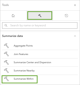
- In the Summarize Within tool pane, enter the following:
- For Input features, choose Emergency Food Providers.
- For Summary polygon layer, choose Enriched Ward Boundaries.
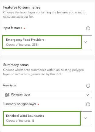
- Under Result layer, for Output name, type Wards EP followed by your name or initials.
- Click Run.
Note:
It will require 0.266 credits to run this tool.
After a few moments, the new layer is drawn on the map.
- In the Layers pane, for the Wards EP layer, click the Options button and choose Show table.
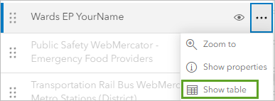
The attribute table for the Wards EP layer appears.
- In the Wards EP table, scroll to the end of the table so you can see the Count of Points field.
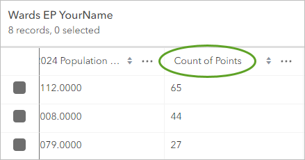
The Count of Points field represents the count of Emergency Food Providers within each ward. You will use this information later in the tutorial when you configure the pop-ups for the layer showing ward boundaries.
- Close the table.
Next, you'll rerun the Summarize Within tool to summarize the number of grocery stores within each ward.
- In the Analysis pane, click the History tab. For the most recent Summarize Within run, click the options button and click Open tool.
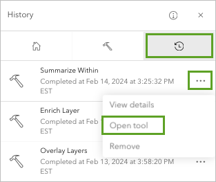
- The Summarize Within tool pane appears with all the parameters you entered before.
- In the Summarize Within tool, adjust the following parameters:
- For Input features, choose Grocery Store Locations.
- Under Summary areas, for Summary polygon layer, choose Wards EP.
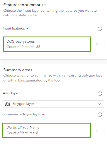
- Under Result layer, for Output name, type Wards Analysis Summary, and add your name or initials.
- Click Run.
Note:
To run this tool will require 0.093 credits.
The Wards Analysis Summary layer is added to your map, which contains summarized data on the number of emergency food providers and number of grocery stores by ward.
- In the Layers pane, confirm the Wards Analysis Summary is selected. On the Settings toolbar, click Fields.
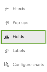
The Fields pane shows a list of all the fields included in the Wards Analysis Summary layer. The resulting layer, the Wards Analysis Summary layer, now includes data on the ward's representatives and contact information, the enriched race and ethnicity data you prepared, the count of emergency food providers, and grocery stores.
- In the Fields pane, in the search bar, type count.
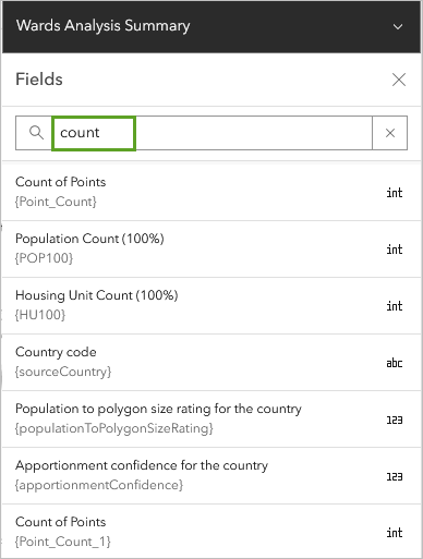
In the list of results, there are two fields with the alias name Count of Points. The one with the field code {Point_Count} is the summary of Emergency Food Providers within each ward. The one with the field code {Point_Count_1} is the summary of the Grocery Store Locations within each ward.
Next, you will style the Wards Analysis Summary layer.
- In the Layers pane, turn off the Wards EP layer.
- In the Layers pane, confirm the Wards Analysis Summary layer is selected. On the Settings toolbar, click Styles.
- In the Styles pane, under Choose attributes, remove the existing field.
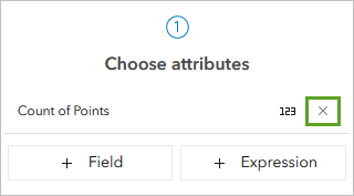
- Under Pick a style, for Location (single style), click Style options.
- In the Style options pane, click the symbol under Symbol style. In the Symbol style window, set the following parameters:
- For Fill color, choose No color.
- Click the Outline color, and for #, type 636363. Click Done.
- For Outline transparency, type 0.
- For Outline width, type 2.
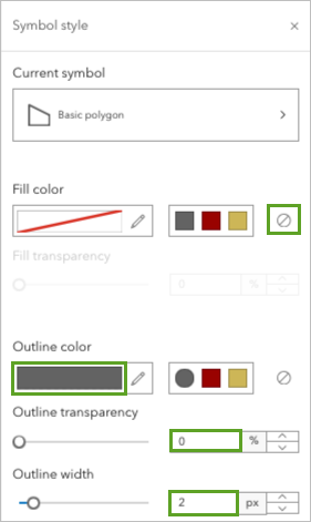
- In the Style options pane, click Done twice.
The Wards Analysis Summary layer is styled.
Prepare your map for sharing
To provide stakeholders with meaningful data that they can use to support action around food access, you'll configure pop-ups for the Wards Analysis Summary layer that makes this information more accessible to app users. You'll also add bookmarks that will be used in the app to allow users to compare this information across city wards, highlighting inequities in access through a spatial lens.
First, you'll remove layers you do not need to show in your final map.
- In the Layers pane, remove the following layers:
- Wards EP
- Enriched Ward Boundaries
- DC Ward Boundaries
- DC Detailed Ward Boundaries
- DC Boundary
Tip:
To remove a layer, in the Layers pane, for each layer, click the Options button and choose Remove.
- Rename the Wards Analysis Summary layer to DC Ward Boundaries.
- In the Layers pane, click the visibility buttons so all the layers are visible.
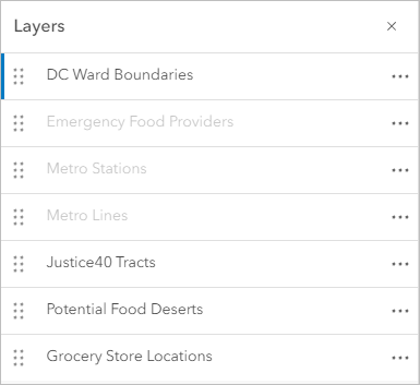
The three layers in the Layers pane that are in a light gray color are not visible on the map. This is because you set the visibility extent for the layers to only be visible when the map is zoomed in to the City level.
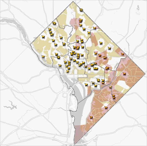
The map contains all the relevant information you need to communicate where there is an increased need for food access.
- Zoom in to the map until the metro-related and Emergency Food Provider layers are visible.
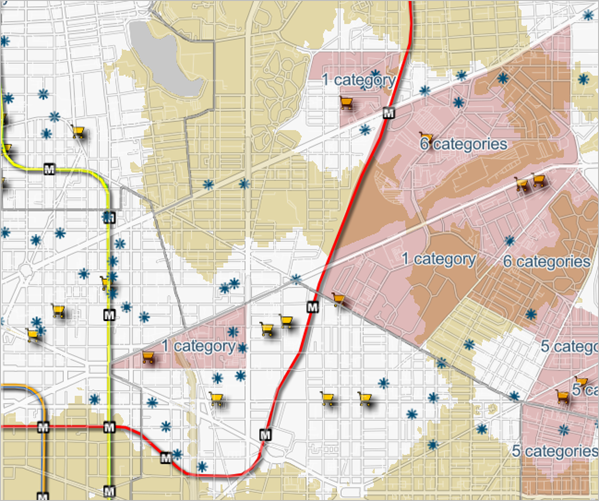
The layers are now visible, but you also notice that the labels for the Justice40 Tracts layer also become visible at this extent. The labels don't provide key information to your audience, so you will turn off the label.
- In the Layers pane, click the Justice40 Tracts layer to select it. On the Settings toolbar, click Labels.
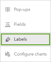
- In the Label features pane, turn off Enable labels.
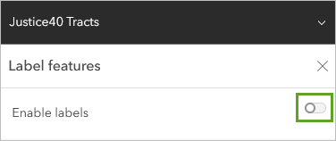
The labels are no longer visible on the map.
The only layer you want to have pop-ups with key information is the DC Ward Boundaries layer. It contains the race and ethnicity data and the number of grocery store and emergency food providers from the Summarize Within tool you ran earlier in the tutorial. It also contains representative contact information from the original DC Ward Boundaries layer. Since it is already rich with data you want to show your audience, you will not need pop-ups from any other layers.
- In the Layers pane, click the Grocery Store Locations layer. On the Settings toolbar, click Pop-ups.
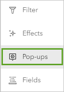
- In the Pop-ups pane, turn off Enable pop-ups.
- Use what you have learned to turn off Enable pop-ups for the following layers:
- Emergency Food Providers
- Metro Stations
- Metro Lines
- Justice40 Tracts
- Potential Food Deserts
The only layer with pop-ups enabled is DC Ward Boundaries.
Next, you will create bookmarks for three city wards. Bookmarks enable you to navigate more seamlessly between places on a map and compare across locations. When choosing places to bookmark, it is important to be intentional and to think carefully about what you want to communicate by bringing attention to a handful of locations.
As part of your web app, bookmarks will allow users to investigate and contrast the demographic characteristics and food access-related infrastructure of different wards. Consider the visual distribution of grocery stores, potential food deserts, and Justice40 tracts across the city.
Where are there clusters of grocery stores? Where are there potential food deserts and areas identified as disadvantaged as part of the Justice40 initiative? Where is the overlap? Where are there gaps?
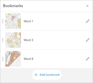
At a glance, Ward 1 has several grocery stores and only a few potential food desert areas and Justice40 tracts. Ward 3 has many potential food desert areas, but there are no Justice40 tracts. Ward 8 is almost entirely covered by potential food desert areas, and there is significant overlap between these areas and Justice40 tracts. Based on these factors, you will create bookmarks for these three wards.
- On the map, pan to center Ward 1 on the map, then zoom in so that it fills the map view.
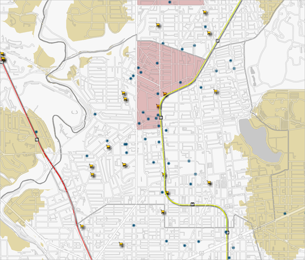
- On the Contents toolbar, click Bookmarks, then click Add bookmark.
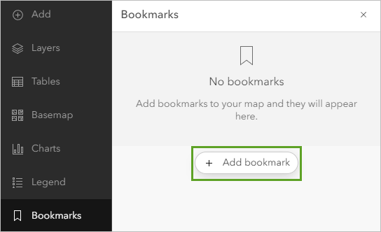
- For Title, type Ward 1 and click Add.
- Use what you have learned to create bookmarks for Ward 3 and Ward 8.
Next, you will customize the pop-up for the DC Ward Boundaries layer to display the most important information to share with stakeholders.
Customize a pop-up
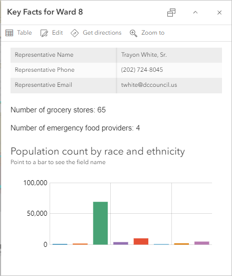
Customizing a pop-up for your audience is important. It is one of the main ways your audience will see the most important information about your map data and enables you to make the map more interactive and persuasive.
- In the Layers pane, click the DC Ward Boundaries layer to select it. On the Settings toolbar, click Pop-ups.
- In the Pop-ups pane, expand Title and clear the existing text. For Title, type Key Facts for Ward and add a space.
- Click the add field button.

- In the Add field window, choose the Ward Number field.
The attribute name for the field is added to the Title in curly brackets, indicating it is a dynamic field.

In the preview pop-up, the pop-up title is updated to show the ward name.
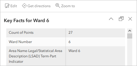
The pop-up currently displays nearly all the fields in the layer. You will only choose the fields related to the representatives for each ward to display.
- Expand the Fields list section and click Select fields.
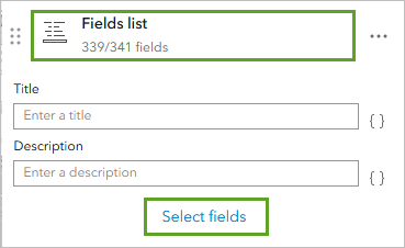
The Select fields window appears.
- In the Select fields window, click Select all and click Deselect all.
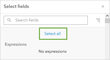
None of the fields are selected.
- In the list of Fields, click the Representative Name, Representative Phone, and Representative Email fields and click Done.
The pop-up preview now shows the three fields you selected.
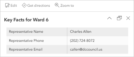
Next, you will add custom text to show the number of food providers in each ward.
- In the Pop-ups pane, click Add content and choose Text.
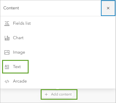
- In the text editor, type Number of grocery stores:.
- Type a space and an open curly bracket ({).
A list of attributes associated with the DC Ward Boundaries layer appears.
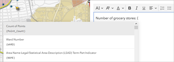
- After the curly bracket, type Point, and in the list of fields that appears, click {Point_Count_1}.

- In the text editor, press Enter to start a new line and type Number of emergency food providers: {. In the list of fields that appears, choose {Point_Count}.

- Click OK.
The pop-up for the DC Ward Boundaries layer now shows the total number of grocery stores and the number of emergency food providers located in that ward.
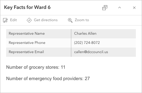
The final type of content you will add to your pop-up is a chart showing race and ethnicity data for each ward.
- In the Pop-ups pane, click Add content and choose Chart.
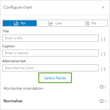
- In the Configure chart window, on the Bar tab, click Select fields.
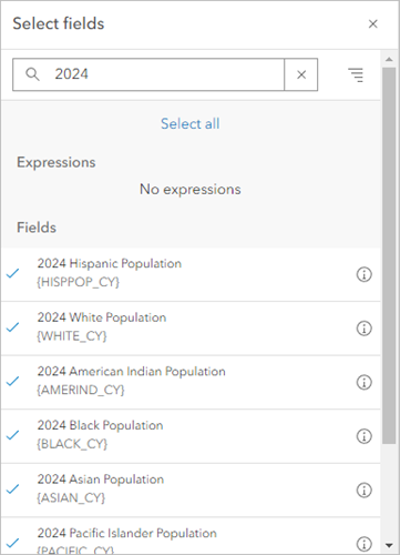
- In the Select fields window, on the search bar, type 2025. In the list of results, check the following fields:
- 2025 American Indian Population
- 2025 Asian Population
- 2025 Black Population
- 2025 Pacific Islander Population
- 2025 Hispanic Population
- 2025 Other Race Population
- 2025 Population of 2+ Races
- 2025 White Population
- Click Done.
- In the Configure chart window, for Title, type Population count by race and ethnicity. For Caption, type Point to a bar to see the field name.
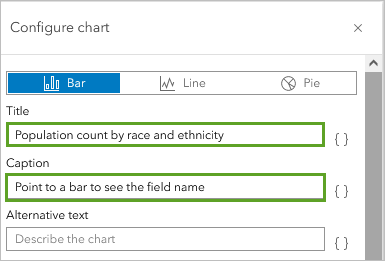
The pop-up is configured.
- Click Done.
- Save the map.
Create a web app
Now that you've prepared your web map to include bookmarks and key facts summarizing information about each ward, you'll create and configure an app using Instant Apps to be able to share your visualization. You'll use an Insets app, allowing you to view and interact with data from multiple places at the same time. This format gives users a high-level overview of an area with the ability to compare across specific locations for which bookmarks have been enabled.
- On the Contents toolbar, click Create app, then click Instant Apps.
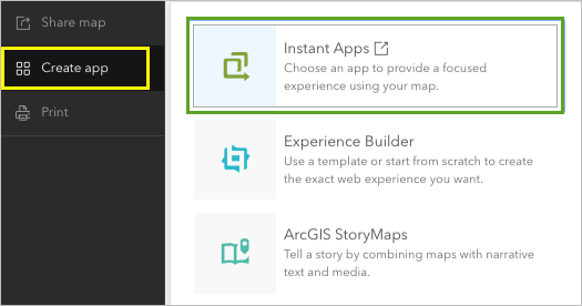
The Instant Apps home page opens in a new browser tab.
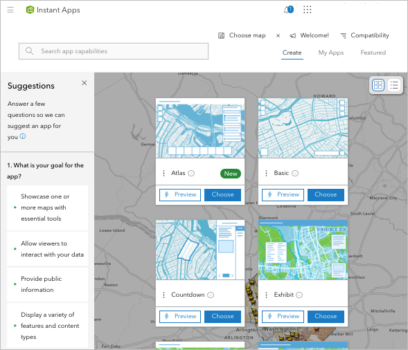
- For the Insets template, click Choose.
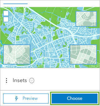
- In the Create app - Insets window, for title, type DC Food access app and add your name or initials. For tags, clear the existing tags, and type Washington DC, food access, food desert, equity, pressing Enter after each tag.
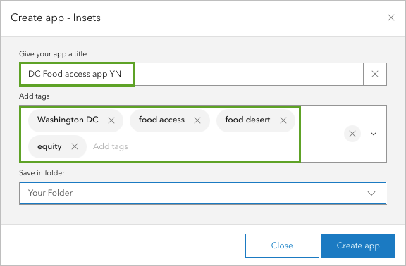
- Click Create app.
The Configure Insets window appears.
- If the Express Wizard window appears, close the window to continue.
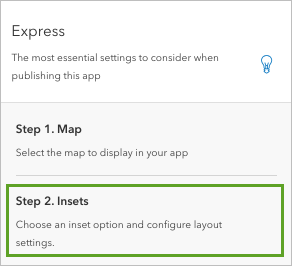
- In the Express pane, click Step 2. Insets.
- In the Insets pane, for Number of inset windows, set it to 3 and click the Import bookmarks button.
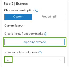
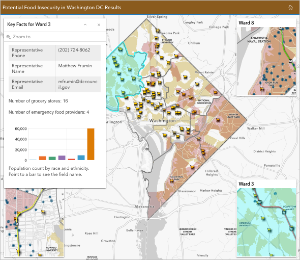
The bookmarks that you enabled for Ward 1, Ward 3, and Ward 8 appear on the app preview as inset maps.
- Turn on Inset title headers to show the ward number on each inset, and ensure Limit map navigation is on to enable users to focus on the study area.

- Click Next.
The About pane appears. In this pane, you can set the title for your app. Since you have three inset maps set up in three corners of the app, you will set the pop-up to appear in the remaining corner so it doesn't overlap with the inset maps.
- In the About pane, for App title, type Potential Food Insecurity in Washington DC Results. For Pop-up position, choose Top left.
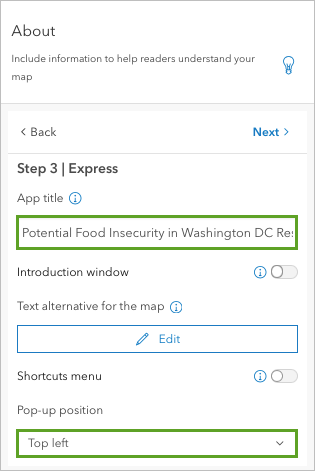
- Click Next two times.
In the Theme & Layout pane, you can adjust the overall look of your app.
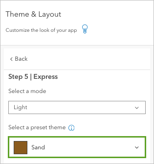
- In the Theme & Layout pane, for Select a preset theme, choose Sand.
Your app is ready to publish.
- Click Publish. In the Publish window, click Confirm.
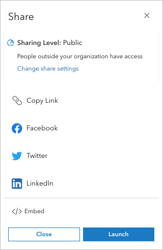
When your app has published, the Share window appears.
- In the Share window, click Change share settings.
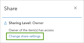
- In the Share window, choose Everyone (public) and click Save.
- In the Item sharing successfully updated window, click Review sharing. In the Review sharing window, click Update sharing.
The app is published. The details are shown on the app configuration pane.

- In the configuration panel, click Share to view the Share window.
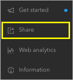
In the Share window, you can now share your web app by copying the link, choosing a sharing platform, or embedding the app in a web page.
In this section, you distilled valuable data from four separate layers into one more manageable layer, then you enabled pop-ups and bookmarks to highlight relevant information about food access in each city ward. You then created and configured an app using Instant Apps showing potential food deserts, travel areas, and infrastructure data with the ability to compare across wards.
In this tutorial, you used data from an open data hub to map and analyze potential food deserts. You used demographic data from the Data Browser to understand who lives in the communities across Washington, D.C., and you compared your potential food desert findings with the Justice40 layer to identify funding opportunities.
You summarized these results in an accessible way by creating an app using Instant Apps to share your findings. This app can now be used to engage members of the community and decision makers around food access by highlighting where there is high need and funding opportunities to address inequities.
Throughout this analysis, you worked with data at the ward boundary level. This enabled you to take a more localized approach in identifying and advocating for improved access throughout the city. It is critical to engage with the community at the most local level as possible to ensure any proposal for policy change or targeted solutions. Possible solutions might include applying for funding to invest in community gardens, increasing the number of farmers market locations, and business development programs. Interventions are most effective when they integrate community input and the analysis uses the most locally available data.
By developing an understanding of local conditions, resources, and opportunities through spatial analysis and combining this with an equity lens, you can begin to implement solutions that target the root causes of a systemic issue of access.
You can find more tutorials in the tutorial gallery.


