Map a historic cholera outbreak
Explore cholera data
In the 1840s and 1850s, London was in the middle of a cholera pandemic. At the time, there was limited understanding of how germs and other microorganisms can cause disease. Most people believed that cholera was spread by miasma, or a toxic vapor, through the air. Dr. John Snow thought otherwise. His observations led him to believe that cholera was a germ that spread via water. As the outbreak began to subside in London, he collected data and commissioned a map to look for patterns. You'll explore Snow's data with pop-ups and the heat map style to explore whether cholera spread by air or another way.
GIS allows you to compare geographic data as layers. Each layer in a map contains different information you can compare to better see and understand patterns and how they influence one another. You'll start by using Map Viewer to explore layers in a map showing data from the 1854 cholera outbreak.
- Open the Cholera Outbreak, 1854 map.
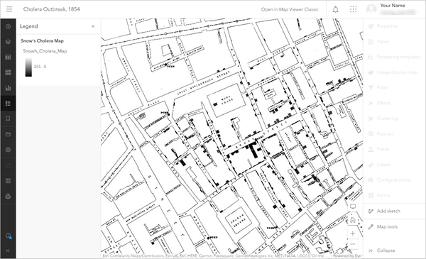
The map appears in Map Viewer. It shows London's Soho district, an area in the City of Westminster in the West End of London.
- If necessary, on the ribbon, click Sign In. Sign in using your ArcGIS organizational account.
Note:
If you don't have an organizational account, see options for software access.
If you encounter an error or are unable to sign into your account, remember that passwords are case-sensitive. If you forget your ArcGIS password, you can reset your password from the sign in page. See the Account troubleshoot page for more information.
Once you sign in, the Legend pane is displayed.
- On the Contents (dark) toolbar, click Layers.
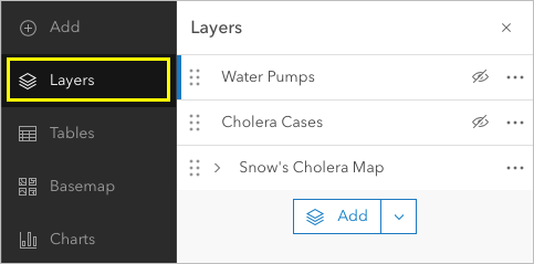
The Layers pane appears.

There are three layers in this map, but the only one that is visible is Snow's Cholera Map. This is the map John Snow published to document the data he collected during the outbreak.
- Use the pan and zoom tools to explore the map to determine where cholera was most prevalent in the Soho district.
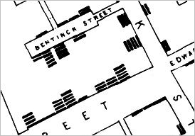
Each hash mark (the stacked, bold lines along the street) represents a death that occurred at that address due to cholera.
Are there any areas or specific addresses with the most documented deaths?
- In the Layers pane, for the Cholera Cases layer, click the Show Cholera Cases button.
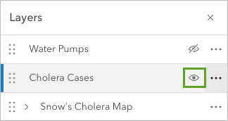
The layer is turned on and becomes visible on the map. The Cholera Cases layer shows the same addresses as Snow's map, but drawn as points. Unlike the hash marks, which are part of a static image, these points can be interacted with.
- On the map, click one of the points.
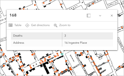
A pop-up appears. It shows the address and the number of deaths that occurred at the point you clicked. A GIS can store much more information than you can draw or label on a map. You can access this information, which is called attribute information, in pop-ups or in the layer's attribute table.
- Close the pop-up.
- In the Layers pane, for Cholera Cases, click the Options button and choose Show table.
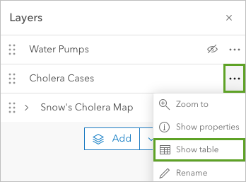
The layer's attribute table appears. It lists the number of deaths that occurred at each address. An attribute table has rows and columns that provide information related to a map feature.
- On the table, in Deaths column, click the Menu button and choose Sort descending.
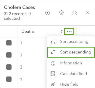
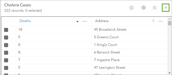
The attribute table is now shown in descending order, with the address with the highest number of deaths listed first. You now know which addresses were affected the most, though you don't know why.
- In the attribute table, click the Close button.
Before you continue, you'll save your own copy of the map so you can make changes to it.
- On the Contents toolbar, click Save and open and choose Save as.

- In the Save map window, for Title, type 1854 Cholera Outbreak Map.
- Click Save.
A copy of the map is saved in your ArcGIS Online account.
Create a heat map
The attribute table provides details of where the cholera deaths were located. However, it can be easier to detect some patterns when the data is viewed on a map. For instance, the distribution of points can indicate where events are happening more or less frequently. To make these patterns even clearer, you'll change the way the points are displayed to a heat map. A heat map displays points as a continuous surface that emphasizes locations with a high density of points.
- In the Layers pane, ensure the Cholera Cases layer is selected.
Note:
A selected layer has a blue bar next to its name. To select a layer, click it.

- On the Settings (light) toolbar, click Styles.
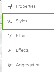
The Styles pane appears. It shows the style options for the selected layer, which in this case is Cholera Cases.
By default, the layer is styled with a single symbol for each point. While you could change the style to the Heat Map style right away, the heat map would only show the density of each point assuming it represents one case. From the attribute table, however, you know that some points represent multiple cholera cases. You'll change the style to account for this attribute data.
- In the Styles pane, for Choose attributes, click Field.

- In the Select fields window, click Deaths.
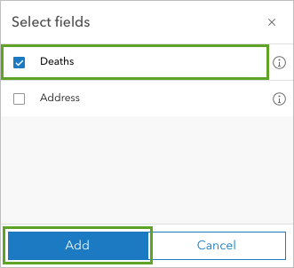
- Click Add.
The map updates to show point symbols of different sizes. Instead of showing only the locations of addresses where cholera deaths occurred, the map now also shows the number of deaths at each address, with larger circles representing more deaths. This style is closer to the original map, which uses hash marks to represent the number of deaths.
Next, you'll change the style to display the data as a heat map.
- For Pick a style, scroll down and click Heat Map.
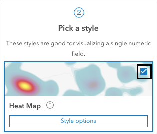
The map updates again.
- Click Done.
A heat map is helpful for visualizing density, or how much of a phenomenon is in a given area. Purple and red represent areas where there was a lower density of cholera deaths. Yellow represents the densest concentration. The density takes into account how close locations are to one another and the number of deaths at each location.
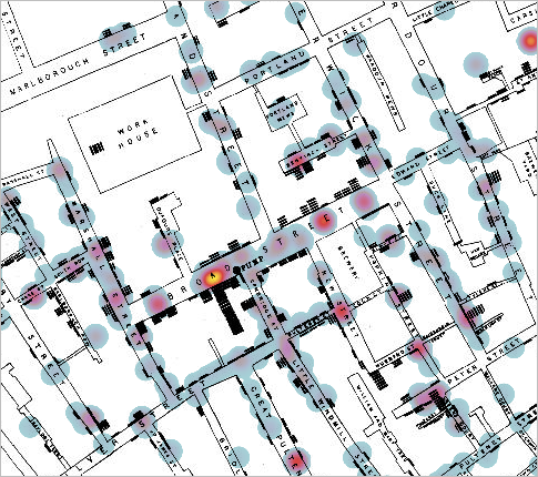
Snow's map is not very visible under the heat map symbology, so you'll adjust the Blending setting for the Cholera Cases layer. Blending visually combines layers so all of the layers are more visible.
- On the Settings toolbar, click Properties.

- In the Properties pane, for the Appearance section, for Blending, click Normal.

- In the Blending window, scroll to the Darken section and choose Multiply.
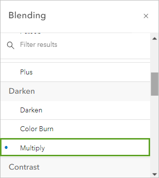
- Close the Blending window.
Additionally, you can set the transparency level of a layer to make it possible to see other layers behind it.
- For Transparency, move the slider to 25%.
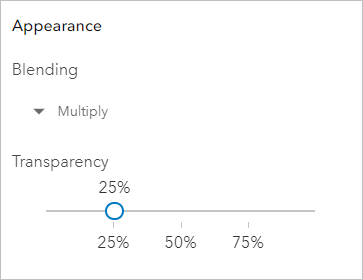
The map updates and Snow's map is more visible.
Explore water pumps
Next, you'll look at another feature on Snow's map, water pumps.
- In the Layers pane, make the Water Pumps layer visible.
The water pumps appear on the map. There is a water pump near the brightest yellow zone of the heat map.
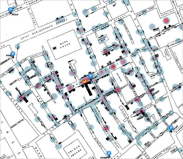
- Click the symbol for the water pump closest to the brightest yellow zone of the heat map.
The water pump's pop-up appears.
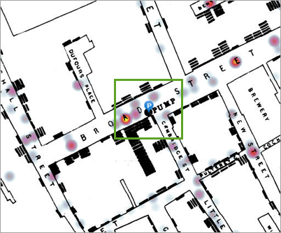
This is the Broad Street pump. (Broad Street has since been renamed to Broadwick Street.) Your map may lead you to the same conclusion that Snow reached: the Broad Street pump should be investigated as a possible source of the outbreak. Before the map was published, Snow brought his research and arguments to city officials, who in September 1854 removed the pump from service.
Once people were no longer able to access the contaminated pump, the cholera outbreak slowed, though Snow acknowledged that people leaving the city may also have reduced the number of cholera deaths. Interestingly, it was not Snow's book, where he wrote his assertion that cholera is caused by a germ and travels via water, that was widely read and cited. Instead, the map he commissioned, which was published after the pump was removed from service, is what continues to illustrate what he learned.
- Close the pop-up. If necessary, zoom in or out until you can see all of the data on the map.
- On the Contents toolbar, click Save and open and choose Save.
In this tutorial, you explored a web map of the investigation done by Dr. John Snow to identify the source of a cholera outbreak using attribute tables, pop-ups, and the heat map style. In this example, the dataset was small, and the relationship between the layers was relatively easy to see. Often, geographic datasets are larger and more complex. Having a system for organizing, analyzing, and sharing GIS data quickly becomes necessary to answer complex spatial questions and solve challenging problems.
John Snow's spatial analysis was able to help people because he shared his findings. Web maps can be shared as apps so the public can view them without needing any GIS expertise. Though this tutorial didn't cover how to create a web app, you can learn more in the tutorial Create an app.
You can find more tutorials in the tutorial gallery.
