Make a map
Filter map data
You will open a web map containing one polygon feature layer. You'll investigate the source of the layer and filter it to only show data for the state of Oregon.
- Open the Portland Urban Heat web map.
The web map opens, showing census tracts in Portland, Oregon, as well as the city boundary.

- Above the map, click Sign In and sign in with your credentials.
- On the Contents (dark) toolbar, click Layers.

Tip:
If the Contents toolbar is collapsed, click the Expand button at the bottom of the toolbar to see the button names.
The Layers pane appears.
- In the Layers pane, click the National Risk Index Census Tracts layer to select it.
Tip:
The blue bar on the side of the layer indicates that the layer is selected. You may need to click the layer twice if it was previously selected.

On the other side of the map, the Properties pane appears. You'll start by investigating the data source.
- In the Properties pane, expand Information and click the Source layer card.
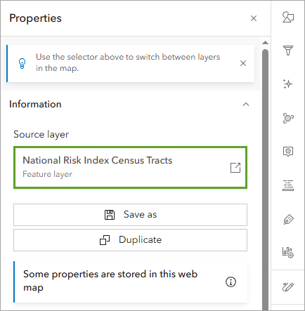
The layer's item page appears in a new browser tab or window.
- On the blue banner, click National Risk Index Census Tracts and review the information displayed.

The National Risk Index Census Tracts layer maps risk from 18 natural hazards across the United States, including earthquakes, hail, heat waves, and hurricanes. It was created by the Federal Emergency Management Agency (FEMA).
- Close the item page browser tab and return to the Portland Urban Heat web map.
The National Risk Index Census Tracts layer covers all of the United States. You'll start by filtering it to only the state of Oregon.
- On the Settings (light) toolbar, click Filter.

- In the Filter pane, click Add new.
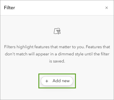
To build a filter expression, you will specify the field, the operator, and the value you want to filter for.
- For the first drop-down menu (the field), choose State Name.

- For the second menu (the operator), choose is.
- For the third menu (the value), click the arrow. Search for and choose Oregon.

- At the bottom of the Filter pane, click Save.
- On the map, zoom out.
The National Risk Index Census Tracts layer now only shows information for the state of Oregon.

Before you continue, you'll save a copy of the map to your account.
- On the Contents toolbar, click Save and open and choose Save as.

- In the Save map window, enter the following:
- For Title, type Tree planting opportunities in Portland.
- For Summary, replace the existing text with the following: Map showing areas that would benefit from additional trees based on heat wave risk, high heat severity, and the locations of existing trees.

- Click Save.
Style a layer
Next, you'll update the style of the layer so the map communicates heat wave risk.
- In the Layers pane, next to City Boundary, click the Options button and click Zoom to layer.
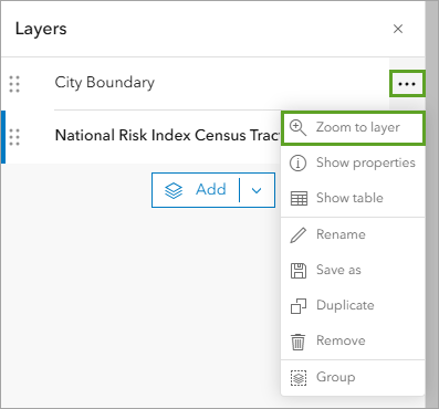
- Ensure that National Risk Index Census Tracts is still the selected layer.
On the Settings toolbar, click Styles.

The layer is currently styled using the National Risk Index - Rating - Composite field, which creates a combined risk rating from all 18 hazards. You'll change the field to one that only measures risk from heat waves.
- In the Styles pane, under Choose attributes, click National Risk Index - Rating - Composite.

-
In the Replace field window, search for heat wave - hazard. Choose Heat Wave - Hazard Type Risk Index Score.
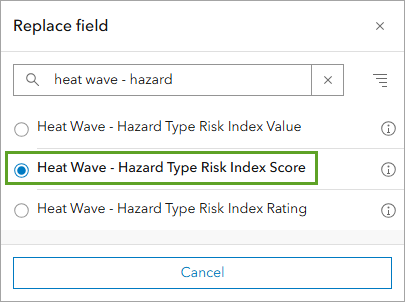
The map updates. The census tracts are now shown in shades of blue. The layer is mapping risk from heat waves, so warmer colors like yellows and reds would be more appropriate. You'll change the color ramp.
- In the Styles pane, under Pick a style, on the Counts and Amounts (color) card, click Style options.

- Under Symbol style, click the blue color ramp.

- In the Symbol style window, under Colors, click the blue color ramp.
- For Category, choose Reds and yellows.
- Scroll halfway down the list and choose the Orange 4 color ramp.
Tip:
Point to the color ramps to see their names.
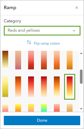
- In the Style options pane, click Done twice.

The map now shows areas of higher risk from heat waves in darker red colors and areas with less risk in pale yellow. You'll update the name of the layer to reflect this change.
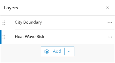
- In the Layers pane, next to National Risk Index Census Tracts, click the Options button and choose Rename.
- For Title, type Heat Wave Risk and click OK.
Next, you'll zoom in to examine the map.
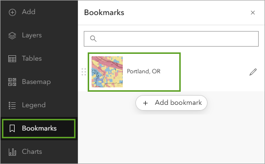
- On the Contents toolbar, click Bookmarks. In the Bookmarks pane, click Portland, OR.
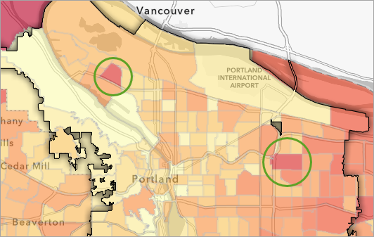
The map shows two census tracts that have higher heat wave risk scores than others within the city of Portland. These tracts could be good locations to plant more trees.
Add a raster layer
The two layers in your map are both polygon feature layers. Feature layers are a kind of vector data, and represent spatial data as a set of discrete features, which can be points, lines, or polygons. Next, you'll add an imagery layer, which is a kind of raster data that represents spatial data as a grid of cells, similar to pixels in a digital photo.
The imagery layer that you'll add maps heat intensity in American cities. You'll access it from ArcGIS Living Atlas of the World, a curated collection of authoritative data.
- In the Contents pane, click Layers.
- In the Layers pane, click Add.

- In the Add layer pane, click My Content and choose Living Atlas.

- In the search bar, type Heat Severity - USA and press Enter.
In the list of results, there are multiple imagery layers named Heat Severity - USA, all owned by The Trust for Public Land.
- In the list of results, find the Heat Severity - USA layer from the most recent year. On the item card, click the Add button.
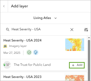
The layer appears on the map. It maps relative heat severity for all cities in the United States. Yellow areas are slightly hotter than the average (mean) temperature of the city, while red areas are significantly hotter than the average.
Note:
You can read more about the Heat Severity - USA layer on its item page.
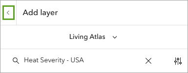
- At the top of the Add layer pane, click the Back button.
It is difficult to read both heat layers on the map at the same time. The Heat Severity - USA layer hides the Heat Wave Risk layer. Additionally, the Heat Severity - USA layer is slightly transparent, so its colors are modified by the colors of the layer underneath. You'll use blend modes and effects to make the map more legible.
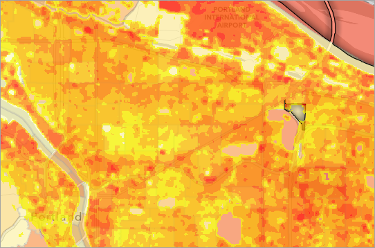
- In the Layers pane, ensure that the Heat Severity - USA layer is selected.
- On the Settings toolbar, click Properties.
- In the Properties pane, under Appearance, under Blending, click Normal.
- In the Blending window, search for and choose Multiply. Click the Close button.
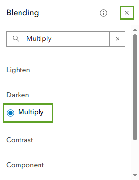
Blending controls how the appearance of a layer interacts with the layers beneath it. The blend mode Multiply is similar to layer transparency, allowing you to see both layers at once, but without dimming either of them.
On your map, the Heat Wave Risk layer is now easier to read beneath the Heat Severity - USA layer. However, the color mixing between the two layers is even more confusing than before. You'll remove color from one of the layers to make the map clearer.
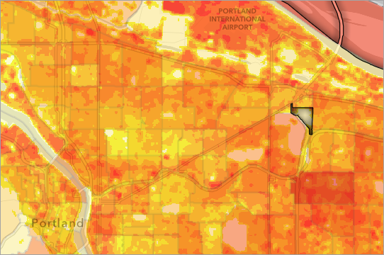
- On the Settings toolbar, click Effects. In the Effects pane, turn on the Grayscale effect.
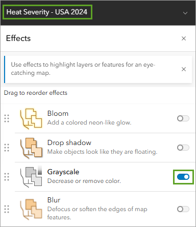
- Close the Effects pane.
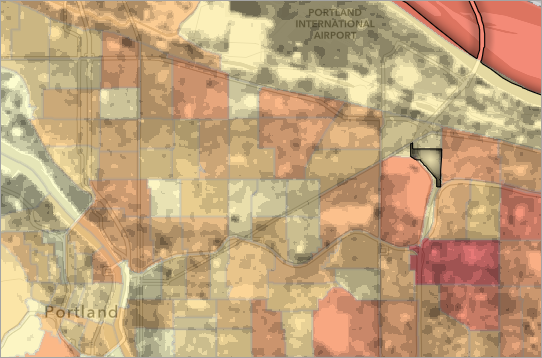
You can now read the Heat wave risk and Heat Severity - USA layers clearly at the same time.
- Save the map.
Add and style data from a .csv file
Next, you will add a point feature layer showing where existing trees are located in one of the tracts that has a high heat wave risk score.
You can add a layer to your map from data saved in a comma-separated values (.csv or .txt) text file. A .csv file has a row of data for each item with a comma between each value. A .csv file has been prepared for you to use in this tutorial that contains the point locations for existing trees in one of the high risk census tracts.
- Download the PortlandTrees.csv file.
- In Map Viewer, on the Contents toolbar, click Add and choose Add layer from file.

- Click Your device and choose the PortlandTrees.csv file you downloaded.
- If you are asked How would you like to add this file, choose Upload the file as an item and add it to the map and click Next.
Note:
This option will only be available if you are signed in to an ArcGIS organizational account.
- On the Fields page, click Next.
- On the Location settings page, click Next.

- On
the How will PortlandTrees.csv be added? page, for Title, type Portland Trees and click Create and
add to map.
Points representing trees from the .csv file are added to the map. They are all within the dark red tract that is part of the Hazelwood neighborhood.
Note:
With an ArcGIS public account, you can map up to 200 points from a .csv file using latitude and longitude coordinates. To add more than 200 points, or to map data using place names or addresses, an ArcGIS organizational account is required.

The tree symbols are very small and difficult to see. You will adjust their style to make them more visible.
- In the Layers pane, confirm the Portland Trees layer is selected. On the Settings toolbar, click Styles.
- In the Styles pane, under Pick a style, click the Location (single symbol) card.
- Click the symbol under Symbol style. In the Symbol style window, set Size to 8 px.
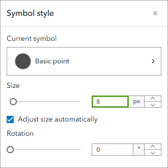
- For Fill color, choose a dark green color and click Done.
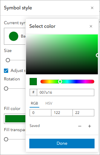
The dark green symbols don't contrast very well with the dark red background. They will be even harder to see for some people since red and green appear the same in several forms of color blindness. However, you can increase the contrast by giving the symbols a bright white outline.
- In the Symbol style window, ensure that Outline color is set to white. Set the Outline transparency to 0 percent.
- In the Styles pane, click Done twice.

You have added points to your map from a .csv file containing coordinate information for tree locations. You styled the point layer so it is more visible on top of the other layers in your map.
Make a sketch layer
Next, you will conduct a visual analysis of your map. Which areas have both a high risk score for heat waves and high heat intensity? Do those areas already have trees? You'll identify a few locations that would benefit from more trees to build resilience to heat waves. You'll use a sketch layer to highlight these areas.
- On the Settings toolbar, click Add Sketch.

The Sketch pane and toolbar appear. A new layer named Sketch is added to the Layers pane.
- On the sketch toolbar, click Polygon.

Before you draw the sketch features, you will set the style for the polygons.
- In the Sketch pane, for Fill color, click the No color button.
- For Outline color, choose a bright yellow color.

- On the map, find an area that meets the following criteria:
- High heat wave risk (within the dark red polygon)
- High heat severity (the darkest areas)
- No trees
- Click to draw the corners of a polygon outlining this area. Double-click to end the sketch feature.
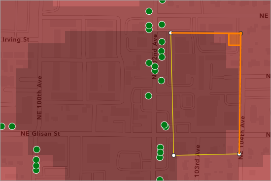
- Draw polygons to cover all of the darkest areas on the map, avoiding the trees.
Note:
You conducted a visual analysis to find these areas. There are more advanced methods to spatially analyze data in other Esri products or with an ArcGIS organizational account.
- Close the Sketch pane.
The map now includes a set of yellow polygons that highlight areas to be prioritized for tree planting.
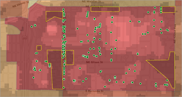
Note:
The map in the image above uses the Heat Severity - USA 2024 layer. If you're using a different version of this data, your map will look different.
- In the Layers pane, rename the Sketch layer to Recommended Tree Planting Locations.
Share the map
You have completed your map, which includes polygon, point, raster, and sketch layers. Next, you'll save and share the map so others can view it.
- On the Contents toolbar, click Save and open and choose Save.
Next, you will change the share settings.
- On the Contents toolbar, click Share map.

The Share window appears.
When Set sharing level is set to Owner, only you can view and edit the map. When it is set to Everyone (public), the map will be accessible to everyone, including people without an ArcGIS account.
Note:
If you are signed in with an ArcGIS organizational account, you'll see an additional option that allows to you share the map only with other members of your organization.
- In the Share window, click Everyone (public).

- Click Save.
- In the Item sharing successfully updated window, click Review sharing.
You are prompted to updating the sharing level of the Portland Trees layer as well. If you don't, people won't be able to view your map.
- In the Review sharing window, click Update sharing.
The map and its components are now visible to everyone.
In this tutorial, you styled vector and raster layers. You created a new point layer from a .csv file. You created a sketch layer highlighting areas that would benefit from more trees to build resilience to heat waves. You saved and made the map public so you can share your findings with anyone.
To learn more about creating maps and apps with an ArcGIS public account, try other tutorials in the series Tutorials for a public account experience.
Note:
For additional capabilities, including private sharing, publishing data, performing analysis, and more, make ArcGIS Online part of your GIS toolset by purchasing an ArcGIS organizational subscription. Subscriptions can include a variety of user types which makes it easy to match you and your team members with the necessary tools for your work. If you have an ArcGIS public account, you can convert your public account to an organizational account.
