Make a dashboard to monitor wildfires
Create and explore a map of current wildfires
First, you will add a layer from ArcGIS Living Atlas to a web map and explore its contents.
- Sign in to your ArcGIS account.
Note:
If you don't have an organizational account, see options for software access.
If you encounter an error or are unable to sign in to your account, remember that passwords are case-sensitive. If you forget your ArcGIS password, you can reset your password from the sign-in page. See Account Troubleshoot for more information.
- On the ribbon, click the Map tab.

This tutorial uses Map Viewer.
- If necessary, in the pop-up window, click Open in Map Viewer or on the ribbon, click Open in Map Viewer.
Map Viewer opens.
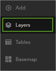
- On the Contents (dark) toolbar, click Layers.
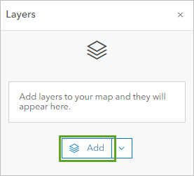
- In the Layers pane, click the Add button.
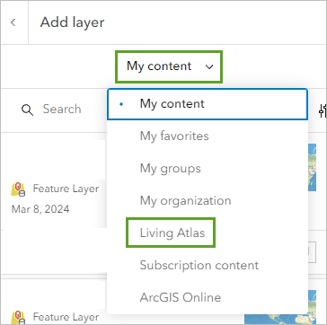
- In the Add layer pane, click My content and select Living Atlas.
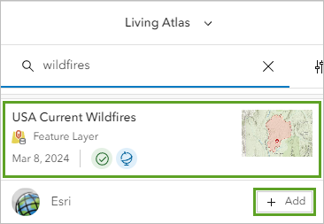
- In the search bar, type wildfires and press Enter. Find the USA Current Wildfires layer owned by Esri and click the Add button.
- Click the back button to return to the Layers pane.

In the Layers pane, notice that USA Current Wildfires is a group layer. Group layers are like folders that contain multiple layers.
- Click the arrow next to the USA Current Wildfires group layer to view the layers in the group.
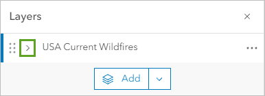
The sublayers appear.
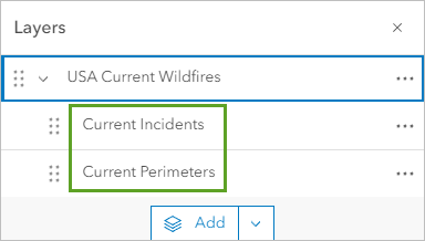
The group layer contains two layers: Current Incidents, which marks a location within each wildfire area and provides current information about that wildfire, and Current Perimeters, which shows the line surrounding land that has been impacted by each wildfire.
Before you explore the layers, you will update the basemap to a neutral basemap so that the wildfire layers will be more visible.
- On the Contents toolbar, click Basemap, and in the Basemap pane, choose Dark Gray Canvas.
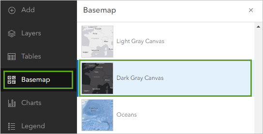
The basemap updates on the map.
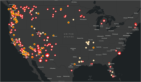
- On the map, zoom in to the 48 contiguous states (the states that are next to one another and share borders) of the United States. Use zoom and pan tools to explore where the current wildfires are located.
Note:
The USA Current Wildfires group layer automatically updates with live information, so the current wildfires on your map may be different from what is shown in the example images.
Next, you will explore the layers to better understand what data is included in the group layer.
- On the Contents toolbar, click Legend.
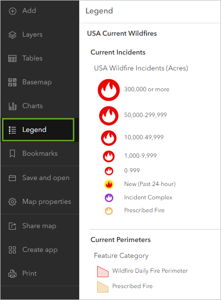
The Legend pane shows what each symbol on the map represents. For Current Incidents, the red fire symbols represent current wildfire incidents by the size of the fire in acres. The yellow fire symbol represents a new wildfire incident that began in the past 24 hours. The purple fire symbol indicates an incident complex, which is when two or more individual incidents in the same general proximity are managed together, and a light-orange fire symbol is a prescribed fire. Prescribed fires are intentional fires set by authorities to reduce the amount of dry grass and vegetation that might make a wildfire worse. Prescribed fires help reduce the intensity of potential wildfires.
The Current Perimeters layer is not shown in the legend because there is a scale range set on it and it is currently not being displayed. If you zoom in to the scale where the sub-layer displays, it will appear in the legend.
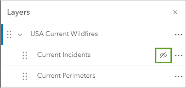
- In the Contents pane, click Layers. In the Layers pane, point to the Current Incidents layer and click the Visibility button.
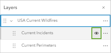
The Visibility button changes and the incidents do not draw.
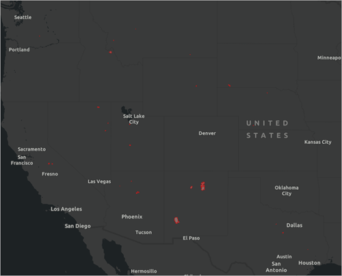
- Zoom in to southern California until the Current Perimeters layer appears (also, the layer name text will turn black when the layer is visible).
Now the Current Perimeters layer appears.
Note:
This layer updates weekly, so the perimeters that you see on your map may differ than what is shown in the example.
You can also view the size of each perimeter in the layer's table.
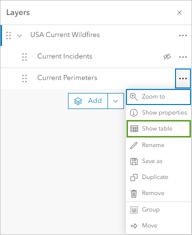
- In the Layers pane, for the Current Perimeters layer, click Options and click Show table.
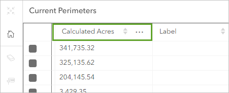
- In the table, scroll horizontally until you see the heading Calculated Acres.
Note:
Since the USA Current Wildfires layer reflects live data, the attributes in your layer may be different that what is shown in the tutorial.
The table shows the area of each current wildfire perimeter. You will use this information for your dashboard.
- Close the table.
- In the Layers pane, for Current Incidents, click the Visibility button so the layer is visible again. On the map, use the zoom tool so that your map shows all the states in the United States.
The goal of your dashboard is to provide live information on wildfires. The map you are creating will be part of the dashboard. It will open in the dashboard at the extent where you save it.
Next, you will save the map.
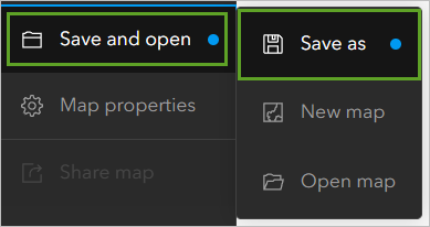
- On the Contents toolbar, click Save and open and click Save as.
- In the Save map window, provide the following information:
- For Title, type Current wildfire map.
- For Tags, type wildfire, monitor, dashboard, and USA, pressing Enter after each word.
- For Summary, type Map showing current wildfires locations and perimeters in the USA.
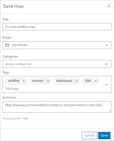
- Click Save.
The map saves. Next, you will set the sharing permissions for the map so that everyone can see it when it's included in the dashboard.
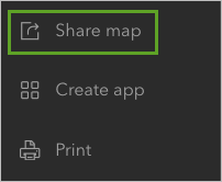
- On the Contents toolbar, click Share map.
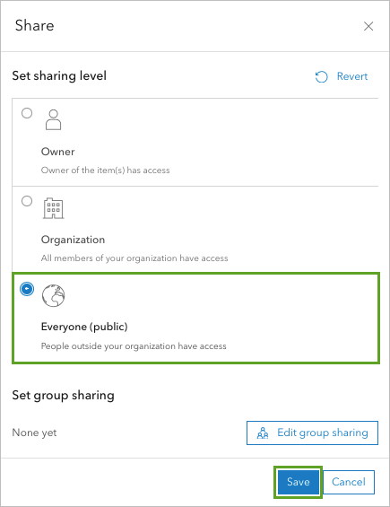
- In the Share window, for Set sharing level, click Everyone (Public) and click Save.
You are now ready to create a dashboard from this map.
Create the dashboard
In this section, you will create a dashboard from the web map you have created.
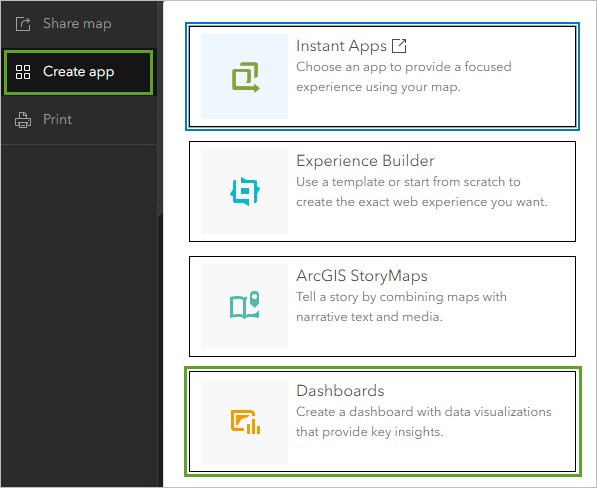
- In the Current wildfire map web map, on the Contents toolbar, click Create app and choose Dashboards.
The Create new dashboard window appears.
- In the Create new dashboard window, enter the following:
- For Title, type Current USA wildfires dashboard.
- For Tags, type monitor, wildfire, USA, current, pressing Enter after typing each tag.
- For Summary, type A dashboard to monitor current wildfires in the USA.
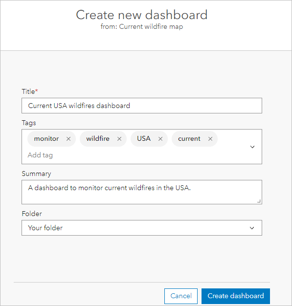
- Click Create dashboard.
The dashboard appears with your current wildfire map as a Map element.
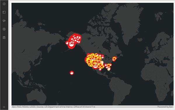
Note:
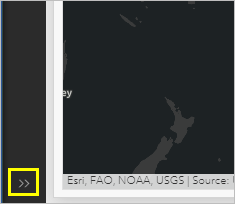
At the bottom of the dashboard toolbar, you can click Expand or Collapse to show or hide the tool names on the toolbar.
First, you will configure the map element.
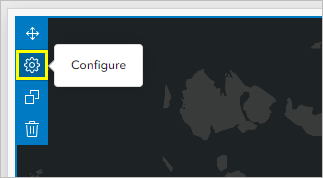
- Point to the Options button at the top corner of the Map element and click Configure.
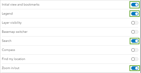
- In the Current wildfire map window that appears, on the Settings tab, turn on Initial view and bookmarks, Legend, Search, and Zoom in/out.
- Click Done.
The interactive tools appear on the map.

Enabling the tools allows your audience to interact with the map on your dashboard. Next, you'll add a header, or a title, for your dashboard.
- On the dashboard toolbar, click View. In the View pane, click the Header tab and click the Add header button.
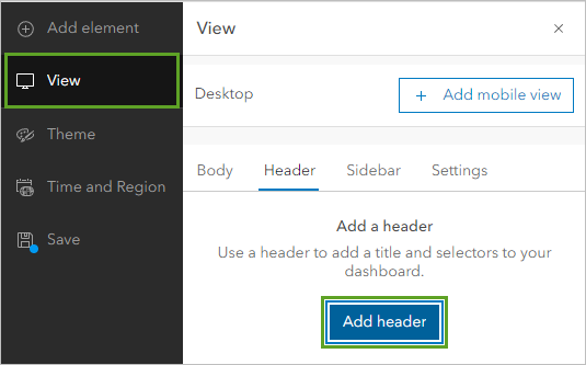
The Header window appears.
- For Title, type Current Wildfires in the USA and click Done.

You have created a dashboard from a web map you created with ArcGIS Living Atlas layers with live data on current wildfires. You configured the map element in your dashboard with tools so your audience can interact with the map, and you and added a header to describe what information your audience can expect in the dashboard.
Next, you will add an indicator element to your dashboard.
Add an indicator element
A dashboard is composed of one or more elements that contain various visualizations. Your dashboard currently has a map element. In this section, you will add indicator element. An indicator is a card that you can add to your dashboard to show the numeric attributes of individual features or display a summary statistic.
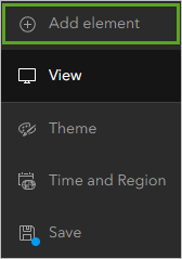
- On the dashboard toolbar, click Add element.
Tip:
If you do not see the name of the tool and you want to make it visible, click Expand at the bottom of the toolbar.
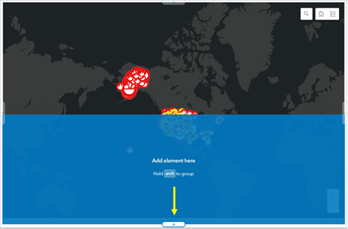
Once you click on the Add element button in the dashboard toolbar, the map will turn gray and the add element buttons are now visible at the edges of the map element.
- Click the add element button at the bottom of the map.
- In the menu that appears, choose Indicator.
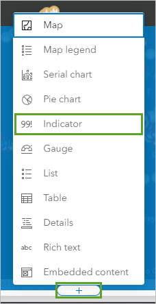
The Select a layer window appears. In this window, you will choose the data you want to use for the indicator.
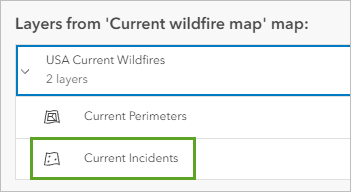
- Expand USA Current Wildfires and choose Current Incidents.
The Indicator window appears. In this window, you can configure your element in many ways, such as formatting the element title and choosing what data to display. You will configure the indicator to display the number of current wildfires in the map area, format the text to a red color, and add an icon for fires.
The default configuration for the indicator has already set the number to display as the count of incidents.
Note:
The data you see may be different than what is displayed because this data updates regularly.
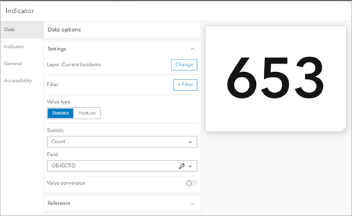
You will edit the indicator text to provide context for what the number means. Later in the tutorial, you will configure the indicator to be linked to the map so that the number reflects the map extent.
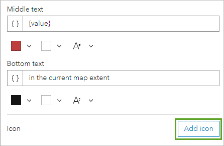
- Click the Indicator tab. For Top text, type Number of wildfires. For Bottom text, type in the current map extent.
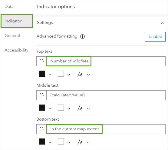
The text you entered for Top text appears above the number and the text you entered for Bottom text appears below the number on the indicator element. Middle text is currently set to show the count value of incidents in the Current Incidents layer.
Next, you will change the indicator font color to a red color.
- For Middle text, click the Text color button, and for Hex, type bd3e3e and press Enter.
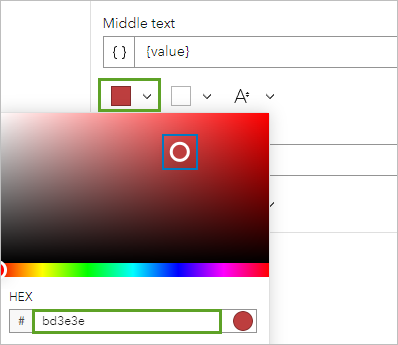
The font color for the indicator changes to red.
- Click theAdd icon button.
- In the Select an icon pane, expand Solutions and choose the fire icon.
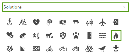
- Click OK.
More options are now available under Icon.
- For Fill, click the color drop-down, and for Hex, type bd3e3e and press Enter.
The fire icon color now matches the indicator font color.
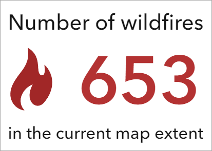
Since the map includes live data, it will be helpful to add a way for your audience to know when the data was last updated.
- Click the General tab. In the General options pane, turn on Last update text.
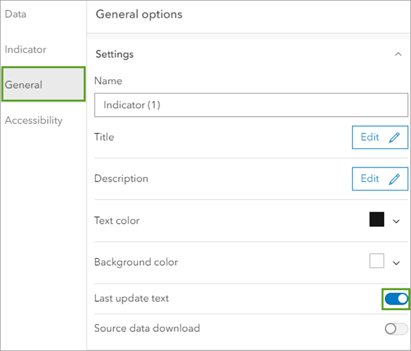
- Click Done.
The indicator element is added to your dashboard.
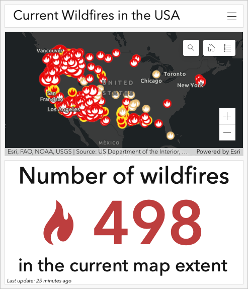
The indicator appears under the map and displays the information that you formatted.
Add a serial chart element
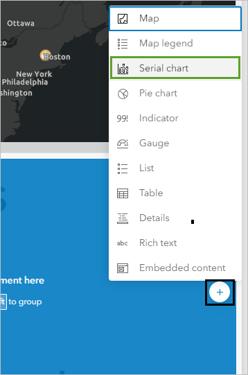
Next, you will add a Serial chart element that shows the 10 largest current wildfires by perimeter size. A serial chart visualizes one or more series of data points along a horizontal (x) axis and a vertical (y) axis.
- On the dashboard toolbar, click Add element.
- Click the add button to the right of the indicator element and choose Serial chart.
- In the Select a layer window, expand USA Current Wildfires and choose Current Perimeters.
The Serial chart window appears.
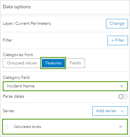
- In the Data options pane, set the following parameters:
- For Categories from, choose Features.
- For Category field, choose Incident Name.
- For Series, click Add series and choose Calculated Acres.
Next, you will set the chart to only show the 10 largest fire perimeters.
- For Sort by, click Add field and choose Calculated Acres. Click the sort button and choose Sort descending.

- For Maximum categories, type 10.
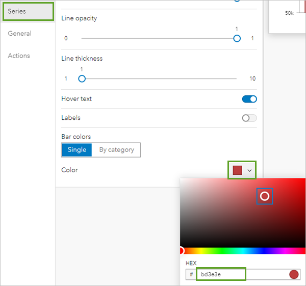
Next, you will format the chart to match the other colors of your dashboard.
- Click the Series tab. Under Bar colors, click the existing Color. For Hex, type bd3e3e and press Enter.
- Click the General tab. In the General options pane, for Title, click the Edit button.
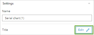
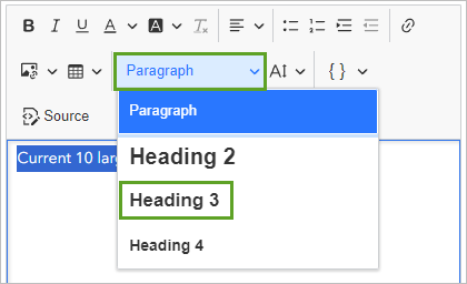
- In the text editor, type Current 10 largest wildfires in the USA.
- Highlight the text. For Paragraph, click the drop-down menu and choose Heading 3.
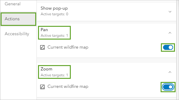
One of the key features of a dashboard is that elements on a dashboard can be linked. Next, you will configure the chart actions so that your audience can interact with the chart and it will change the extent of the map on the dashboard.
- Click the Actions tab.
- Expand Pan and turn on Current wildfire map. Expand Zoom and turn on Current wildfire map.
The Serial chart element configuration is complete.
- Click Done.
- On your dashboard, click one of the bars on the chart.
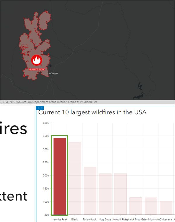
The map zooms in to the wildfire you selected on the bar chart.
- Click the same bar again to deselect it and bring the map back to its previous map extent.
You now have the three elements of your dashboard: a map, an indicator, and a serial chart. Next, you will configure the map element so that it is linked to the indicator element.
Set a map action and theme
To provide a more interactive experience, you can configure actions in your dashboards. When actions are enabled, interacting with one element such as changing the extent on a map element, will automatically update data on another element, such as the indicator number value. In this section, you will configure the value in the indicator element to change according to the number of features in the map extent.
- Point to the top of the map element so the Options menu is visible and click Configure.
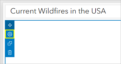
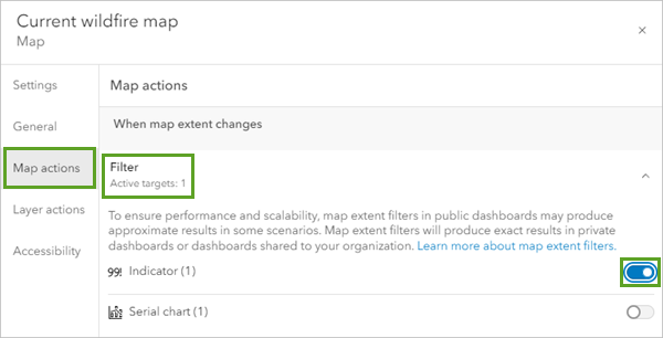
- In the Current wildfire map window, click the Map actions tab.
- In the Map actions pane, click Filter and turn on Indicator (1).
- Click Done.
- On the map, zoom in and out and observe the indicator element.
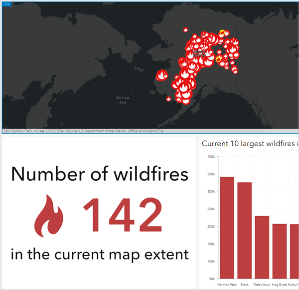
The number of incidents changes as you adjust the extent of the map.
Next, you will configure the theme of the dashboard, which changes how the application's overall appearance. Setting a theme updates several design elements of your dashboard, such as font and background color with a single click.
- On the dashboard toolbar, click Theme. On the Theme pane, choose Dark.
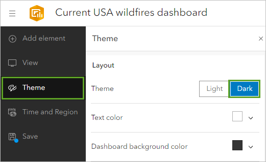
The theme of the dashboard updates.
Next, you will resize your dashboard elements so that the map element is the main focus. To resize an element, hover over its vertical or horizontal border until the pointer changes to crosshairs, and drag the border until the element is the size you want. As you drag an element's border, you can view the percentage of the row or column the element takes up.
- For the horizontal divider below the map, drag the divider to about 66 percent.
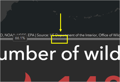
- Drag the divider between the indicator and bar chart to 25 percent.
- If necessary, click the default extent to return the map to the default map extent.
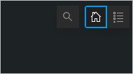
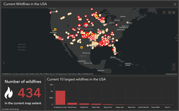
The dashboard is complete.
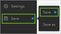
- On the dashboard toolbar, click Save and choose Save.
Share the dashboard
You will set your dashboard share setting so anyone can view the dashboard. You will also test the URL to be sure the app works as expected.
- At the top of screen, click the menu button and click Dashboard item details.
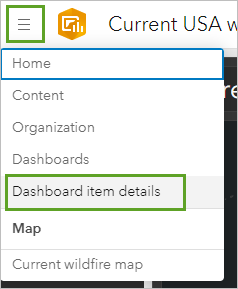
The item page for your dashboard appears.
- Click the Share button.
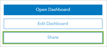
- In the Share window, choose Everyone (public) and click Save.
- Click Open Dashboard.
Your dashboard appears in a new tab. This is what your audience will see when you share the link with them. To confirm that you have set the map and dashboard settings so anyone can view your dashboard, you will test the link in your browser's incognito mode.
- Copy your dashboard URL.
- Open a new window in incognito mode. Paste the URL in the incognito mode window and press Enter.
Tip:
For most browsers, you can open a new window in incognito mode by pressing Ctrl+Shift+N. If you are using a Mac, press Cmd+Shift+N to open a new window in incognito mode.
- Explore and test the dashboard to ensure it is functioning as you expect.
If your dashboard appears and functions as you expect, then the dashboard URL is ready for you to share.
In this tutorial, you created a map that contains a live feed layer showing current wildfires in the United States. You created a dashboard and configured a map, indicator, and serial chart element. You configured map actions to link the elements, making the dashboard is interactive. Finally, you set the share setting for the dashboard and tested the link before sharing it.
Consider answering the following questions to further explore the dashboard you created:
- Are there any states with several wildfires burning? Are they large or small perimeters?
- Are there any clusters of wildfires?
- Do you notice any patterns of where most of the wildfires are located?
- Where is the largest wildfire currently? Are any urban or suburban areas possibly threatened by it?
Dashboards offer a comprehensive view of your data and provide key insights for at-a-glance decision-making. They are intuitive and easy to understand by many audiences. Now that you have worked through the basics of creating a dashboard, for an additional challenge, try creating a dashboard for another live feed layer or a dashboard that focuses on a single state.
You can find more tutorials in the tutorial gallery.
