Map swing states
In the United States, presidential campaigns require significant amounts of money, time, and people. Because of these costs, candidates cannot campaign everywhere. To increase the odds of winning the election, their campaigns prioritize investing resources into states that could be reasonably won by either major political party instead of investing in states that historically favor one party over the other. These states, which can be decided by a change in relatively few votes, are called swing states.
Because demographics and voting patterns change over time, the states that are considered swing states are not the same in every election. In this tutorial, you'll conduct a visual analysis of potential swing states by reviewing a map of election results from the 2020 presidential and 2022 midterm elections and identify states that swung from one party to the other.
Add election data
First, you'll add data for the presidential election in November 2020 and the midterm elections in November 2022 for the entire United States.
- Sign in to your ArcGIS organizational account.
Note:
If you don't have an organizational account, see options for software access.
- On the ribbon, click Map.

- If necessary, in the pop-up window, click Open in Map Viewer or on the ribbon, click Open in Map Viewer.
Note:
Depending on your organizational and user settings, you may have opened Map Viewer. ArcGIS Online offers two map viewers for viewing, using, and creating maps. For more information on the map viewers available and which to use, please see this FAQ.
Map Viewer opens.
Next, you'll add election results data to your map. First, you'll add data from the 2020 presidential election.
- If necessary, on the Contents (dark) toolbar, click Layers. In the Layers pane, click Add.
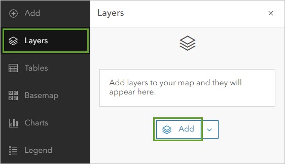
The Add layer pane appears. In this pane, you can search for data from a variety of sources. The default source is My content, which is content hosted in your account. The data you want to add is hosted on ArcGIS Online.
- Click My content and choose ArcGIS Online.
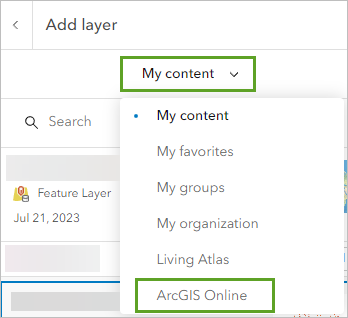
Now, you can search all public web content hosted on ArcGIS Online. To narrow your search results, you'll search both the title of the data and the name of the account that owns it.
- In the search bar, type presidential election 2020 owner: Esri_Tutorials and press Enter.
- In the search results, for the Presidential Election 2020 USA - States feature layer, click the Add button.
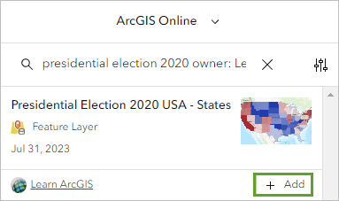
The layer is added to your map. The layer contains election result data for the 2020 U.S. presidential election for each state.
You'll also add a layer of 2022 midterm election data. Midterm elections occur midway between a president's four-year term. During a midterm election, people do not vote for the president, but they do vote for other important national offices, including senators and representatives.
- In the search bar, delete the search text. Type midterm election 2022 owner:Esri_Tutorials and press Enter.
- In the search results, for the Midterm Elections 2022 USA States feature layer, click the Add button.
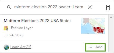
The layer is added to the map.
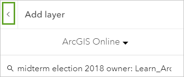
- In the Add layer pane, click the back button.
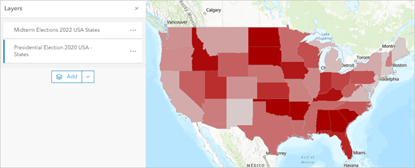
The Layers pane lists both layers you added. Because both layers cover the same geographic area, the United States, you can only see one at a time on the map.
- Zoom and drag the map to center on the contiguous United States.
Before you continue, you'll save your map.
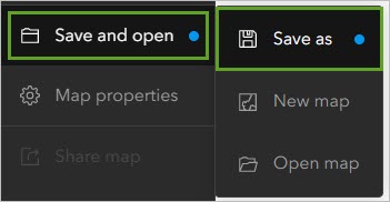
- On the Contents toolbar, click Save and open and choose Save as.
- In the Save map window, for Title, type Swing State Analysis and add your initials. For Summary, type Map analyzing which US states are likely swing states in the 2024 presidential elections.
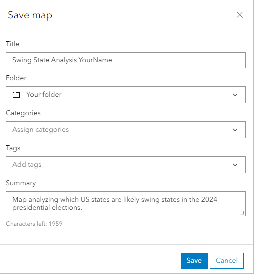
- Click Save.
Style the presidential election results
Your goal is to identify states that swung from favoring one of the two major American political parties in 2020 to favoring the other party in 2022. To help identify these states, you'll change the style, or appearance, of the election data on the map. In particular, you'll use a type of style called predominance.
Predominance compares multiple attributes and changes the map's appearance based on which attribute has the largest value. For your map, you'll compare the percentage of votes received by the Democratic and Republican parties in each state. You'll style states where the Democratic party received more votes in blue and states where the Republican party received more votes in red. This way, you can tell at a glance which state favored which party.
First, you'll turn off the midterm election results layer so you can focus on updating the last presidential election results layer.
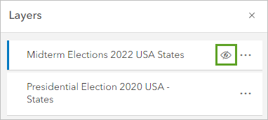
- In the Layers pane, point to the Midterm Elections 2022 USA States layer and click the layer visibility button.
- If necessary, click the Presidential Election 2020 USA - States layer to select it.
Note:
You can tell that a layer is selected because it has a blue highlight next to its name.
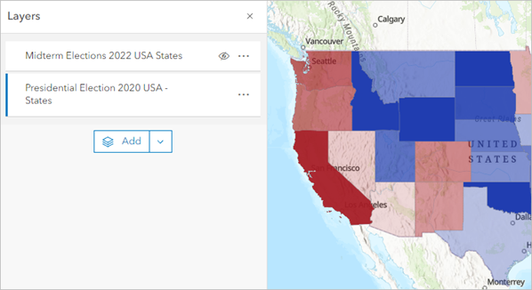
On the map, red states are states where the Democratic party received the majority of the votes, while blue states are states where the Republican party received the majority. In United States politics, blue represents the Democratic party and red represents the Republican party. You will update the layer style accordingly.
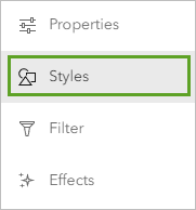
- On the Settings toolbar, click Styles.
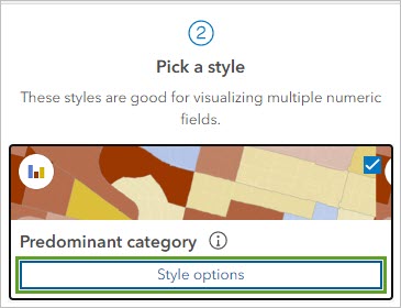
- In the Styles pane, for Predominant category, click Style options.
Options to modify the style become available.
- Click the symbol for %DEM.
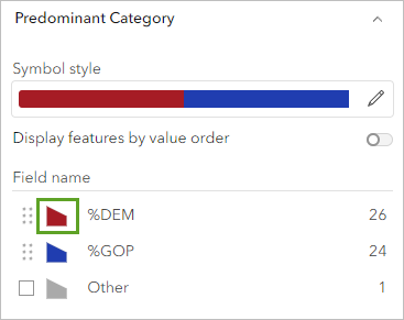
A Symbol style pane appears with options to change the fill and outline color and transparency.
- In the Symbol style pane, under Fill color, click the edit button.
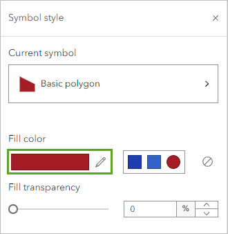
The Select color pane appears.
- In the Select color pane, for Hex, type 3264c8 and press Enter. Click Done.
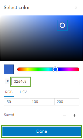
The states that voted primarily for Democratic candidates change color to blue. The states that voted for Republican candidates are already styled using a red color, so you don't need to change them.
- Use what you have learned to change the Fill color for the %GOP to a61c25.
Note:
GOP stands for Grand Old Party, another name for the Republican party of the United States.
- In the Style options pane, click Done and click Done again.
The panes close, increasing the size of the map.
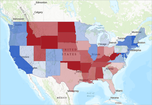
- On the Contents toolbar, click Legend.
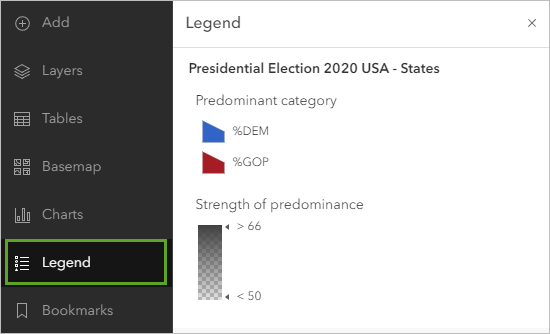
The legend shows that red states predominantly voted for Republican candidates and blue states predominantly voted for Democratic candidates. Additionally, if a state is darker in color, the percentage of votes favoring the predominant party was higher. Lighter colored states have percentages that are closer to 50.
The current basemap adds extra color and texture that is not necessary for this analysis. You'll update the basemap to a more neutral color and design.
- On the Contents toolbar, click Basemap and choose Light Gray Canvas.
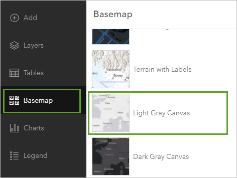
The basemap is updated. Its gray color and minimal detail provide more focus to the election results.
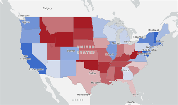
Next, you will style the 2022 midterm election results so that you can view both election result layers at the same time.
- On the Contents toolbar, click Save and open and click Save to save the map.
Style the midterm election results
You'll also style the 2022 midterm election results layer using predominance mapping in a way that distinguishes it from the midterm election results. You'll update the layer order so that the midterm election layer is visible over the presidential election data. Previously, you turned off the 2020 layer to focus on the 2018 layer. Now, you'll turn the 2020 layer back on and turn the 2018 layer off.
- On the Contents toolbar, click Layers.
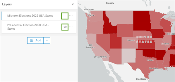
- In the Layers pane, ensure the Midterm Elections 2022 USA States layer is selected and click the visibility button to show the layer. Click the visibility button for the Presidential Election 2020 USA - States layer to hide the layer.
- On the Settings toolbar, click Styles.
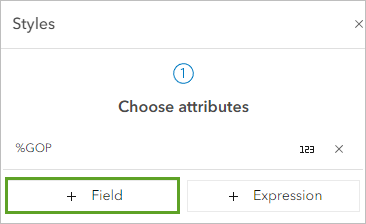
- Under Choose attributes, click Field.
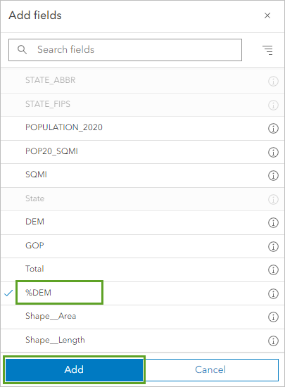
- In the Add fields pane, click %DEM and click Add.
The style is automatically updated to one that shows multiple attributes at once. This style uses size to represent the %DEM attribute and color to represent the %GOP attribute, but it still doesn't show you which party won each state. To see that, you'll use a predominance style.
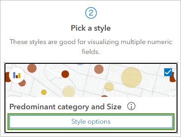
- Under Pick a style, click Predominant category and Size.
The symbols on the map change. Instead of covering the entire state, they are now centroids. The color of the symbols is reversed, with the Democratic party represented by red and the Republican party represented by blue. You'll change the colors.
- Click Style options.
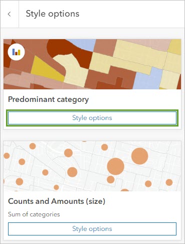
The Style options pane shows two types of styles: Predominant category, which determines the color and shape of the symbols, and Counts and Amounts, which determines the size of the symbols.
- For Predominant category, click Style options.
- Click the symbol for %DEM. For Fill color, type 3264c8.
- Click the symbol for %GOP. For Fill color, type a61c25.
The colors now match the color commonly associated with each of the United States major political parties. These colors are also the same used in the 2018 election layer.
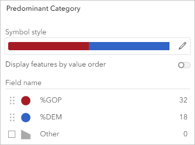
- In the Style options pane, click Done.
The symbol size is set to Sum of categories, which is the sum of the %DEM and %GOP attributes. Because there are only two major political parties in the United States, the sum is close to 100 percent for almost every state, which is not particularly informative for your purposes.
You're more interested in the predominance of the votes for each political party, so the size of the symbols is less important. You'll update the size of the symbols to a single size for each state.
- For Counts and Amounts (size), click Style options.
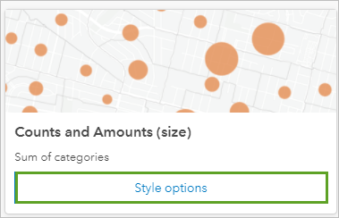
Next, you will adjust the maximum size of the symbols so they appear within the state boundaries.
- For Size range, click the right slider, type 30, and press Enter.
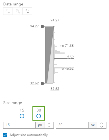
- Click Done three times.
- In the Layers pane, turn on the Presidential Election 2020 USA - States layer.
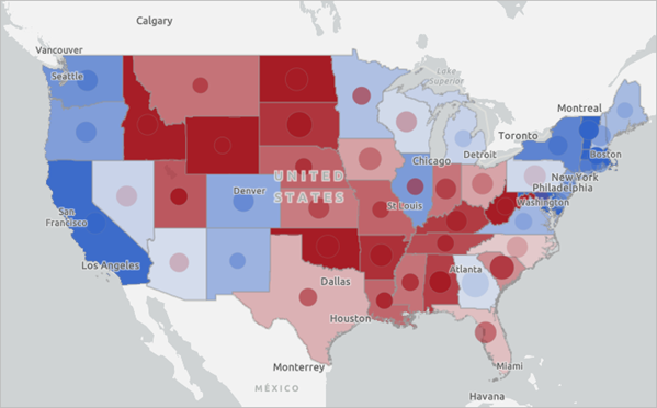
You can now see both layers at the same time. The 2020 results are represented as centroids, while the 2018 results are represented as the state's boundaries.
Tip:
If you need more screen space to explore your map, you can close any open panes and collapse the Contents and Settings toolbars by clicking Collapse at the bottom of each toolbar.
In states where the color of the state and the centroid are the same, there was no change in which party received the most votes in the state between 2020 and 2022. In states where the color is the same but the shade is darker or lighter, the same party won, but it won by a different degree. States where the state and the centroid are different colors are the states that swung from one party to another between the elections.
- Save the map.
Label swing states
Next, you'll mark the states that swung from one party to the other between the 2020 and 2022 elections. You'll use the Sketch tool to label these states as swing states.
- On the Contents toolbar, click Add and choose Create Sketch layer.
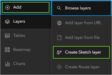
The Sketch pane appears. Additionally, a toolbar appears on the side of the map with options for the geometry of the sketch layer. By default, the Stamp feature is selected. Using this feature type, you can draw points that use a particular symbol of your choosing.
You'll draw this symbol on the map to mark each state that swung from one political party to the other between 2020 and 2022.
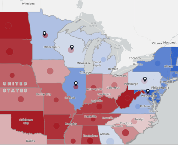
- On your map, click the states that switched political parties between 2020 and 2022.
Tip:
These states are Alaska, Nevada, Arizona, Minnesota, Wisconsin, Illinois, Pennsylvania, and Maryland. You may zoom and drag the map to see Alaska, as it is located farther north of the 48 contiguous states.
- Close the Sketch pane.
You'll rename the sketch layer you created so that its name is more meaningful.
- In the Layers pane, for the Sketch layer, click the Options button and choose Rename. Rename the layer Swing States.
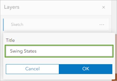
- Click OK.
- Save the map.
You've created a map that highlights which states swung from one political party to the other between the 2020 and 2022 elections. These swing states are politically volatile and may favor either party in any given election.
It's important to consider the differences between midterm elections, such as the one that took place in 2022, and presidential elections, such as the one that took place in 2020 and will take place in 2024. Midterm campaigns feature candidates who only campaign in a single state or an area in a single state, such as senators or representatives. Meanwhile, presidential elections feature candidates who must campaign in multiple states and thus appeal to a more national audience. Because of this, some states that consistently and strongly vote for one political party for president may still be likely to vote for candidates from the other party during midterm elections. An example of this is Alaska, which generally votes for the Republican candidate for president, but which may vote for more moderate Democratic candidates at the state level. For presidential elections, Alaska is not usually considered a swing state, although it can be for midterm elections.
While this map focuses on swing states, there are other states that might be useful for campaigns to focus on. For instance, a state that was won by the same political party in both 2020 and 2022 by a relatively small margin may still be an important state to send campaign resources.
Can you identify which states were won by a relatively slim margin in both elections?
Note:
Possible answers to questions are listed at the end of the tutorial.
Analyze election results for a state
Now that you have an overview of election result trends by political parties between 2020 and 2022, you'll further explore the 2022 presidential election results at the county level for a single state. Previously, you identified that Illinois was a swing state in the 2022 midterm election. You will use a filter to focus your county-level map on election results for Illinois and style the election results data to reflect the number of votes for the predominant candidate.
Use predominant mapping by counties
First, you'll create a map for this analysis.
- On the Contents (dark) toolbar, click Save and open and choose New map.
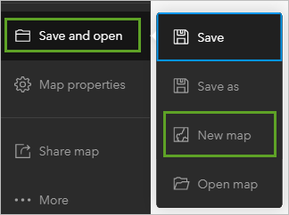
A new map appears with the Layers pane open.
- In the Layers pane, click Add.
- Search ArcGIS Online for presidential election 2020 owner: Esri_Tutorials.

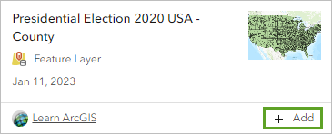
- In the search results, click the Add button for the Presidential Election 2020 USA - County layer.
- In the Add layer pane, click the back button.
- On the Contents toolbar, click Basemap and choose Light Gray Canvas.
- On the Contents toolbar, click Layers.
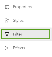
- Click the Presidential Election 2020 USA - County layer to select it. On the Settings (light) toolbar, click Filter.
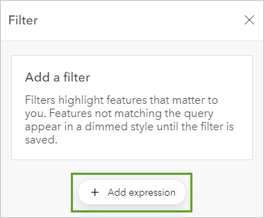
- In the Filter pane, click Add new.
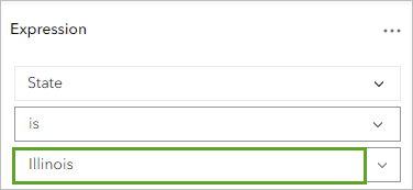
- Build the expression State is Illinois.
- Click Save.
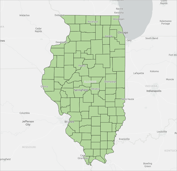
The Presidential Election 2020 USA - County layer filters to only show the counties in the state of Illinois.
- Zoom in closer to the state of Illinois.
Before continuing, you will save the map.
- On the Contents toolbar, click Save and open and click Save as.
- In the Save map window, for Title, type Congressional District analysis for Illinois, followed by your initials. For Summary, type Map comparing congressional district boundaries with county presidential election results.
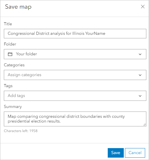
- Click Save.
Next, you'll configure the symbology of the layer. Populations can vary greatly from county to county, so it is important to not only identify the predominant results by party but also how many people voted.
- On the Settings toolbar, click Styles.
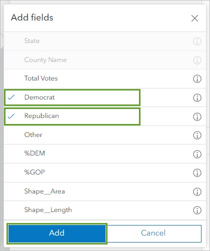
Instead of styling the layer by the percentage of votes for either party, you will style it by the fields that contain the number of votes for each party, Democrat and Republican.
- In the Styles pane, click Field and select Democrat and Republican. Click Add.
- Update the drawing style to Predominant category and Size and click the Style options button for Predominant category and Size.
For this drawing style, you are presented with two sets of style options. First, you will need to update the style colors to represent the traditionally understood colors for each political party.
- For Predominant Category, click Style options. Choose the color associated with each political party.
The map updates to show the predominant election results with respect to the size of the populations who voted.
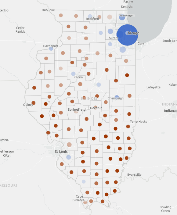
The largest blue circles, representing predominant election results in favor of the Democratic candidate, are in the counties surrounding the capital of Illinois, the city of Chicago. Several of the other counties where cities are located were also predominantly supportive of the Democratic candidate. Although fewer counties predominantly voted for the Democratic candidate, far more voters lived in these counties, resulting in the majority of votes for the Democratic candidate for the entire state. This map also shows there is a difference in political party preference between those who live in a more populated, urban part of the state and those who live in the less populated, rural areas of the state.
Which political party did urban areas prefer in the 2020 presidential election? What party did rural areas prefer? How did the population densities in these regions impact the state’s overall election results?
- Click Done three times and save the map.
Investigate potential trends in election results
In this section, you'll map the current congressional district maps for Illinois and compare the presidential election results by county to consider possible outcomes for this swing state in the next major election cycle.
The United States Congress is the legislative branch of the federal United States government and consists of the House of Representatives and the Senate. Each Congress lasts for two years and begins on January 3 of odd years. As of 2023, the Congress is currently in its 118th session. In this tutorial, analyzing the 2020 presidential election and 2022 midterm results will inform campaign plans for the 2024 presidential election.
Note:
See American redistricting history for more information about United States history on reapportionment and gerrymandering.
First, you'll add the 118th congressional district maps from ArcGIS Living Atlas of the World.
- Search Living Atlas for congressional districts. In the list of results, locate and add the USA 118th Congressional Districts (All Territories) layer.
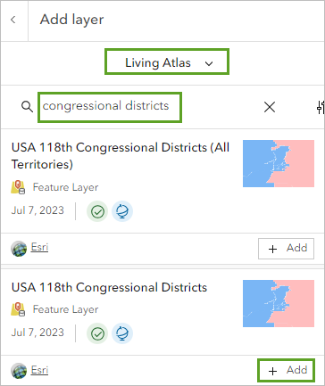
- In the Add layer pane, click the back button. Ensure the congressional districts layer is selected.
Next, you'll filter the layer to only show congressional districts for Illinois.
- On the Settings toolbar, click Filter.

- In the Filter pane, click Add expression and build the expression State Name is Illinois. Click Save.
- On the Settings toolbar, click Styles. For Types (unique symbols), click Style options. Change the symbol for Republican to a red color and the symbol for Democrat to a blue color.
- Click Done two times.
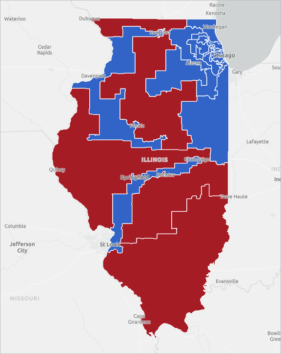
Now that you have added and symbolized both congressional district layers, you can analyze how the district party affiliations have changed.
- In the Layers pane, drag the Presidential Election 2020 USA - County layer above the congressional district layer.
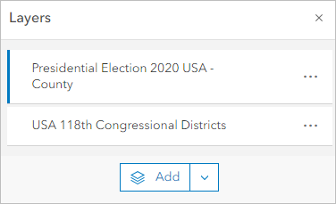
Now the Presidential Election 2020 USA - County layer is visible, but it is still somewhat difficult to distinguish the red circles from the congressional district layer. You will update the layer transparency setting for the congressional district layer.
- Click the USA 118th Congressional Districts layer to select it. On the Settings toolbar, click Properties.
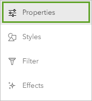
- In the Properties pane, under Appearance, for Transparency, drag the slider to 50%.
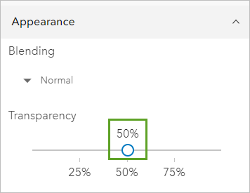
Now both layers are visible.
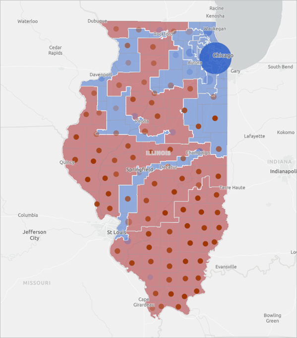
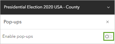
To better explore the map, you will turn off pop-ups for the county layer and update the field name for the congressional district number.
- In the Layers pane, click the Presidential Election 2020 USA - County layer to select it. On the Settings toolbar, click Pop-ups.
- In the Pop-ups pane, turn off Enable pop-ups.
- In the Layers pane, click the USA 118th Congressional Districts layer to select it, and on the Settings toolbar, click Fields.
The field name CDFIPS represents the district number. You will update the field name to be clearer.
- In the Fields pane, click CDFIPS. In the Formatting pane that appears, for Display name, type District Number, and click Done.
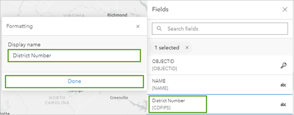
Now when you view a pop-up for a congressional district, the CDFIPS field is labeled District Number.
- On the map, click the districts and view their pop-ups to answer the following questions:
Which districts appear to have consistent support for the same political party? Which districts may be highly competitive in the 2022 midterms?
Note:
Optionally, see how your results compare with the findings from a political news outlet.
- Save the map.
Political analysts often use partisan lean scores to predict potential election outcomes. Partisan lean scores are a relative measure of how strongly or not strongly a particular location favors one political party or the other. Developing and calculating these metrics is a complex process. It requires considering election outcomes from previous presidential election data and congressional district election data with a host of additional indicators.
Note:
To learn more about developing and calculating partisan lean scores, see How Red Or Blue Is Your State? or the Cook Political Report Partisan Voter Index.
While the map you produced did not include these complex and important considerations, you can start to get a sense of possible trends in constituent preferences.
Share your results
You've completed a comparison of election returns for the country by state, county, and congressional district. Next, you'll share your findings by creating a story with ArcGIS Instant Apps.
Create a web app
You can create a web app from the Contents toolbar in Map Viewer.
- On the Contents (dark) toolbar, click Create app and choose Instant Apps.
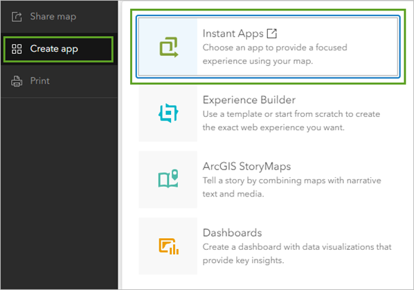
The ArcGIS Instant Apps configuration page appears.
Each app template has a specific purpose, such as viewing a map or scene, comparing content, getting directions, exploring a gallery of content, and finding something nearby.
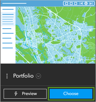
You'll use the Portfolio template, which presents a series of maps, apps, and other content, such as images. This is a good choice to create a simple interactive display of many maps that share a topic.
- For the Portfolio template, click Choose.
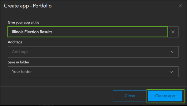
- In the Create app – Portfolio window, for the title, type Illinois Election Results and click Create app.
The Instant Apps configuration window appears.
- If necessary, close the Welcome window that appears.
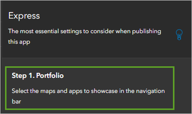
- In the Express Setup pane, click Step 1. Portfolio.
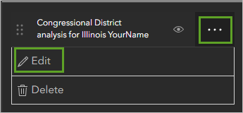
- Click the more options button for the Congressional District analysis for Illinois map and choose Edit.
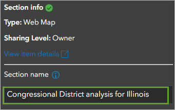
- For Section name, remove your name or initials.
Next, you'll add a description to provide your viewers with more context for your analysis map.
- Ensure Description is turned on.
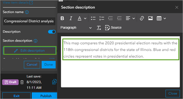
- For Section description, click Edit description. In the text editor, copy and paste the following text:
This map compares the 2020 presidential election results with the 118th congressional districts for the state of Illinois. Blue and red circles represent votes in the presidential election.
Tip:
Press Ctrl+Shift+V to paste without text formatting.
- Click Done.
- In the app preview, point to the thumbnail for the Congressional District analysis for Illinois map and click the Open Description button.
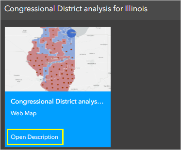
The information pane for the app section appears.
You've configured the first section in your app. Next, you'll add and configure the two remaining analysis maps to your app.
- Click Add new section.
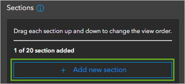
More options appear under New section.
- Click Browse for content.
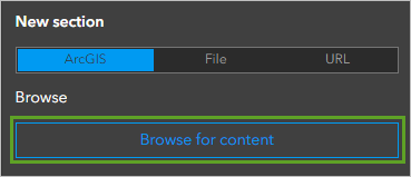
The Item browser window appears.
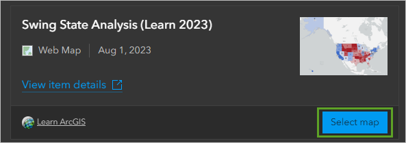
- In the Item browser window, search for your Swing State Analysis map and click Select map.
- In the Portfolio pane, under Section info, for Section name, delete your name or initials.
- Ensure Description is turned on.
- Under Section description, click Edit description. In the text box, copy and paste the following text:
In this map, the color of each state represents the election results for the predominant political party in the 2020 presidential elections. The color of each circle represents the election results for the predominant political party in the 2022 midterm elections.
If a state has a different circle symbol color than the color of the state, that means the state "swung" political parties between the 2020 presidential and 2022 midterm elections.
You've added the two maps you want to include in your web app and updated the section names so they are appropriate for presentation.
The app arranged the maps in the order you added them. Next, you'll arrange the maps in order from largest geography to smallest geography.
- Click Done.
- In the Portfolio pane, drag Swing State Analysis to the top of the section list.
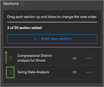
The maps are now in the desired order.
- At the top of the Portfolio pane, click Next.
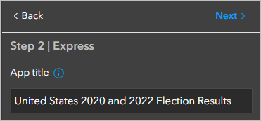
- For App title, type United States 2020 and 2022 Election Results.
- Under Introduction panel content, click Edit.

- In the text box, copy and paste the following text:
This web app includes a map comparing the 2020 presidential and 2022 midterm elections and a map of 2020 presidential election results for the state of Illinois compared to the state's 118th congressional districts.
- Click Close.
Publish and share
Your app is ready to publish and share with stakeholders.
- At the bottom of the pane, click Publish.

- In the Publish window, click Confirm.
A success message appears and the window updates to show share setting options. A warning message appears at the top of the window reminding you that the app is not currently set to share with the public.
- Click Change share settings.
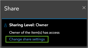
The Share window appears
- In the Share window, choose Everyone (public) and click Save.
- In the Review sharing window, click Update sharing.
- On the toolbar, click Share.
- In the Share window, click Launch.
The published app appears in a new browser tab.
Exercise responses
The following are possible responses to the reflection questions asked throughout this tutorial.
- Can you identify which states were won by a relatively slim margin in both elections?
Although the following states did not swing between the 2020 presidential and 2022 midterm elections, the faded transparency levels of the midterm results and presidential results indicate that the state did not swing by a slim margin: Georgia and North Carolina.
- Which political party did urban areas prefer in the 2020 presidential election? What party did rural areas prefer? How did the population densities in these regions impact the state’s overall election results?
The predominant party urban areas voted for was the Democratic party. The predominant party rural areas voted for was the Republican party. Because the urban areas had larger populations compared to the rural areas, the state’s election results were predominantly for the Democratic party.
- Which districts appear to have consistent support for the same political party? Which districts may be highly competitive in the 2024 presidential election?
The 118th Congressional Districts 12, 15, and 16 (more rural areas of the state) and 3, 4, 5, 6, 8, 9, 10, 11, and 14 (Chicago-area districts) appear to have consistent preference for the same party. However, Districts 2, 13, and 17 appear to be potentially competitive districts in the 2024 presidential election. Because congressional lines do not directly align with county lines, it may not be possible to determine consistency of support for political parties for every district based on this analysis alone.
In this tutorial, you mapped election results data and identified swing states, styled presidential election results by county for the state of Illinois, and compared the results with congressional district representation. You created a web app to share your findings and can include it in your news article covering the upcoming midterm election campaign season. There is so much you can do with maps to provide public education, inform political campaign strategy, and visualize the transforming sentiments of a nation.
You can find more tutorials in the tutorial gallery.

