Interpolate values
Open, save, and explore a map of Thailand
In this section, you'll open a map, save a copy, and explore the layers you'll use to predict air quality in Thailand.
- Open the Interpolate air quality values map.
A map with three layers and a basemap, centered on Thailand, appears.

Note:
The Recent Conditions in Air Quality (World) and Recent Conditions in Air Quality (Thailand) layers are updated regularly. This means the maps you see that include these layers will look different from the images in this tutorial. The layers you see will reflect the most recent data.
Next, you'll sign into your ArcGIS Online account.
- On the ribbon, click Sign In and sign in to your ArcGIS account.
Note:
If you don't have an organizational account, see options for software access.
Next, you'll save a copy of the map.
- On the Contents (dark) toolbar, click Save and open and choose Save as.

- In the Save map window, click Save.

Now, you'll investigate the data to be used for interpolation. The item details page contains information about the layer's data source.
- On the Contents toolbar, click Layers. Select the Recent Conditions in Air Quality (World) layer.

When a layer is selected, a blue bar appears next to its name.
The Properties pane appears.

- In the Properties pane, expand Information. Under Source Layer, click OpenAQ Recent Conditions in Air Quality / Recent Conditions in Air Quality (World).

A web browser tab opens with details about the OpenAQ Recent Conditions in Air Quality item.

The Open AQ Recent Conditions in Air Quality page provides information about how this data is collected and how frequently it is updated. For analysis purposes, it is important to know that some air quality readings from this layer can be up to 30 days old.
- Close the browser tab for the OpenAQ Recent Conditions in Air Quality layer.
Next, you'll look at the data for air quality globally by using a bookmark. Bookmarks allow you to move to specific saved extents of a map.
- On the Contents toolbar, click Bookmarks. Choose World.

The map extent changes to show the world.
Look at the map and note in which countries air quality data points appear. Do most countries have data points or only some countries? For the countries that have data points, are they distributed evenly? Why would this matter if you plan to use interpolation?
- On the map, from the navigation tools, click Default map view.

The map extent changes to center on Thailand again.
Next, you'll explore the legend to better understand the air quality symbology.
- On the Contents toolbar, click Legend.

Review the legend to understand the symbols on the map. If a point has a darker color and a larger symbol, this indicates that there are more air pollutants recorded and poorer air quality at that location. If a point has a lighter color and a smaller symbol, this means that there are fewer air pollutants and better air quality.
While you could use all of the data points in the Recent Conditions in Air Quality (World) layer to predict the air quality in Thailand, you'll use a filtered dataset to focus on only the points in Thailand.
- On the Contents toolbar, click Layers. Turn off Visibility for the Recent Conditions in Air Quality (World) layer and turn on Visibility for the Recent Conditions Air Quality (Thailand) layer.

Now, you'll only see the air quality monitoring stations in Thailand.

- For the Recent Conditions Air Quality (Thailand) layer, click the Options button and choose Rename.

- For Title, type Air Quality (Thailand) and click OK.

Next, you'll review the air quality data for Thailand that'll be used for analysis.
- For the Air Quality (Thailand) layer, click Options and choose Show table.

The attribute table appears.

The Value - mass concentration attribute is the air quality reading that was recorded at each point on the map. Higher values indicate that there are more pollutants in the air; this could potentially be harmful to human health over time. You'll use these readings at known locations to estimate the air quality at other locations on the map that do not have an air quality monitoring station.
Note:
To see more attributes in the table, scroll to the right. To see more records (rows), scroll down.
The number of records in this table may vary depending on the availability of data from the air quality monitoring stations.
- Close the Air Quality (Thailand) attribute table.

Interpolate air pollution patterns
Now, you'll create a continuous air quality layer for Thailand.
- On the Settings (light) toolbar, click Analysis and choose Tools.

- Expand Analyze Patterns. Choose the first instance of Interpolate Points to create feature outputs.

Next, you'll chose the layer to use for interpolation. It'll be the Air Quality (Thailand) layer.
- Under Input layers, for Input points, click Layer. Choose Air Quality (Thailand). Ensure that Field to interpolate is set to Value - mass concentration.

You only want air quality results for Thailand, so you'll use the Thailand Boundary layer to restrict the tool's output to this country.
- Under Input layers, expand Optional layers. For Clipping polygons, click Layer and choose Thailand Boundary.

Next, you'll configure the output results. You'll have the tool break your data into ten classes. You'll also set the classification type. This lets you choose how the range of air quality values for each class will be calculated.
- Under Interpolation settings, ensure that Classification type is set to Geometric interval and the Number of classes is set to 10.

The results will be put into ten classes. The Geometric interval method classifies data based on a geometric progression. It is useful for visualizing data that is not distributed normally, or when the distribution is highly skewed.
- Under Result layers, for Output features name type Continuous air quality followed by today's date and your name. Optionally, you can choose a folder to save your results.

- Click Estimate credits to determine the number of credits that this tool will consume.

Running this tool for all of the air quality points in Thailand will consume less than one credit.

Note:
The number of credits used is determined by how many points are used for the analysis. Since the number of points varies, the estimated number of credits you see may not match the one in the tutorial.
- Click Run.
After a few moments, the layer of interpolated air quality across Thailand is added to the map.

Note:
The Recent Conditions in Air Quality (Thailand) layer is updated regularly. This means the results of your analysis will look different from the images in this tutorial.
- In the Layers pane,
turn off the Air Quality (Thailand) layer.

The Continuous air quality layer includes ten classes with each symbolized in a different color. Depending on the data values and their locations, there may be fewer classes than requested. The darker classes have higher air pollution values, meaning poorer air quality, while the lighter classes have lower air pollution values, meaning better air quality.
The default styling for the Continuous air quality layer uses a light gray outline between the 10 different classes. You'll remove the outline.
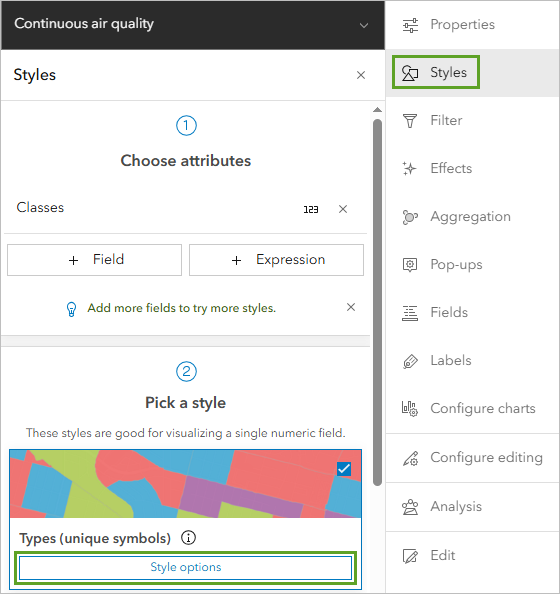
- On the Settings toolbar, click Styles. Under Pick a style, click Style options.

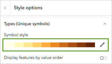
- In the Style options pane, under Symbol style, click the Edit button.

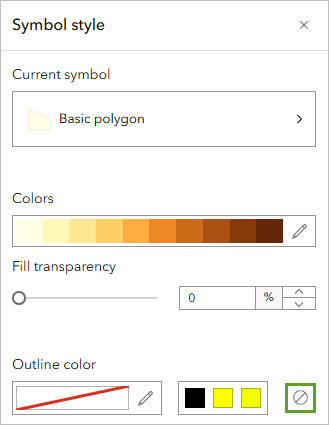
- In the Symbol style window, under Outline color, choose No color.

- On the Settings toolbar, click Styles to close the Style options pane and Symbol style window.
Your results are visible without the outlines.

Now, you'll explore the results of your interpolation analysis with map pop-ups.
- On the map, click one of the colors to see the range of air quality predicted for that area.

The pop-ups for this layer indicate the estimated range of air quality values between the Value_Min, the better air quality, and the Value_Max, the poorer air quality.
How confident would you be about these predictions? Remember that the Interpolate Points tool can be used to find patterns, but it does not have the detail you would get if you measured the air quality at a specific location.
Remember too, from reading the description of the data, that measurements up to 30 days old can be included in the air quality dataset. So, if there was a wildfire or other event that impacts air quality 27 days ago, and that was the most recent measurement from that sensor in Thailand, it would be included in the current data.
- On the Contents toolbar, click Save and open and choose Save.

In this tutorial, you used today's air quality data to create a continuous layer to show the pattern of air quality across Thailand based on values collected by sensors at a few known locations.
You can find more tutorials in the tutorial gallery.
