Explore traffic incidents
A common step before any analysis is acquiring the data. The data that you will use is a Microsoft Excel table that contains the location, date, and type of traffic incidents. After you download the data, you will create a workbook in ArcGIS Insights in which you can upload the data and begin your analysis.
Download data and create the workbook
You will first download the data to your computer, and once you are in Insights, you can add the data directly to a workbook to explore it.
- Download the Traffic_Incidents spreadsheet.
- In File Explorer, go to the Downloads folder and locate the traffic_data spreadsheet. Copy the spreadsheet to another folder on your computer that you will use for the tutorial.
- Rename the traffic_data file to include your initials at the end, for example, traffic_data_YourName.
Note:
You cannot create two layers in an ArcGIS organization with the same name. Adding your initials to a layer name ensures that other people in your organization can also complete this tutorial. Once a layer has been created, you can rename it in the map to remove your initials, which will not affect the name of the underlying data layer.
Now that you have downloaded the data, you will open Insights and add the data to a workbook.
- Go to Insights and click Sign in.
- Sign in using either your ArcGIS Online or ArcGIS Enterprise account, depending on your setup.
Note:
The first time you open Insights, you are prompted to activate it using your organizational account, which can be ArcGIS Online or Enterprise. If you are using Insights in your own portal, Insights must be properly licensed, and you must sign in using an account that is the Insights Analyst user type.
If this is your first time signing into your Insights account, the Welcome to Insights window appears.
- If necessary, in the Welcome to Insights window, click Skip.
- On the home page, click the Workbooks tab.
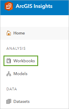
- On the ribbon, click New workbook.

The Add to page window appears, containing various options for adding data to your workbook.
- In the Add to page window, click Upload file.
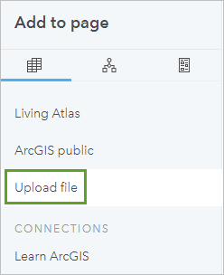
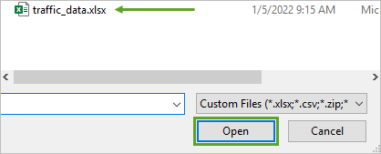
- Click Browse my computer and browse to where you stored the traffic_data file. Click traffic_data.xlsx and click Open.
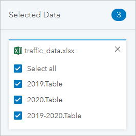
When you choose data to add, it appears in the Selected Data section of the window.
- Click Add.
The added data appears in the data pane.
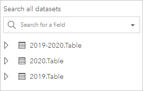
The file contains three spreadsheets: one for 2019, one for 2020, and one for both 2019 and 2020.
- On the ribbon, click Untitled Workbook and change the name to Covid Traffic Analysis with your initials at the end, and press Enter.
- On the ribbon, click Save.

You have added tabular data containing traffic incidents to an Insights workbook and saved it. Now you can explore the data.
Explore the data
Since the data is from an Excel file, it is nonspatial, meaning there are currently no features to display. Insights has many exploration tools for spatial and nonspatial data that you can use. If the table contains latitude and longitude values, you can view the features on a map.
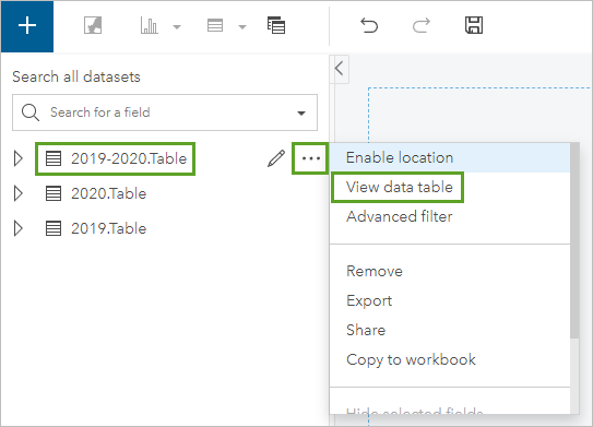
- In the data pane, for the 2019-2020.Table file, click Dataset options and choose View data table.
The table appears in a separate window.
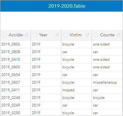
- In the lower right corner of the table, click the arrow and drag the table to expand it.
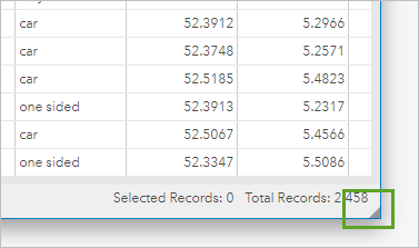
- Click the vertical divider next to the Number of patients column and drag the divider to expand the field (you should see the entire field name when finished).

- For the Number of patients field, click the arrows two times to sort the values in the field in descending order.
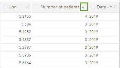
- Scroll down in the table until the value in the Number of patients field is 1.
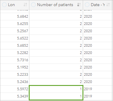
Out of nearly 2,500 records, there are only about 84 with more than one patient, and most of these incidents involve cars.
- In the 2019-2020.Table window, click Close.
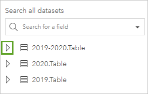
- In the data pane, for 2019-2020.Table, click the arrow next to the name to expand the dataset and view the fields.
All the fields you viewed in the table display in the data pane.
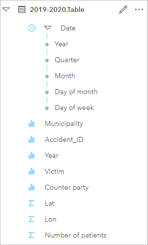
Each field has a symbol next to it indicating its type, such as string, number, or rate/ratio. The clock icon indicates a time field. The field type determines what types of items you can create with it, such as a map, chart, or table. Currently, there are no fields that you can use to create a map of the incidents, but notice that there are Lat and Lon fields, which store the coordinates of the incident.
Note:
You can click the symbol to see the type of field and change it to a different type.
- In the data pane, click the Victim field and drag it onto the workbook page.
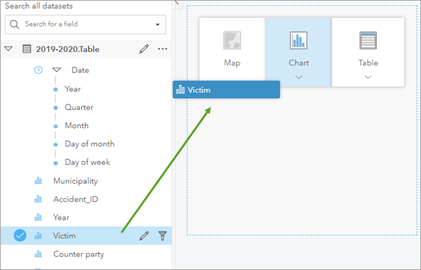
When you drag a field onto the page, various items that you can create with it appear.
- Point to Chart and drop the field on Bubble Chart.
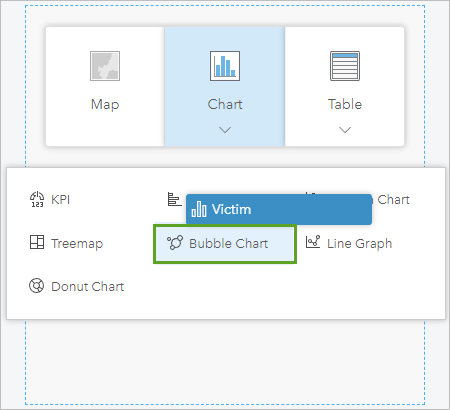
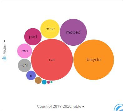
The bubble chart appears.
Note:
The colors in your bubble chart may vary.
The size of the bubble is determined by the number of victims for each category, such as car, bicycle, or another type. With a quick glance at the bubble chart, you see that most victims in incidents are either in a car or on a bike. The chart also provides information when you point to a bubble.
- In the bubble chart, point to the car bubble.
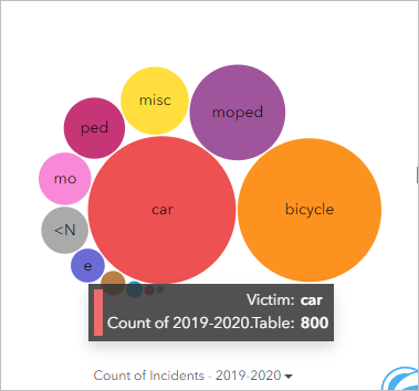
Of the 2,500 incidents, 800 victims were in a car.
- Point to the remaining bubbles to see how many victims there are for each.
With 800 and 755, respectively, the car and bicycle categories have more than double the number of victims of the next closest category of moped. Next, you will rename the dataset to a more descriptive name and use the Lat and Lon fields to enable location and view the incidents on a map.
- In the data pane, point to 2019-2020.Table and click the Rename dataset button.
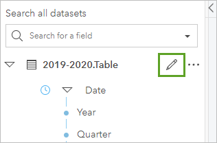
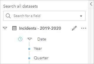
- For the name, type Incidents - 2019-2020 and click the gray space of the workbook or press Enter.
The updated name appears in the data pane.
- In the data pane, for Incidents - 2019-2020, click Dataset options, and choose Enable location.
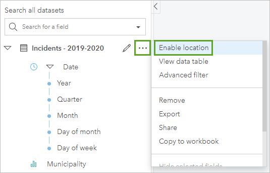
Insights automatically recognizes the Lon field for the X (Longitude) parameter and the Lat field for the Y (Latitude) parameter.
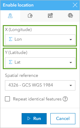
- Click Run.
In the data pane, a Coordinates field is added to the Incidents - 2019-2020 dataset.
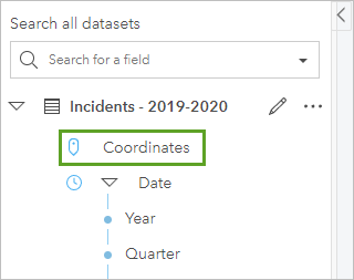
Now that you have enabled location on the dataset, you can create a map card and view the incidents spatially.
- In the data pane, drag the Victim field to the page and onto the Map option.
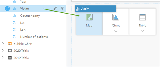
The points appear on a map card, symbolized uniquely by the Victim attributes.
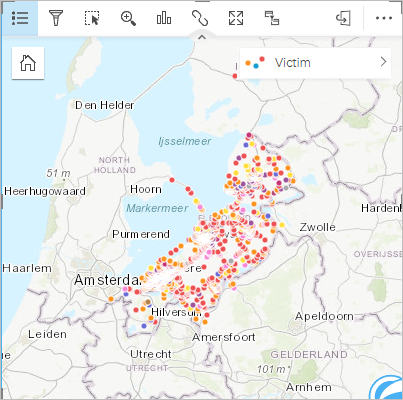
In Insights, cards containing the same dataset are connected, so if you select something in one card, it is reflected in others. This allows you to explore all cards simultaneously.
- On the page, drag and arrange the bubble chart and map card so that they are side by side.
- In the bubble chart, click the victim categories and notice the changes in the map. Be sure to click car, bicycle, ped, and moped.
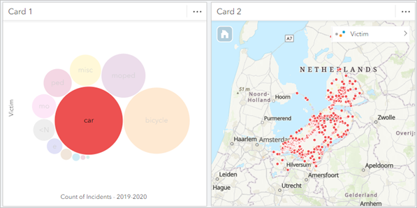
Notice that pedestrian, bicycle, and moped incidents happen more often in the cities, while the car incident locations are more spread out over Flevoland.
- At the bottom of the page, click Page 1 and rename the page Sandbox.

- Save the workbook.
You’ve created a workbook in Insights and uploaded incident data. You created a chart, enabled location, and created a map. With some simple exploration of the map and chart, you have already noticed important spatial patterns in the data. Next, you'll dig deeper into the data by comparing the years 2019 and 2020.
Compare 2019 and 2020 incidents
Next, you will compare traffic safety in the years 2019 and 2020 to see the impact COVID-19 measures had in the Netherlands.
Explore changes in a column chart
In this section, you will create a chart to compare traffic incidents in 2019 and 2020. First, you'll create a column chart that shows the different composition of the traffic incidents in both years.
- In the data pane, click the Incidents - 2019-2020 dataset and drag it to the New page button at the bottom of the workbook.

- Click Page 2, type 2019-2020, and press Enter.

- In the data pane of the 2019-2020 page, expand the Incidents - 2019-2020 dataset to view its fields.
- Point to the Year and Victim fields and click to the left of their names to select them both.
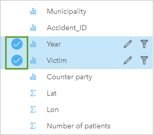
- Drag the selected fields to the page, point to Chart, and drop the fields on Column Chart.
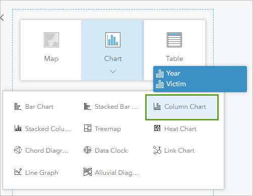
A column chart appears on the page.
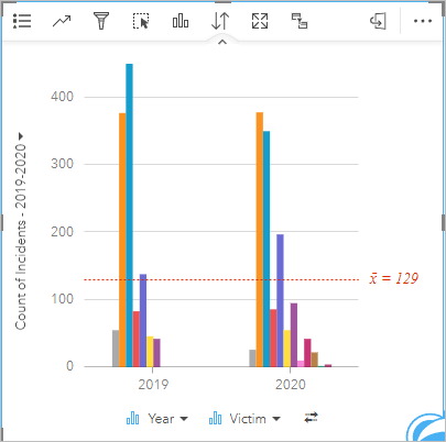
- Expand the card by dragging one of the corners to get a better view of the data.
- Below the charts, click the Flip fields button to switch the axes for the fields.
Note:
If the Victim attribute is already displayed on the y-axis, or bottom of the chart, you don’t have to flip the fields.
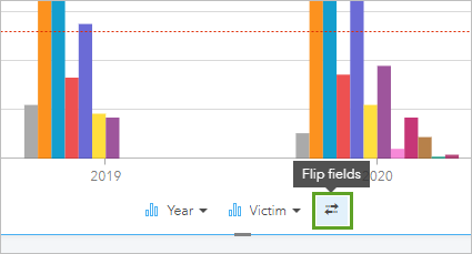
The fields are flipped in the chart.
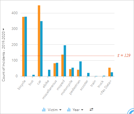
As with the bubble chart, you can point to columns to see more information. Next, you will sort the data in the chart to get a more descriptive visual of the number of victims in each year.
- On the top of the chart window, click Sort, and click Sort descending.
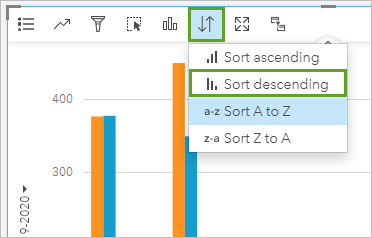
The values are sorted from highest to lowest, making it easier to interpret the chart.
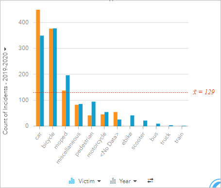
Notice that while the biggest difference in numbers is the decrease in car incidents from 2019 to 2020, the biggest relative difference is the rise in pedestrian incidents. Pedestrian incidents went from 42 incidents in 2019 to 95 incidents in 2020, a rise of approximately 125 percent. The differences in car accidents between 2019 and 2020 could be due to fewer people driving in the pandemic. Also, pedestrian traffic may have increased during the pandemic because carpooling and driving to the workplace likely decreased, and more people were walking trying to get out of the house.
- After you've examined the chart, make it small again by dragging one of the corners to make room for the next cards.
- Save the workbook.
Compare incidents to the time of lockdown measures
Next, you will make a time series chart that shows the number of incidents over time for each year. With this chart you can make a comparison between the number of incidents and the timeline of the lockdown measures in the Netherlands to see if there's a correlation between them.
- Below the workbook, click the Sandbox page to view it.

- In the data pane, rename 2020.Table to Incidents – 2020 and rename 2019.Table to Incidents – 2019.
- Drag Incidents – 2020 and Incidents - 2019 from the Sandbox page to the 2019-2020 page.
Note:
After you drag one dataset to the 2019-2020 page, you must activate the Sandbox page again to drag the other dataset.
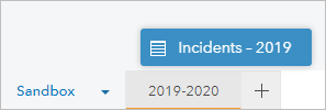
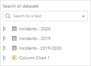
Now the 2019-2020 page contains all the datasets.
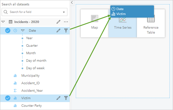
- In the data pane, expand Incidents – 2020. Select both the Date and Victim fields. Drag the selected fields to the page and onto the Time Series option.
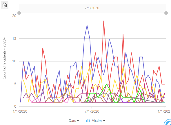
Expand the time series card.
- Click the gray space on the page to deselect the time series chart card.
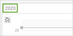
- On the time series card, click its name, Card 2, to make it editable. Type 2020 and press Enter.
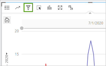
- On the 2020 card, click the title bar to view the tools, and click the Card filter button.
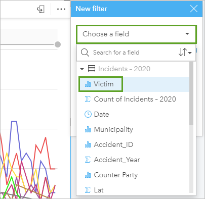
- In the New filter window, for Choose a field, click Victim.
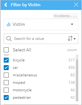
- Check the Select all check box to deselect everything. Check bicycle, car, and pedestrian.
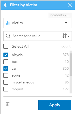
- Click Apply.
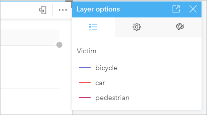
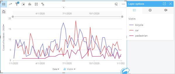
- On the 2020 card, click the Layer options button to see the legend.
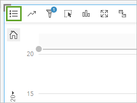
The legend for the chart appears.
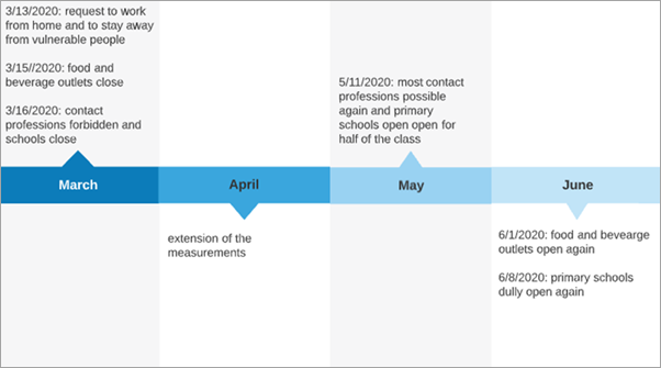
- Using the chart and the timeline of the lockdowns as a reference, analyze the information in the time series chart.
The timeline shows lockdown measures starting in mid-March and lasting until around mid-May, when measures were lifted a bit.
The time series chart is filtered for 2020.
Notice the decrease in all incidents around March to April 2020. The first lockdown measures were implemented in March, and there was a decrease in the number of overall incidents. After these measures were softened in May to allow for some work contact and some schools reopening, the number of incidents started to rise rapidly.
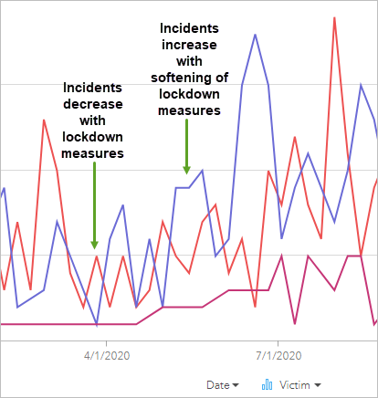
These patterns may be caused by the weather; after all, when the weather is nicer, people tend to go outside more often. To check if these patterns are weather related or totally different than they were in 2020, you can make a time series chart using the 2019 data.
- In the data pane, expand Incidents – 2019. Select Date and Victim and drag the selected fields to the Time Series option.
- On the time series chart, click the Card filter button and choose the Victim field. Filter on the bicycle, car, and pedestrian fields.
- Click Apply.
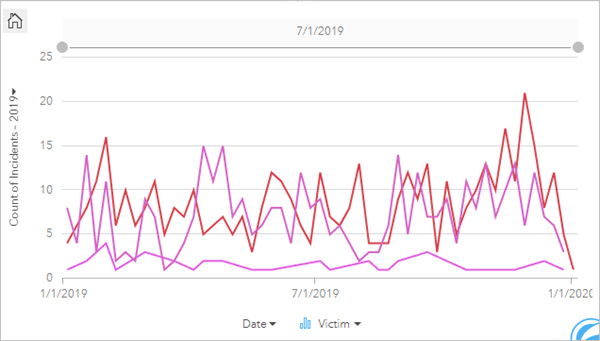
- Explore both charts by pointing to a victim line to see the number of counts in the March to May time frame.
In 2019, there are fewer pedestrian incidents and more bicycle incidents. The higher number of bicycle incidents could be a result of more bikes and more cars on the roads, increasing the chances of an accident, while in 2020, there were fewer cars and bicycles on the roads, decreasing the chances of an incident.
You have analyzed and visualized some of the differences between incidents in 2019 and 2020 using a time series. You've seen that there was a decline in the number of car incidents but a rise in bicycle and pedestrian incidents. You've also seen the impact of the lockdown measures on the number of incidents.
Perform spatial analysis to determine incidents close to traffic lights
Next, you will analyze traffic incidents around traffic lights. You will create a buffer and use a spatial filter to look at which incidents happened around traffic lights and create some charts to better understand the composition of these incidents.
Buffer traffic lights
First you will make a buffer of 50 meters around traffic lights. This will later be used for a spatial analysis of victims around traffic lights.
- Download the traffic light data.
- At the bottom of the page, click the New page button to add a page.

The Add to page window appears.
- In the Add to page window, choose Upload file, and click Browse my computer. Browse to where you stored the traffic lights data, select the .zip file, and click Open.
The data appears in the Selected Data section.
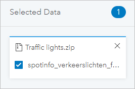
- Click Add.
The dataset is added to the data pane.
- Rename the dataset Traffic lights.
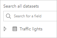
- Rename the page Traffic light analysis.
- In the data pane, expand Traffic lights to see the fields.
Because this dataset is a shapefile and inherently a spatial dataset, there is already a Location field enabled on the dataset.
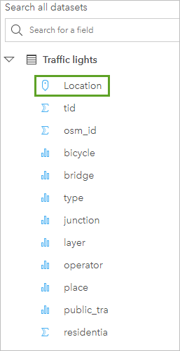
- Drag the Location field onto the Map option to create a map card.
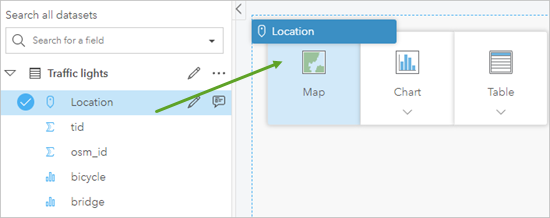
Now you can see all the locations of traffic lights in Flevoland.
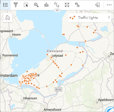
- Click the empty page to deselect the card. Click Card 1 and rename the card Traffic lights location.
Next, you will add the incident locations from the other page so that you can analyze incident and traffic light locations together.
- Activate the 2019-2020 page.

- Drag Incidents 2019 – 2020 to the Traffic light analysis page.

You will add the incidents to the existing map card containing traffic lights so that you can analyze them together.
- In the data pane, drag Incidents – 2019-2020 to the Traffic lights location map card and onto the Add new layer area.
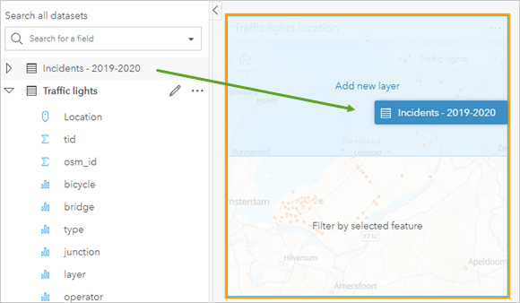
The Incidents – 2019-2020 layer appears in the map card.
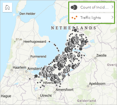
Now that you have both layers in the same map, you will analyze the incidents that happen near traffic lights. The first step in this process is creating a buffer around each traffic light.
- On the Traffic lights location map card, click the Action button.
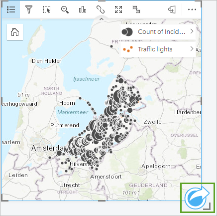
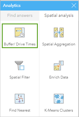
The Analytics window appears and contains various types of analysis that you can perform on your data.
- In the Analytics window, under Spatial analysis, click Buffer/Drive Times.
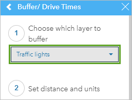
- For Choose which layer to buffer, choose Traffic lights.
Next, you will specify the distance and units for the buffer. You want to buffer each traffic light by 50 meters to analyze accidents around them.
- For Set distance and units, verify that Fixed Distance is selected. Under Fixed Distance, replace the value of 1 with 50, and click the drop-down menu for units and choose m.
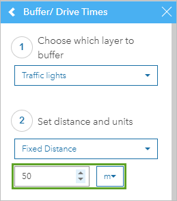
The final parameter for buffer style is set to Overlap, which is what you want.
- Click Run.
In the data pane, a dataset named Fixed distance 1 appears.
- Rename the Fixed distance 1 dataset Buffer 50 m.

- Use the mouse wheel button to zoom in to an area that has traffic lights.
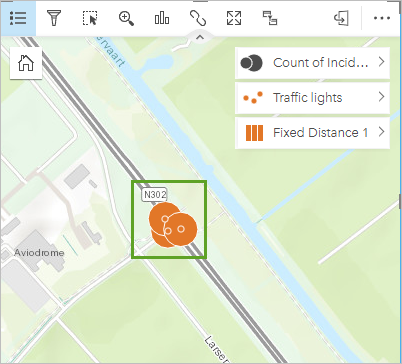
On the map, you can see the traffic light features and their associated 50-meter buffers. You will use the buffers to discover incidents that fall within them.
Make a spatial filter
Next, you will use the buffer layer that you created and another analysis tool, a spatial filter, to analyze victim types near traffic lights.
- In the data pane, expand Incidents - 2019-2020. Drag the Victim field onto the Traffic lights location map card and choose Style Incidents - 2019-2020 by Victim.
Note:
When you drag the Victim field to a card that is already styled by another field, the name Style Incidents - 2019-2020 by Victim appears. Because you already had the Incidents – 2019-2020 layer styled in the map, by adding the Victim field, you can choose to style the layer using the field.
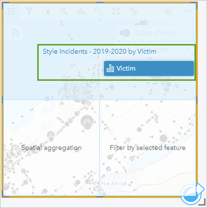
Now the Incidents – 2019-2020 layer displays each victim type with a unique symbol.
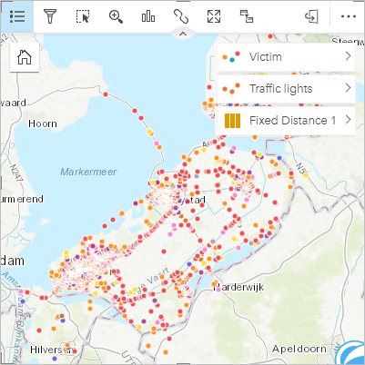
- On the Traffic lights location map card, click the Action button to view the analysis tools.
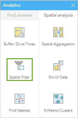
- In the Analytics window, choose Spatial Filter.
- In the Spatial Filter tool, set the following parameters:
- For Choose a layer to filter, choose Victim.
- For Choose a layer to filter by, choose Buffer 50 m.
- For Choose a type of filter, choose Contains.
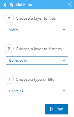
The tool will filter out features in the Victim layer that are contained within the buffers.
- Click Run.
On the map, only the incidents that happened within 50 meters of a traffic light are now shown.
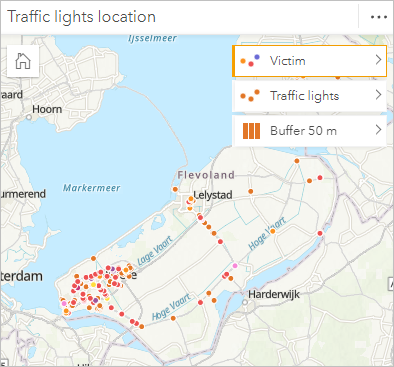
In the data pane, a dataset named Spatial Filter 1 appears.
- On the data pane, rename Spatial Filter 1 to Incidents near traffic lights.
- Expand Incidents near traffic lights, select the Year and Victim fields, and drag them to Column Chart.
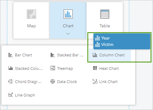
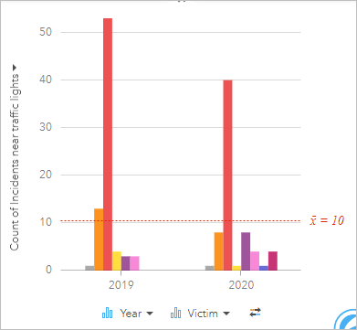
The column chart appears, showing the Year and Victim fields.
- In the Traffic lights location map card, click the symbols for the Traffic lights and Buffer 50 m layers to turn them off.
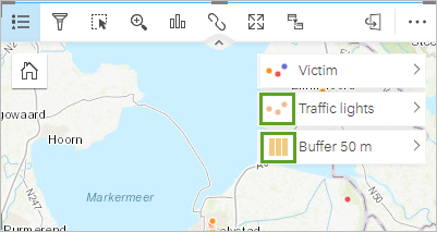
Note:
When a layer is displayed, its symbol in the legend is darker, but when it is turned off, the symbol is more lighter in color.
Now the only features displayed on the map are incidents that happened in 2019 and 2020 within 50- meters of traffic lights.
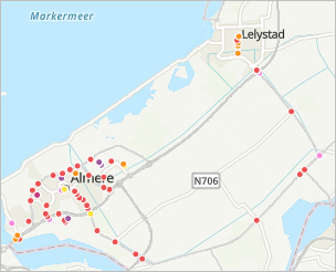
- In the column chart, point to the columns (which represent victims) to see the attributes. Click the columns to see on the map where the incidents happened.
- In the column chart, point to the bicycle column for each year to see how many bicycle victims there are for each year.
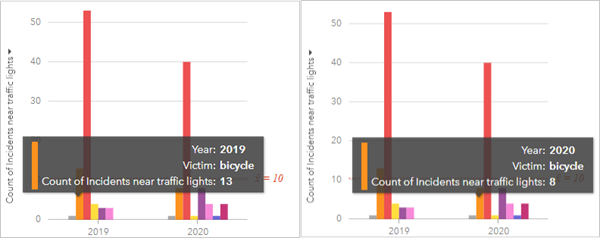
Notice that in 2019, 13 bicycle incidents happened within 50 meters of traffic lights, and that number decreased to 8 in 2020. Also, notice for the overall chart that most incidents near traffic lights have decreased in 2020. Next, you will look at victims during the work week, during which in 2020 most people were working from home and not out as much.
- In the data pane, for the Incidents near traffic lights dataset, below the Date field, select Year and Day of week.
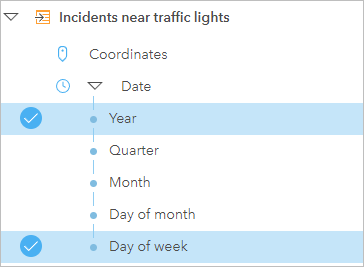
- Drag the selected fields onto the page and onto the Column Chart option.
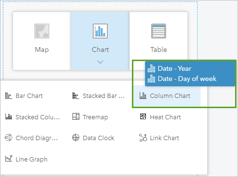
- In the chart, click the Flip fields button.
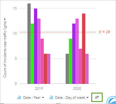
Note:
If the Day of week attribute is already on the left side of the Year attribute, you don’t need to flip the fields.
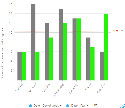
Looking at the chart, you can see an overall decrease in incidents in 2020.
- Point to the columns for Monday through Friday for each year to see the number of incidents for each.
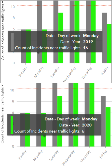
Notice that the incidents on Monday and other days of the workweek decreased from 2019 to 2020.
- In the chart, point to the columns for each year for Saturday.
From 2019 to 2020, the number of incidents on the weekend increased.
- Save the workbook.
You have made a buffer and a spatial filter. You used the result of the spatial filter to create a stacked column chart showing the composition of victims around traffic lights in 2019 and 2020. Last, you analyzed victims within 50 meters of traffic lights for 2019 and 2020 to see how during the work week, incidents decreased when lockdown measures were in place and people were working from home and increased on the weekend when people were not working and wanted to get out.
Share your results
You have done your analysis and explored the data for 2019 and 2020 and made some observations about traffic incidents within 50 meters of traffic lights. Next, you will share your results so others can see your work.
- On the ribbon, click the Home button to go your Insights homepage.
- Under Recent Workbooks, point to your Covid Traffic Analysis workbook and click the Share button.
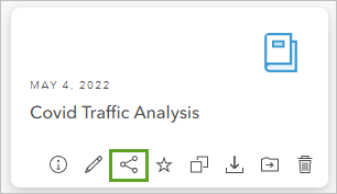
The Share workbook window appears.
- Under Enable viewers to export as, check both Image and Data. Under Share with, Check Everyone (public).
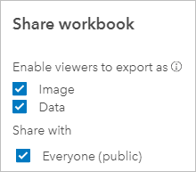
- Click Share.
Now your workbook can be viewed by everyone.
- On the side panel, under Analysis, click Workbooks.
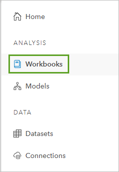
Your workbook is listed here. Any other workbooks that you or other members of your organization create may be listed as well. Other users in your organization, or outside of it, can access your workbook and view your maps and charts.
Note:
If you have many workbooks and cannot see your workbook, in the search bar, type covid traffic to filter the workbooks by name.
In this tutorial, you analyzed the traffic incidents before and during the 2020 COVID-19 pandemic to get an idea of how the pandemic and lockdown measures impacted traffic-related accidents. You learned that COVID-19 lockdown measures had a distinct impact on not only total accidents but also the type of vehicle involved. You made maps and different types of charts to explore and analyze the traffic data and performed spatial analysis to determine incidents that happened within close proximity to traffic lights. Finally, you shared your findings with the public. If you want to gain more knowledge and compare your incidents in and outside the cities, you can add the Urban_Flevoland layer to your workbook and a map card and explore it with your data. This link opens the layer's item details page in ArcGIS Online. In Insights, you can add data to a workbook and search in ArcGIS public to locate the layer by its name.
You can find more tutorials in the tutorial gallery..


