Turn a web map into a web app
Your team agrees that a map-focused web app is the best communication device for your story. You'll find and modify a web map, create a new web app from the map, and configure its basic layout structure.
Find a map with housing data
Instead of starting with a blank web map, you'll modify an existing one. ArcGIS Living Atlas of the World is a curated collection of geographic data and maps. It includes Esri Maps for Public Policy, a site dedicated to raising the level of spatial and data literacy in public policy. You'll search this site for data and maps related to housing policy.
- Go to the Esri Maps for Public Policy site.
Here you can search through data resources related to a variety of public policy topics. In this tutorial, you're searching for a web map related to housing.
- Click the Issues tab.

- Click the Housing tab. In the search bar, type Owned, rented, or vacant housing units and press Enter.

- In the search results, click the title of the web map named Owned, rented, or vacant housing units, owned by esri_demographics.
The map's item page appears, where you can read about the map and the data it contains. This map shows where owner-occupied housing, rented housing, or vacant housing is more prevalent. The data in this map is from the American Community Survey (ACS), which is conducted by the United States Census Bureau. This map is a good starting point for your app.
Note:
ACS five-year estimates are commonly used for public policy decisions and cover a wide variety of topics such as poverty, income, housing, and more. To learn more about ACS layers available in ArcGIS Living Atlas, view the Learn about your community using Census ACS layers in Living Atlas series.
You intend to use this map in a public-facing web app, so before you continue, you'll check if there are any special restrictions or limitations on using the content.
- Scroll to the bottom of the item page and find the Terms of Use section.

The web map is licensed under the Web Services and API Terms of Use for Esri. You can learn more about these terms by clicking either View Summary or View Terms of Use. The summary explains that anyone may use this web map for both internal and external use so long as they provide attribution to Esri and its data providers.
- Scroll up and find the Acknowledgements section.

This is the information that you need to properly attribute the data providers. You'll use this information later.
Configure the web map
So far you have found a web map about housing occupancy that you can use as the primary content for your web app, and you verified that you have permission to use it for your specific project. Next, you'll save a copy of the web map and reconfigure its layers to better suit the purpose of your web app.
- Scroll to the top of the item page and click Sign In. Sign in to your ArcGIS organizational account.
Note:
If you don't have an organizational account, see options for software access.
- At the top of the item page, click the Open in Map Viewer button.

The map appears.
- On the Contents (dark) toolbar, click the Layers button.

The Layers pane appears. Three layers are listed, containing housing data at the state, county, and census tract level. Each layer is configured to appear at different scales, so only the Tract layer is visible currently.
Your advocacy group focuses on local level housing issues, so you are only interested in the census tract level data. You'll save a copy of the web map with only the Tract layer.
- In the Layers pane, next to State, click the Options button. Click Remove.

- Also remove the County layer.
Only the data relevant to your web app remains. Next, you'll make sure it is visible at all scales.
- Click the Tract layer.
The Properties pane appears on the other side of the map.
Tip:
If the Properties pane is not visible, on the Settings (light) toolbar, click the Properties button.
- Scroll down in the Properties pane. Adjust the Visible range slider until it ranges from World to Room.

- On the Contents toolbar, click the Save and open button and click Save as.

- In the Save window, for Title, type Housing map. In the Summary box, replace the existing text with the following:
This map shows if owner-occupied housing, rented housing, or vacant housing is more prevalent in an area. This national data is from the most current American Community Survey (ACS) estimates census tracts. This is a copy of the web map found here: https://arcgis.com/home/item.html?id=d26a86e24de542a8bfb2b0986b5eddee
- Click Save.
Create a web app
You now have a web map configured for your needs. You'll create a web app from this map with ArcGIS Experience Builder. You'll design the layout of the app with a map and a column.
- On the Contents toolbar, click the Create app button.

A list of options appear. There are several ArcGIS products that allow you to create web apps from web maps. Each offers different tools and is suitable for different situations. For this project, you want to exercise a lot of control over the appearance of the app, so it can match both the web map and your organization's style. You'll choose ArcGIS Experience Builder, because it provides the most customization control.
- Click Experience Builder.
A template gallery appears. For future projects, these templates can save you time by preconfiguring the layout, but for this tutorial, you'll start with a blank canvas so you can more directly learn how to structure a layout.
- On the Blank fullscreen card, click Create.

- If a Getting started window appears, click Skip.
ArcGIS Experience Builder appears, showing the map in the center of the canvas. You'll rename your experience with a more meaningful title.
- On the top ribbon, click Untitled experience and type Housing Availability.

Next, you'll ensure that you can see the entire canvas.
- In the bottom right corner of the screen, click the Fit width to current window button.

- If the Insert widget pane is not already visible, on the side toolbar, click the Insert button.

- Scroll to the bottom of the Insert widget pane to find the Layout section.
Layout widgets help you to arrange groups of widgets in your app. Sizing and positioning widgets neatly is often easier when they are inside of a layout widget.
- Drag the Column widget onto the canvas.

- On the Column widget's toolbar, click the Align button and click Full height.

- Click the Align button again and click Snap to left.
Now that the column is in place, you'll resize the map. One of the goals for your project is that the map should be the main focus of the app, so you'll make it fill the entire canvas.
- Click the Map widget to select it. On the map's toolbar, click the Align button and click Full size.

The map expands to fill the entire canvas, with a portion of it hidden behind the column. Next, you'll define the default extent of the map in the map's property settings.
- In the Map pane, next to Initial view, click the arrow to expand this section.
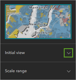
- Click Custom and click Modify.

The Modify initial view window appears.
- Zoom to your community or another area of the United States that interests you, for example, Manhattan Island in New York City.

- Click OK.
You'll make a few more configurations to the Map widget.
- In the Map pane, expand Tools and turn off Search.

Later you'll add a Search widget that you have more control over.
- Near the bottom of the Map pane, expand Tools layout. Under Large and medium size, choose the second option.

The map's navigation controls move to the bottom right corner of the map. Previously, they were hidden behind the column.
Finally, you'll disable pop-ups. Later in the tutorial, you'll add widgets to show information about the number of housing units of each type in each tract. This information will make the pop-ups unnecessary.
- At the bottom of the Map pane, expand Options and turn off Enable pop-up.

- On the builder toolbar, click the Save button.

- Close the Map Viewer Housing map browser tab and the Esri Maps for Public Policy browser tab.
So far in this tutorial, you've found a web map, modified it for your needs, and converted it into a web app in ArcGIS Experience Builder.
Add and configure widgets
Now that you've configured the map, it's time to add a few widgets to help users understand and explore the data. You'll add Chart, Text, Search, and Menu widgets.
Add a Chart widget
You'll add a pie chart to the empty column. You'll connect the chart to the data in the map, so it displays the housing composition of the selected census tract.
- If necessary, reopen your Housing Availability app in ArcGIS Experience Builder.

- In the Insert widget pane, click the Search button and type chart.

- In the search results, drag the Chart widget onto the column.
A blank Chart widget appears in the column. The rest of the column appears transparent, since by default, it has no background color.

Next, you'll configure the chart so that it displays housing information from the map.
- In the Chart pane, click Select data.

- In the Select data pane, expand Housing map and click Tract.

- In the Chart pane, under Tract, click Default and choose Selected features.

- Under Chart type, click Select chart and in the Chart type pane, choose Pie chart.

A pie chart is appropriate for this data since it is divided into three categories (owner occupied, renter occupied, and vacant), which together add up to 100 percent of housing units.
- In the Chart pane, under Data, set the following parameters:
- For Category type, choose By field.
- For Number Fields, check Vacant Housing Units, Owner-Occupied Housing Units, and Renter-Occupied Housing Units.
- For Statistics, choose Sum.
- For Sort by, choose Category.

The chart shows a No data found warning. This warning appears because you chose to show selected features on the chart and there are currently no features selected.
- On the builder toolbar, click Live view.

In live view mode, you can interact with your web app as a user might. You can't select widgets and move them around.
- On the map, click any census tract.
Now that a census tract is selected, the pie chart turns blue and the warning disappears. You'll exit live view mode so you can continue to configure the Chart widget.
- Turn off Live view. Click the Chart widget.
The Chart pane reappears.
- In the Chart pane, expand General. For Chart title, erase the text.

- Ensure that the Legend option is turned on and set to Category.
- For Legend position, choose Bottom. For Maximum width, type 300.

Next, you'll add color to the chart so that it matches the colors on the map.
- Expand the Slices section. Under Color, click Use color from layer and choose Custom color.
- Ensure By category is selected and click the options button.

- In the Slice color pane, click B25002_003E. Erase the existing text and type Vacant housing units
- Rename B25003_002E as Owner-Occupied housing units and B25003_003E as Renter-Occupied housing units.
The labels update on the chart's legend.
- In the Slice color pane, click the color next to Vacant housing units and click Custom.

- In the Custom colors window, for HEX, type #aa7b7b and press Enter.

The color updates to a muted red color.
- Change the color for Owner-Occupied housing units to #d3c268, a yellow color. Change the color for Renter-Occupied housing units to #6b99b5, a blue color.
The chart and its legend now match the colors of the map. If your selected census tract is yellow, the largest slice in the pie chart is also yellow.

Configuring the chart to match the colors on the map makes the chart easier to read and also allows it to double as a map's legend.
- Turn on Live view and click different tracts to observe changes in the chart.
Note:
A few census tracts will display only one or two slices, because they have only one or two housing types.
Configure a view for empty selections
The Chart widget will not show a chart in three situations: when the app is first opened, when you click an area that is not a census tract (for example, water areas or other countries), and when you click a census tract that has no housing (shown in gray on the map). You'll address the gray census tracts later. First, you'll choose a census tract to act as the default feature. When no census tract is selected, the chart will display data for the default feature.
- On the map, click any water area.
The chart returns to the No data found view. The chart will also appear like this when the web app is first opened. You can fix this problem by configuring a view for empty selections.
- On the side toolbar, click the Data button. In the Data pane, click the Housing map card.

- Under In use, click the Tract card.
- At the bottom of the pane, check the View for empty selection check box.
The Chart widget populates with red, blue, and yellow slices. This setting ensures that the chart does not appear empty when no feature is selected.
- Next to the check box, click the Settings button.

The View for empty selection window appears. Here, you'll choose which census tract will appear when none is selected on the map. In the following steps, you'll choose Census Tract 94 in New York County, New York. If you chose to center your map over another city, choose a tract from that area instead.
- On the Filter tab, click Add and click Clause.

An empty clause appears.
- Click Add and Clause twice more.
Now there are three clauses. You'll use the first clause to narrow down the data by state.
- For the first clause, click OBJECTID and choose State. For the second menu, choose is.
- Next to the third menu, click the Select source type button and choose Unique.

Now you can choose from a list of all unique values in the State field.
- Click the third menu. In the search bar, type new and choose New York, or your state of interest.

- Configure the second clause to read County is New York County, or your county of interest. If the county does not appear in the third menu, click Search more to reveal more search results.
Tip:
Remember to change the source type to Unique.
- Configure the third clause to read NAME is Census Tract 94, or a census tract in your area of interest.
- Ensure that the control above the clauses is set to And.

When And is chosen, a feature must satisfy all three of the clauses. The table shows one row for the one feature selected by the three clauses. The pie chart will show the results for this census tract when none are selected in the map.
- Click Apply changes.
Modify the chart's appearance
You'll complete the Chart widget by adjusting some of its appearance properties. You'll start by removing the buttons from the top of the widget. These provide functions that aren't necessary in your app. You'll remove them so they don't distract from the map's message.
- Turn off Live view and select the Chart widget.
- In the Chart pane, expand the Tools section. Turn off Selection.

Two of the buttons disappear from the Chart widget.
- Click the Action tab and click the Data action tab. Turn off Enable data action.

The third button disappears from the chart. Next, you'll change the background color of the Chart widget.
- Click the Content tab and expand the Appearance section. Click the background color and click Custom.
- For HEX, type #000000. Next to the HEX text box, click the arrows button.

- For A, type 75.

A stands for Alpha, and controls the opacity of the color. The map is partially visible behind the Chart widget now. However, the text is almost invisible. You'll change it to white.
- Click outside of the Custom colors window to close it. Next to Text elements, click the settings button.

- In the Text elements pane, next to Legend label, click the edit button.
- Click the black square and in the colors window, choose white.

- In the Chart pane, expand the Slices section. Change the Outline color to black.

The finished Chart widget has white text on a dark background.

Add a Text widget
Next, you'll add some text to give context to the map, including a title and data acknowledgement. You'll format different parts of the text to make it more readable and add some links where users of your app can find more information about the data shown on the map.
- On the side toolbar, click the Insert button. In the Insert widget pane, clear the search.
- Under the Page elements section, drag the Text widget onto the column below the chart.

The Text widget automatically positions itself below the Chart widget with a small gap in between.
- Double-click the Text widget and copy and paste the following text:
Owned, Rented, or Vacant?
Click a Census Tract to see housing information for that area.
Housing in Tract, County, State. The median rent is $Rent. The median home value is $Value.
Map by Lisa Berry, Esri. Data from U.S. Census Bureau's American Community Survey (ACS) 2019-2023 5-year estimates, Table B25002.
Include the spaces between the lines of text. The third line of text will make more sense later, when you add dynamic elements.
Tip:
Use Ctrl+Shift+V or Command+Shift+V to paste the text without any formatting.
Next, you'll change the height of the Text widget.
- In the Text pane, click the Style tab. Next to Height, click the arrow button and choose Auto.

This setting will ensure that the Text widget is always tall enough to show all of its contents and never too tall.
Next, you'll choose the same text and background colors as the Chart widget.
- In the Text pane, next to Background, click the Fill color button.

- Under Recent colors, choose the semitransparent black that you created for the pie chart background.

- Click the Text widget and highlight all of the text.
Tip:
Use Ctrl+A or Command+A to highlight all of the text.
- In the Text pane, click the Content tab.
- Under Text format, click the Font color button and choose white.

- Click the Center alignment button.

The chart's text is now white and center aligned. Next, you'll format the first line of text—your app's title—to be larger and bolder.
- Highlight the first line of text. On the text toolbar, click the Bold button and change the size to 25 px.

Tip:
If the text toolbar is not visible, change the font properties on the Content tab in the Text pane.
Next, you'll include a link to a United States Census Bureau resource for readers who may not know what a census tract is.
- In the second line of text, highlight the words Census Tract. In the Text pane, on the Content tab, under Text format, click the Link button.

- In the Set link pane, for Link to, choose URL. For URL, copy and paste https://www2.census.gov/geo/pdfs/reference/GARM/Ch10GARM.pdf.
- For Open in, choose New window. Click OK.

- Make the Census Tract text bold.
You'll also link to more information about the American Community Survey. Your data visualization will be considered more trustworthy if it provides information about how the data was collected, and by whom.
- In the last line of text, highlight the American Community Survey (ACS) text and link it to the following URL: https://www.census.gov/programs-surveys/acs/about.html.
- Make the American Community Survey (ACS) text bold.

Since the Text widget contains the map's title, you'll place it at the top of the column.
- Drag the Chart widget below the Text widget.
You'll also remove the gap between the column's items.
- Click the empty bottom part of the column, or the gap between the Text and Chart widgets to select the column.
- In the Column pane, for Gap, type 0 px.

The Text and Chart widgets now appear as one item.

Add dynamic text
For the third line of text, you'll include housing information that updates to reflect selections on the map, in the same way as the chart. You saw the fields that are available in the data when you configured the pie chart. You'll display some of those fields in the Text widget.
- Select the Text widget. In the Text pane, turn on Connect to data. Click Select data.

- In the Select data pane, expand Housing map and click Tract.
Now the Text widget has access to the housing data in the map.
- Double-click the Text widget and in the second sentence, highlight the word Tract.
You'll replace this text with dynamic content.
- In the Text widget's toolbar, click the Dynamic content button.

- In the Dynamic content window, click the NAME field.

In the Text widget, the highlighted text is replaced with {NAME}. An extra space was also added between the field and the comma.
- Remove the extra space.

- Replace the following words with the following fields:
- Replace the word County with the County field.
- Replace the word State with the State field.
- Replace the word Rent with the Median Rent (Contract Rent for Renter-Occupied Housing Units Paying Cash Rent) field.
- Replace the word Value with the Median Home Value (for Owner-Occupied Housing Units) field.
Tip:
To see the full name of a field, point to the field.
- Remove any extra spaces.
- Change all of the dynamic fields to bold.

- Turn on Live view and click different census tracts on the map.
The dynamic text updates to reflect housing information for the selected tract.

Add text for census tracts with no housing
You'll duplicate the text widget and configure it to show a message when the chart is blank.
- Ensure that Live view is turned on.
- On the map, click any gray census tract, for example, Central Park in New York City.
The chart disappears.
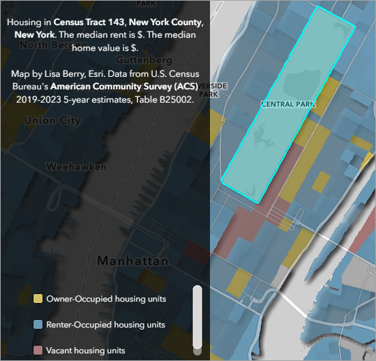
- Turn off Live view.
- Click the text widget. On its toolbar, click the Duplicate button.
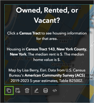
- In the new text widget, replace Owned, Rented, or Vacant? with This census tract contains no housing units. Please select another census tract.
- Erase the rest of the text in this widget.
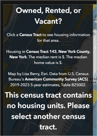
Next, you'll configure the text widget so the text only appears when a gray census tract is selected.
- On the new Text widget toolbar, click the Edit button to stop editing the text.
- Scroll to the bottom of the Text 2 pane and turn on Dynamic style.
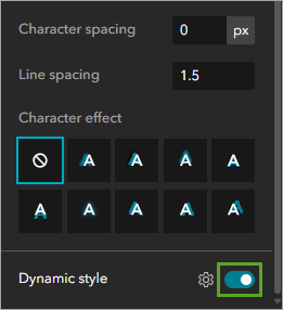
This option is available because the text widget, like the one it was copied from, is connected to data.
- Next to Dynamic style, click the settings button.
- In the Dynamic Style pane, ensure that Use Attribute and Statistics is selected.
- Click the menu and choose Total Housing Units.
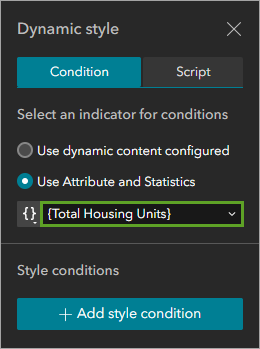
- Click Add style condition.
- In the second menu, type 0 and press Enter.
The condition should say If value is 0.
- Expand Text format. Click ## and type 20 px to change the font size.
You've defined how the text will appear when the selected census tract has no housing units. Next, you'll define how it will appear when one of the blue, red, or yellow census tracts is selected.
- Click Add style condition again. In the second condition, for If value, choose is not.
- In the second menu, type 0 and press Enter.
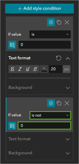
- Under the second condition, expand Text format. Click ## and type 0.
The font size changes to 4. This is the smallest font size possible.
- Click the font color button and click Custom.
- Click the arrows button and for A, type 0.
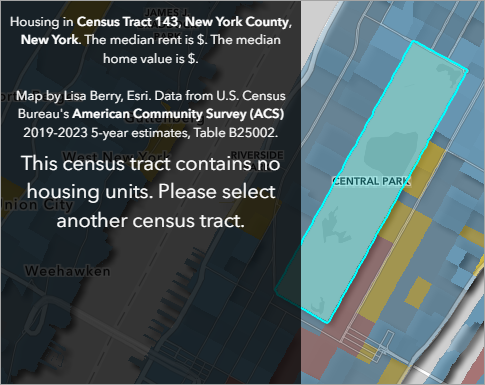
- Turn on Live view and test clicking different census tracts.
When a blue, red, or yellow tract is selected, the text is not visible. When a gray tract is selected, the chart widget is empty, but the text is visible.
Add a Search widget
Earlier, you removed the search bar from the Map widget. Now you'll replace it with a Search widget. This widget offers more customization control than the built-in tool. For example, you can place it anywhere, and modify its appearance.
- Turn off Live view. From the Insert widget pane, under the Data centric group, click the Search widget and drag it onto the map.

- Place the Search widget near the top right corner of the map.
The Search widget's default hint text is Find address or place. You'll reword this text.
- In the Search pane, under Source, click Add custom search sources and click ArcGIS World Geocoding Service.

The Set locator source pane appears.
- In the Set locator source pane, under Search options, for Hint, type Search for your area.

The hint text in the Search widget changes.
Next, you'll connect the Search widget to the Map widget with an action.
- In the Search pane, click the Action tab. Click Add a trigger.
- In the Select a trigger pane, click Record selection changes.

- Under Widgets, click Map. Under Select an action, click Pan to.

- Close the Action settings pane.
You'll test the search to ensure that the action was set up correctly.
- Turn on Live view. In the Search widget, type a place name. In the search results, click one of the place names.

The map zooms to the selected location.
- On the map, near the zoom controls, click the Home button.

- Clear your search in the Search widget. On the builder toolbar, turn off Live view and click Save.
Add a page
Your data visualization is now complete. Next, you'll add the related article that your coworkers wrote. You could add a link to the story in the Text widget, but you'd prefer to make the story more obvious and feel like a part of the web app. You'll add a second page to the app and embed the story in it.
- On the side toolbar, click the Page button.

- In the Page pane, click the Add page button and click the Blank fullscreen option.

A new blank canvas appears.
- In the Page pane, rename Page 2 to Story.
- Rename Page to Map, then click the Story page to select it.

- From the Insert widget pane, under Page elements, add an Embed widget to the canvas.
- On the Embed widget's toolbar, click the Align button and click Full size.

For this tutorial, you'll embed How the Age of Housing Impacts Affordability, a story written by Steven Aviles on Esri's Policy Maps team.
- In the Embed pane, for Embed by, choose URL.
- Paste the following URL: https://storymaps.arcgis.com/stories/ae7f226a5ffd4466acbe0c7a14deab0e.

The story appears on the canvas. It was created with ArcGIS StoryMaps.
Add a Menu widget
Next, you'll add a Menu widget. This will provide a way for users to switch between the two pages of your app. To prevent the menu from hiding parts of the story, you'll add a header to the page first.
- On the side toolbar, click the Page button. In the Page pane, click the Story page.

- In the Story pane, turn on Header.
A blue bar appears at the top of the page.
- For Height, type 60 px.
- Point to the header and click Edit header.

- From the Insert widget pane, under the Menu and tools group, add a Menu widget to the page header.

- Snap the Menu widget to the right side.
- In the Menu pane, on the Content tab, for Style, choose Pills.

The Menu widget doesn't match the rest of your app. Instead of changing colors in multiple locations, you'll change the app's theme.
- On the side toolbar, click the Theme button. In the Theme pane, click Customize.

- For Primary change the color from blue to dark gray.
The menu pill changes to a dark gray color.
The Menu widget allows users to switch from the story to the map. You'll add the same Menu widget to the map page so they can also switch to the story.
- Open the Page pane and click the Map page.
You don't need to add a header to the page, since users can pan on the map to see areas that are hidden by widgets.
- From the Insert widget pane, add a Menu widget to the page.
- In the Menu 2 pane, for Style, choose Pills.
- Place the menu widget in the upper-right corner of the app. Move the Search widget down to make room.
- Turn on Live view. Click the menu buttons to test switching between the two pages.

- In the Page pane, make sure that the Make homepage button is visible next to the Map page.

This button indicates which page acts as the home page. The home page will appear when the app is first opened.
- Click Save.
You have created a web app with two pages, containing a map and a story. You configured Map, Column, Chart, Text, Search, Embed, and Menu widgets. You connected widgets using actions and dynamic content to help users explore housing availability.
Optimize the app for mobile devices
So far, you have achieved four of the goals for the web app:
- The map should be the main focus of the app.
- The app should allow users to search for their own address or areas of interest.
- The app should include dynamic text and charts to allow users to explore and interact with the data.
- The map should be paired with a journalistic story.
There is one remaining goal: the app should work on a mobile device as well as a desktop computer screen.
Currently, your web app looks good on a large screen only. To finish the project, you'll adjust elements until the app looks good on any screen size.
Optimize the story page for mobile
To make the story page work across different screen sizes, you'll adjust the sizing of the Menu widget from relative sizing (defined in percentages) to absolute sizing (defined in pixels).
- If necessary, reopen your Housing Availability app in ArcGIS Experience Builder. Turn on Live view.
- If necessary, on the app's menu, click the Story pill to view the Story page.
- On the builder toolbar, click the Edit your page for small screen devices button to switch to small screen mode.

This view emulates how your app will appear on a mobile device.
- Scroll through the story to confirm that none of the text or maps are cut off.
ArcGIS StoryMaps stories are already configured to resize for mobile devices. However, the Menu widget on the page header is too short to read.

You could create a custom layout for small screens, but in this case, you can fix this problem by changing how the Menu widget is sized across all screen sizes. Solutions that work across all screen sizes are preferable to custom solutions for different screen sizes because they make the app easier to edit and maintain in the future.
- On the builder toolbar, click the Edit your page for large screen devices button.

It's necessary to switch to large screen mode to reconfigure widgets.
- Turn off Live view. Click Edit header and click the Menu widget.

- In the Menu pane, click the Style tab. Find the Width property.
The Width property is defined as a percentage of the screen's width, which becomes too small on narrow screens. You'll define the width in pixels instead, so you can ensure that it's always the same size, regardless of screen size.
- Next to Width, click the Change unit button and choose px.

- Set Width to 250.00 px.

- Switch to small screen mode.
The menu is now large enough to read on the small screen.

Optimize the map page for mobile
Next, you'll make adjustments to the map page so it too works on all screen sizes. You'll change some elements to absolute sizing. You'll also configure a custom layout for mobile devices.
- In the Page pane, click the Map page.
All of the widgets are too narrow on this page. Most of the text can't be read.

- On the builder toolbar, click the Edit your page for medium screen devices button to switch to medium screen mode.

This view emulates how your app will appear on a tablet. It looks better, but the chart's legend and the menu are still cut off. You'll adjust their widths to absolute sizing.
- Switch to large screen mode.
- Select the Menu widget. In the Menu 2 pane, on the Style tab, change Width to 250.00 px.
- Select the Search widget. Change its Width to 250.00 px.

- Click below the chart to select the Column widget. Set its Width to 300.00 px.
- Switch to medium screen mode.
The layout changes are effective on this screen size.

- Switch to small screen mode.

The changes are not effective here. The map is almost entirely hidden behind the Text and Chart widgets. You discussed with your teammates and decided that the chart isn't necessary for the mobile version of your web app. You'll hide it from view when the screen size is small. To do this, you need to create a custom layout for small screens.
- Next to the canvas, click Custom.

- In the warning pop-up window, click OK.
Now you can make changes to the layout that will only affect the app when it's viewed on small screens. You'll hide the Chart widget so that it appears when the screen is large and disappears when the screen is small.
- Click the Chart widget. On its toolbar, click the Move to the pending list button.

The Chart widget disappears.
It's important that you don't delete the Chart widget. Even though you are in custom mode, if you delete a widget, it will be deleted from all versions of the app. The pending list allows you to remove widgets from view without deleting them.
Tip:
If you accidentally deleted the Chart widget, click the Undo button on the builder toolbar. If you decide to add Chart back later, you can find it on the Insert widget pane, on the Pending tab.
- Select the text widget with the invisible text and move it to the pending list as well.
Next, you'll change the size and position of the Text widget so it no longer hides the Search and Menu widgets.
- Click the remaining Text widget. Drag it outside of the column and place it on the map.

- Move the Column widget to the pending list.

- Snap the Text widget to the bottom left corner.
- In the Text pane, click the Style tab. Change Width to 90.00 percent and Height to 35.00 percent.

This size prevents the map's navigation controls from hiding any of the text.

Note:
In custom mode, you can change the size and position of widgets without affecting other screen sizes. However, changes to other properties will be visible on all screen sizes. For example, if you choose a smaller font size for the Text widget, it will appear smaller on all screen sizes. If you want a smaller font size on small screens only, you must duplicate the Text widget, move the original widget to the pending list, and change the font size in the new widget.
Finalize and publish
To finish the project, you'll preview, publish, and share the web app.
- On the builder toolbar, click the Save button.
- When the Saved successfully message appears, click the Preview button.

A new browser window appears with your app.
- Test the app by exploring the map, chart, and story.
- Resize the browser window to test the app's layout on different screen sizes.

- Return to the Experience Builder editing tab. On the builder toolbar, click Publish.
You'll also update the app's sharing settings to make it accessible to the public.
- Click the More button and click Change share settings.

The item page appears for the web app.
- Click Share.

- Click Everyone (public) and click Save.
- In the Item sharing successfully updated window, click Review sharing.
It's necessary to share the web map as well as the app.
- In the Review sharing window, click Update sharing.
In this tutorial, you built a multipage web app that features a map and story about housing occupancy in the United States. You added interactive widgets to enhance readers' understanding of the data. Finally, you altered the layout to ensure that it works for screens of all sizes.
Now you and your teammates can embed your work on your housing advocacy group's website or share links to the web app on social media.
You can find more tutorials in the tutorial gallery.

