Explore community trends for a comprehensive plan
Create a project
First, you'll create a project in ArcGIS Business Analyst Web App. Projects contain layers, reports, and other map items and help you manage and organize your data more efficiently. Projects also allow you to share your work with your colleagues.
Your project will examine community trends in Fullerton, California. However, you can perform this workflow for any community in the United States.
- Go to Business Analyst.
- If you are not already signed in, click Sign In. Sign in with your ArcGIS organizational account.
Note:
Your account must be licensed to use Business Analyst. If you are the administrator of your organization, you can assign yourself a license. Otherwise, you must contact your administrator for permission.
If this is your first time using Business Analyst, a Welcome screen appears.
Note:
If you've created a project in Business Analyst previously, you will not see the Welcome screen. If necessary, on the ribbon, click the Home tab.
- On the Welcome screen, click Skip this step and click Create project.
You'll be taken to the Home tab and the Create project window appears.
Note:
Users who have previously used Business Analyst will need to click the Create new project button. The Create project window appears.
- For Project name, type Fullerton Community Trends and add your name or initials. Click Create.
A window appears, explaining that a project is being created. The process may take a few moments. When it finishes, a message appears confirming that the project has been created.
- Click OK.
- If necessary, on the ribbon, click the Maps tab.
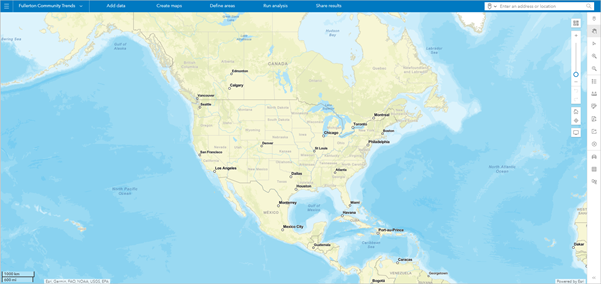
The project appears.
Note:
Depending on your organization's settings, the default extent and appearance of your project may differ from the example image.
Create a citywide infographic
As part of any comprehensive plan update process, you must provide a snapshot of current demographic trends to the public.
For this tutorial, you'll start by providing an infographic that summarizes demographic variables such as population, education, income, age, and employment. This infographic can be used as an informative resource on high-level topics that your next comprehensive plan will address.
Before you create the infographic, you'll define your study area of Fullerton, California, near Los Angeles.
- On the ribbon, in the search bar, type Fullerton and choose Fullerton, CA, USA.
Note:
If Fullerton does not appear in the list of results, your project may have a default geography that does not include the United States address locator. You can change your project's geography by clicking the country code in the upper right corner and choosing USA.
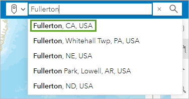
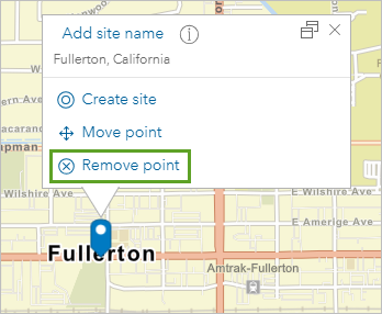
The map navigates to Fullerton, California. A point is added to the map to represent the city and a pop-up appears with options to create a site, move the point, or remove the point. You won't need this point, so you'll remove it.
- In the pop-up, click Remove point.
Next, you'll define a polygon area for the city.
- On the ribbon, click Define areas and choose Select geography.
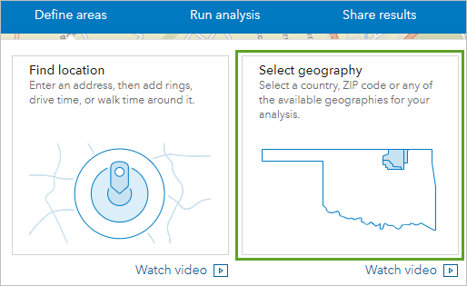
The Select geography pane appears. You can either search for a specific geography, select a geography from a layer on the map, or browse a full list of available geographies based on country, state, city, or other subdivisions. Because you've already navigated to Fullerton, you can select it from the map.
- In the Select geography pane, click Select from map.
A list of options appears, including countries, states, counties, and other types of geographic divisions.
- Click Cities and Towns (Places).
- Click the map near the Fullerton place name.
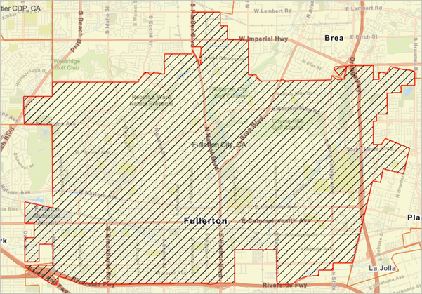
The Fullerton city boundary is selected. The Fullerton City, CA entry is added to the Select geography pane.
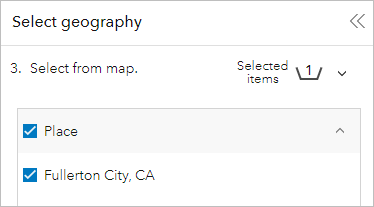
- If necessary, on the map, zoom out until you can see the entire Fullerton city boundary.
- In the Select geography pane, click Finish.
The boundary is saved to the map. Now, you can run reports and analyses on the boundary. To update your comprehensive plan, you'll need data about how the city is currently operating. To summarize key demographic information, you'll run an infographic.
- In the Select geography pane, click Run infographics.
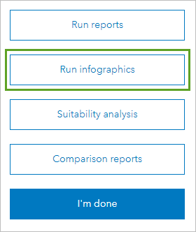
The Run reports window opens to the Infographics tab. You can run infographics on a wide range of topics, including at-risk population, employment overview, population trends, and many more. You want a general summary of demographic information.
- For Select and run reports, check Demographic Summary.
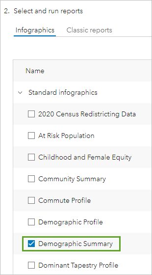
- Under Selected infographics, for Fullerton City, CA, click Run now.

After a few moments, the infographic is created. It contains a demographic summary of Fullerton and includes information about population, net worth, education, and employment, among others.
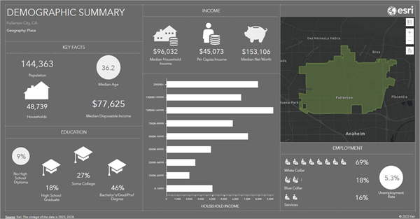
Note:
Demographic information is updated periodically. Your infographic may differ from the example image.
When planning for the next 30 years, it's important to know the existing conditions of a city. As you saw when you chose the infographic to run, Business Analyst provides many different options for infographics, some of which may help reveal other trends in the city. For the purposes of this tutorial, you'll only use this infographic.
You can print or export infographics as PDF files or images. The options to print or export the infographic are located on the ribbon. For now, however, you'll close the infographic and clear the map in preparation for the next part of your analysis.
- On the ribbon, click the Close button.

- Click the Maps tab.

You return to the map.
- On the map toolbar, click the Clear map button.

The Clear map window appears.
- In the Clear map window, check Sites. Click Clear.
The map is cleared.
Visualize housing trends across the city
Comprehensive plans identify focus areas for new policy decisions related to growth and community development. These focus areas are determined not only by data and trend analysis but also by the issues and concerns of the time.
Housing availability and affordability is one of the biggest concerns for many cities. For the remainder of the tutorial, you'll examine the housing situation in Fullerton and perform analyses necessary to inform the city's housing framework.
First, you'll visualize current housing trends across the city by creating a color-coded map. Later, you'll locate areas that need more access to housing and find the most suitable areas for the addition of new suitable housing.
- On the ribbon, click Create maps and choose Color-coded maps.
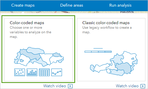
The Color-coded maps pane appears. Color-coded maps show geographic areas (such as countries, states, counties, cities, or census blocks) that are colored based on a demographic variable of your choice. Areas with a higher value will be a different color than areas with a lower value. You'll create a map that shows how housing costs vary within Fullerton.
You can choose the demographic variable to map by searching for keywords, exploring popular categories, or browsing all variables.
- In the Color-coded maps pane, click Browse all variables.
The Data browser window appears. This window contains all categories and variables.
- Click the Housing category.
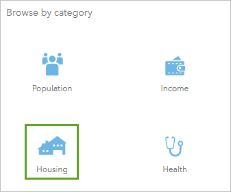
Many housing variables are available. One useful variable to understand is the percentage of renters who spend a large portion of their income on rent. The housing market may be unaffordable if rent is too high relative to income, signaling a need for more housing units.
- Under Keep browsing, click Housing Costs.
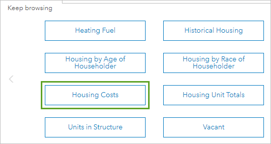
A list of variables related to housing costs appears.
- Expand 2017-2021 Gross Rent (ACS).
Note:
Demographic data is updated periodically. If more recent data is available, you can use it instead.
- For the 2021 HHs w/Gross Rent 50% + of Household Income (ACS 5-Yr) variable, click the % button. (You may need to scroll to find the variable.)

- Click the name of the 2021 Households: Gross Rent 50% + of Household Income (ACS 5-Yr) variable to choose it.
The variable is added to the map, but it's currently showing data at the county scale. You'll adjust this to see the data at the census block group scale.
- In the Color-coded maps pane, under Geography, change Analysis extent to Current map extent.

The color-coded census block groups appear.
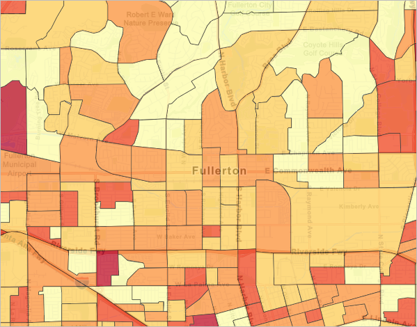
Darker census blocks represent areas where a higher percentage of renters pay 50 percent or more of their income in rent. A few of the darkest census blocks are in the Fullerton area.
- On the map, point to some of the darkest census blocks.
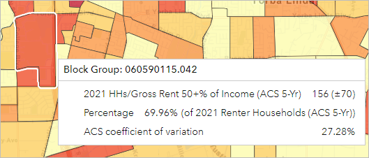
In the example image, about 70 percent of the households in the census block group pay over 50 percent of their income in rent. Overall, your exploration gives you a better idea of where people are struggling to pay rent.
Locate areas that need more access to housing
Your map currently displays a single variable. Next, you'll add multiple variables to the map to help identify where the greatest need for housing may be. You'll clear the current map and perform a smart map search to find the variables to map.
- On the map toolbar, click the Clear map button. In the Clear map window, check All and click Clear.
- On the ribbon, click Create maps and choose Smart map search.
The Smart map search pane appears. Using this pane, you can map up to five variables. You'll add four, with the first being the same variable you mapped in the previous section: Renters paying more than 50 percent of their income on rent.
- If necessary, in the Smart map search pane, click Get started.
- Click Browse all variables. In the Data browser window, click the Housing variable.
- For Popular variables, for the 2021 HHs w/Gross Rent 50% + of Household Income (ACS 5-Yr) variable, click the % button and check the variable.

You'll continue to add variables. Next, you'll add a variable for the percentage of households occupied by a renter. When creating a plan for development, the city may want to focus on areas with a majority of renters.
- Under Keep browsing, click Owner & Renter. Expand 2023 Key Demographic Indicators (Esri).
- For the 2023 Renter Occupied Housing Units variable, click the % button. Check the box for the variable.

The variable is added to the list of selected variables. Next, you'll add a variable for the total number of housing units. This variable will help the city understand where there is already abundant housing and where there isn't.
- Click the Housing button to return to the list of housing variables.
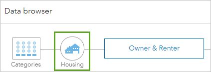
- For Keep browsing, click Housing Unit Totals.
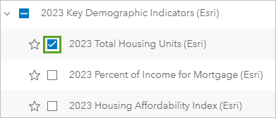
- Expand 2023 Key Demographic Indicators (Esri). Check the box for the 2023 Total Housing Units (Esri) variable.
You'll add one more variable, which will show the amount of households below the poverty level.
- Click the Categories button.

- In the list of categories, click the arrow to move to the next page. Click the Poverty category.
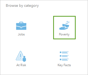
- For Popular variables, for 2021 Households Below the Poverty Level (ACS 5-Yr), click the % button. Check the box for the variable.

You've selected four variables.
- Click Save list. In the Save variable list window, for List name, type Housing Criteria and click Save.
- In the Data browser window, click Apply.
The data is added to the map.
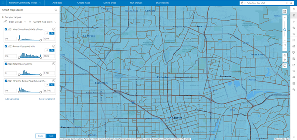
Right now, the map doesn't tell you anything. It only shows the location of block groups in the city. However, the Smart map search pane includes sliders that you can use to filter the block groups by demographic information.
- Type 20 to set the minimum of 2023 Renter Occupied HUs to 20% and press Enter. Do the same for 2021 HHs: Inc Below Poverty Level.
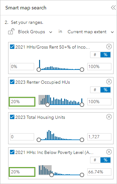
The map updates. Only block groups that match the criteria you set are displayed.
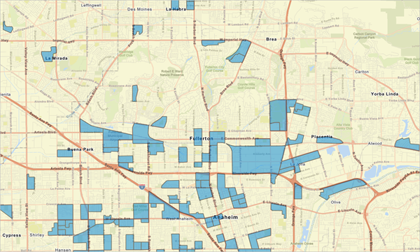
The displayed block groups include those with higher percentages of renters and higher percentages of households with income below poverty level. You've narrowed your search for areas that are suitable for more housing units.
Rank the best areas for more affordable housing
You've identified which areas are suitable for new affordable housing based on the demographic criteria you chose. However, there are still numerous block groups on the map. Which are the most suitable?
Using site suitability analysis, you'll rank the block groups by their suitability for more affordable housing. Based on this ranking, you'll find the block group that is the most suitable and run a report for it.
First, you'll save the filtered census blocks as sites so you can perform further analysis on them. You'll analyze five census blocks in particular, all located in Fullerton.
- On the map, click Block Group 060590112.001, located near the Fullerton place name.
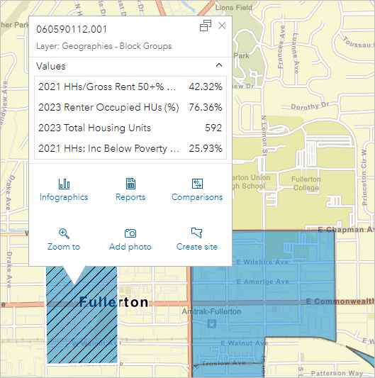
- In the pop-up, click Create site.
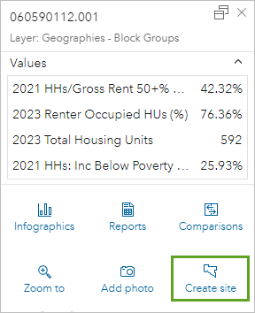
- Click Create site again.
A site is created for the selected block group.
- Create a site for each of the following block groups:
- 060590113.001
- 060590116.012
- 060590116.021
- 060590116.023
- Close any open pop-ups and zoom out so you can see all five sites.
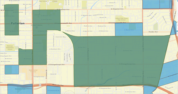
Next, you'll remove the smart map search results from the map, so only the sites you created are displayed.
- On the map toolbar, click the Clear map button. Check the Smart map search results box and click Clear.
The blue smart map search results are removed from the map. Next, you'll perform suitability analysis on the five sites to find which is the most suitable for new affordable housing.
- On the ribbon, click Run analysis and choose Suitability analysis.
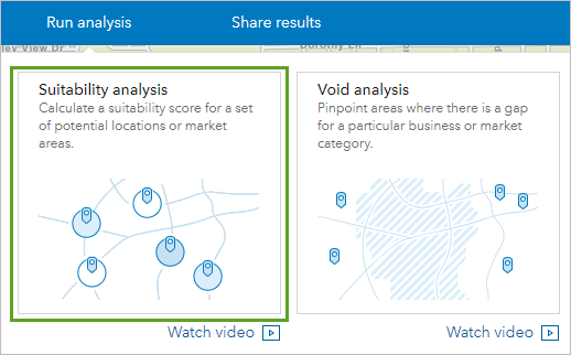
The Suitability analysis pane appears. Using this pane, you can rank sites based on attributes that you choose.
- If necessary, click Get started.
You'll run the analysis on the sites you created on the map.
- Click Start with features on map. Confirm the five block groups are selected and click Next.
Next, you'll choose the criteria by which to rank the sites.
- Click Add criteria and choose Add variables from data browser.
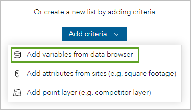
- In the Data browser window, click Saved variables. Under Variables, click the % button next to:
- 2021 Households Below the Poverty Level (ACS 5-Yr)
- 2021 Households: Gross Rent 50% + of Households Income (ACS 5-Yr)
- 2023 Renter Occupied Housing Units (Esri)
- Check the boxes for all four variables.
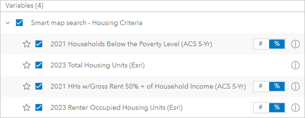
- Click Apply.
The census blocks on the map are symbolized with different colors based on the criteria you chose. Before you continue, you'll change the color scheme.
- In the Suitability analysis pane, for Ranking color, choose the light green to dark green color scheme.
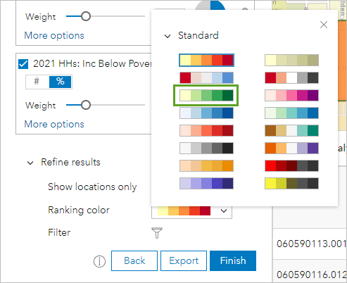
The block groups on the map change color. The darker green the block group, the more suitable it is for new affordable housing based on the criteria you chose.
You can adjust the weight each criteria receives when determining suitability. For this analysis, you'll find the block group most suitable for new affordable housing units. You may want to weigh poverty and income criteria higher, as those variables indicate how much of the population is struggling to pay for housing.
- In the Suitability analysis pane, for 2021 HHs/Gross Rent 50%+ of Income (ACS 5-Yr), adjust Weight to 30 percent. For 2021 HHs: Inc Below Poverty Level (ACS 5-Yr), adjust Weight to 45 percent.
When you adjust one variable, the other variables are adjusted accordingly, as the total percentage of all four variables cannot exceed 100 percent. Adjusting the poverty level variable also adjusts the rent as percentage of income variable, so it will end up less than 30 percent.
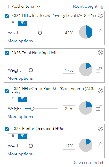
Tip:
If you want to ensure a weight doesn't change when you adjust another weight, click the lock button.
The block groups on the map change color based on the changes to the weights. The block groups to the west are darker.
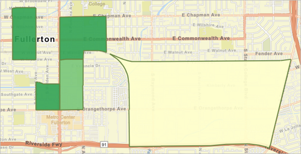
- On the map, point to each block group to see its Final score and Rank. Find the block group with the highest score.
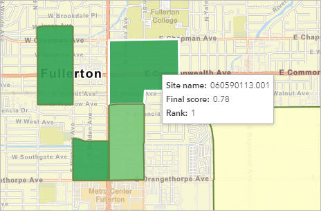
The highest score is 0.78 in block group 060590113.001.
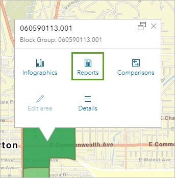
- Click on block group 060590113.001.
A pop-up appears. It contains options for creating infographics and reports. You'll create a report that summarizes the relevant demographic information for the block group.
- Click Reports.
- For Choose a report to run, choose ACS Housing Summary.
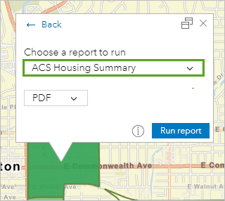
- Click Run report. Once the report is run, click Open report.
The report opens in a new browser tab. The report is a PDF file that summarizes housing data for the selected block group. This report can then be used to further inform the community's housing framework and affordable housing needs across the city.
In this tutorial, you created a color-coded map to show which block groups had renters paying more than 50 percent of their income on rent. To explore the housing story in Fullerton more deeply, you conducted a smart map search to weigh the block groups based on four housing criteria. You also conducted a suitability analysis to rank those block groups and find the block group most suitable for new affordable housing.
A city's comprehensive plan update is a complex task that requires thorough analysis from a city's planning staff. This tutorial is just the start to demonstrate how Business Analyst can help gather information essential to a comprehensive plan.
You can find more tutorials in the tutorial gallery.

