Explore the infographic builder
The railway already has a basic infographic template that shows grain and intermodal freight facilities near its lines. You'll download this template and add it to a project in ArcGIS Business Analyst Web App. Then, you'll explore the layout of the infographic builder and adjust the elements already in the template.
Create a project
First, you'll create a project in Business Analyst Web App.
- Go to Business Analyst Web App.
- If you are not signed in, click Sign In. Sign in with your ArcGIS organizational account.
Note:
If you don't have an organizational account, see options for software access.
Your account must be licensed to use Business Analyst Web App. If you are the administrator of your organization, you can assign yourself a license. Otherwise, you'll need to contact your administrator for permission.
- If necessary, close any What's new window.
Note:
If this is your first time using Business Analyst Web App, you may see a Welcome window asking you to add a profile image. If so, click Skip This Step and click Create Project.
- If necessary, on the ribbon, click Home. Click New project.
- In the Create project window, for Project name, type Rail Line Infographic Design and add your name or initials. Click Create.
A message explains that the project is being created. When it finishes, either the project opens automatically or a confirmation message appears.
- If the confirmation message appears, check Open new projects as soon as they are created and click OK.
The project opens.
Note:
If your project does not open, you can open it from the Home page. Under Recently Created, confirm that the Projects tab is selected. Point to your Rail Line Infographic Design project and click Open project.
Add the template
In Business Analyst, you can create an infographic using templates included with the application. You can also create your own templates, customizing them to your needs and branding. To do this, you use the infographic builder.
In this scenario, you'll work with a customized infographic template that has already been created. You'll download the template as a file and add it to your project.
Note:
The infographic template you'll download is similar to the one created in the tutorial Use infographics to understand total addressable market. To learn how to create a template from scratch, try that tutorial.
- Download the Rail Market Analysis.zip file. Unzip the file to a location on your computer you can easily remember, such as the Documents folder.
The folder contains one file: Rail Market Analysis.brpt, which contains the infographic template.
- In Business Analyst, on the ribbon, click Reports.

- Click Build infographics.

A gallery of templates appears. There are multiple standard templates provided by Esri, as well as templates shared by your organization and any that you've previously built. You'll import the template you downloaded.
- In the Start with a template page, click My templates.

- Click Add template from file.

- Browse to the extracted Rail_Market_Analysis folder. Double-click Rail Market Analysis.brpt.
A warning appears, telling you the template has missing variables that are not available in the current data source. The variables in question are from an older version of the United States census. In this tutorial, you can ignore the warning, because your focus is on grain and intermodal freight facilities, not census data. For templates where census data is vital to the information presented, you may want to replace the missing variables in the template.
- In the Action required window, click Yes to dismiss the warning.
- In the Save infographic window, change the name to Rail Freight Facilities.

- Click Save.
The template is saved and added to the list of your templates.
- In the Start with a template page, point to the Rail Freight Facilities template and click Open.

The template opens in the infographic builder.

Explore infographic design tools
Understanding the basic tools in the infographic builder will help you customize this and future infographic templates. The term infographic refers to the entire document as a whole. Each infographic is made up of a series of panels, which are individual elements containing data and graphics. You'll explore the infographic's existing panels to see what data is there and what still could be shown.
- In the infographic, under the table panel, point to the panel with the truck icon.

Panel-specific editing tools appear. The Edit button allows you to change the style of the panel or data shown. The Replace button allows you to replace the current panel with a different type. The More options button allows you to duplicate the current panel or change the dimensions or position of the template.
- Click the panel.
Editing handles appear. You can resize the panel or move it to a different position on the page.
- If necessary, above the infographic, click the Undo button to revert any changes you made.
The tools above the infographic control settings for the entire infographic. They are:
- Theme—Choose colors, font, and images for your template.
- Add element—Add a new panel (chart, image, text box, infographic, table, map, or nearby panel).
- Align—Align panels on the page or align elements within a panel.
- Layers—View and rename panels.
- Add page—Add another page, either blank or from another template.
- View/scale—View template at various levels of zoom.
- General settings—Change the page size, margins, and customize table and chart settings.
- Undo/Redo—Undo or redo the most recent action.
- Above the infographic, click 100% and choose Fit page.

The infographic resizes so you can see the entire template on your page without scrolling.
- Above the infographic, click Layers.

The Layers window appears, showing the panels currently in your infographic. When you move the pointer over an item on the Layers window, the corresponding panel is highlighted in the infographic template.
- In the Layers pane, double-click Infographic panel 1 and rename the panel Facilities Summary. Press Enter.
- Rename Infographic panel 2 to Intermodal Freight Facilities.

Giving your infographic panels descriptive titles is a good practice for infographic design, as it allows you to more easily view the components in your template.
- Close the Layers window. Click Save.

- In the Save infographic template window, click Save.
A Confirm replace window appears, asking whether you want to replace the template.
- Click Yes.
The most recent version of your template is saved.
- In the Infographic saved window, check Set this as the default infographic in the site menu.

Setting a template as the default infographic means it will run automatically when you click Infographics on a site's pop-up menu in Business Analyst. It is helpful to set your default template to the one you are working on to streamline the process of viewing your changes.
- Click OK.
Now that you've learned about the infographic builder and the editing tools available, you're ready to customize your infographic template.
Add a map and title
The basic infographic you have highlights two important sets of data, but doesn't include contextual geographic information or a title. Next, you'll add two new panels: a map and a title. Maps can be helpful components in infographics, providing geographic context for the data being displayed. The title panel will help viewers understand what information the infographic provides.
Add, resize, and position a map
You can add a map panel using the infographic builder. In this infographic, the map will show the location of new clients the rail company hopes to attract. You'll add a map and place it on your template, adjusting the other panels accordingly.
- Point to the Rail Freight Facilities template and click Open.
- Click 100% and choose Fit page.
To create space for your map in the template, you'll rearrange the panels.
- Drag the Facilities Summary panel (the table) to the bottom of the page. Click the panel to select it and drag the upper middle handle to resize it so it takes up roughly the bottom third of the page.
- Drag the Intermodal Freight Facilities panel to the middle left of the page.

As you move panels, guides appear to help you center or align panels. For a clean look, you'll ensure these panels align with each other.
- Press the Shift key and click both panels to select them.
- Above the infographic, click Align and choose Align selected.

- Click Align left.
The Intermodal Freight Facilities panel aligns with the left edge of the Facilities Summary panel. There is now space for your map.
- Above the infographic, click Add element and choose Map.

The Browse and select maps window appears. You'll choose the basemap you want the data drawn on top of.
- In the Browse and select maps window, choose Streets (Night).

This basemap contains a lot of transportation data, highlighting roads and natural features, making it a good background for the content you'll display on the map. The map panel appears in the center of the template by default. You'll resize it to fill the space available while considering where other panels might still go.
- Point to the map panel and click Panel options.

- In the Panel options window, expand Dimensions. Change Height (px) to 500.

- Expand Arrange & position. For Left (px), type 556 and for Top (px), type 0.

Your map panel adjusts and resizes as you change the values.
- Close the Panel options window.
- If necessary, resize the table panel so the top of the table is right below the map element. Drag the map element until its right edge aligns with the right edge of the table.

Tip:
If your infographic still has overlapping panels or awkward spacing, feel free to adjust the infographic as needed by dragging panels, using keyboard arrows, or entering manual values.
Link the map to data
Now that the map element is on the template, you'll decide what data you want the map to show. You'll link the map to the grain and freight facility data listed in the other panels to show where these facilities are.
- Point to the map panel and click Edit. Click Edit map.
- In the Map properties window, click Add other layers.

- In the Add layers to map window, click Add layer and choose Associate existing nearby locations table.

The Add nearby locations table window appears, displaying a preview of your infographic template. When you point to either of the other two panels, a button labeled Add appears.
- Point to the Facilities Summary table panel and click Add.

In the Add layers to map window, the Facilities Summary panel (called Grain Facility, the name of the feature layer used to create the table) appears as a layer associated with the map panel. You'll change the symbol the layer will use on the map.
- Click the arrow next to the Grain Facility symbol.
- In the symbols window, click the Standard tab. Click the CheckeredFlag symbol.

In the symbology window, you can change the color and size of the flag symbol that will represent the locations of grain facilities on the map.
- For Size, use the slider to change the symbol size to 32.
- For Color, click the color patch. Under Standard, choose the orange color in the fourth row, third column(#f09135).

- Click Done.
Next, you'll add the layer for the intermodal freight facilities.
- In the Add layers to map window, click Add layer and choose Associate existing nearby locations table.
- Point to the Intermodal Freight Facilities panel and click Add.
- Click the arrow next to the Rail_and_Truck_Intermodla_Freight_Facilities symbol. Click the Transportation tab and choose the Truck symbol.

- Change Size to 32 and Color to the blue color in the fourth row, sixth column (#97cdf6).
This color will contrast the orange symbol representing the grain facilities.
- Click Done.
Both symbols are ready.

- In the Add layers to map window, click Apply. Under the map, click Apply.
The map panel now lists the layers it will show. The map will appear once you run the infographic.
Add a title
Adding and a title to your infographic makes it look professional and provides context to someone not familiar with the purpose of the infographic. You'll add a title that also includes the railway company's branding.
- Above the infographic, click Add element. Click Text and choose Panel.

A blank text panel appears. A text panel can contain multiple grouped text boxes and other visual elements that function (and can be moved) as a unit. First, you'll add the title text, which will identify the name of the rail company, ACME Rail. (This company is fictitious.)
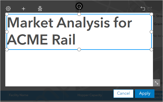
- Click inside the text panel and type Market Analysis for ACME Rail.
- Highlight the title. In the Text style window, style the text as bold, 48 px, and aligned left.

- Resize the text panel until the text box is the same height of the text.
Before adding more text, you'll add a dividing line.
- Above the text panel, click the Add element button and choose Shape.
Note:
If the Add element button does not appear, click Cancel. Try creating the title text again following the same steps as before.

- In the list of shapes, click All icons and choose Shapes. Click the Line shape.

A line is added to the text panel.
- Drag the line below the text and align it with the left edge of the text. Resize the line until it's the same width as the text box.
- Point to the line and click Edit shape.
- In the Shape properties window, for Thickness, type 3. Close the Shape properties window.
Now, there is a line under the title that will divide it from other text.

Add dynamic text
Next, you'll add dynamic text that shows the name of the site displayed on the map. This text will change depending on the area where the infographic is run, which is what makes the text dynamic.
- Above the text panel, click Add element and choose Text box.
- Drag the text box under the line. Align it with the left edge of the title.
- Point to the new text box and click Edit text.
- In the Text style window, click Advanced text editing.

- In the Add variables to text window, click Add dynamic field or notes and choose Site name.

A variable named [My site name] is added to the lower right corner of the window.

Dynamic text is linked to the data on the map, so this field will display the name of any site you run the infographic for.
- Highlight [My site name]. In the Text style section, style the text as bold, 24 px, and aligned left.

- Click Save.
Finally, you'll add an icon to the title panel to give a visual indication of the infographic's purpose. The icon will go to the left of the title text.
- Resize the Market Analysis for ACME Rail text box so there is a gap between the left margin of the panel and the text box.

- Above the text panel, click Add element and choose Shape.
- In the list of shapes, click Shapes and choose Transportation. Click the train icon.

A train icon appears in the center of the text panel.
- Reposition the icon to the left of the title, aligned with the left edge of the line and site name.

- Click Apply. Reposition the new title panel at the upper left of the infographic, aligned with the top of the map panel and the left of the other two panels.

- Click Save. In the Save infographic template window, click Save.
- In the Confirm replace window, click Yes. In the Infographic saved window, click OK.
You've added a map and title to your infographic template. Now that all the elements are assembled in your template, you can customize the infographic's colors and themes.
Customize the theme
The final step before sharing your infographic template is to change the theme colors. In this case, you'll change the colors and symbology of the template to reflect your desired aesthetic and present the information in a visually compelling way. In other cases, the theme can also be customized to match brand colors and styles.
Change a panel's display style
Currently, information about intermodal facilities is displayed on the infographic template as a truck icon accompanied by a number. To display more information about the locations on the map, you'll change the intermodal facilities information to a table.
- In the list of templates, point to the Rail Freight Facilities infographic template and click Open.
- Point to the Intermodal Freight Facilities panel and click the Edit button.
- Click Switch to display as table.

The intermodal facilities information now appears as a table—with very narrow columns that make it unreadable.
- Close the More options window. Click Apply.
- Select the table and resize it so that the right side almost touches the map panel. Make any other adjustments necessary so the table is positioned appropriately under the title panel.

Now that you have two tables on the page, you also want to indicate what each are listing.
- Point to the Intermodal Freight Facilities table and click Edit. Above the panel, click More options.
- In the More options window, check Show title.

The table title is added above the table panel. Next, you'll edit the title.
- On the table, point to the title and click Edit text. Replace the existing title text with Intermodal Freight Facilities.
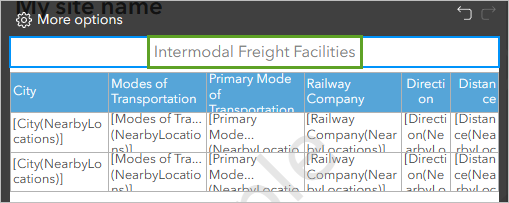
Next, you'll adjust the row header height so the text displays properly.
- In the table, drag the sides of the row header cells until the title of every row is displayed in one or two lines of text.

- Click Apply.
You'll also add a title to the other table.
- Point to the Facilities Summary table (the table at the bottom of the infographic) and click Edit. Above the table, click More options.
- In the More options window, check Show title. Change the title text to Grain Facilities.
- Click Apply.
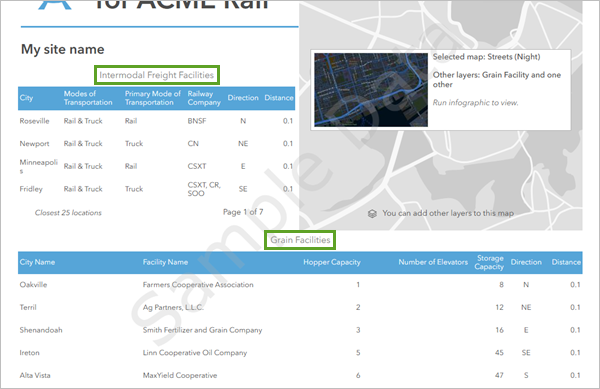
Now, both tables have titles.
Choose a color theme
The infographic template currently uses the default Business Analyst color settings. You'll refine your template's design by choosing colors for the infographic.
- Above the infographic, click Theme.

- In the Infographic template theme window, for Select a color theme for your template, click the grayscale color theme.

The template preview shows the selected theme. The shades of gray aren't very visually appealing, so you'll add a contrasting color.
- Click Advanced options.

- Expand Table. For Table header, click the Background color swatch.

Tip:
To match brand colors or choose custom colors, you can manually enter a color's HEX code or RGB value using the Advanced options.
- Choose the dark teal color in the fifth column, fifth row (#3c898a).
This teal color matches the gray theme, but stands out enough to provide more visual appeal. To make the text on the table header visible on the new, darker background, you'll also change the text color.
- Next to Table header, click Change font. Check Bold and change Text color to white (#ffffff).

To make the table easier to read, you'll choose a new background color for alternating rows in the table.
- For Alternating row, next to Background, click the color swatch and choose the lightest gray in the first column, third row (#696969).
Nothing changes on the example template. You'll also need to change the table panel's settings to display alternating rows in the table as different colors.
- Click Apply.
Next, you'll change the title panel to match the colors you just picked.
- Point to the title panel and click Edit.
Each element in the panel is editable.
- Point to the train icon and click the Edit shape button.
- In the Shape properties window, click the Fill color swatch.

- Choose the dark teal color in the fifth column, fifth row (#3c898a).
The train icon now matches the teal you chose for table headers.
- Close the Shape properties window. Click Apply.

Finally, you'll style the alternating rows of the table. Alternating rows makes the text-dense table easier to read.
- Point to the Intermodal Freight Facilities table and click Edit. Click Edit table style and number of locations.
- Press and hold the Shift key. In the table, click the first and last cells in the third row to select the entire third row.

- In the Style and format window, for Styles, choose Alternating row.
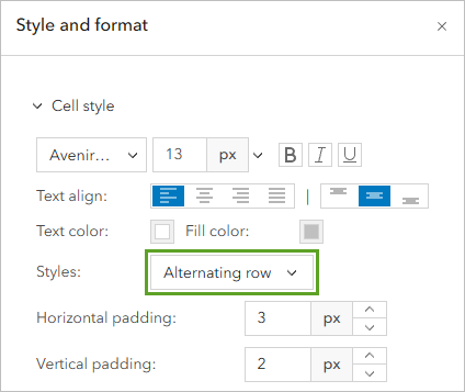
Every other row in the table is now a light gray color.
- Close the Style and format window. Click Apply.
- Edit the Grain Facilities table to also have alternating row colors.

- Save the infographic template.
Run the infographic
You've finished styling the infographic. Next, you'll run it to confirm it functions as expected.
- On the ribbon, click the Maps tab.

You'll make a sample site to test the infographic. The company's rail lines are in Iowa, so you'll create the site there.
- On the map, navigate to Iowa in the United States.
- On the toolbar, click the Pin button.

- On the map, click anywhere in Iowa.
Tip:
For the best results, click near Des Moines, the capital and largest city.
A pin is added where you clicked. A pop-up appears for the pin.
- In the pop-up window, click Create site.

- On the Rings tab, for Radius, type 30 in the first box. Erase the text from the other two boxes and set the units to miles.

- Click Apply.
A circle with a 30 mile radius appears around the pin.
- In the pop-up window, click Infographics.

Your infographic runs, displaying the infographic for the sample site you created. The map shows several flag symbols (representing grain facilities) and truck symbols (representing intermodal freight facilities). The tables contain information about these facilities.

This tutorial walked you through the steps for customizing a simple infographic in ArcGIS Business Analyst. Though this workflow was focused on the rail industry, the skills you learned can be used for any infographic in Business Analyst. Using these design techniques and the infographic builder, you can create polished, informative displays of information crucial to your work.
You can find more tutorials in the tutorial gallery.


