Customize a theme for impactful stories
Create a theme
You'll begin by duplicating an existing story and creating a new theme to style it with.
- Sign in to ArcGIS StoryMaps with your ArcGIS organization account.
Note:
If you don't have an organizational account, see options for software access.
- Open the Smoke on the Horizon story.
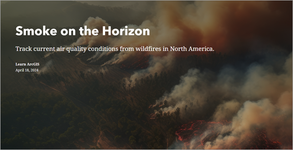
- Scroll through and read its content.
The story includes a map, photos, text, buttons, and links to data sources. You'll create a copy of it that you own and can edit.
- On the ribbon, click the More actions button and click Duplicate story.
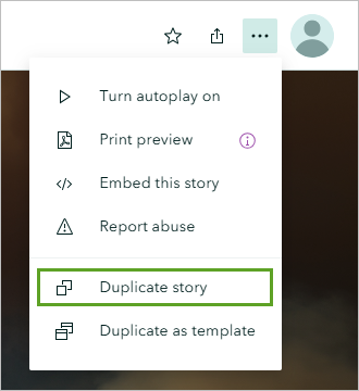
- In the Duplicate this story window, click Yes, duplicate.
- Delete the text (Copy) from the title so only Smoke on the Horizon remains.
The story currently uses the default theme, with a white background, dark gray text, and blue accents. These colors don't suit the story. Wildfire smoke creates a dark, hazy, and ominous mood. The map and photos in the story suit this mood, but the theme does not. You'll look for a different theme.
- On the ribbon, click Design.

- In the Design pane, under Theme, click Mesa.
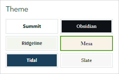
- Scroll through the story to observe the changes.
The Mesa theme matches the colors of the story better than the default Summit theme did, but the mood it creates feels light and clear. You'll create a custom theme to make the story seem smokier, somber, and a bit ominous.
- Click the Show my themes link.
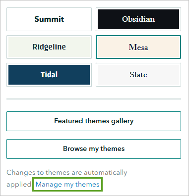
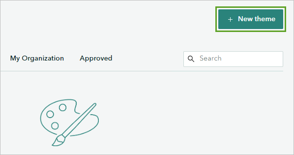
- Click the New theme button.
- In the Choose a starting point pane, click Obsidian, then click Select.
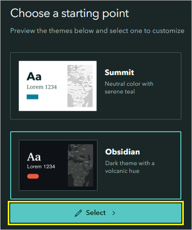
Choosing a theme as a starting point will load the theme's colors, fonts, and other characteristics into the editor as a starting point. Because you've decided to go for a darker, smokier feel to the story, Obsidian's dark background and red accent colors are a good starting point to work from.
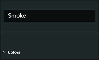
- In the side pane, delete Untitled theme and type Smoke.
Choose fonts and colors
Next, you'll choose fonts and colors that help to set a serious tone. You'll borrow colors from the map and photos already present in your story and ensure that these colors meet accessibility guidelines for contrast ratios.
- In the side pane, expand the Colors section and click the Background color menu.
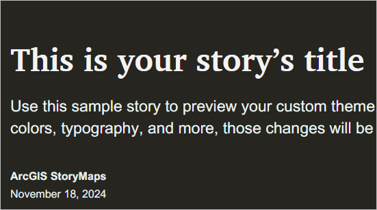
- Delete #0E1116 and type #272520.
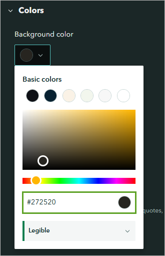
The background color of the page changes to a dark brown. This color is the same as the background color (the color of the ocean) in the smoke forecast map.
Tip:
You can install extensions on your web browser that allow you to find the hexadecimal values of colors from maps, photographs, and other graphics. Eye Dropper is one example of such an extension.
- Click the Accent color menu. From the Basic colors list, choose the orange option or type #C86624.
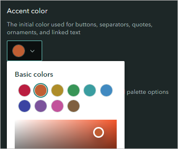
- Scroll through the example story to see where orange accents appear.
The Accent color affects buttons, links, separators, and quotes. Orange is associated with fire, so it suits the topic of your story.
- Expand the Typography section.
Fonts have personalities. You are trying to set a serious tone with this theme, so you should avoid any font that appears too casual, playful, or decorative. The Charter BT font has a formal personality, so it suits your theme well. Many of the fonts available in this menu could also be suitable, so the choice of font is largely determined by taste. When choosing fonts, think about what each one reminds you of. A font that reminds you of a wedding invitation, children's book, or online game might not be the best choice for a story about wildfire smoke. A font that reminds you of official documents is more appropriate.
The Charter BT font that is currently being used for the title is a good option for an official-looking font, so you'll keep this the same.
- For Title and headings, click the color menu. Type #A6671B.
The title text changes to a yellow-orange color that was borrowed from one of the photos in your story.
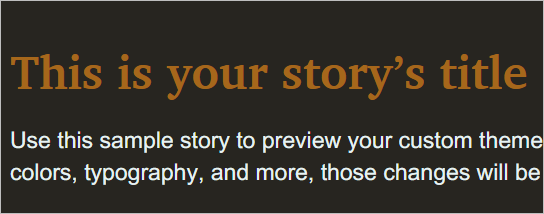
A warning symbol appears next to the color menu. It indicates that there is a low contrast between the text and background colors, making the text difficult to read.
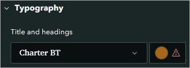
- In the color picker window, click the arrow next to Not legible.
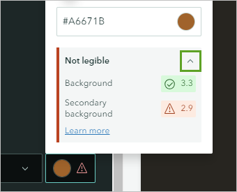
The information in this section tells you how well the text color contrasts with the background. The numbers listed are contrast ratios. A contrast ratio is considered legible if it meets the thresholds set by the WCAG 2.1 AA guidelines. In this case, the orange color contrasts well with the background, but not with the secondary background.
The secondary background color is a lighter version of the brown background color. It is automatically generated and not configurable. You'll make the orange color lighter so it is legible against both backgrounds.
- In the color picker box, move the circle a little higher and to the left. Alternatively, type #BC7F38.
The contrast ratio numbers turn green to indicate an adequate contrast with both background colors.
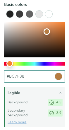
The contrast warnings should not be ignored. While you may be able to read the title without difficulty in your chosen color, other people may not. Following the warnings allows you to create an accessible story.
For the paragraph text, you'll choose the same font as the title and headings. In cartography, it is often recommended to use only one or two fonts, because it's easier to design an attractive and effective map with few elements than with many. You'll extend this advice to your theme design and use only one font throughout your story.
- For Paragraph, choose Charter BT.
Limiting your theme to only one font allows you more room for variation in colors.
- For Paragraph, change the color to #C8BEA4.
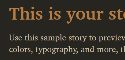
This color is a paler version of the title color. It is less saturated, which makes it feel smokier and helps it match the story's theme. It is also lighter, which increases its contrast with the background. The smaller the text, the more important contrast becomes for legibility.
- For Captions, set the color to #B5ADB7, a pale and desaturated purple.
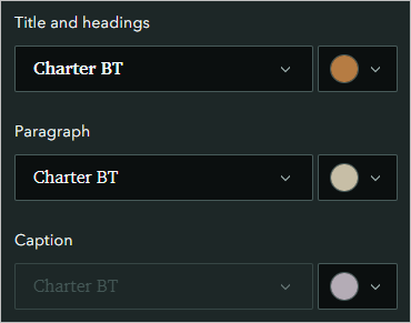
The three text colors were inspired by one of the photos featured in the story.
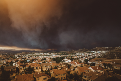
Borrowing colors from photos and graphics is a reliable method for devising a color scheme. These colors will help to set the tone of the story based on the tone of the photo. The orange and yellow text colors also match the symbology of the map.
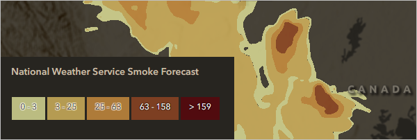
They aren't exactly the same colors, but they are similar enough to make the story feel consistent.
The pale purple color looks good on the brown background but it only appears in a few places. You may want to reuse this color in some other places. You'll set it as an optional accent color so you can access it later.
- In the side pane, scroll up. In the Colors section, under Optional accent colors, click the first color menu and set it to #B5ADB7.
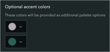
This color won’t be immediately applied to any story elements, but it will be available in the story builder later.
Set other design elements
Next, you'll change the appearance of buttons and links in your theme.
- Collapse the Colors and Typography sections and expand the Buttons section.
The example story jumps to the location of the example button.
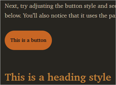
The button looks very bold in orange. For some stories, bold buttons are appropriate. For example, a call to action button should be very prominent. However, in your story, you don't want the buttons to distract from the paragraph text, so you'll change them to a duller color that is less attention-grabbing.
- In the side pane, check the Use custom background color box.
- Set the color to #776f5b.
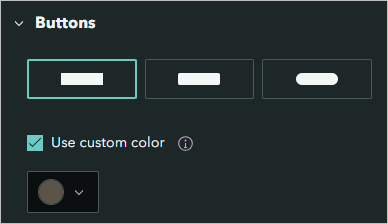
This grayish-brown color is a similar shade to the body text of the story. It's a duller shade that doesn't grab attention from the text, and is light enough against the background to pass accessibility tests.
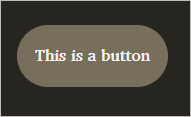
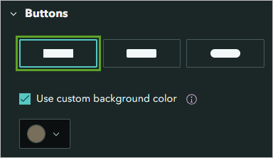
The button text has also changed from black to white to ensure a legible color contrast. You'll also make the button square to better align it with the straight line that the theme uses for the quote block.
- Under Buttons, click the first button type with the squared corners.
- Expand the Links section and choose the second style.
The orange accent color was too bold for the buttons, but seems appropriate for underlining links, so you won’t change it to a custom color.

- Expand the Separators section. Under Position, choose the Full option.
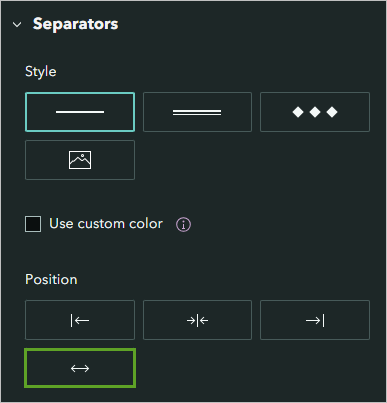
The example separator line extends to the full width of the story.

There are further options for quotes and basemaps. Since neither of these are used in your story, you won't adjust them.
Publish the theme
You'll publish and share your theme so you can apply it to your story.
- Scroll through the example story and review the design.
It has a serious and formal appearance, and the colors match the theme of wildfires and smoke.
- On the ribbon, click Publish.

You plan to share the Smoke on the Horizon story with the public, so your theme must also be shared publicly. Otherwise, people without access to the theme will see the story with the default theme applied.
- For Set sharing level, choose Everyone (Public).
- For Advanced options, check the Allow duplication box.
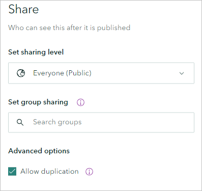
This option will allow you to make a copy of your theme and modify it later.
- Click Publish.
Apply the theme to the story
Next, you'll apply your theme and review how it changes the look and feel of your story. You'll override one of the colors from the theme.
- Return to the browser tab with your story. Optionally, close the tab with your theme.
Note:
If you previously closed the tab with your story, sign in to your ArcGIS account. Click the Content tab and click the Smoke on the Horizon ArcGIS StoryMaps item. Click Edit Story.
- On the ribbon, click Design.
- Scroll to the bottom of the Design pane and click Browse my themes.
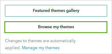
- In the theme gallery, click the Smoke card.
The theme is applied to the story.
- Close the Design pane and scroll through the story to review how it appears with the new theme.
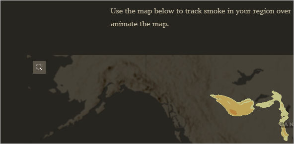
The map background blends seamlessly with the story background and the text and accent colors suit the photos and map.
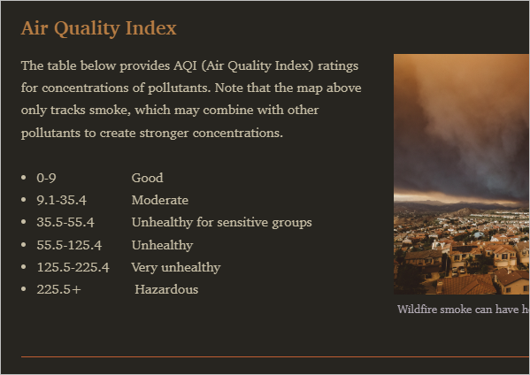
- Scroll to the end of the story.
The first line in the credits section uses the orange title and headings color.

You chose this color with larger text in mind and would prefer something with higher contrast for this smaller font. You'll override the theme and choose another color.
- Highlight the line of text that begins with This story was created for.
- In the menu that appears, click the Color button.

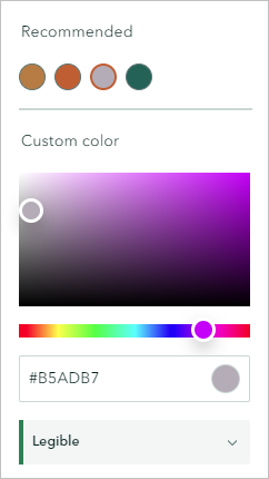
Under Recommended, four colors are listed. These include the title and accent colors you set in your theme.
- Under Recommended, click the pale purple color. Confirm that the color contrast is listed as Legible.
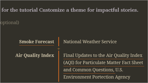
The color of the text changes to purple.
Publish the story
To finish, you'll publish the story and share it with the public.
- On the ribbon, click Preview.

- Click Yes, continue.
- Scroll through the story to review it.
- On the preview toolbar, click the Close preview button.

- On the ribbon, click Publish.
- For Set sharing level, choose Everyone (Public).
- Click Publish.
- Click View published story.
Your story is complete. Thanks to your custom theme, it has a tone and mood to suit its topic. In this tutorial, you learned the following skills:
- How to create a custom theme that sets an appropriate tone for your story
- How to create a consistent and cohesive feel by borrowing colors already present in the story
- How to choose colors that meet accessibility guidelines
You can find more tutorials in the tutorial gallery.

