Cartographic creations – Arrange a map layout
Make a layout
The first items that you'll add to the layout are the map, a title, and guides.
- If you completed the earlier tutorial Cartographic creations – Label a map, reopen Arctic sea ice.aprx. Otherwise, download Cartographic creations 4.ppkx. Double-click the file to open it in ArcGIS Pro.
Note:
A .ppkx file is an ArcGIS Pro project package and may contain maps, data, and other files that you can open in ArcGIS Pro. Learn more about managing .ppkx files in this guide.
- If prompted, sign in to ArcGIS Pro using your licensed ArcGIS account.
Note:
If you don't have access to ArcGIS Pro or an ArcGIS organizational account, see options for software access.
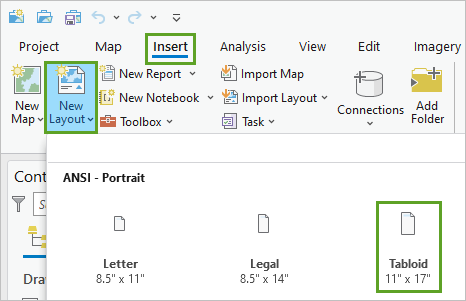
- On the ribbon, click the Insert tab. In the Project group, click New Layout. Under ANSI – Portrait, click Tabloid (11 by 17 inches or 279 by 432 millimeters).

- Below the Layout view, ensure that the Snapping toggle and the Snap to page boundaries when using interactive layout tools button are on.

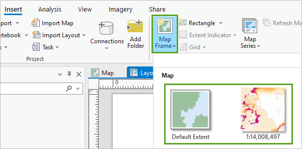
- On the ribbon, on the Insert tab, in the Map Frames group, click Map Frame. Click either of the options under Map.

- Click and drag from one corner of the layout to its opposite corner.
Your map appears on the layout, filling the whole page. You'll adjust its scale and position later.
In the Contents pane, a Map Frame was added. It contains the Map and all of the map's layers.

Next, you'll add guides. These won't be visible in your final map, but will help you keep the elements of your layout neatly aligned.
- Right-click the ruler surrounding the Layout view and click Add Guides.

- In the Add Guides window, set the following parameters:
- For Orientation, choose Both.
- For Placement, choose Offset from edge.
- For Margin, type 0.5 inches.

- Click OK.
Four blue lines appear along the edges of the layout. You should not place any text outside of these margins.
Next, you'll add a map title. A strong map title helps to communicate the map's message, rather than only describing its data.
- On the ribbon, on the Insert tab, in the Graphics and Text group, click Straight text.

- Click anywhere on the layout and type ARCTIC SEA ICE DECLINE. Click elsewhere on the page to finish typing.
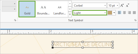
- With the text selected, on the ribbon, click the Text tab. In the Text Symbol group, click Gold. Change the Text Symbol Font Style to Light.

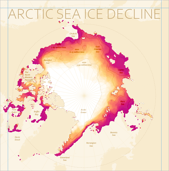
- Drag the corners of the text's bounding box to make it larger. Stretch the text until it touches both side guides. Move it until it also touches the top guide.

- In the Contents pane, rename the Text element as Title.

Next, you'll position the map under the title.
- Below the Layout view, in the scale box, type 22,000,000 and press Enter.

- Right-click the map and click Activate.
- Pan the map to reposition it. Place it so the topmost pink spots are immediately below the title, and the Arctic circle is centered between the two side guides.

Tip:
To pan and zoom on the layout instead of the map, press and hold the 1 key. If you accidentally zoom on the map, retype 22,000,000 in the scale box. You can also press and hold the right button of the mouse and drag to control the scale.
- Above the Layout view, click the Back to Layout link.

You'll lock the map frame so you don't accidentally move it while you work on other layout elements.
- In the Contents pane, next to Map Frame, click the lock button.

Add a legend
The map needs a legend to explain the meaning of the white, orange, and pink colors. You'll add one to the layout, then convert it to graphics so you can have more control over its appearance.
- On the ribbon, on the Insert tab, in the Map Surrounds group, click the lower part of the Legend button and click Legend 1.

- On the map, click and drag to add a legend to the right (south) of the Laptev Sea label.

The legend describes every layer on the map. This isn't necessary; most layers are background information and don’t need to be explained. You'll remove everything except the color ramp that explains the thematic data.
- In the Contents pane, expand Legend. Uncheck all layers except IceExtent_Raster.

The legend has a lot of text, but none of it explains what the colors on the map mean. You'll remove some of this text and edit the rest to make a meaningful legend.
- If necessary, right-click Legend and click Properties to open the Element pane.
- If necessary, in the Element pane, click the Options tab.

- Under Legend, for Title, uncheck the Show box. Under Legend Items, click Show properties.

- Under Show, uncheck Headings.
You'll also make the legend patch taller so more of the color variation can be read.
- Under Sizing, change Patch height to 30 pt.

For the legend, you'll use the same font as the rest of the map.
- On the ribbon, click the Legend tab. In the Text Symbol group, click Gold.
You could continue to adjust legend properties, but sometimes it is easier to convert a legend to graphics and edit the pieces directly.
- In the Contents pane, right-click Legend and click Convert To Graphics.
- In the Contents pane, right-click Legend and click Ungroup.

The Legend group breaks up into four graphic layers: three pieces of text and one rectangle.
- On the layout, zoom to the legend. Double-click IceExtent_Raster and type Number of Septembers covered in ice from 1979-2021. Click outside of the text box to finish typing.
- With the text selected, on the ribbon, ensure that the font size is 10 pt.
- Position the text next to the color ramp, between the number labels. Drag the corners of the text box to make it tall and narrow, with only four or five short lines of text.

This text explains what the numbers 1 and 43 (and the colors white and pink) signify. While precise, this explanation is long and not very intuitive. If you were to explain the map to someone out loud, you might tell them that the white areas have always been ice-covered, while the pink areas are only rarely ice-covered. You'll add some text to the legend to include this more conversational explanation as well as the accurate one.
- Double-click 43 and type 43 – Always ice-covered. Change the font size to 8 pt.
Note:
The number 43 refers to the number of Septembers since 1979. After September 2022, this number should read 44.
- Double-click 1 and type 1 – Rarely ice-covered. Change the font size to 8 pt.
- If necessary, resize the color ramp and reposition the text.
- Drag a box over all of the legend elements to select them. Right-click any of the selected elements and click Group.

- In the Contents pane, rename Group Element to Legend.
As the cartographer, it's your responsibility to ensure the symbols on your map are explained clearly. You made the legend easier to understand by removing unnecessary information and rewording the descriptions.

Fade the edges of the map
The shape of Europe in the lower half of the layout is somewhat distracting. You'll add a subtle fade effect to the map so Europe is less noticeable. Previously, you made a background layer that covers almost the entire earth. You'll reuse this layer to create the fade effect.
- In the Contents pane, if necessary, expand Map Frame and expand Map. Right-click Ocean and click Copy.
- Right-click Map and click Paste. Rename the new layer Fade.

The map is now hidden behind the new Fade layer and only the title and legend are visible on the layout.
- Click the symbol under Fade to open the Symbology pane. If necessary, open the Properties tab. Click the Layers tab.

Symbols in ArcGIS Pro are often made of several symbol layers. This symbol has a Solid stroke symbol layer for the outline, which won't be visible on your map, and a Solid fill symbol layer, which is set to a single beige color.
- Click the Solid fill symbol layer and change it to Gradient fill.

You'll adjust the Gradient fill properties so the opaque beige color fades to a fully transparent white near its center (the north pole).
- Under Appearance, change second color (white) to No color.
- Expand Pattern. Change the following settings:
- For Direction, choose Circular.
- For Type, choose Continuous.
- For Size, type 50 percent.

- Click Apply.
The map reappears.

The fade effect is too gradual: the fully transparent area doesn't extend far beyond the north pole, so the map's thematic data is partially hidden behind a thin haze. You'll tighten the fade effect so it covers Europe more and the Arctic region not at all.
- Under Appearance, click the gradient menu and click Color scheme properties.

- In the Color Scheme Editor window, click the beige color stop and change Position to 30 percent.
The beige color stop is duplicated.
- Click the transparent color stop and change Position to 70 percent.

- Click OK. In the Symbology pane, click Apply.
Europe is now fully faded at the bottom of the layout and the Arctic region is no longer obscured.

Style a chart
In the first tutorial in this series, you made a chart to help you understand the data. Now, you'll reuse that chart in the layout so you can share that understanding with your map readers. The chart will help to illustrate the change over time better than the map can alone.
- On the ribbon, click the Insert tab. In the Map Surrounds group, click the lower part of the Chart Frame button and click the chart under IceExtent.

- Click and drag anywhere on the layout to add the chart frame.
An empty chart frame appears on the map. The chart isn't visible yet because its layer isn't turned on.
- In the Contents pane, under Map, turn on the IceExtent layer.

The chart appears on the map. You'll change its appearance to better match the rest of the map.
- In the Contents pane, under the IceExtent layer, right-click the chart and click Open.
The Chart view and Chart Properties pane appear. The first thing you'll change is to remove the legend from the side of the chart. There's only one line shown, so a legend isn't necessary.
- In the Chart Properties pane, for Split by, choose the blank row at the top of the list.
Next, you'll change the thickness and the color of the line.
- Click the Series tab. In the table, click the symbol.

- For Width, type 1 px. Under Favorites, click the pink Melt color.

Next, you'll remove the commas from the year labels along the x-axis.
- Click the Axes tab. Under X-axis, for Number format, click the edit button.

- For Category, choose Numeric. Click Apply.
The chart is a bit misleading because the bottom represents the current lowest value, instead of the lowest possible value: zero. You'll change the chart's bounds.
- Under Y-axis, change Minimum to 0 and Maximum to 8.

There's now room on the chart to add a guide.
- Click the Guides tab and click the Horizontal Guide tab. Click Add guide.

- For Value, in the first box, type 1. Click the Line Color symbol and choose Tecate Dust. For type, choose Dot.
- For Label, type 1 million km2 or less means an ice-free Arctic Ocean.

The last ice to melt will be in bays and inlets. This means that the Arctic Ocean will be ice-free long before all of the ice has melted.
You'll ensure that the chart uses the same font as the rest of the map.
- Click the Format tab and click the Text elements tab.

- Click All Text. For Font, choose Corbel. For Color, under Favorites, choose the gold Text color.
- Click Guide Labels. Change Font Size to 10 pt.

You'll remove the white background of the chart so it fits more naturally into the rest of the layout design.
- Click the Symbol elements tab. Click Background. For Color, choose No color.

- For Grid Lines, choose Tecate Dust. For X-Axis Line, choose Tecate Dust.
To finish the chart, you'll simplify the text.
- Click the General tab. Change the following titles:
- For Chart title, type September ice extent.
- Uncheck X axis title.
- For Y-axis title, type Million km2.

- Close the Chart view and the Chart Properties pane.
Add descriptive text
Your map tells an important story, but it is difficult to tell a story with data alone. You'll add descriptive text to the layout to help illuminate the patterns shown in the map and chart, and explain why they matter.
- On the ribbon, on the Insert tab, in the Graphics and Text group, click Rectangle text.

- Click and drag anywhere on the layout to add a text box. Type or copy and paste the following text:
Systematic measurements of sea ice have been collected via satellite since 1978. Since then, ice packs in both the Arctic and Antarctic have seen consistent decline. This map shows Arctic sea ice extent in the month of September between years 1979 and 2021.
- Click outside of the text box to finish typing.
- With the text selected, on the ribbon, click the Text tab. In the Text Symbol group, click Gold.
- Change the Text Symbol Font Style to Regular.
- Position the text box below the title text. Snap the text box to the left guide, below the word Arctic.
- Resize the box so the text does not cross the Arctic circle.

You'll add another text box to explain the term extent.
- Right-click the text and click Copy. Right-click elsewhere on the layout and click Paste.
- Drag the new text box to the other side of the layout and position it below the word Decline, snapping it to the right guide.
- Delete the existing text and replace it with the following:
Sea ice extent can be defined as the area covered by at least 15 percent sea ice cover. This measurement is used because with satellite imagery it is often difficult to distinguish between open water and melted water on top of ice.
- On the ribbon, on the Format tab, in the Text Symbol group, click the Right horizontal alignment button.

- If necessary, resize the text box so all text is visible and no text crosses the Arctic circle.
You'll add more text about the causes and effects of declining sea ice.
- Copy one of the text boxes and paste four copies of it onto the layout. Drag the four new text boxes to the bottom of the layout.

- Edit one of the text boxes to the following:
The decline in sea ice is caused by global warming. It also contributes to global warming: ice reflects 60-80 percent of radiation from the sun, compared to only 10 percent reflected by open water. When solar radiation is not reflected, it warms the oceans faster.
As the ice melts, more of the Arctic Ocean becomes open sea, which generates waves. Wave action contributes to further decline of the remaining ice.
Include the empty line between the paragraphs.
- Edit the other three text boxes to the following:
September is the month with the least ice cover. Sea ice must persist through September if it is to become or remain multi-year ice, which is thicker and less likely to melt than first-year ice. A lesser September extent means younger ice and faster melting for future years.
At some point during this century summer ice will disappear entirely from the Arctic. The most common definition of "ice-free" is a September arctic ice extent of fewer than 1 million square kilometers. At that point, the Arctic Ocean will be open water, although ice will still cling to some coastlines of Canada, Greenland, and Alaska.
Ice data: Fetterer, F., K. Knowles, W. N. Meier, M. Savoie, and A. K. Windnagel. 2017, updated daily. Sea Ice Index, Version 3. [Ice extent]. Boulder, Colorado USA. NSIDC: National Snow and Ice Data Center. doi: https://doi.org/10.7265/N5K072F8. [October 2021].
Other map data: Esri; Garmin International, Inc.; U.S. Central Intelligence Agency; National Geographic Society, Natural Earth
The last text box contains the credit information. It's important to explain where the map's data came from. However, it doesn't need to be as visually prominent as the other text, so you'll change its text style.
- Select the Ice data: Fetterer… text. On the ribbon, change the font style to Light. Change the size to 8 pt.

- Drag a box around all four text boxes in the lower part of the layout to select them. On the ribbon, click the Justify horizontal alignment button.

You'll resize and position these text boxes later, after you've added the last layout element: an inset map.

- On the Quick Access Toolbar, click Save.

In this tutorial, you made a layout consisting of a map, a legend, a chart, and some descriptive text, which all work together to tell the story of declining sea ice. In the next tutorial, you'll complete the layout with an inset map.
You can find all of the tutorials in this series at Cartographic creations in ArcGIS Pro. You can find more cartography tutorials on the Introduction to Cartography page.

