Explore dissolved oxygen in 3D
Oxygen levels are an important component of ocean ecology, and recent research has established that global oxygen levels in the ocean have been declining for decades and will continue to decline as climate breakdown intensifies in the future. To tackle these difficult problems, you must be able to make accurate three-dimensional models of dissolved oxygen levels in the oceans.
You'll use dissolved oxygen measurements taken at various depths in Monterey Bay, California, and perform 3D geostatistical interpolation to predict the oxygen levels throughout the entire bay. You'll learn how to explore 3D data, configure the parameters of Empirical Bayesian Kriging 3D (EBK3D), and export the results into convenient GIS formats and video animations.
Download and explore the project
You'll start by downloading the project containing the dissolved oxygen measurements and opening it in ArcGIS Pro.
- Download the Interpolate 3D Dissolved Oxygen Measurements in Monterey Bay project package.
- Locate the downloaded file on your computer.
- Double-click Interpolate_3D_Dissolved_Oxygen_Measurements_in_Monterey_Bay.ppkx to open the project. If prompted, sign in to your ArcGIS organizational account.
The project opens to display a map and a local scene.
- Click the Monterey Bay map tab. If necessary, zoom in to better see the points on the map.
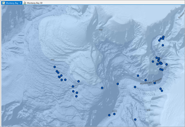
The OxygenPoints layer is a small sample of the data provided by the NOAA National Centers for Environmental Information's World Ocean Database (WOD). These points represent locations in Monterey Bay where dissolved oxygen levels, measured in micromoles per liter, were observed and recorded for various depths.
- In the Contents pane, right-click the OxygenPoints layer and choose Attribute Table.
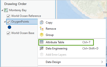
The layer attribute table opens.
- On the Map tab, in the Selection group, click the Select button.

- On the map, drag a box around any OxygenPoints feature.
All features within the box are selected.
- In the OxygenPoints table, click the Show selected records button.
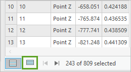
Only selected records are displayed in the attribute table.
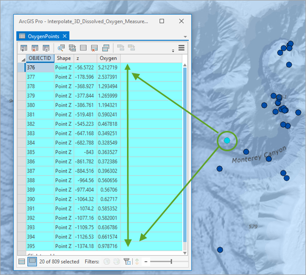
You've selected multiple sample points that have the same x- and y-coordinate but different z-values. These represent observed oxygen levels at different depths (z) below the surface. Your number of selected coincident records may differ from the example images, as each sample location may not have the same number of samples at various depths.
Note:
If you were to interpolate a continuous surface of oxygen levels at this time, your interpolation could only be generated for one depth (z-value) at a time, and you would need to create multiple interpolated surfaces for the different depths. This would make it difficult to interpret and understand how oxygen levels differ as depth increases.
Next, you'll explore the data in a 3D scene.
- Close the table. On the ribbon, on the Map tab, in the Selection group, click the Clear button.
- Above the map, click the Monterey Bay 3D tab.
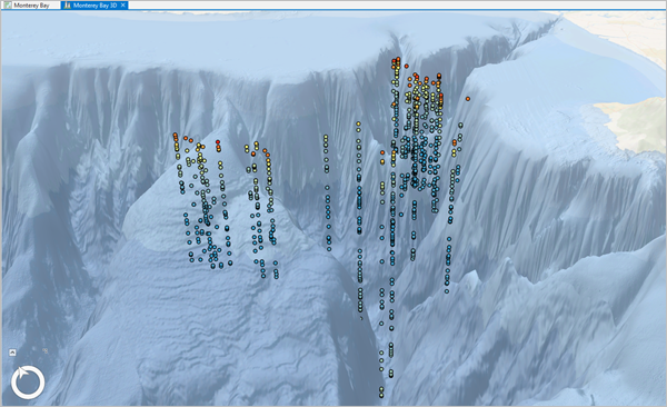
The 3D scene shows Monterey Bay, California, with 10x vertical exaggeration applied. As a result, the Monterey Canyon appears ten times deeper and steeper than it actually is. The WorldElevation/TopoBathy layer is used to define the elevation surface and the World Ocean Base basemap is draped on top of the elevation to provide a 3D effect. This elevation surface is available in the ArcGIS Living Atlas of the World.
Note:
This tutorial generally refers to the depth of the points in positive numbers, such as the point at depth 150 meters. However, the actual z-coordinates of the feature class are stored as negative numbers and are often referred to as elevation in the various windows and panes of ArcGIS Pro. Negative elevations indicate that the point depths are below mean sea level.
- In the Contents pane, expand the OxygenPoints layer.
The oxygen points are symbolized by their oxygen level, with the lowest measurements displayed in blue and the largest measurements displayed in red. In addition to the symbology, the points also have a 10x vertical exaggeration applied to depth to match the exaggeration applied to the elevation surface.
- Collapse and turn off the OxygenPoints layer. Turn on the TargetPoints layer.
The TargetPoints layer contains points that are gridded in 3D. They have no attributes and will serve as target locations in a later tutorial.
- Uncheck the TargetPoints layer and turn on the OxygenPoints layer.
- On the ribbon, on the Map tab, in the Navigate group, click the Explore button.
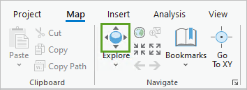
- Rotate, tilt, pan, and zoom around Monterey Canyon and observe the oxygen points at different locations and depths.
Note:
If you have a mouse with a wheel button, clicking the wheel button allows you to rotate and tilt in 3D. Click to pan and right-click to zoom. For more information on using the Explore tool for navigation, see Navigation in 3D. For more advanced 3D navigation, you can use the on-screen navigator, which exposes many camera navigation commands in a single control in the lower left of a scene or view.
- If necessary, on the View tab, in the Navigation group, click the Navigator button.
Using the navigator, you can now rotate, move, tilt, pan, and zoom using the control in the lower left of the map.
Note:
The navigator is useful when well-defined control is needed for camera movements. The navigator is resizable and provides quick access to controls to tilt and change direction. Review Use the on-screen navigator to learn more about the camera navigation commands.
- On the scene, click any point and review the pop-up.
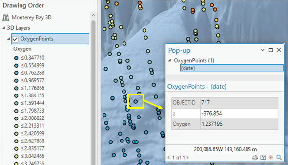
Each point is individually symbolized by its oxygen level value and displays at the depth it was measured (z-value). The highest oxygen measurements are found near the surface of the ocean and the lowest measurements are near the middle of the vertical columns. Points at the same depth tend to have roughly the same oxygen level, but oxygen levels change very quickly going up and down the vertical columns.
- Close the pop-up.
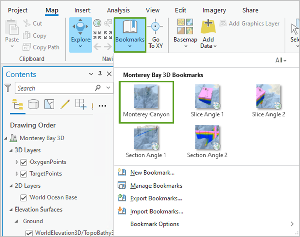
- On the ribbon, on the Map tab, in the Navigate group, click Bookmarks and choose Monterey Canyon.
Explore the oxygen measurements
Next, you'll use a histogram chart to explore the distribution of the dissolved oxygen measurements and use transformations to adjust the distribution to be more suitable for interpolation. The histograms will visually summarize the distribution of dissolved oxygen measurements by measuring the frequency at which oxygen measurements occur in the dataset. Interpolation works best when data is normally distributed; when data is skewed (the distribution is lopsided), you might want to transform the data to make it normal. Histograms allow you to explore the effects of logarithmic and square root transformations on the distribution of your data.
- In the Contents pane, right-click OxygenPoints, point to Create Chart, and choose Histogram.
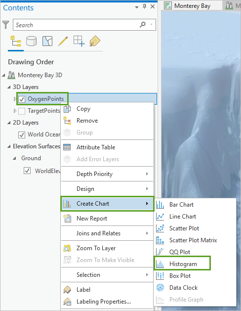
The Chart and Chart Properties panes appear. The Chart pane will be empty until you specify which field you want to investigate.
- In the Chart Properties pane, on the Data tab, for Number, choose Oxygen.
This is the field that stores the dissolved oxygen measurements at each point.
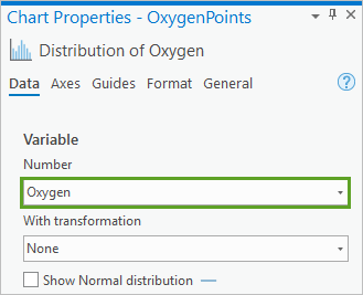
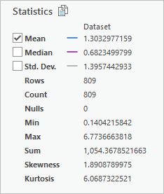
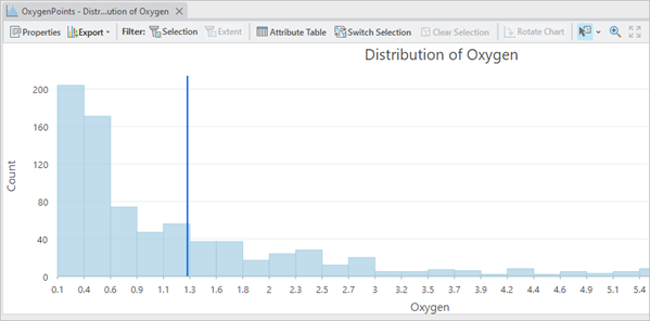
In the Chart Properties pane, the statistics update with the mean, minimum, and maximum oxygen measurement values and the chart pane updates to display a histogram of measurements. The following statistics are included:
- The Count is 809 points.
- The Mean dissolved oxygen level is 1.3 micromoles/liter.
- The lowest (Min) dissolved oxygen level is 0.14.
- The largest (Max) dissolved oxygen level is 6.8.
The histogram reflects that the distribution is heavily skewed to the left, with many observations on the lower end of the distribution and few observations at the higher end.
Note:
The values on the axes of the histogram may be different for you, as the values that are displayed depend on the size of the pane.
- In the Chart Properties pane, check the Show Normal distribution box.
The chart updates and you are now able to visually compare the result to a normal distribution that best fits the histogram.
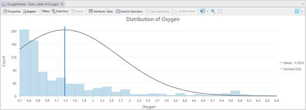
Comparing the normal distribution curve overlaid on the histogram, it is clear that the bars of the histogram are not close to the curve. Next, you'll use a transformation to try to make the oxygen measurements distribution closer to a normal distribution.
Transformations are mathematical operations that are applied to each data measurement, such as taking the square root or logarithm of each value. The distribution of the transformed dataset will be different than the distribution of the original dataset. Interpolation methods are most effective when the data is close to a normal (bell-shaped) distribution, and transformations can be used to make a dataset closer to a normal distribution.
- In the Chart Properties pane, for With transformation, choose Square Root.
The histogram updates to display the distribution with the application of a square root transformation.
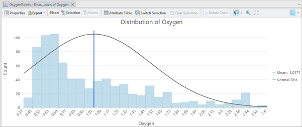
The square root transformation has removed some of the skewness, but the distribution is still strongly right skewed and the normal distribution curve still does not match the histogram very well.
- In the Chart Properties pane, for With transformation, choose Logarithmic.
The histogram updates to display the distribution with a logarithmic transformation applied.
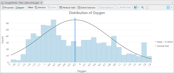
The distribution now appears to be more symmetrical and closer to a bell shape than in the two previous histograms. You'll use the fact that a logarithmic transformation is effective later when configuring interpolation options and settings.
- Close the Chart Properties pane and the OxygenPoints – Distribution of Oxygen chart.
Explore the relationship between oxygen and elevation
While navigating in 3D, you observed the highest dissolved oxygen levels near the surface of the bay, and the lowest levels in the middle of the vertical columns. Next, you'll use a scatterplot to visualize how the oxygen levels change with depth.
A scatterplot is used to visualize the relationship between two numeric variables, where one variable is displayed on the x-axis, and the other variable is displayed on the y-axis.
- In the Contents pane, right-click OxygenPoints, point to Create Chart, and choose Scatter Plot.
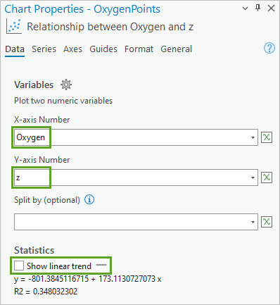
- In the Chart Properties pane, on the Data tab, for X-axis Number, choose Oxygen.
- For Y-axis Number, choose z.
The chart name updates to Relationship between Oxygen and z.
- In the Chart Properties - OxygenPoints pane, uncheck Show linear trend.
The scatterplot shows a clear relationship between oxygen levels and depth. The oxygen level is highest near the surface and then drops quickly and steadily.
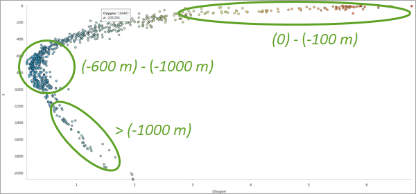
The lowest values occur between approximately -600 and -1,000 meters. At depths below -1,000 meters, the oxygen levels slowly rise back up.
Note:
Placing depth values on the y-axis is most typical when plotting values measured at different depths, but in these tutorials, you are interested in predicting oxygen levels based on depth, so it makes more sense to put the depth on the x-axis of the scatterplot.
- In the Chart Properties pane, change the following parameters:
- For X-axis Number, choose z.
- For Y-axis Number, choose Oxygen.
The scatterplot updates and displays the relationship between depth and oxygen levels, with depth now represented on the x-axis.
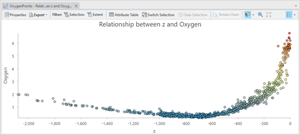
You learned from the histogram earlier that a logarithmic transformation is appropriate, so it will be helpful to see the scatterplot with the oxygen measurements on a logarithmic scale.
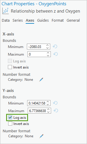
- In the Chart Properties pane, click the Axes tab. For the Y-axis properties, check Log axis.
Note:
Using a logarithmic axis is the equivalent of applying a logarithmic transformation to data on a linear axis. This is similar to what you did to the histogram in the previous section.
The scatterplot updates to show the oxygen values on a logarithmic scale. With the logarithmic scale applied, you can see the same trend as before, with the largest values at the surface and smallest values around 800 meters below the surface. The points seem to form two distinct lines that connect at an approximate depth of -800 meters.
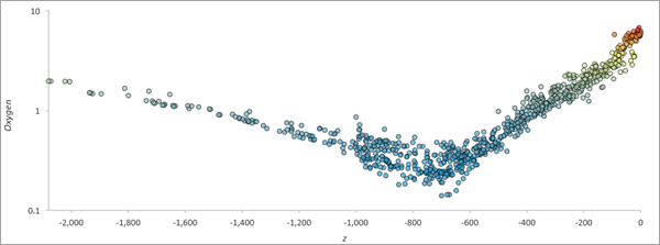
For this data, only two lines are needed to approximate the scatterplot. In a more dispersed scatterplot, using more lines would provide an even closer approximation. This is a very important finding because local linear trends can be modeled and removed when performing interpolation.
- Close the Chart Properties pane and the OxygenPoints – Relationship between z and Oxygen chart.
Note:
Charts are managed as a property of a layer, so they are not deleted when you close charting panes. You can view your charts by expanding the OxygenPoints layers legend in the Contents pane and scrolling to the bottom of the legend. Double-clicking the charts in the legend will reopen them.
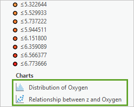
- If necessary, in the Contents pane, collapse the OxygenPoints layer.
- Save the project and confirm that you want to save it to the current version of ArcGIS Pro.
You've explored the dissolved oxygen measurement data for Monterey Bay by navigating a local scene and using a histogram and scatterplot. You saw that the largest oxygen measurements were near the surface, and the smallest measurements were near the middle of the vertical columns.
Using the histogram chart, you determined that a logarithmic transformation stabilizes the distribution of dissolved oxygen measurements. The scatterplot then showed a strong relationship between oxygen levels and depth, and you determined that oxygen on a logarithmic scale can be accurately approximated with local linear trends based on depth.
Interpolate dissolved oxygen using Empirical Bayesian Kriging 3D
Previously, you explored the dissolved oxygen measurements in the map and used charting to better understand the distribution of the oxygen measurements. You also observed that oxygen levels vary strongly with depth.
Next, you'll use these insights to interpolate the oxygen values into a continuous 3D model that predicts dissolved oxygen levels throughout Monterey Bay. You'll use the Empirical Bayesian Kriging 3D (EBK3D) geoprocessing tool perform the interpolation and explore the 3D model in a scene. Then, you'll use cross validation to evaluate if the model accurately predicts dissolved oxygen.
Interpolate using the geoprocessing tool
In this section, you'll use the EBK3D geoprocessing tool to interpolate the dissolved oxygen measurements into a continuous model that predicts dissolved oxygen everywhere between the measured points.
- If necessary, open your project.
- On the ribbon, on the Analysis tab, in the Geoprocessing group, click Tools.
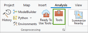
The Geoprocessing pane opens.
- In the Geoprocessing pane, in the search box, type Empirical Bayesian Kriging 3D. In the search results, click Empirical Bayesian Kriging 3D.
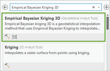
EBK3D is available in the Geostatistical Wizard and as a geoprocessing tool. The result of the interpolation is a geostatistical layer that shows a horizontal transect at a given elevation. The current elevation can be changed with a range slider, and the layer will update to show the interpolated predictions for the new elevation.
- In the Empirical Bayesian Kriging 3D geoprocessing tool, change the following parameters:
- For Input features, choose OxygenPoints.
- Verify that Elevation field is set to Shape.Z.
- For Value field, choose Oxygen.
- For Output geostatistical layer, delete the existing text and type Oxygen Prediction.
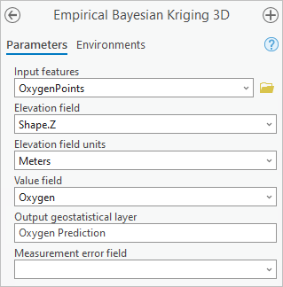
These parameters are all that are required to run the tool. However, in the previous tutorial, you learned that the distribution of dissolved oxygen measurements needs a logarithmic transformation. In the geoprocessing tool, a log empirical transformation applies a logarithmic transformation before additionally applying a normal score transformation.
Note:
Normal score transformations are beyond the scope of this tutorial, but they are flexible, nonparametric transformations to the normal distribution based on equating empirical quantiles to corresponding quantiles of the normal distribution. By applying a logarithm and using an empirical normal score transformation (Log Empirical), the resulting distribution after the transformation will be close to a normal distribution and most optimally suited for EBK3D.
- Expand Advanced Model Parameters. For Transformation type, choose Log empirical.
After you change the transformation type, the Semivariogram model type automatically changes to Exponential. The default semivariogram model is not applicable with a transformation.
Previously, you learned that oxygen levels can be accurately approximated by two local trend lines based on depth. In EBK3D, choosing to remove a first-order (linear) trend will estimate a vertical linear trend to the oxygen measurements. Because this vertical trend is calculated locally in subsets, removing the first-order trend is equivalent to fitting local trend lines in a scatterplot of depth versus oxygen (the correspondence between vertical trend removal in subsets and local lines on a scatterplot may not be obvious if you do not have experience with linear regression). Because you previously showed that this scatterplot can be accurately approximated with a sequence of straight lines, you'll remove the first-order trend.
- Under Advanced Model Parameters, for Order of trend removal, choose First order.
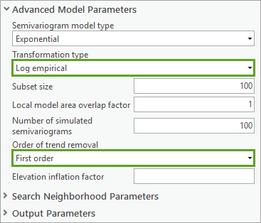
The Elevation inflation factor parameter defines the ratio of speed of the change of the measured values vertically versus horizontally. For example, if the values change 10 times faster vertically than they do horizontally, this value should be 10. This allows the equations to give proper weights to the measured values in all directions in 3D. Because you do not know an appropriate elevation inflation factor for the oxygen measurements, you'll leave the parameter empty, and a value will be estimated when you run the tool. The estimated value can be verified after the tool has run by viewing tool details.
In this example, the elevation inflation factor is used to correct for the fact that the oxygen measurements change much more quickly vertically than they do horizontally. You saw this both in the map and in the scatterplot, and it presents a problem for 3D interpolation because the kriging equations need to properly weight each measurement to make predictions at new locations. If the measured values change faster vertically than horizontally, this means that when making a prediction at a new location, points that are at approximately the same depth should be weighted higher than points that are at very different depths, even if the points at the same depth are comparatively far away from the prediction location.
- Collapse Advanced Model Parameters and expand Search Neighborhood Parameters.
The Search neighborhood parameter defines how neighbors will be determined when making predictions at new locations. To predict a new value, oxygen measurements near the prediction location (called neighbors) need to be identified. It is important to get a variety of neighbors in different directions, especially when the data forms vertical columns.
- For Search Neighborhood Parameters, verify the following parameters
- Verify that Search neighborhood is set to Standard 3D.
- Verify that Max neighbors is set to 2.
- Verify that Min neighbors is set to 1.
- Verify that Sector Type is set to 12 Sectors (Dodecahedron).
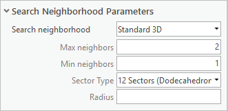
These settings ensure that the search neighborhood will look in 12 different directions (Sector Type) in 3D and find at least one neighbor (Min neighbors) and at most two neighbors (Max neighbors) in each of the 12 directions.
- Click Run.
The tool runs. It may take up to a minute for the tool to execute. When a geoprocessing tool is run, an entry is added to the project's geoprocessing history with details on when the tool was run, the settings that were used, whether the tool completed successfully, and any error messages.
- After the tool finishes running, in the Geoprocessing pane, click View Details.

A window appears with a summary of the parameters used in the tool. The Messages section indicates that an elevation inflation factor was estimated to be about 12.7. This means that even after removing the vertical trend, the oxygen values still changed about 12.7 times faster vertically than horizontally.

- Close the window.
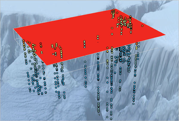
The Oxygen Prediction geostatistical layer was added to the map. It displays as a 2D slice at the surface of the ocean. The layer is initially entirely red, and a small 3D wireframe box is drawn around the 3D extent of the layer. If you cannot see this wireframe box on your screen, turn off the World Ocean Base layer. The geostatistical layer is not yet in the same vertical exaggeration as the elevation surface and the points, so the wireframe box does not visually match the 3D extent of the oxygen measurements.
Explore the geostatistical layer in 3D
In the previous section, you used EBK3D to create a geostatistical layer predicting dissolved oxygen levels across Monterey Bay. Next, you'll explore geostatistical layers in 3D. First, you'll change some elevation and symbology settings.
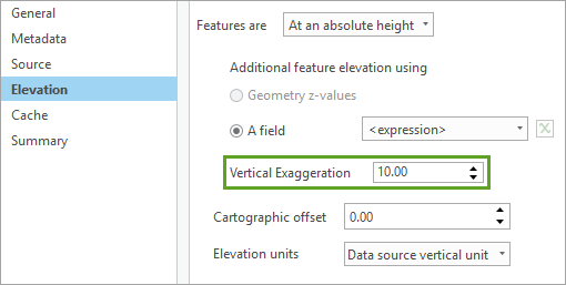
- In the Contents pane, right-click Oxygen Prediction and choose Properties.
- On the Elevation tab, for Vertical Exaggeration, type 10.
This sets the vertical exaggeration of the geostatistical layer to match the basemap and points.
- Click OK.
The wireframe box around the geostatistical layer extends to the bottom of the oxygen measurements. Next, you'll apply a different color scheme to the geostatistical layer.
- In Contents pane, expand the Oxygen Prediction layer.
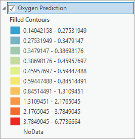
Geostatistical layers are rendered using filled contours based on a classification method. The default color scheme for this data uses red to indicate areas with predicted oxygen levels above 3.785 micromoles/liter. It appears that all locations at the surface of the ocean have predicted oxygen levels above this value, so the entire 2D slice renders in red at the surface.
- Collapse the Oxygen Prediction layer.
To see variability in the predicted oxygen levels at the surface, you'll change the classification method and increase the number of classes.
- Right-click the Oxygen Prediction layer and choose Symbology.
The Symbology pane appears, displaying available classification options.
- In the Symbology pane, for Method, choose Equal Intervals. For Classes, type 32.
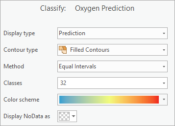
After changing the method and number of classes, the geostatistical layer updates to display the predicted oxygen levels using an equal interval color scheme with 32 classes. With the updated color ramp, you can now confirm how oxygen levels vary at the surface.
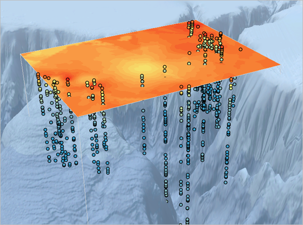
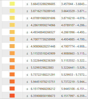
- In the Symbology pane, in the Class Breaks list, scroll down to display the yellow and orange class breaks associated to the surface oxygen levels.
These class breaks correspond to dissolved oxygen levels between about 4 and 6 micromoles/liter as observed on the ocean surface.
- Close the Symbology pane.
The 3D geostatistical layer automatically enables a range slider, located on the right of the Monterey Bay 3D scene. When you point to the control, it becomes active and enables you to change the current depth of the geostatistical layer.
- On the Range Slider control, point to the slider, click inside the green box. Type -100 and press Enter.
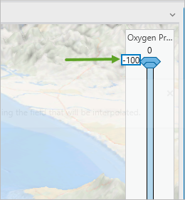
The slider moves to a depth of 100 meters below the surface. The geostatistical layer updates to show the predicted oxygen levels at the new depth.
Note:
It may take several seconds for the layer to update at the new depth. If you find that it takes too long on your computer, you can reduce the number of classes in the Symbology pane. This will speed up calculation and not change the basic concepts of these tutorials.
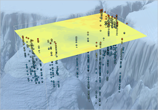
At 100 meters below the surface, the predicted oxygen levels have dropped significantly. This should be expected based on what you saw in the scatterplot.
- Point to the middle of the range slider control and click the down button.

The layer moves down to a depth of 169 meters and the geostatistical layer updates. The dissolved oxygen predictions drop as the geostatistical layer moves deeper into the ocean.
- Drag the slider back to the surface of the ocean.

Note:
If you accidentally separate the slider into an interval, the geostatistical layer will always use the top value of the interval.
- On the ribbon, click the Range tab. In the Playback group, click Direction to set the animation playback direction from top to bottom.

- On the range slider, click the play button.

The Oxygen Prediction layer moves down through the ocean and displays the predicted oxygen levels at 30 different depths. The layer moves under the elevation surface and basemap as it descends.
Note:
It may take several minutes for the animation to complete because the layer must calculate and contour itself at every new depth. However, once a depth is calculated, it is cached and will draw quickly every subsequent time at that same depth.
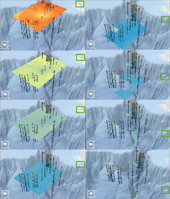
- When the animation finishes, drag the slider back to the surface elevation (0).
- Click the play button again.
Your animation should play quickly this time, allowing you to see how the oxygen levels change. If you watch closely, you can see the oxygen levels decreasing until around a depth of 800 meters, and then the oxygen levels begin to slowly rise.
- Drag the range slider back to the surface elevation (0).
Assess the accuracy of the model
You can gain a lot of insight into your model by exploring it in a map or scene, but a more quantitative and verifiable method is needed to validate the accuracy and reliability of the predicted dissolved oxygen levels. A common method of validating geostatistical models is via cross validation.
Cross validation removes a measured point and then uses all remaining points to predict the location of the removed point. The measured value at the hidden point is then compared to the prediction value from cross validation. The difference between these two values is called the cross validation error and is performed on every input point.
- In the Contents pane, right-click Oxygen Prediction and choose Cross Validation.
The Cross Validation window opens and displays various graphical and numerical diagnostics about the accuracy of the interpolation model. The window is composed of a graph on the left and summary statistics on the right. The calculated statistics serve as diagnostics that indicate whether the model and its associated parameter values are reasonable.
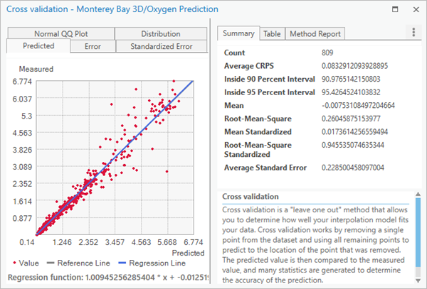
The summary statistics include the following information:
- The Mean and Mean Standardized errors are both close to zero (0.007 and 0.017, respectively), which indicates that the model has very little bias. It does not tend to predict values that are too large or too small.
- The Root-Mean-Square value of 0.26 indicates that on average, the predicted oxygen level differed from the measured value by about one quarter of a micromole/liter.
- The Root-Mean-Square-Standardized value of 0.94 is close to the ideal value of 1, and the Average Standard Error of 0.22 is approximately equal to the root-mean-square. These indicate that the variability in the predictions is being estimated properly.
- The Inside 90/95 Percent Interval values of 90.9 and 95.4 are both close to the ideal values of 90 and 95, which indicates consistency between the predicted values and the uncertainty of the predictions.
- Average CRPS is difficult to interpret literally, but smaller values indicate higher accuracy and precision. This value of 0.083 will be compared to a different model in the next tutorial.
- On the right side of the Cross Validation window, click the Table tab.
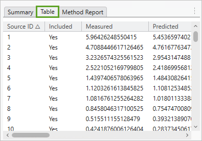
The table shows individual cross validation results for each input point. These values are used to generate the graphs on the left side of the window.
- If necessary, on the left side of the Cross Validation window, click the Predicted tab.
With cross validation, if your model can accurately predict the oxygen values at the hidden points, it should be able to accurately predict oxygen levels at new locations that you haven't measured.
This graph is a scatterplot of the predicted oxygen values from cross validation versus the measured oxygen values for each point. Since the predicted values should equal the measured values if the model is accurate, ideally the points will fall along the gray reference line. A blue regression line is calculated for the points to judge how closely they follow this ideal line.
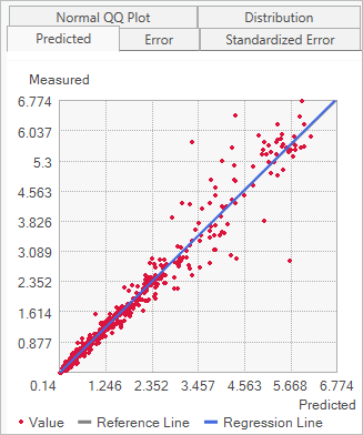
Your points are so close to ideal that the regression line (blue) nearly covers up the reference line (gray), so it is difficult to see.
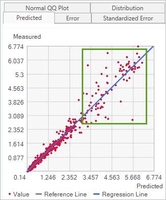
The points in the upper right show that there is more variability around the regression line for larger oxygen values. This is common for geostatistical data, but it is interesting to note because it means that the model can more accurately predict in areas of the ocean with low oxygen levels than it can in areas with high oxygen levels.
- On the left side of the Cross Validation window, click the Error tab.
The measured versus error graph shows the measured oxygen values plotted against the cross validation errors. The blue regression line is flat, which indicates that the model is making unbiased predictions for low and high levels of oxygen.
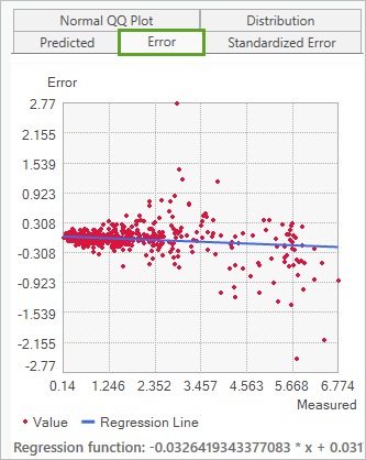
The graph shows that the predictions are unbiased for all levels of oxygen, and the variability of the points around the regression line is largest for the highest measured values. This means that on average, the model accurately predicts large oxygen values, but there is a lot of variation in individual predictions in areas of high oxygen.
- Close the Cross Validation window.
The cross validation summary statistics and graphs give strong evidence that the EBK3D model that you created is able to accurately predict dissolved oxygen levels throughout Monterey Bay with an average error of about one-quarter of a micromole/liter. This error will generally be larger near the surface, where oxygen levels are highest.
- Save the project.
You've used the Empirical Bayesian Kriging 3D tool to interpolate dissolved oxygen measurements in Monterey Bay. You also learned how to explore geostatistical layers in 3D using the range slider, and you the demonstrated the accuracy of the model using cross validation.
Execute 3D interpolation in the Geostatistical Wizard
Previously, you used the EBK3D geoprocessing tool to interpolate the dissolved oxygen measurements throughout Monterey Bay. You learned how to use the range slider to change the depth of the geostatistical layer, and you validated the accuracy of the model.
Next, you'll use the Geostatistical Wizard to interpolate the dissolved oxygen measurements. The Geostatistical Wizard provides a guided experience that allows you to see the local kriging models that the EBK3D method uses to make the predictions. By exploring these local models, you can visualize how the local models change throughout Monterey Bay.
Perform Empirical Bayesian Kriging 3D
First, you'll move to a 2D map and run Empirical Bayesian Kriging 3D (EBK3D) using the Geostatistical Wizard. You'll use all default settings and compare the cross validation results to the advanced model from the previous tutorial.
The Geostatistical Wizard is a dynamic set of pages that is designed to guide you through the process of constructing and evaluating the performance of an interpolation model. Choices made on one page determine which options will be available on the following pages and how you interact with the data to develop a suitable model. The wizard guides you from the point when you choose an interpolation method all the way to viewing summary measures of the model's expected performance.
- If necessary, open your project.
- Click the Monterey Bay map tab.
The map changes to a 2D map of Monterey Bay. The oxygen measurements are drawn on the map.
- If necessary, close the OxygenPoints table.
- On the ribbon, click the Analysis tab. In the Workflows group, click Geostatistical Wizard.

The Geostatistical Wizard opens. The first page of the wizard allows you to choose an interpolation method on the left and specify input parameters on the right.
- From the 3D Interpolation group, choose Empirical Bayesian Kriging 3D. Under Input Dataset, for Source Dataset, choose OxygenPoints. For Data Field, choose Oxygen.
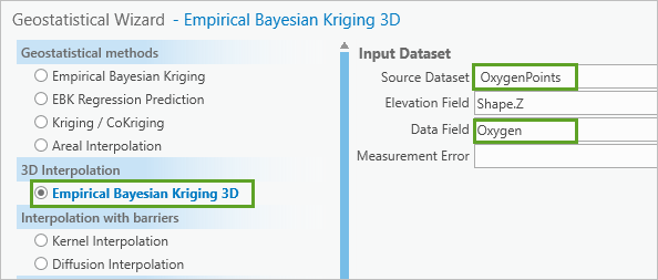
These settings specify that you want to run EBK3D on the Oxygen value field of the OxygenPoints layer.
- In the Geostatistical Wizard window, click Next.
The second page of the Geostatistical Wizard opens.
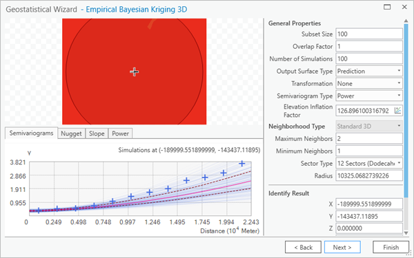
The second page of the Geostatistical Wizard is split into several sections.
- The General Properties section shows all of the parameters available for EBK3D.
- The preview surface shows a horizontal slice of predicted oxygen values at the current depth. The preview surface will update whenever a parameter is changed in General Properties. This allows you to interactively change parameters and see how the model responds.
- The lower left section of the page displays the semivariograms, which are simulated local models from EBK3D at the current location and depth. The blue lines in the graph are the simulated semivariograms at the location. The graph also contains blue crosses (empirical semivariances) that are calculated directly from the data. In general, the blue crosses should fall toward the middle of the simulated semivariograms.
- The Identify Result section in the lower right of the page displays the current location and predicted value from the preview surface. The location (X and Y) and depth (Z) can be altered by typing coordinates in the Identify Result section or by clicking a location in the preview surface.
- Point to the preview surface.
A depth slider appears, allowing you to change the current depth.
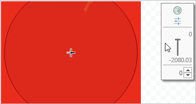
You can drag the slider to modify depth in much the same manner as the range slider on the map. You can also type a depth in the box below the slider.
- In the box below the slider, type -500 and press Enter.
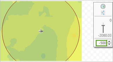
The preview surface now displays the predicted oxygen levels at 500 meters below the surface of the ocean. The graph updates to show simulated local models from EBK3D at the current location and depth.
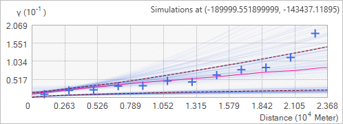
- In the preview section, drag the slider to several different depths.
At each depth, click around the preview surface and observe how the local semivariograms change. Some areas will have semivariograms that rise more quickly than others. The faster these models rise, the faster the oxygen values change at that location.
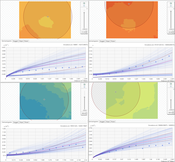
- When you have finished exploring the local models, drag the slider back to the surface of the ocean.
In the Geostatistical Wizard, you'll accept all of the default settings for EBK3D in order to compare the results with the advanced model results you created in the previous tutorial. You justified using the advanced settings with charting and exploration, and now you can observe how much better you actually did by using those advanced options.
- In the Geostatistical Wizard, click Next.
The Geostatistical Wizard executes and displays cross validation results for the default EBK3D settings. This page is identical to the Cross Validation window that you created in the last tutorial, but it is integrated into the Geostatistical Wizard. Measured values appear on the y-axis and predicted values appear along the x-axis.
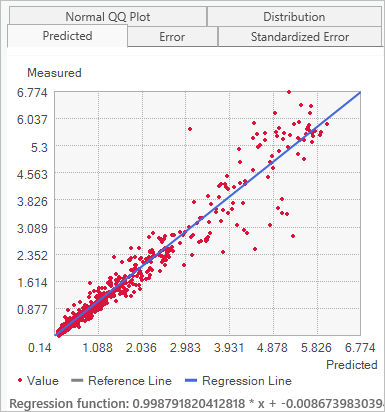
The predicted versus measured graph shows the same pattern as the advanced model in the previous tutorial. The regression line falls nearly on top of the gray reference line, and the largest oxygen measurements show the largest variability around the regression line.
- Click the Error tab.
Error values appear on the x-axis and measured values appear along the y-axis.
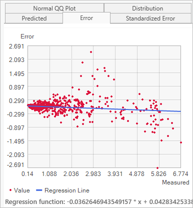
The measured versus error graph shows the same pattern as the previous model. The regression line is flat, and larger measured values have larger variability around the regression line.
- Review the summary statistics.
The following table compares the summary statistics for the default model as generated by the Geostatistical Wizard and your previous advanced model.
Statistic Advanced model Default model Average CRPS
0.083
0.114
Inside 90 Percent Interval
90.9
91.2
Inside 95 Percent Interval
95.4
95.4
Mean
-0.007
0.007
Root-Mean-Square
0.260
0.308
Mean Standardized
0.017
0.029
Root-Mean-Square Standardized
0.945
0.964
Average Standard Error
0.228
0.305
The summary statistics reveal the following insights:
- The default model has low levels of bias, because both the Mean and Mean Standardized values are close to zero.
- The Root-Mean-Square Standardized value is close to 1.
- The Inside 90 Percent Interval and Inside 95 Percent Interval values are both close to the ideal values of 90 and 95.
- The Root-Mean-Square value is approximately equal to the Average Standard Error value.
These results are encouraging and indicate that the default model passes all the typical tests needed to assess a geostatistical model. However, the following statements are also true:
- The Root-Mean-Square value for the default model is 18 percent larger than the advanced model.
- The Average CRPS value is 37 percent larger.
It is easy to miss these from a visual inspection of the graphs, but it is clear that the advanced model is substantially more accurate than the default model. On average, the predictions from the advanced model are 18 percent closer to the true values, and the uncertainties associated with the predicted values are substantially more accurate. They only clear way to identify this difference is through a quantitative comparison like cross validation.
- Click Finish.
The Method Report window opens. This window shows all of the parameters and settings used in the wizard.
- In the Method Report window, click OK.
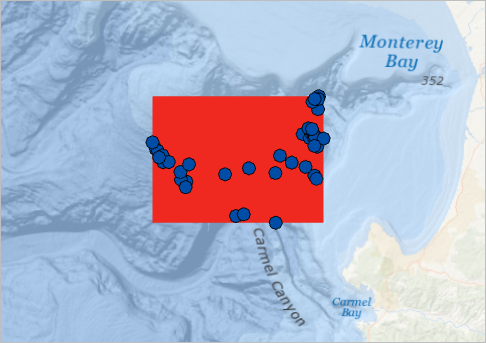
As the wizard completes, a geostatistical layer named Empirical Bayesian Kriging 3D is added to the map. It initially shows the predicted oxygen levels at the surface of the ocean and is rendered entirely in red. On the right of the map, a range slider appears.
Explore standard errors
Next, you'll use the range slider to change the depth of the geostatistical layer and symbolize the layer based on standard errors of prediction. Like in the 3D scene, you can change the depth of the geostatistical layer using the range slider in a 2D map.
Standard errors are measures of uncertainty associated with the predicted value. The larger the standard error, the lower the certainty of the predicted value. Recall the cross validation graphs where higher oxygen measurements had more variability around the regression lines than lower oxygen measurements. This implies that areas with larger predicted oxygen values should have larger standard errors than areas with lower predicted oxygen levels.
- In the Contents pane, right-click the Empirical Bayesian Kriging 3D layer and choose Zoom To Layer.
- On the ribbon, on the Geostatistical Layer tab, in the Drawing group, for Display Type, choose Standard Error.

The geostatistical layer updates to show the standard errors of the predicted oxygen values at the surface of the ocean.
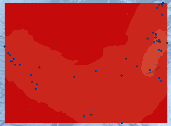
On the map, the standard errors at the surface are rendered in dark shades of red, indicating that they have the highest uncertainties in the entire 3D model. This makes sense, because the surface of the ocean has the highest oxygen levels and should therefore have the largest standard errors.
Even at the surface, the standard errors are slightly lower in the areas immediately around the input points. This also makes sense, because the model should have higher certainty of predictions that are close to measured points than predictions that are far away from any measured points.
- Save the project and click Yes to save it to a different version of ArcGIS Pro.
You've used the Geostatistical Wizard to interpolate the dissolved oxygen measurements in Monterey Bay. You also used cross validation to determine that the advanced EBK3D model from the second tutorial is substantially more accurate than the default model from this section. You then used the range slider to explore the standard errors of the 3D geostatistical model in a 2D map.
Share the results
Previously, you explored the dissolved oxygen measurements with 3D navigation and charting. Then, you used Empirical Bayesian Kriging 3D to create an advanced model in a 3D scene and a simple model in a 2D map.
Next, you'll learn how to export the results of these 3D models. Geostatistical layers are convenient for exploring geostatistical models with the range slider and simple access to cross validation results, but to integrate these results into larger workflows, you need to be able to export the results to formats that are more common in GIS workflows. You'll learn how to export 2D slices to rasters and feature contours, and you will use the surface to predict dissolved oxygen level at gridded (not sampled) points in 3D.
You'll conclude the tutorial by creating an animation of the advanced model moving through Monterey Bay in 3D and exporting the animation as a video.
Export contour polygons at different depths
First, you'll export filled contour polygons at two depths using a geoprocessing tool. The exported filled contour polygons will look identical to the geostatistical layer at a given depth, but they will be stored in a polygon feature class rather than a geostatistical layer.
- If necessary, open your project.
- Open the Monterey Bay 3D scene.
- Turn off the OxygenPoints and Oxygen Prediction layers. If necessary, drag the range slider to the surface of the ocean.
Your scene only shows the basemap draped on the elevation surface.
- Right-click Oxygen Prediction, point to Export Layer, and choose To Contours.
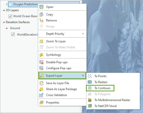
The Geoprocessing pane appears with the GA Layer To Contour tool parameters.
- In the GA Layer To Contour tool, change the following parameters:
- For Input geostatistical layer, choose Oxygen Prediction.
- For Output feature class, delete all existing text and type ContoursDepth0.
- Expand Classification. For Classification type, choose Equal interval.
- For Number of classes, type 32.
Note:
Contour lines rather than filled polygons can be created by changing the Contour type parameter in the GA Layer To Contour tool.
- Click Run.
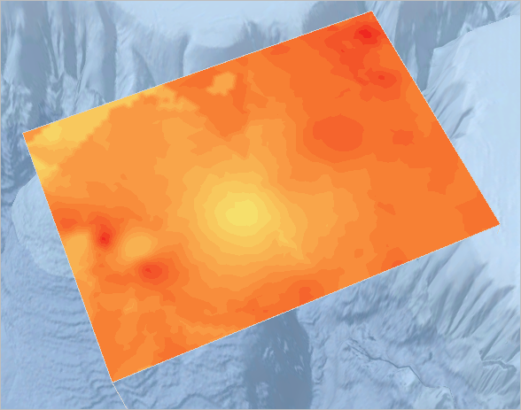
When the tool completes, a polygon layer named ContoursDepth0 is added to the Contents pane of the map. It appears identical to the Oxygen Prediction geostatistical layer. However, it displays no 3D wireframe because it represents the original empirical Bayesian kriging 3D result at a single depth (0).
- Collapse the legend for the ContoursDepth0 layer. Check the Oxygen Prediction layer to turn it on.
- If necessary, in the Contents pane, click the ContoursDepth0 layer to select it. On the ribbon, on the Feature Layer tab, in the Compare group, click the Swipe button.
- Swipe the ContoursDepth0 layer in several directions.
As you swipe, there is no visible difference between the layers. Because you just created a copy of the EBK result at depth (0) and named it ContoursDepth0, this layer is visually identical to the current surface depth (0) of the Oxygen Prediction layer.
- On the Map tab, in the Navigate group, click the Explore button.
Next, you'll create a layer for a depth of -500 meters.
- In the Contents pane, turn off the ContoursDepth0 and the Oxygen Prediction layers.
The GA Layer To Contour tool inherits the depth of the geostatistical layer by default. The depth is currently set to 0 and can be updated by changing the Output elevation parameter.
- In the GA Layer To Contour tool, change the following parameters:
- For Output feature class, delete all text and type ContoursDepth500.
- For Output elevation, type -500.
- For Output elevation, set the unit to Meters if it is not already chosen.
- Click Run.
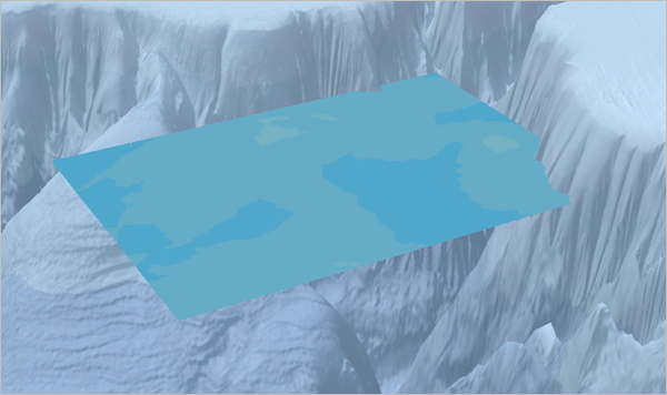
After the tool completes, a layer named ContoursDepth500 is added to the scene. It shows the predicted dissolved oxygen at 500 meters below the surface of the ocean. However, the layer does not have the same vertical exaggeration as the scene, so it does not initially draw at the correct depth. (You did not need to change the vertical exaggeration on the previous polygon layer because it displays at depth 0, so multiplying the depth by 10 is not needed.) You'll need to change the vertical exaggeration.
- In the Contents pane, collapse the legend of the ContoursDepth500 layer. Right-click ContoursDepth500 and choose Properties.
- On the Elevation tab, for Vertical Exaggeration, type 10. Click OK.
The ContoursDepth500 layer adjusts and displays at the correct depth relative to the basemap. A corner of the layer even moves under part of the elevation surface.
- Turn off the ContoursDepth500 layer.
To export contours at multiple depths, you can use batch geoprocessing, ModelBuilder, or Python scripting. The contours can then be displayed on the same map to simulate a 3D effect.
Export rasters of standard errors at different depths
Next, you'll export standard errors of the predicted values to rasters in the 2D map. This workflow is analogous to exporting feature contours.
- Switch to the Monterey Bay map. Turn off the Empirical Bayesian Kriging 3D layer.
- In the Contents pane, right-click Empirical Bayesian Kriging 3D, point to Export Layer, and choose To Rasters.
The GA Layer To Rasters tool opens.
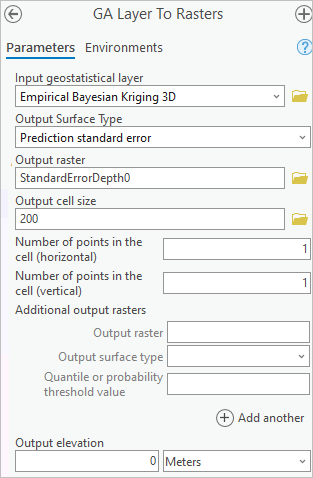
- In the GA Layer To Rasters tool, change the following parameters:
- Verify that Input geostatistical layer is set to Empirical Bayesian Kriging 3D.
- Verify that Output Surface Type is set to Prediction standard error.
- For Output raster, delete the text and type StandardErrorDepth0.
- For Output cell size, delete the text and type 200.
- For Output elevation, type 0.
- Click Run.
After the tool completes, a raster layer named StandardErrorDepth0 is added to the map and displays the standard errors of the predicted values at the surface of the ocean.
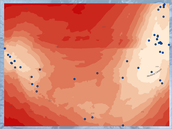
The standard errors are lowest in areas immediately around the input points. This is because predictions are more precise and accurate in areas that have been more heavily measured.
- Turn off the StandardErrorDepth0 layer.
Next, you'll create an additional raster layer for a depth of -500 meters. The GA Layer To Raster tool inherits the depth of the geostatistical layer by default. It is currently set to 0 and can be updated by changing the Output elevation parameter.
- In the GA Layer To Rasters tool, change the following parameters:
- Verify that Input geostatistical layer is set to Empirical Bayesian Kriging 3D.
- Verify that Output Surface Type is set to Prediction standard error.
- For Output raster, delete all text and type StandardErrorDepth500.
- Verify that Output cell size is set to 200.
- For Output elevation, type -500.
- Verify that Output elevation units is set to Meters.
- Click Run.
After the tool completes, a raster layer named StandardErrorDepth500 is added to the map and displays the standard errors of the predicted dissolved oxygen levels at 500-meter depth.
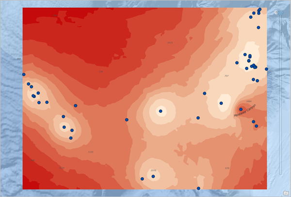
- Use the Swipe tool to compare the StandardErrorDepth500 and the StandardErrorDepth0 layers.
The StandardErrorDepth500 raster looks much like the StandardErrorDepth0 raster. The smallest standard errors are in the areas immediately around the points. However, the legends for the layers show that there are dramatic differences in the absolute values of the standard errors.
The symbology of rasters is based on their individual histograms, so the color of red at one depth will not correspond to the same range of values at different depths. In fact, for these depths, the darkest shade of red at depth 500 meters (0.217) corresponds to standard errors that are smaller than even the lightest shade of red at the surface (0.294).
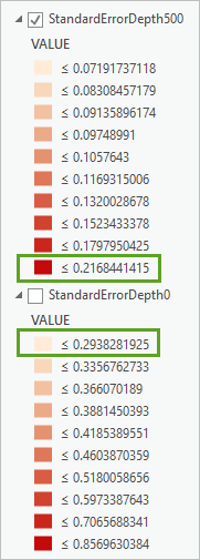
This makes sense, because in both the advanced and simple models there was higher uncertainty for large oxygen values than there was for small oxygen values.
Note:
If your analysis calls for a raster of the predicted oxygen values rather than a raster of the standard errors of the predictions, you would change the Output Surface Type parameter to Prediction in the GA Layer To Rasters tool.
You can also export rasters to multiple elevations simultaneously and save the result as a multidimensional raster dataset using the GA Layer to 3D Multidimensional Raster tool. You can open this tool using To Multidimensional Raster button in the Export Layer menu of the geostatistical layer property page.
Predict gridded points in 3D
An important use case for 3D geostatistical layers is the ability to predict arbitrary locations in 3D using the GA Layer To Points geoprocessing tool. While you can predict any points in 3D, it is often useful to predict points that are gridded in 3D in order to simultaneously visualize the entire 3D model. Next, you'll use this functionality to predict grid points.
- Switch to the Monterey Bay 3D scene.
- On the Map tab, in the Navigate group, click Bookmarks and choose Monterey Canyon.
- In the Contents pane, turn on the TargetPoints layer.
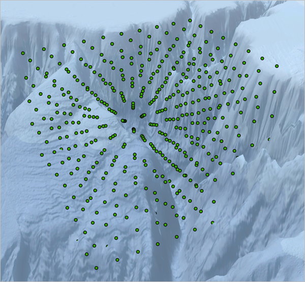
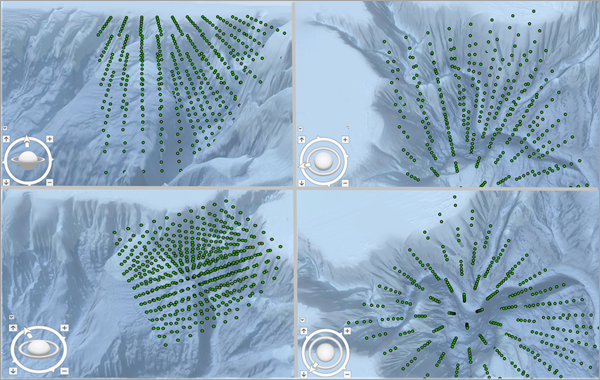
This layer contains 560 points in an approximate grid throughout Monterey Bay. The points do not have any relevant attributes, and they will serve as target locations for the 3D model. Their depths range from 150 meters to 1,950 meters, so they have a slightly narrower depth range than the measured oxygen values. This will ensure that each target point has sufficient input points above and below.
- Use the Explore or Navigator tools to explore (pan, zoom, rotate, and tilt) the distribution of points in the TargetPoints layer.
- In the Contents pane, uncheck the TargetPoints layer.
- Right-click Oxygen Prediction, point to Export Layer, and choose To Points.
The GA Layer To Points geoprocessing tool opens.
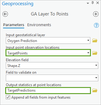
- In the GA Layer To Points tool, change the following parameters:
- Verify that Input geostatistical layer is set to Oxygen Prediction.
- For Input point observation locations, choose TargetPoints.
- Verify that Elevation field is set to Shape.Z.
- For Output statistics at point locations, delete all text and type TargetPredictions.
- Click Run.
After the tool executes, a layer named TargetPredictions is added to the map. The predicted dissolved oxygen levels at the points are stored in a field named Predicted and the standard errors of the predictions are stored in a field named Standard Error. (You can view them by opening the TargetPredictions attribute table and scrolling to the right.) The points initially display without vertical exaggeration and have default symbology.
- Right-click TargetPredictions and choose Properties. On the Elevation tab, for Vertical Exaggeration, type 10 and click OK.
The TargetPredictions layer updates to display with the same vertical exaggeration as the basemap. Next, you'll symbolize the points using the predicted dissolved oxygen level. To do this, you'll import and apply symbology from the OxygenPoints layer.
- Right-click TargetPredictions and choose Symbology. In the Symbology pane, click the options menu and choose Import symbology.
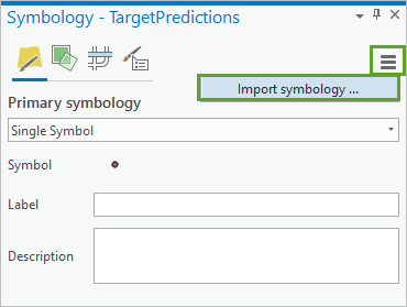
The Apply Symbology From Layer tool opens in the Geoprocessing pane.
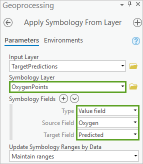
- In the Apply Symbology From Layer tool, change the following parameters:
- Verify that Input Layer is set to TargetPredictions.
- For Symbology Layer, choose OxygenPoints.
- For Symbology Fields, for Type, choose Value field.
- For Source Field, choose Oxygen.
- For Target Field, choose Predicted.
- Click Run.
The tool takes several moments to run, but when it completes, the Symbology pane updates the classification and color scheme for the TargetPredictions layer. On the map, the features update and are symbolized by predicted dissolved oxygen level.
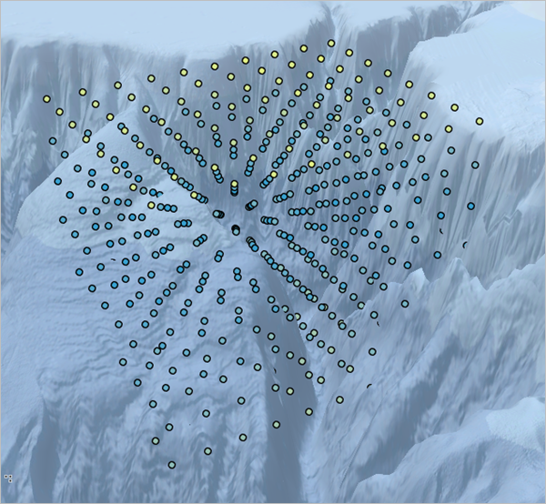
- Close the Symbology and Geoprocessing panes.
The top layer of points at depth 150 meters receive predicted values between about 3.2 and 3.7 micromoles/liter, and the points toward the middle have predicted oxygen levels of less than 1. At deeper depths, the trend reverses and the predicted values start to increase. You had previously seen these same trends in oxygen values at different depths in the scatterplot chart and with the range slider, but this is the first time you have seen the trend simultaneously in a 3D map.
Note:
There are many potential applications for gridded prediction points in 3D, including estimating the average value of the predictions in a 3D volume by taking the average of the predicted values, and filtering the points by their predicted values to isolate areas where the where the predicted values are too high or too low.
Create an animation using range slider settings
Next, you'll create an animation of the Oxygen Prediction layer moving from the surface of the ocean down to the bottom of Monterey Canyon. You'll then export a video of the animation so that you can share the results of your work with colleagues and the public. This animation will illustrate the results of your 3D geostatistical interpolation used to predict the oxygen levels throughout the Monterey Bay.
Note:
If you want to review the animation as a video, follow the link below. If you would like to create the animation and export the result to your own video, continue with the steps that follow.
- Turn off the TargetPredictions layer and collapse its legend. Turn on the Oxygen Prediction layer.
- Using the range slider, ensure the Oxygen Prediction layer is displaying the surface prediction.
- On the Map tab, in the Navigate group, click Bookmarks and choose Monterey Canyon.
Your map displays only the Oxygen Prediction geostatistical layer. All the other layers, except for World Ocean Base and WorldElevation3D/TopoBathy3D, are unchecked.
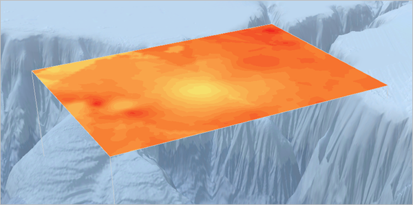
- On the ribbon, on the Range tab, in the Step group, click Number of Steps and verify that it is set to 30.

- On the View tab, in the Animation group, click Add.

The Animation Timeline pane appears and the active ribbon tab changes to the Animation tab.
Note:
If your Animation Timeline pane is not visible, click the Timeline button in the Playback group on the Animation tab.
- On the Animation tab, in the Create group, click Import and choose Range Slider Steps.
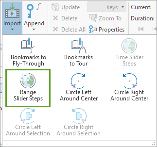
Because you set the number of steps for the range to 30, a sequence of 32 frames will be generated and displayed side by side in the Animation pane. The additional frames are automatically added to accommodate a start and end keyframe for the animation.
Note:
If you have changed the step interval, number of steps, or direction of playback for the range, you may have a different number of frames.
- If necessary, dock the Animation Timeline view below the Monterey Bay 3D scene.
Your animation frames may initially be empty and appear blank, but as the frames are generated for each depth, they will slowly fill and update with previews of the geostatistical layer at different depths. It may take several minutes for all frames to load.
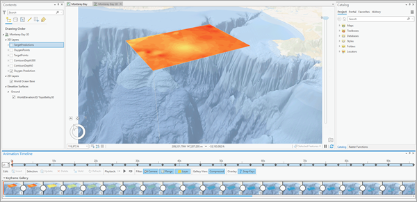
- In the Animation Timeline view, verify that all the frames have been generated. Scroll to the right until you can see frame 33.
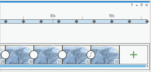
On the ribbon, on the Animation tab, in the Playback group, the Current and Duration fields of the animation are displayed.
The duration of the animation is set to 1 minute 36 seconds (01:36.000). (Your duration time may vary.) Regardless, this time is too long, so you'll shorten the duration to 30 seconds.
- For Duration, type 00:30.000 and press Enter.
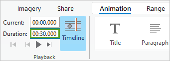
The duration between animation frames is adjusted so the total length of the entire animation is 30 seconds. Next, you'll export the animation timeline to a movie.
- On the ribbon, on the Animation tab, in the Export group, click Movie.

The Export Movie pane appears and allows you to specify options related to the exported video.
- In the Export Movie pane, expand Movie Export Presets to reveal a list of predefined export presets. Change the following presets:
- From the presets, click HD720.
- For File Name, change the file path to the directory where you extracted your project, and verify that the name of the video file is Monterey Bay 3D.mp4.
- Expand File Export Settings and verify that Media Format is set to MPEG4 movie (.mp4).
- For Frames Per Second, type 15.
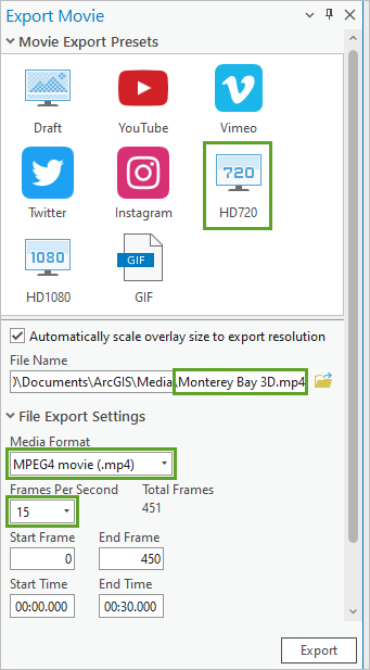
To save time in the export, your video uses a relatively low frame rate of 15 frames per second. To create a higher-resolution video, you can increase the number of frames per second.
- Click Export.
It may take a few minutes to export the video file. Your computer's processor and graphics card will directly influence how quickly your animation will export. In addition, the length of the animation and the size of the resolution will also impact how long it takes to generate each frame of the movie.
- When the video has finished exporting, in the lower left of the Export Movie pane, click Play the video.
The default video viewer of your computer opens to display your movie of the geostatistical layer from the surface of the ocean down through various depths of Monterey Bay, predicting dissolved oxygen levels as it progresses.
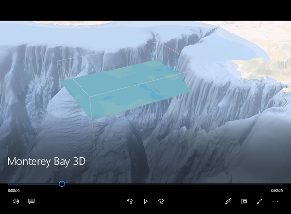
This video can now be shared and accessed by anyone. You can upload this video to ArcGIS Online, share it on YouTube, or show it to colleagues.
Note:
If Windows Media Player or another common video player is unable to play your exported movie from ArcGIS Pro, most likely you are missing the necessary codec file. The codec is a form of compression used to keep the video file size low. With the correct codecs installed, Windows Media Player will be able to play the supported movie formats.
- Close the Animation Timeline and Export Movie panes.
- Save the project.
You've learned how to export 3D geostatistical layers to contour polygons, rasters, and 3D points. You've also learned how to create a movie of the geostatistical layer moving through Monterey Canyon visualizing the estimated dissolved oxygen.
Visualize the results as a voxel layer
Previously, you learned how to export the results of the interpolation to useful formats such as rasters, contour features, and animations.
Next, you'll learn how to visualize the results as a voxel layer. A voxel layer is a 3D volumetric visualization that allows you to see and explore a full 3D cube of the predicted dissolved oxygen level.
Create a netCDF file and add a voxel layer
To visualize the dissolved oxygen predictions as a voxel layer, you must first create the source file for the voxel layer. This source file is a netCDF (*.nc) file representing 3D gridded locations that are used to render each voxel in the voxel layer. This file can be created using the GA Layer 3D To NetCDF tool.
- If necessary, open your project and open the Monterey Bay 3D scene.
- Turn off the Oxygen Prediction layer.
- Navigate to the Monterey Canyon bookmark.
- Right-click Oxygen Prediction, point to Export Layer, and choose To NetCDF/Voxel.
The GA Layer 3D To NetCDF tool opens in the Geoprocessing pane. This tool allows you to export 3D gridded points to netCDF format. You can provide the separation between these gridded points using the X spacing, Y spacing, and Elevation spacing parameters. By default, 40 points are created in all dimensions, which results in 64,000 locations.
The Input 3D geostatistical layers parameter automatically populates with the Oxygen Prediction layer. Multiple geostatistical layers can be provided and exported to the same netCDF file.
- For the Output netCDF file, delete all text and type VoxelSource. Select the entire output path and file name, right-click, and select Copy.
You'll paste the path and file name in a later step.
- For Output variables, click the Add another button to add a new row to the value table. In the new row, for Layer name, choose Oxygen Prediction. For the Output surface type, choose Prediction standard error.
Setting the parameters in this way will cause the tool to export the predictions and standard errors of the dissolved oxygen predictions at the locations.
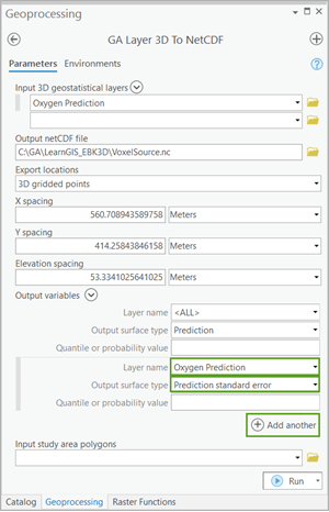
- Click Run.
The tool may take a few minutes to run. Initially, no output layer is added to the scene.
- Close the Geoprocessing pane.
- On the Map tab, in the Layer group, click Add Data and choose Add Multidimensional Voxel Layer.
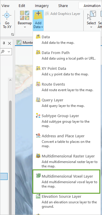
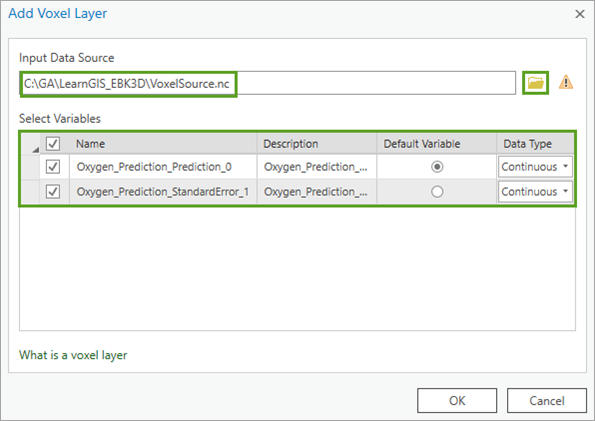
The Add Voxel Layer window appears.
- For Input Data Source, paste the output path you copied. Alternatively, browse to the VoxelSource.nc file using the Browse button.
Note:
The location of your file may be different than the one shown in the example image.
The predictions and standard errors of the dissolved oxygen predictions will display in the Select Variables section. The predictions are chosen as the Default Variable.
- Click OK.
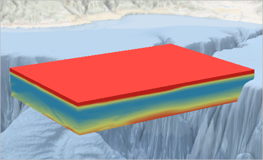
The VoxelSource voxel layer is added to the scene and is rendered in 3D.
Adjust the properties of the voxel layer
Initially, the voxel layer does not have the same symbology or vertical exaggeration as the rest of the scene. You'll adjust the properties of the voxel layer to better match the scene.
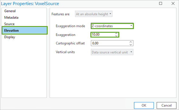
- Right-click VoxelSource and choose Properties.
- On the Elevation tab, change Exaggeration mode to Z-coordinates. For Exaggeration, type 10.
- Click OK.
The voxel layer stretches to the same vertical exaggeration as the scene.
- Right-click VoxelSource and choose Symbology.
The Symbology pane appears.
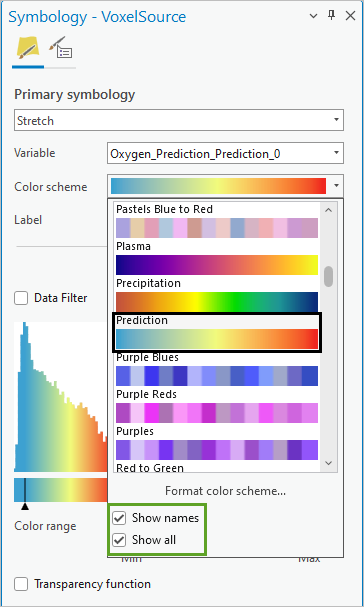
- In the Symbology pane, for Color scheme, click the menu and check Show names and Show all.
- Choose the Prediction color scheme.
Tip:
The color schemes are organized alphabetically.
- Close the Symbology pane.
The voxel layer now has the same color scheme as the points and the geostatistical layer.
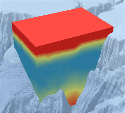
- Using the Explore tool, navigate around Monterey Canyon. Look at the voxel layer from different angles.
The middle of the volume has the lowest predicted oxygen levels and the surface of the ocean has the highest.
Remove the corners of the study area using slices
The voxel layer fills up a full 3D cube, but some of the areas of this cube do not have any oxygen measurements. You'll use slices to remove two corners of the voxel layer that do not have points nearby.
- Turn on the OxygenPoints layer.
You can see most of the points through the voxel layer. Some of the areas of the cube do not have points.
- Navigate to the Slice Angle 1 bookmark.
The extent changes to show a corner of the voxel layer without points. In the example image, the shaded region with no points is the area of the voxel layer that you will slice out.
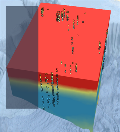
- Expand VoxelSource if it is not already expanded. Right-click Slices and choose Create Slice.
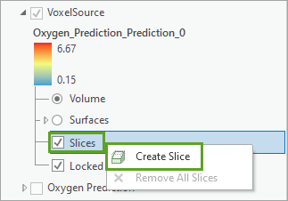
The Slice and Section toolbar appears at the bottom of the scene, allowing you to create the slice interactively. By default, the Vertical Slice button is selected.
- Confirm that the Vertical Slice button is selected. Click twice along the edges of the region of the voxel you want to remove.
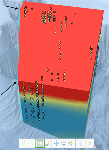
The Voxel Exploration pane appears, allowing you to change the position, orientation, and tilt of the slice. You'll create another slice to remove the opposite corner.
- Navigate to the Slice Angle 2 bookmark.
- In the Contents pane, for VoxelSource, right-click Slices and choose Create Slice.
- Using the Vertical Slice tool, once again click twice along the edges of the region of the voxel you want to remove.
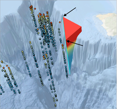
- On the toolbar, click the Flip tool to flip the side that is sliced.
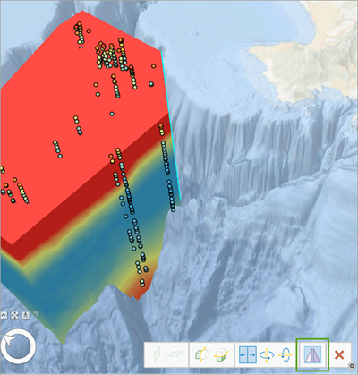
Two of the corners of the voxel layer with no oxygen measurements have now been removed from the voxel layer. Slices could also be used to remove the other two corners.
- Using the Explore tool, navigate around Monterey Canyon. Look at the voxel layer from different angles.
Create vertical and angled sections
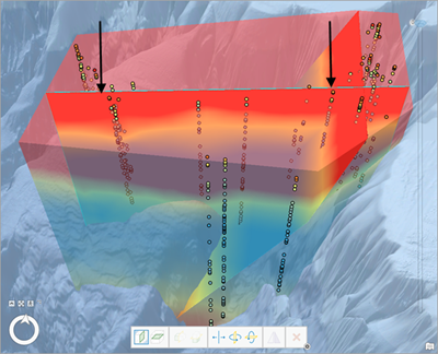
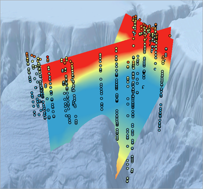
Sections are used to visualize horizontal, vertical, or angled slices showing 2D transects. Previously, you had only been able to see perfectly horizontal transects. Next, you'll create a section approximately parallel to the steepest part of Monterey Canyon. Then, you'll create a second section that is approximately perpendicular to the first section.
- Navigate to the Section Angle 1 bookmark.
The camera zooms to an angle parallel to the side of the canyon.
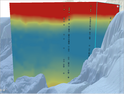
- In the Contents pane, for VoxelSource, click the button next to Surfaces to change the visualization.
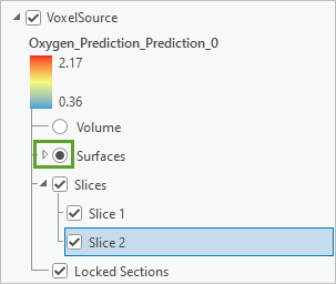
The voxel layer disappears from the map and will not reappear until you add a surface.
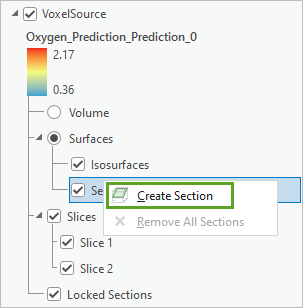
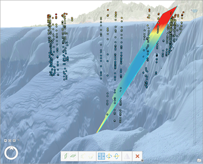
- Expand Surfaces, right-click Sections, and choose Create Section.
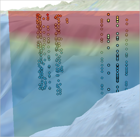
A transparent visualization of the voxel layer appears to help you create your slice.
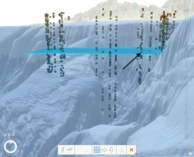
- On the Slice and Section toolbar, click the Horizontal Section button.

- Using the Horizontal Section tool, click in the middle of the column of points near the steepest part of the canyon.
- In the Voxel Exploration pane, for Tilt, type -150 and press Enter.
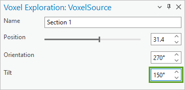
The tilt of the section changes to be approximately parallel to the canyon.
- Navigate to the Section Angle 2 bookmark.
- In the Contents pane, for VoxelSource, for Surfaces, right-click Sections and choose Create Section.
- Using the Vertical Section tool, click the map twice to make another section approximately perpendicular to the first section. Ensure that you click the right most side before the left most side.
- Navigate to the Monterey Canyon bookmark.
- Click any other layer in the Contents pane to remove the highlight effect on the vertical section.
- Using the Explore tool, navigate around Monterey Canyon and look at the sections from different angles.
- When finished, navigate back to the Monterey Canyon bookmark.
Create isosurfaces of dissolved oxygen
Isosurfaces are the 3D equivalent of contours. A contour is a line where all locations on the line have the same value. Similarly, an isosurface is a shell in 3D where all locations on the shell have the same value. In this section, you will create an isosurface and interactively change the value of the isosurface.
- In the Contents pane, expand VoxelSource, and for Surfaces, uncheck the box next to Sections.
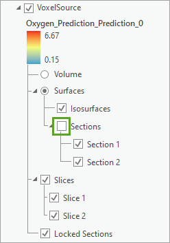
The sections disappear from the map.
- For VoxelSource, for Surfaces, right-click Isosurfaces and choose Create Isosurface.
An isosurface visualization adds to the map showing a shell of all 3D areas with the same dissolved oxygen level.
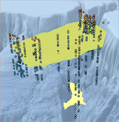
In the Voxel Exploration pane, the slider next to Value gives you the option to look at the isosurface of various dissolved oxygen levels.
- Drag the Value slider to the far left to see the minimum value.
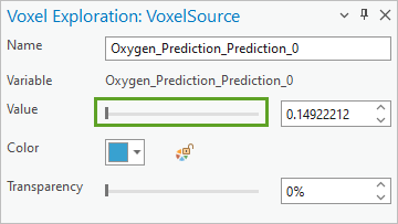
For this value, the voxel does not render anywhere.
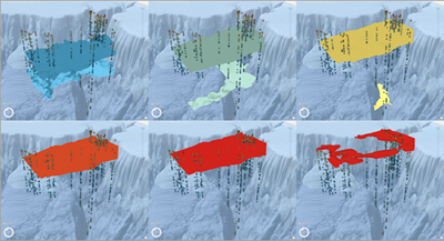
- Slowly drag the Value slider to the right and watch the isosurface morph in 3D to visualize the various dissolved oxygen levels.
- Save the project.
Empirical Bayesian Kriging 3D is a general-purpose 3D interpolation method, and the skills you learned in this tutorial can be directly applied to many fields, including oceanography, atmospheric science, and some geological applications. You are encouraged to try Empirical Bayesian Kriging 3D on your data or to download different data from the World Ocean Database (WOD) and repeat the steps you learned in these tutorials.
In this tutorial, you learned how to use Empirical Bayesian Kriging 3D to interpolate dissolved oxygen measurements in Monterey Bay into a 3D geostatistical model that can predict dissolved oxygen levels everywhere between the measured points. You performed Empirical Bayesian Kriging 3D using both the geoprocessing tool and the Geostatistical Wizard, and you learned how to validate the accuracy of the interpolation models. You exported your results to rasters and feature contours and shared an animation of your model so that others can see what you learned. Finally, you visualized the results as a voxel layer and learned how to create volumes, slices, sections, and isosurfaces.
You can find more tutorials in the tutorial gallery.

